
What is Responsive Website Design: Understanding the Core Concept

#web_design #responsive #user_experience In today’s world, where users access the internet from various devices, the concept of responsive website design has become increasingly important.
This approach means designing websites that can automatically adapt their layout and content to the screen size and user’s device (such as a computer, tablet, or smartphone).
The main goal of implementing a responsive website is to provide an optimal and consistent experience to visitors, regardless of the device they use.
This process is achieved using three main pillars: Fluid Grids, Flexible Images, and Media Queries in CSS.
Fluid grids use relative units like percentages for element widths, while flexible images ensure that images are correctly scaled at any screen size.
Media queries are powerful tools that allow developers to apply different CSS rules based on device characteristics such as width, height, or orientation.
These features together allow a website to adapt to the user environment, preventing sudden resizing of elements or the need for horizontal scrolling.
Given the significant increase in mobile browsing, responsive website design is no longer a luxury option, but a necessity for any online business.
This approach not only helps improve user experience but also plays a key role in improving search engine rankings.
This explanatory and educational aspect forms the foundation for a deeper understanding of subsequent topics.
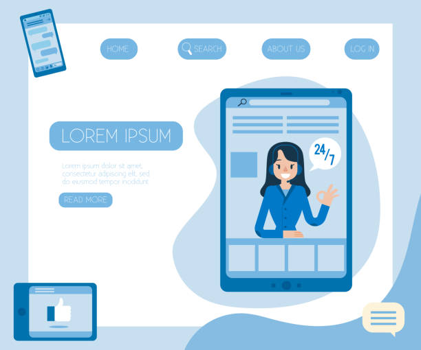
Tired of missing business opportunities due to not having a professional company website? Don’t worry anymore! With RasaWeb’s corporate website design services:
✅ Your brand’s credibility and professionalism will increase.
✅ You will attract more customers and sales leads.
⚡ Get a free consultation right now to start!
Why Responsive Website Design is Crucial Today?

#mobile_first #seo #accessibility Today, the importance of responsive website design goes beyond a web design trend and has become a business necessity.
Statistics clearly show that a significant portion of internet traffic occurs via mobile devices.
This growing trend necessitates that websites are displayed correctly not only on desktops but on all screens, from the smallest smartphones to the largest smart TVs.
Google, as the largest search engine, has also doubled its emphasis on responsive design by introducing mobile-first indexing.
This means that if your website is not optimized for mobile, it may rank lower in search results, directly impacting your traffic and SEO.
A responsive website significantly improves user experience (UX), as users do not need to zoom, scroll horizontally, or struggle to find information on a cluttered page.
This leads to a reduction in Bounce Rate and an increase in user time on site, both of which are positive signals for search engines.
Furthermore, maintaining only one version of the website instead of separate versions for mobile and desktop significantly reduces development and maintenance costs.
These analyses and guidelines indicate that responsive website design is no longer a competitive advantage, but a foundation for success in today’s digital space.
This investment not only leads to user satisfaction but also yields a significant return on investment.
Fundamental Principles of Responsive Website Design: Techniques and Tools
#media_query #flexbox #css_grid For effective implementation of responsive website design, a deep understanding of its technical principles and related tools is essential.
The core of this approach is the use of Media Queries in CSS.
These conditional statements allow the browser to apply different styles based on specific device characteristics such as screen width, height, orientation, or even resolution.
For example, you can define that for pages with a width less than 768 pixels, a column layout changes to a single-column layout.
Alongside media queries, the use of Flexbox and CSS Grid is crucial for layout structuring.
Flexbox is suitable for arranging elements in one dimension (a row or a column), and Grid for arranging in two dimensions (rows and columns), offering exceptional flexibility in responsive structuring.
Also, images and videos should be designed to be fluid and responsive using CSS properties like max-width: 100%; height: auto; or the <picture> tag and the srcset attribute for images, to display correctly and load quickly at any size.
The meta tag <meta name="viewport" content="width=device-width, initial-scale=1.0"> is also essential to ensure correct page scaling on mobile devices.
These specialized principles are integral components of any modern responsive website design project.
Table 1: Comparison of Responsive Layout Methods
| Method | Description | Primary Use | Advantages |
|---|---|---|---|
| Media Queries | Conditional CSS rules based on device characteristics (width, height, resolution) | Changing the overall website layout for different breakpoints | Precise control over site appearance at different sizes |
| Flexbox | A CSS layout module for distributing space and aligning items in one dimension | Building flexible components such as navigation bars, forms, or cards | Simplifying single-dimensional layout, automatic item alignment |
| CSS Grid | A two-dimensional layout system for designing complex layouts | Creating the main page structure, full control over rows and columns | High flexibility in two-dimensional layout, ideal for full-page layouts |
Challenges of Implementing Responsive Website Design: Overcoming Obstacles

#code_complexity #performance #testability Although responsive website design has countless advantages, its implementation is not without challenges.
One of the biggest obstacles is managing code complexity.
As the number of breakpoints and CSS rules associated with each device increases, CSS files can quickly become large and complex, leading to difficulties in maintenance and debugging.
This is where the question arises: Is the complexity caused by a responsive website worth its benefits? The answer is yes, provided it is approached with the right strategy and suitable methods.
Another challenge is website performance; especially on mobile devices with lower bandwidth.
Loading large images or heavy scripts optimized for desktop can severely reduce site speed and disrupt user experience.
Testing and validation across various devices is also a significant challenge.
Given the countless variety of devices and browsers, ensuring that your website works correctly on all of them requires precise testing tools and processes.
Content management must also ensure that content is displayed optimally across different screen sizes, without vital information being hidden or readability reduced.
Overcoming these challenges requires careful planning, adherence to best practices in coding, and the utilization of appropriate development and testing tools.
This analytical section shows that success in responsive website design depends not only on technical knowledge but also on problem-solving ability and strategic planning.
Did you know that 94% of the first impression of a company is related to its website design?
RasaWeb, by providing professional and efficient corporate website design services, helps you create the best first impression.
✅ Creates a professional and trustworthy image for your brand
✅ Easier attraction of potential customers and improved online standing
⚡ Get a free corporate website design consultation!
Improving Performance and Speed in Responsive Website Design
#optimization #responsive_images #slow_loading Website loading speed is a crucial factor in user experience and SEO ranking, and this becomes doubly important in responsive website design.
Mobile devices often have slower internet connections and more limited processing power, so any optimization can have a significant impact.
One of the most important strategies is image optimization.
Using images with appropriate resolution for each device, instead of loading one high-quality image for all, can drastically reduce the amount of data transferred.
Techniques like srcset and <picture> in HTML allow developers to provide different versions of an image for varying screen sizes.
Lazy Loading of images and videos, meaning they are only loaded when the user needs them, also helps improve initial site speed.
Minification of CSS and JavaScript and removal of unnecessary code are also important measures.
Using a CDN (Content Delivery Network) to serve static files, reducing HTTP requests, and optimizing fonts can also help increase speed.
Correct implementation of these techniques in a responsive website design not only leads to a smoother user experience but also helps improve site ranking in search engines.
These specialized explanations provide practical guidance for building a fast and efficient website.
Seamless User Experience with Responsive Website Design

#UX #user_interaction #readability The success of a responsive website design ultimately depends on its ability to provide a seamless user experience (UX).
This goes beyond merely having a responsive layout and includes how users interact with the website on different devices.
The design should allow for easy finger navigation on smartphones, ensure buttons and links are large enough to be tappable, and make content simple to read and understand.
Text readability and font sizes should be optimized for every screen size so that users do not constantly need to zoom.
Also, images and visual elements should be designed to maintain their appeal and not lose important information on smaller screens.
This entertaining yet guiding aspect emphasizes that responsive web design is not just about aesthetics but also about functionality and usability.
Attention to details such as form placement, the purchasing process, and even animations across different scales can make a significant difference in user satisfaction.
The ultimate goal is for the user, regardless of the device they are using, to feel that the website has been personalized for them.
This level of attention to user experience not only leads to users spending more time on the site but also significantly contributes to increased conversion rates and customer loyalty.
Responsive website design that focuses on UX is a long-term investment in your online success.
Popular Tools and Frameworks for Responsive Website Design

#bootstrap #tailwindcss #wordpress The world of responsive website design assists developers with a rich set of tools and frameworks to facilitate the process of building responsive websites.
These tools, from CSS libraries to content management systems, help you achieve professional results without needing to write every line of code from scratch.
Bootstrap and Tailwind CSS are two of the most popular CSS frameworks that quickly enable the creation of responsive layouts.
Bootstrap, with its pre-built UI components and powerful grid system, is a suitable choice for quickly starting projects, while Tailwind CSS, with its Utility-First approach, offers more flexibility in style customization.
Furthermore, CSS preprocessors like Sass and Less, with features such as variables, functions, and nesting CSS rules, help organize and maintain complex CSS codes in large responsive website design projects.
For those using Content Management Systems (CMS), platforms like WordPress, Joomla, or Drupal provide the ability to build fully responsive websites with responsive themes and plugins, without requiring deep programming knowledge.
These tools and frameworks form an important part of the specialized responsive website design ecosystem and help developers design efficient, beautiful, and accessible websites for all users.
This guide greatly assists in choosing the right tools for each project.
Table 2: Comparison of Popular Frameworks for Responsive Design
| Framework | Approach | Advantages | Suitable for |
|---|---|---|---|
| Bootstrap | Component-based, ready-to-use | High development speed, strong documentation, large community | Projects with a need for quick start and standardization |
| Tailwind CSS | Utility-First, with utility classes | High flexibility, lighter CSS code, and full customization | Projects requiring fully custom and scalable design |
| Foundation | Comprehensive, modular Front-end framework | Good flexibility, focus on advanced user experience and accessibility | Complex and large enterprise projects |
The Future of Responsive Website Design: Emerging Trends

#PWA #AMP #automation Responsive website design is not a static field and is constantly evolving.
With technological advancements and changing user expectations, new trends are emerging that will define the future of the web.
Progressive Web Apps (PWAs) have emerged as one of the most important of these trends.
PWAs offer a combination of the best features of websites and mobile applications, including home screen installation, offline access, and push notifications.
This technology provides a native app-like experience through the web browser and is considered the next step in the evolution of responsive web design.
Also, Accelerated Mobile Pages (AMP) has gained significant popularity with the goal of delivering incredibly fast content on mobile devices, especially for news articles and blogs.
This technology provides a very smooth user experience by limiting JavaScript usage and optimizing loading.
Web Components also allow developers to create reusable and encapsulated UI elements, which can simplify the development process of responsive sites.
The future of responsive website design is moving towards more automation, the use of AI for content and layout optimization, and a focus on Headless CMS architectures that manage content independently of its presentation.
These news analyses show that the field of web design is constantly changing, and to succeed, one must keep pace with these emerging trends.
Are you worried your company’s old website will drive away new customers? RasaWeb solves this problem with modern and efficient corporate website design.
✅ Increases your brand’s credibility.
✅ Helps attract targeted customers.
⚡ Contact RasaWeb for a free website design consultation!
Step-by-Step to Responsive Website Design: Practical Implementation

#planning #testing #deployment Implementing a successful responsive website design requires a systematic and step-by-step approach.
The first step is a Mobile-First approach in design.
Instead of designing for desktop and then adapting it for mobile, first design for the smallest screen and then gradually add features for larger sizes.
This helps you focus on core content and functionality.
Next, it’s time to define Breakpoints; points at which the page layout or styles change.
These points should be determined based on content and design needs, not merely common device dimensions.
Using browser developer tools (like Chrome DevTools) to simulate different screen sizes and test the website during development is crucial.
Also, conducting comprehensive tests on real devices is essential to ensure proper functionality and optimal user experience in various environments.
This includes testing loading speed, interactivity, and compatibility with various browsers.
After development and testing, it’s time for website Deployment.
At this stage, optimizations such as file compression and caching should also be considered to increase loading speed.
This educational guide provides a practical path for building a professional and efficient responsive website design and helps developers advance their projects with greater confidence.
Case Study and Business Benefits of Responsive Website Design

#ROI #sales_increase #branding Finally, reviewing the business benefits and real-world case studies further highlights the importance of responsive website design.
Companies that have adopted this approach have clearly seen increased conversion rates, improved search engine rankings, and reduced maintenance costs.
For example, an e-commerce company that redesigned its website to be responsive saw a 20% increase in mobile sales and a 15% decrease in bounce rate.
This demonstrates the significant Return on Investment (ROI) that responsive website design can bring.
Furthermore, having a website that looks great on any device helps strengthen the brand and increase business credibility.
Reduced development and maintenance costs are another important benefit, as there is only one codebase to maintain instead of managing multiple versions of a site (for desktop, mobile, and tablet).
This makes the process of updating content and applying changes much simpler and faster.
These explanatory analyses and case studies provide strong evidence that responsive website design is not only a smart technical choice but also a strategic business decision for long-term success in the digital space.
Frequently Asked Questions
| Question | Answer |
|---|---|
| What is responsive website design? | Responsive Web Design is an approach where the design and layout of a website automatically adjust to the screen size and user’s device (such as desktop, tablet, mobile) to provide the best user experience. |
| Why is responsive website design important? | With the increasing use of mobile phones and tablets for internet browsing, responsive design ensures that your website displays well at any size, and users do not need to zoom or scroll horizontally, which leads to improved user experience and reduced bounce rate. |
| What are the main techniques used in responsive design? | The three main techniques include Flexible Grids, Flexible Images, and Media Queries in CSS. |
| What is a Media Query? | A Media Query is a CSS feature that allows you to apply different styles based on user device characteristics such as screen width, height, orientation (portrait or landscape), and resolution. |
| How does responsive design affect SEO? | Google prefers responsive websites and ranks them higher in mobile search results. Additionally, improved user experience leads to a reduced bounce rate and increased user time on site, which are positive signals for search engines. |
And other services of RasaWeb Advertising Agency in the field of advertising
Smart Marketing Automation: Professional optimization for digital branding using attractive UI design.
Smart Advertorial: An effective tool to increase sales with intelligent data analysis.
Smart Google Ads: An effective tool to improve SEO ranking with SEO-driven content strategy.
Smart Sales Automation: A creative platform for improving customer behavior analysis with attractive UI design.
Smart Brand Identity: Professional optimization for improved SEO ranking using real data.
And over hundreds of other services in the field of internet advertising, advertising consultation, and organizational solutions
Internet Advertising | Advertising Strategy | Advertorial
Sources
Advantages of responsive website designDigital transformation in IranImportance of user experience and user interfaceResponsive website design guide
? For your business to leap forward in the digital world, count on the expertise of “RasaWeb Afarin”! We help you have a powerful and impactful online presence by providing comprehensive digital marketing services, including multilingual website design.
📍 Tehran, Mirdamad Street, next to Central Bank, Kazeroon South Alley, Ramin Alley, No. 6


