
What is Responsive Website Design and Why Is It Important for Your Business?

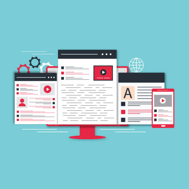
In today’s world, where users access the internet through various devices such as smartphones, tablets, laptops, and desktop computers, Responsive Web Design has become an undeniable necessity.
This approach enables your website to be displayed in the best possible way, regardless of the screen size or resolution of the user’s device, providing a consistent and optimized User Experience.
This is crucial for #User_Experience and #Search_Engine_Optimization (#SEO).
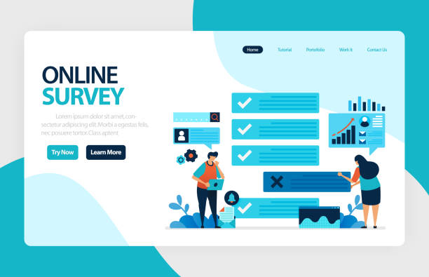
This section provides an explanatory and educational content for you to get acquainted with its basic concept.
In fact, a responsive website automatically adjusts its content to be easily viewable and usable on any #device, from the smallest #mobiles to the largest #televisions.
This not only increases #User_Satisfaction but also directly impacts #Load_Speed and, consequently, your site’s ranking in #browsers.
Don’t have a corporate website yet and missing out on online opportunities? With professional corporate website design by Rasavab,
✅ Double your business’s credibility
✅ Attract new customers
⚡ Free consultation for your corporate website!
Core Principles and Pillars of Responsive Design
Responsive design is built upon three fundamental principles, each playing a crucial role in a website’s adaptability.
The first principle is the use of Media Queries in CSS.
This allows developers to apply different style rules based on device characteristics such as screen width, orientation (portrait or landscape), and resolution.
For example, you can set columns on smaller screens to appear stacked rather than side-by-side.
The second principle is the use of Fluid Grids.
Instead of fixed pixel units, the website’s layout is created using percentages and relative units (such as em or rem).
This ensures that elements are scaled flexibly and proportionally to the available space.
The third and final principle is Flexible Images.
By setting properties like `max-width: 100%` in CSS, these images ensure they never exceed their parent container and automatically adjust their scale to the available space.
Understanding these principles is a specialized approach for effective implementation.
Popular Tools and Frameworks in Responsive Design

To simplify and accelerate the responsive design process, numerous highly efficient tools and frameworks have been developed.
One of the most popular and widely used is Bootstrap, a comprehensive front-end framework including HTML, CSS, and JavaScript for developing responsive and mobile-first websites.
Bootstrap helps developers quickly implement complex layouts by providing a 12-column grid system, ready-to-use components (such as buttons, forms, navigation bars), and JavaScript plugins.
Another framework that has its own fan base is Foundation, which is also considered a powerful and flexible tool for responsive design.
Using these frameworks provides practical and specialized guidance for any developer seeking efficiency and code standardization.
Furthermore, other tools like CSS preprocessors (such as Sass and Less) significantly help in organizing and managing complex styles.
| Feature | Bootstrap | Foundation |
|---|---|---|
| Design Philosophy | Mobile-first, Component-based | Mobile-first, Flexbox-based |
| Customization Capability | Medium, requires CSS overrides for deep customization | High, modular and customizable with Sass |
| User Community | Very large and active | Large and active |
| Learning Complexity | Relatively easy to start, complex in customization | Requires familiarity with Sass for full utilization |
| File Size | Larger than Foundation (full file) | Smaller in base version, increases with modules |
Impact of Responsive Website Design on SEO and Google Ranking

One of the most important reasons businesses should adopt responsive website design is its direct impact on Search Engine Optimization (SEO) and site ranking on Google.
Since 2015, Google officially announced that website responsiveness is a significant ranking factor, and with the introduction of Mobile-First Indexing, this importance has doubled.
This means Google primarily considers the mobile version of your website for crawling and indexing.
A responsive website, by providing an excellent user experience on mobile, naturally reduces the Bounce Rate and increases user dwell time on the site, both of which are positive signals for search engines.
This is an important and newsworthy point that every business should take seriously, and an in-depth analysis of this topic will help you optimize your SEO strategies.
Did you know that 85% of customers check your company’s website before any interaction?
With Rasavab, build a corporate website worthy of your credibility.
✅ Increase credibility and customer trust
✅ Attract high-quality leads
⚡ Get a free website design consultation
User Experience (UX) and Responsive Website Design
Responsive website design is not only beneficial for SEO but also an excellent advantage for User Experience (UX).
The main goal of UX is to ensure that users can interact with your website as easily and enjoyably as possible.
A responsive website, by providing a consistent look and feel across all devices, eliminates user confusion and removes the need for zooming or horizontal scrolling.
This is a specialized approach to improving user interaction.
Users expect websites to load quickly and function well at any size; failure to meet these expectations can lead to rapid user abandonment.
By providing a seamless experience, responsive websites increase customer satisfaction, improve conversion rates, and ultimately foster brand loyalty.
This section delves analytically and deeply into the importance of UX alongside responsiveness.
Challenges and Solutions for Implementing Responsive Design

Despite numerous advantages, implementing responsive design is not without its challenges.
One of the biggest concerns is website Performance.
Sometimes, to support various devices, the volume of CSS and JavaScript code increases, which can lead to slower load times.
The solution is to utilize techniques such as Lazy Loading for images and videos, code compression, and Content Delivery Networks (CDNs).
Another challenge is managing complex layouts and ensuring their correct display on different screen sizes, which can create questionable and complex content in implementation.
For this purpose, the Mobile-First approach (designing for mobile first and then developing for larger devices) is very effective.
Also, ensuring proper support in older browsers can be problematic, requiring extensive testing and the use of Polyfills.
This section provides a comprehensive guide to overcoming these challenges.
Case Study: Responsive Design in Various Industries

Responsive design has wide applications across various industries, and its flexibility can be observed in numerous examples.
In the E-commerce industry, retail sites like Digikala and Amazon use this approach to provide a consistent shopping experience across desktop, tablet, and mobile; this significantly helps in maintaining conversion rates and reducing abandoned carts.
In the media and news industry, websites like BBC Persian or ISNA news agency display their content in a way that makes reading news comfortable and pleasant, whether on a small smartphone or a large monitor.
Portfolios of graphic designers and photographers also benefit from responsive design to showcase their artworks in the best possible way on any device.
This section is a practical educational piece with entertaining real-world examples, showing how this technology helps businesses achieve their goals.
| Industry | Main Advantage of Responsiveness | Notable Examples |
|---|---|---|
| E-commerce | Increased mobile conversion rates, reduced abandoned carts, improved shopping experience | Digikala, Amazon, Zara |
| Media and News | High accessibility, improved content readability across devices, increased mobile traffic | BBC Persian, New York Times |
| Banking and Finance | Easy and secure access to banking services, improved customer interaction with web application | Bank Melli, PayPal |
| Travel Services | Easy ticket and hotel booking, optimized display of travel information on mobile | Alibaba, Booking.com |
| Health and Treatment | Access to medical information, online appointments, contact information | Hospital websites, medical portals |
The Future of Web Design and the Role of Responsive Design

The future of web design is moving towards greater adaptability and delivering truly immersive experiences.
On this path, responsive design will play a pivotal role, even beyond today’s mobile and desktop devices.
With the emergence of technologies such as Augmented Reality (AR), Virtual Reality (VR), and smart displays in cars or home appliances, websites must be able to adjust their content not only based on screen size but also on user interaction mode and surroundings.
This is an analysis of the trends ahead and news of future developments.
Concepts such as Adaptive Websites and even website design for Wearable Devices indicate the evolution of this approach.
The future belongs to designs that can seamlessly appear on any digital platform and provide a flawless user experience.
Does your company’s website perform as befits your brand? In today’s competitive world, your website is your most important online tool. Rasavab, specializing in professional corporate website design, helps you to:
✅ Gain credibility and customer trust
✅ Convert website visitors into customers
⚡ Get a free consultation!
Key Tips for Testing and Optimizing a Responsive Site

After implementing a responsive site, the crucial stage of testing and optimization arrives to ensure its flawless performance.
Firstly, the website should be tested across various browsers (Chrome, Firefox, Safari, Edge) and different devices (mobile, tablet, desktop with varying sizes).
Tools such as Google PageSpeed Insights and Lighthouse can help you identify performance issues and provide expert guidance for improving speed and user experience.
Furthermore, using Device Emulators in browsers (such as Chrome DevTools) is very useful for quick layout testing across different screen sizes.
However, testing on real devices should never be overlooked.
Optimizing images for various sizes, using web fonts with optimized formats, and reducing HTTP requests are also crucial measures for increasing load speed.
This is a specialized and comprehensive guide for maintaining your site’s quality.
Summary and Next Steps in Responsive Website Design

As explored in this comprehensive article, responsive website design is no longer just an option, but a strategic necessity for any business in the digital age.
From improving SEO and search engine rankings to providing a flawless user experience across all devices, its benefits are numerous.
This approach helps you target a wider audience and ensures your brand is displayed optimally at every point of the user’s digital journey.
As a next step, it is recommended that you conduct a thorough evaluation of your website’s responsiveness and, if necessary, develop a plan for updating or redesigning it.
This is a final educational and explanatory piece on the importance of this topic.
Investing in responsive design is an investment in your business’s future and a guarantee of its stability and growth in the ever-changing world of the web.
With this knowledge, you can now make more informed decisions for your online presence.
Frequently Asked Questions
| Question | Answer |
|---|---|
| What is responsive website design? | It is a web design approach that ensures a website displays correctly on various screen sizes (such as mobile, tablet, desktop) and its layout adapts to the user’s screen size. |
| Why is responsive design important? | Given the widespread use of various devices to access the internet, responsive design provides a consistent user experience for all users, reduces the website’s bounce rate, and improves site SEO. |
| How is responsive design implemented? | This type of design is often implemented using CSS3 Media Queries, Flexible Grids, and Flexible Images. |
| What are the main components of responsive design? | Includes Media Queries for applying different styles based on device characteristics, using relative units (like percentages and em) for sizes and layouts, and using flexible images and media whose dimensions change proportionally to the available space. |
| What are the main advantages of using responsive design? | Improved user experience, reduced development and maintenance costs (compared to having separate mobile and desktop versions), improved search engine rankings (as Google prefers it), and increased site accessibility for all users. |
And other services of Rasavab Advertising Agency in the field of advertising
Smart Advertising Campaign: Professional optimization for customer acquisition using SEO-driven content strategy.
Smart UI/UX: A fast and efficient solution for customer acquisition, focusing on attractive user interface design.
Smart Direct Marketing: A specialized service for improving SEO ranking based on attractive user interface design.
Smart Advertising Campaign: An effective tool for customer acquisition with the help of SEO-driven content strategy.
Smart Digital Branding: A specialized service for increasing user engagement based on precise audience targeting.
And over a hundred other services in the field of internet advertising, advertising consulting, and organizational solutions
Internet Advertising | Advertising Strategy | Advertorial
Sources
Comprehensive Guide to Responsive Website Design
What is Responsive Design?
Importance of Responsive Website Design
Responsive Design Tutorial
? Rasavab Afarin: Your digital partner for growth and visibility in the online world. From custom website design to SEO optimization, we provide comprehensive solutions for your business success.
📍 Tehran, Mirdamad Street, Next to Central Bank, Southern Kazeroun Alley, Ramin Alley, No. 6


