
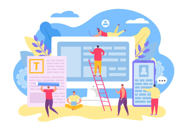
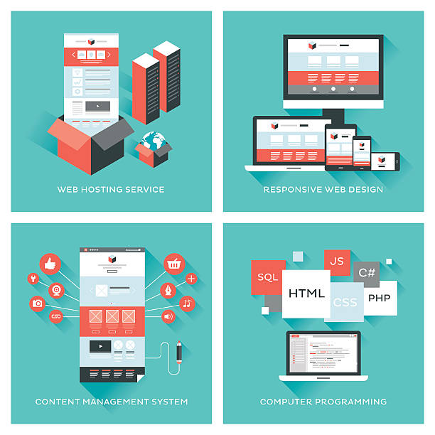
An Introduction to Responsive Web Design and Its Importance
In the current era, where the internet has become an inseparable part of daily life, having a website that displays well on every device is not a privilege, but a necessity.
The concept of #Responsive_Web_Design directly addresses this need.
Responsive web design means that your website’s layout and content automatically adapt to the user’s screen size (whether desktop, tablet, or mobile) and provide the best #user_experience.
This approach not only allows users to easily access your content from any device but also plays a vital role in your website’s #SEO and ranking in search engines.
Without a #responsive_website, businesses and online content will quickly fall out of the competition, as a large portion of internet traffic today comes from #mobile devices.
This is a comprehensive explanation of what this technology is and why it’s important.
Did you know your company’s website is the first point of contact for 75% of potential customers?
Your website is the face of your brand. With Rasawww‘s corporate website design services, build an online presence that earns customer trust.
✅ Create a professional and lasting image for your brand
✅ Attract target customers and increase online credibility
⚡ Get a free consultation from Rasawww experts!
Technical Foundations of Responsive Design

The implementation of responsive web design is based on several key technical pillars.
At the heart of this process is the use of CSS Media Queries.
This capability allows developers to apply different styles based on device characteristics (such as screen width, height, orientation, and resolution).
For example, you can specify that on smaller screens, elements are displayed in a single column, while on larger displays, they have a multi-column layout.
In addition to media queries, the use of Flexible Grids and Flexible Images is also crucial.
This means that instead of defining fixed dimensions for elements, relative units like percentages (%) are used.
This specialized approach ensures that your website’s content and layout dynamically adapt to any screen size and prevent clutter.
These technical aspects are the cornerstone of any modern, user-friendly website that aims to provide a seamless experience across all devices.
This section is educational and specialized to provide a deeper understanding of how this system works.
Endless Benefits of Responsive Design for User Experience
Responsive web design is not just a technical standard; it also creates a significant improvement in user experience (UX).
When a user accesses your website with any device and encounters a compatible and readable layout, they are more likely to stay on the site, interact with the content, and convert into a customer.
A non-responsive website on mobile devices can lead to user frustration, the need to zoom, horizontal scrolling, and ultimately, quickly leaving the site.
With responsive design, the bounce rate (Bounce Rate) decreases, and the user’s dwell time on the site (Dwell Time) increases.
This analytical guide shows how an optimized user interface for all devices maximizes user satisfaction and leads to greater loyalty.
Imagine a customer on the go, looking for information on their phone; if your website is immediately and effortlessly usable, they are likely to achieve their goal, and so will you.

Click here to preview your posts with PRO themes ››
| Factor | Responsive Website | Non-Responsive Website |
|---|---|---|
| User Experience | Excellent on all devices | Poor on mobile/tablet |
| Bounce Rate | Low | High (on mobile) |
| User Dwell Time | High | Low (on mobile) |
| SEO Support | Very Good | Poor |
The Impact of Responsive Web Design on SEO and Ranking

Search engines, especially Google, have long emphasized the importance of mobile-friendly websites.
In recent years, responsive web design has become a significant ranking factor.
Google prefers to rank websites higher in mobile search results that provide an optimized user experience on these devices.
This means that if your website is not responsive, you will likely have a lower ranking in mobile searches and lose a large portion of organic traffic.
Having a single URL for all devices also helps Google’s bots crawl and index content better, preventing duplicate content issues that arise with separate mobile solutions.
This is important and specialized news for anyone looking to increase their website’s visibility and traffic.
This approach ultimately leads to overall SEO improvement and increased domain authority.
Do you have an e-commerce site, but your sales aren’t what you expected? Rasawww solves your problem forever with professional e-commerce website design!
✅ Significant increase in conversion rates and sales
✅ Unparalleled user experience for your customers
⚡ Click here for a free consultation with Rasawww!
Website Performance and Speed in Responsive Design
In addition to user experience and SEO, responsive web design can directly impact website performance and loading speed.
In the past, some believed that responsive websites might be slower due to loading all elements for all screen sizes.
However, with modern techniques like “Mobile First Design” and Conditional Loading of resources, significant optimizations can be applied.
The Mobile First approach means that design and development are first done for mobile devices, and then capabilities are gradually added for larger screens.
This makes the website lighter and faster to load on mobile devices, as only the necessary resources for that device are loaded.
A fast-loading website not only provides a better user experience but is also an important factor in search engine rankings.
This analysis shows how, with proper planning, high speed can be achieved alongside flexibility.
Challenges and Considerations in Implementing Responsive Design

Despite all the advantages that responsive web design offers, its implementation is not without challenges.
One of the most challenging issues is image management.
How can images be optimized to be clearly visible on small screens and maintain high quality on large displays, without consuming excessive bandwidth? Solutions like using the `srcset` attribute in HTML and Lazy Loading techniques help with this issue.
Another challenge is planning for various types of content and how they are displayed across different sizes.
Sometimes, rich and complex content on desktops requires significant rearrangement for mobile to remain readable and accessible.
Furthermore, testing a website across a wide range of devices and browsers can be time-consuming and complex.
These considerations highlight the need for an experienced development team and meticulous planning to ensure project success.
This thought-provoking content helps developers be aware of potential challenges before starting work.

Click here to preview your posts with PRO themes ››
Popular Tools and Frameworks for Responsive Design

To facilitate the responsive web design process, numerous tools and frameworks have been developed that help developers build responsive websites with greater speed and efficiency.
Bootstrap is undoubtedly one of the most popular and well-known front-end frameworks, offering a set of predefined CSS and JavaScript components for building responsive layouts.
Foundation is another powerful option that offers high flexibility and is suitable for larger projects.
In addition to frameworks, browser developer tools (such as Chrome DevTools) provide very useful capabilities for simulating different devices and testing responsiveness.
Content Management Systems (CMS) like WordPress, with their numerous themes and plugins, also enable the creation of responsive websites without the need for deep coding knowledge.
This educational guide helps you familiarize yourself with some of the best available tools and pave your way towards implementing a modern and adaptive website.
| Tool/Framework | Type | Key Features |
|---|---|---|
| Bootstrap | CSS Framework | Grid System, UI Components, JS Plugins |
| Foundation | CSS Framework | High flexibility, specialized tools |
| Chrome DevTools | Browser Tool | Device simulator, style inspection, optimization |
| WordPress | CMS | Responsive themes, mobile plugins |
The Future of Web Design and the Evolution of Responsiveness
With the continuous advancement of technology and the emergence of new devices such as smartwatches, foldable displays, and virtual/augmented reality, the concept of responsive web design is also evolving.
The future of this field will go beyond mere responsiveness to screen size.
We are witnessing the emergence of “Adaptive Design” and even “Intrinsic Design,” which allow websites to more intelligently adjust content and user interface by better understanding the environment and user behavior.
Furthermore, with the increasing importance of speed and performance, new techniques such as “Lazy Loading” and “Responsive Images” will be increasingly used.
New web architectures like Progressive Web Apps (PWAs) will also play a significant role in providing an experience similar to native applications in the browser.
This news and analytical section provides a look at the horizons ahead in the world of web and shows how website design is moving towards greater intelligence and adaptability to changing user needs.
Are you tired of losing business opportunities due to not having a professional corporate website?
Rasawww helps you with professional corporate website design:
✅ Build a powerful and trustworthy image for your brand
✅ Convert website visitors into loyal customers
⚡ Get a free consultation right now!
Successful Examples of Responsive Design
To better understand the effectiveness of responsive web design, looking at some successful examples can be inspiring.
Websites such as The New York Times, Apple, and Starbucks are all prominent examples of successful responsive design implementation.
These websites, regardless of the device you use, offer a seamless, visual, and user-friendly experience.
Content is well-organized, images are optimized, and navigation is easily accessible.
Case studies of these sites show how a strong responsive design can strengthen a brand, increase accessibility, and improve user engagement.
From a news platform that must deliver information instantly to millions of users worldwide to an online store offering a flawless shopping experience, all bear witness to the power of this approach in today’s digital world.
This entertaining and explanatory section illustrates the practical and successful aspects of this type of design.

Click here to preview your posts with PRO themes ››
Conclusion and Best Practices for Adaptive Website Design

Ultimately, it is clear that responsive web design is no longer a luxury option, but the backbone of any successful online presence.
To ensure your website remains successful not only now but also in the future, adhering to best practices is essential.
Always design with a “Mobile-First” approach, as this ensures your website is optimized for the majority of users.
Use media queries intelligently, and implement necessary optimizations for managing images and videos.
Continuous testing across various devices and browsers is also crucial for identifying and resolving potential issues.
This comprehensive and informative guide not only emphasizes the importance of responsive design but also helps you, by adopting the right approaches, build a website that remains effective and attractive in today’s and tomorrow’s changing digital world.
Investing in an adaptive website design is investing in the future of your business.
Frequently Asked Questions
| Question | Answer |
|---|---|
| What is responsive web design? | A web design approach that automatically adjusts and optimizes the layout and content of a website for display on various devices (mobile, tablet, desktop). |
| Why is responsive design important? | Due to the variety of devices users employ to access the web; better user experience, stronger SEO, and reduced user bounce rate are among its advantages. |
| What are the main techniques in responsive design? | Use of Media Queries in CSS, Fluid Grids, and Flexible Images. |
| What is a Media Query? | A CSS rule that allows you to apply different styles based on device characteristics (such as screen width, height, display orientation). |
| Is responsive design different from Mobile-First design? | Mobile-First is an approach within responsive design where the site is initially designed for the smallest screen (mobile) and then gradually improved for larger screens. |
And other services of Rasawww Advertising Agency in the field of advertising
Smart Advertising Campaign: A specialized service for growing user engagement based on user experience customization.
Smart Sales Automation: A combination of creativity and technology for user interaction through Google Ads management.
Smart Customer Journey Map: Revolutionize sales growth with precise audience targeting.
Smart Google Ads: A specialized service for growing website traffic based on real data utilization.
Smart Marketing Automation: A specialized service for growing customer acquisition based on marketing automation.
And over hundreds of other services in the field of internet advertising, advertising consultation, and organizational solutions
Internet Advertising | Advertising Strategy | Advertorial
Resources
What is Responsive Design?The Importance of Responsive Web DesignThe Digital Future and the Role of Web DesignComprehensive Guide to Responsive Website Design
❓ For your business to shine in the digital world, Rasawww Afarin is with you, offering comprehensive digital marketing solutions including custom website design, SEO optimization, and targeted advertising campaigns. With us, have a powerful and impactful online presence and pave your path to success.
📍 Tehran, Mirdamad Street, next to the Central Bank, Kazeroon Janubi Alley, Ramin Alley No. 6


