")
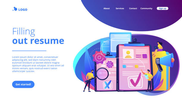
Introduction to Responsive Website Design: Why is it Important?

In today’s world, where smart devices have become an indispensable part of our daily lives, the concept of #Responsive_Web_Design or #Responsive_Design has gained more importance than ever.
This advanced approach in web design allows websites to display correctly and provide a consistent user experience regardless of the screen size of the device the user is using.
Whether a user visits your site with a desktop computer, laptop, tablet, or smartphone, responsive website design ensures that content, images, and navigation are presented optimally and accessibly. This not only adds to the site’s aesthetics but also significantly improves its efficiency and usability.
The importance of responsive design is not limited to visual appeal; it has a direct impact on conversion rates, user dwell time on the site, and even site ranking in search engines.
In the past, websites were typically designed for display on large computer screens and encountered problems on smaller devices, such as the need for horizontal scrolling, excessively small text, or cluttered layouts.
However, with the advent of smartphones and tablets, the need for a more flexible approach became apparent.
This explanatory approach was first proposed by Ethan Marcotte in 2010 and has since become one of the main standards in web design.
The main goal of responsive website design is to create a seamless and pleasant experience for users on any platform. This means that regardless of the device a user is using, they can easily find the information they need and interact with the site.
This is particularly crucial in e-commerce, news portals, and blogs that require quick and easy access to content.
This instructional approach helps developers maintain a single, flexible codebase instead of designing multiple different versions of a site for various devices, which itself reduces development and maintenance time and cost.
This paradigm shift has ushered in a new era of accessibility and efficiency on the web.
Is your current e-commerce website not generating the sales you expect?
Rasawob is specialized in professional e-commerce website design!
✅ An attractive and user-friendly site aimed at increasing sales
✅ High speed and security for an ideal shopping experience⚡ Get a free consultation on online store design with Rasawob!
The Necessity of Responsive Design in the Multi-Device Era

The current era can be called the “multi-device” era, where users access information, communications, and entertainment through multiple devices such as smartphones, tablets, laptops, and even smart TVs.
In such an environment, having a website optimized for only one type of device means losing a significant portion of the audience.
This is where the necessity of responsive website design becomes more apparent than ever.
A website designed responsively can adjust its content and layout based on the user’s screen size and characteristics, leading to a smooth and hassle-free user experience.
From a business perspective, ignoring responsive design can have serious consequences.
Statistics show that a high percentage of internet searches and online purchases occur via mobile devices.
If your site does not display correctly on mobile, users will quickly leave it and move towards your competitors who offer a better experience.
This directly affects your Bounce Rate, Conversion Rate, and ultimately your business’s revenue and profitability.
Google has also explicitly stated that it prioritizes responsive websites in its rankings. This is a clear analysis of the importance of this approach.
Furthermore, maintaining and updating a responsive site is far easier and less costly than maintaining several separate versions for different devices.
This specialized approach allows developers to reach all users with a single codebase, eliminating the need to manage multiple platforms.
This, in turn, leads to resource optimization and increased productivity.
Ultimately, responsive website design is not just a choice, but a strategic necessity for any business that wants to succeed in today’s digital world and provide a comprehensive user experience.
This approach is a guide for entering the future of the web.
Fundamental Principles and Techniques in Responsive Design

For successful implementation of responsive website design, understanding and applying its fundamental principles and techniques are essential.
These principles include Fluid Grids, Flexible Images, and Media Queries, each playing a vital role in adapting the site to different screen dimensions.
Fluid grids, instead of using fixed pixels, use relative units like percentages to define column widths and elements, so that the site’s layout automatically adjusts with changes in screen size.
Flexible images ensure that images do not extend beyond the available space and are dynamically resized with their container through techniques such as using the max-width: 100% property in CSS.
This prevents layout clutter and the loading of large, unnecessary images on small devices.
But the backbone of responsive design is Media Queries. This CSS3 capability allows developers to apply different CSS rules based on specific device characteristics, such as screen width, height, orientation (landscape or portrait), and even resolution.
Using Media Queries, different Breakpoints can be defined where the layout, font sizes, or the hiding/showing of specific elements change.
This specialized approach allows designers to optimize the user experience for every screen size.
Another important aspect of responsive website design is the Mobile-First approach. In this approach, design begins for the smallest screen (mobile) and then gradually expands for larger devices.
This ensures that the mobile user experience, which often faces more limitations, is optimized from the outset.
This explanatory approach provides a strong foundation for modern web development.
| Principle | Explanation | Related Technology |
|---|---|---|
| Fluid Grids | Using relative units (percentages) instead of fixed pixels for column and element layouts. | CSS (width: %, flexbox, CSS Grid) |
| Flexible Images | Automatic image resizing to prevent overflow and maintain aspect ratio. | CSS (max-width: 100%), <picture> tag, srcset attribute |
| Media Queries | Applying different CSS rules based on device characteristics like screen width. | CSS3 Media Queries (@media rule) |
| Mobile-First Approach | Starting design and development from the smallest screen and then expanding to larger ones. | Design and Development Strategy |
User Experience and SEO Benefits in Responsive Design

Responsive website design is not only a technical necessity but also offers significant advantages for user experience (UX) and search engine optimization (SEO).
From the user’s perspective, a responsive site means easy and hassle-free access to content on any device.
Users no longer need to zoom or scroll horizontally to view information, which reduces friction and increases user satisfaction.
This smooth experience increases the likelihood of users staying longer on the site and interacting more deeply with the content.
A positive user experience can also significantly contribute to increasing conversion rates, whether it’s product purchases, form submissions, or newsletter sign-ups.
User Experience is the cornerstone of online success.
From an SEO perspective, Google has explicitly stated that it recognizes responsive sites as its recommended solution for being mobile-friendly and ranks them higher in mobile search results.
This means that a responsive site has a greater chance of being seen by mobile users in search results.
Furthermore, having a single URL for all devices, instead of separate versions (like m.example.com), simplifies crawling and indexing for search engines. This prevents duplicate content issues and keeps the site’s SEO power focused.
Another SEO benefit of responsive website design is a reduced bounce rate.
When users have a positive experience across different devices, they are less likely to quickly leave the site, which sends a positive signal to search engines.
Also, site loading speed, which is a crucial ranking factor for Google, can be optimized in responsive design, especially with approaches like conditional image loading or optimized CSS/JS for each device.
This analytical and guiding approach puts your website on the path to SEO success and user satisfaction.
Did you know that 85% of customers check your company’s website before any interaction?
With Rasawob, build a corporate website worthy of your reputation.
✅ Increase credibility and customer trust
✅ Attract quality leads
⚡ Get free website design consultation
Challenges and Solutions for Implementing Responsive Design

Implementing responsive website design, despite its numerous benefits, is not without challenges.
One of the main challenges is the complexity of managing multiple breakpoints.
Given the countless variety of devices and screen sizes, deciding on the exact number and placement of these points can be difficult.
The solution to this challenge is to adopt a logical, content-out approach instead of a device-in approach.
This means that breakpoints should be determined based on when your content starts to break or become unsuitable, not based on standard device sizes.
Another challenge is managing site performance and loading speed.
Loading high-quality images and videos for large screens on mobile devices can lead to increased loading times and data consumption.
Solutions such as using Responsive Images with srcset and sizes attributes, Lazy Loading content, and file compression can help improve performance.
Additionally, optimizing CSS and JavaScript for each breakpoint and removing unnecessary code are crucial.
This specialized approach is essential for improving your site’s performance.
Complexity in testing and Debugging is also another challenge.
Ensuring the site functions correctly on all devices and browsers requires extensive testing tools and simulators.
Using browser developer tools (like Chrome DevTools) that allow simulating various devices can be very useful.
Also, continuous testing on actual devices is recommended to ensure a real user experience.
Sometimes, the content might seem questionable as to why a section displays differently on a particular device.
Finally, educating the design and development team on the best practices of responsive website design and keeping their technical knowledge up-to-date significantly helps overcome these challenges.
Comparison of Responsive Design and Adaptive Design

In the discussion of web design for different devices, two main approaches are often raised: Responsive Design and Adaptive Design.
Both aim for the same goal, which is to provide an optimal user experience on various devices, but they use different mechanisms to achieve this goal.
Understanding the differences between these two approaches is crucial.
Responsive design, as explained earlier, is based on a single, flexible layout that adapts to the device’s screen size using fluid grids, flexible images, and media queries.
This approach means having one website that can seamlessly and continuously adapt to any screen size, from the smallest mobile to the largest monitor.
In contrast, adaptive design operates by detecting the device type and serving a pre-defined version of the layout for that specific device.
This approach typically involves defining a limited number of breakpoints (e.g., for mobile, tablet, and desktop) and designing a fixed, separate layout for each point.
In other words, in adaptive design, the site “jumps to a specific size,” while in responsive design, it “fluidly resizes.” This is the main distinction between these two strategies.
The advantage of adaptive design can be more precise control over the user experience at each breakpoint, as each layout is individually optimized.
This may lead to faster loading on specific devices, as only the necessary code and content for that screen size are loaded.
However, its disadvantages include the need to maintain multiple versions of the layout and the inability to adapt to screen sizes outside the defined breakpoints.
Responsive website design often offers more flexibility and is easier to maintain in the long run because there is a single codebase to manage.
This analytical comparison helps in choosing the appropriate approach for each project.
Tools and Frameworks for Responsive Development

To facilitate the process of implementing responsive website design, numerous tools and frameworks have been developed that help developers build device-compatible websites more efficiently and quickly.
One of the most popular and widely used frameworks is Bootstrap.
Bootstrap is an HTML, CSS, and JavaScript framework that includes a collection of CSS and HTML-based design templates for typography, forms, buttons, tables, navigation, and other UI components, and is designed responsively by default.
Using its 12-column Grid System makes it easy to build complex layouts for various screen sizes.
In addition to Bootstrap, frameworks like Foundation are also very popular.
Foundation is an advanced and flexible front-end framework that provides powerful features for developing responsive websites and complex web applications.
With a focus on performance and flexibility, this framework offers various tools including a grid system, UI components, and JavaScript tools.
Also, the use of native CSS capabilities such as Flexbox and CSS Grid has in itself brought a huge revolution in building responsive layouts. These techniques allow for building complex and responsive layouts with less code and more control, without the need for heavy frameworks.
Other tools, such as browser developer tools (like Chrome DevTools), are vital for simulating and testing responsive design on different screen sizes.
Also, CSS preprocessors like Sass and Less help manage CSS code better and create reusable modules, which is very useful in large responsive website design projects.
These tools and frameworks provide a complete and specialized set for developers to successfully complete their projects with high efficiency and desired results.
This educational and practical approach facilitates the optimization of the web design process.
| Name | Type | Key Features | Application |
|---|---|---|---|
| Bootstrap | Front-end Framework | 12-column Grid System, ready-made UI components, JavaScript, Mobile-First | Rapid development of responsive websites, dashboards, and web applications |
| Foundation | Front-end Framework | Lighter library, high flexibility, specialized tools for complex web applications | Custom projects, large websites with specific needs |
| CSS Flexbox | CSS Module | One-dimensional layout (row or column), space distribution between items | Aligning and distributing items in small and medium containers |
| CSS Grid | CSS Module | Two-dimensional layout (rows and columns), full control over overall page structure | Building complex and main web page layouts |
| Chrome DevTools | Browser Tool | Device simulation, element inspection, real-time CSS/JS modification | Testing, debugging, and optimizing responsive websites |
Future Trends in Responsive Design and Device Evolution

The world of the web is rapidly changing, and responsive website design must keep pace with these changes.
Future trends in web design and device evolution create new challenges and opportunities for the responsive approach.
One such trend is the emergence of new types of devices such as smartwatches, flexible displays, and even voice user interfaces.
These devices have unique design requirements that go beyond just screen size.
This trend creates news and thought-provoking content about the future of the web.
Furthermore, the focus on performance and loading speed will become increasingly important.
With rising user expectations and search engine emphasis on site speed, optimizing content loading for each device, especially on slower networks, becomes more critical.
Technologies like AMP (Accelerated Mobile Pages) and PWA (Progressive Web Apps), which provide a fast, app-like user experience, can complement responsive design and shape the future of the web.
This means going beyond just resizing; it’s about optimizing the entire experience for the user’s specific device and communication platform.
Also, artificial intelligence and machine learning are expected to play a more prominent role in web design.
These technologies can automatically adjust layouts based on user behavior and device characteristics, or even provide personalized content based on the context of use.
This could lead to a new generation of responsive design that is much more dynamic and intelligent.
Evolution in CSS standards like Subgrid for CSS Grid also provides new possibilities for more complex and flexible layouts. These future trends are pushing responsive website design towards more advanced capabilities and ensuring that websites remain relevant and accessible.
Did you know that 85% of customers check your company’s website before any interaction?
With Rasawob, build a corporate website worthy of your reputation.
✅ Increase credibility and customer trust
✅ Attract quality leads
⚡ Get free website design consultation
Measuring the Success of a Responsive Website
After implementing responsive website design, it is important to measure its success to ensure the effectiveness of the investment and identify areas for improvement.
Various metrics exist to evaluate the performance of a responsive site.
One of the most important is the Bounce Rate across different devices.
If the bounce rate on mobile is significantly higher than on desktop, this could indicate problems with the mobile user experience that need investigation.
Tools like Google Analytics can provide precise data on user behavior based on device type.
Another crucial metric is Time on Site and Pages per Session.
If mobile users spend less time on the site or view fewer pages, this could also be an indication of problems with navigation or content readability.
The Conversion Rate for various goals, such as completing a purchase, subscribing to a newsletter, or filling out a contact form, should be carefully examined for each device.
A decrease in conversion rate on specific devices can signify obstacles in the conversion process for that platform.
In addition to quantitative metrics, qualitative user feedback is also highly valuable.
Conducting Usability Testing with real users on different devices can provide deep insights into the problems and strengths of responsive design.
Also, using Heatmap tools and Session Recording can help identify behavioral patterns and weaknesses in layouts.
Checking the site’s ranking in mobile search results is also an important SEO indicator. Overall, an analytical and continuous approach to monitoring performance is key to the sustained success of a responsive website.
This guiding approach will lead to continuous improvement of your site.
Long-Term Impact of Responsive Design on Businesses
Ultimately, responsive website design is more than a temporary trend in web design; it is a strategic investment with a long-term impact on the stability and growth of businesses.
In today’s digital age, an efficient and accessible online presence is essential for any organization.
A fully responsive website not only meets current user needs but also prepares the business for a future where the diversity of devices and internet access methods is increasing.
One of the most important long-term impacts is increased accessibility.
By ensuring your site is viewable and interactive on any device, you significantly expand your potential audience.
This includes users who only access the internet via mobile or those who use specific assistive devices.
Improved accessibility is not only ethically correct but can also open up new markets for your business.
On the other hand, responsive website design leads to reduced maintenance and development costs in the long run.
Instead of needing to design and update multiple separate sites, a single codebase can cover all needs.
This frees up IT resources to focus on innovation and developing new features, rather than being tied up in maintaining different versions.
Finally, by providing a superior and consistent user experience, a responsive site helps strengthen your brand and build customer trust.
This is an enjoyable yet crucial approach for staying competitive in today’s market.
Frequently Asked Questions
| Question | Answer |
|---|---|
| What is Responsive Web Design? | It’s a method of website design that optimizes the appearance and functionality of a website according to the screen size of the user’s device (mobile, tablet, laptop, etc.). |
| Why is responsive design important? | Due to the increasing use of various devices to access the internet, responsive design provides a better user experience, improves site SEO, and reduces maintenance costs. |
| What are the most important tools for responsive design? | Media Queries in CSS, use of relative units (such as percentages, em, rem, vw, vh), Fluid Images, and Grid Systems. |
| What role do Media Queries play in responsive design? | Media Queries allow applying different CSS styles based on device characteristics (such as screen width, height, orientation, and screen type). |
| What is the Mobile First concept in responsive design? | It’s an approach where design and development begin for the smallest screen (mobile) and then gradually expand to larger screens (tablet, desktop). |
| Does responsive design affect SEO? | Yes, Google prefers responsive websites because they offer a better user experience and eliminate the need for separate mobile and desktop versions, which helps improve SEO ranking. |
| What does Fluid Layout mean? | It means that the width of page elements is defined using relative units (such as percentages) instead of fixed pixel values, so they automatically adjust with changes in screen size. |
| How are Flexible Images used in responsive design? | By setting the `max-width: 100%;` property for images in CSS, it’s ensured that the image never becomes larger than its container and maintains its scale with screen size changes. |
| What are the differences between responsive design and adaptive design? | Responsive design uses a single layout that fluidly adapts to any screen size, while adaptive design uses several fixed, pre-defined layouts for specific screen sizes. |
| Are CSS frameworks like Bootstrap useful in responsive design? | Yes, frameworks like Bootstrap have a responsive Grid System and pre-designed components that significantly simplify and speed up the process of building responsive websites. |
And other services of Rasa Web Advertising Agency in the field of advertising
Smart Direct Marketing: A specialized service for growth and increased sales based on user experience customization.
Smart Digital Branding: An effective tool to increase website traffic by using real data.
Smart Custom Software: A novel service to increase sales through attractive user interface design.
Smart Data Analysis: A specialized service for growth and increased click-through rate based on marketing automation.
Smart Sales Automation: Revolutionize customer acquisition with Google Ads management.
And over hundreds of other services in the field of internet advertising, advertising consultation, and organizational solutions
Internet Advertising | Advertising Strategy | Advertorial
Resources
Digital Transformation TrendsResponsive Website Design GuideImportance of User ExperienceFuture of Web Design
📍 To elevate your business in the digital world and achieve unprecedented success, Rasawob Afarin Digital Marketing Agency is by your side with its expertise and experience. From user-friendly website design and SEO optimization to executing targeted advertising campaigns, we are ready to transform your brand in the online space and pave the way for sustainable growth.
For consultation and services, please contact us.
📍 Tehran, Mirdamad Street, next to Bank Markazi, Kazerun Jonoubi Alley, Ramin Alley, No. 6


