
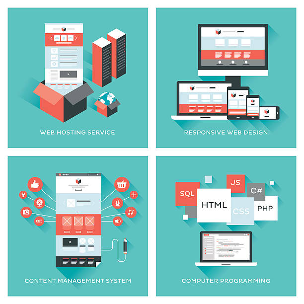
Introduction to Responsive Website Design: Why is it Important?

In today’s world where users access the internet from a variety of devices, #responsive_web_design is no longer a luxury, but a vital necessity.
This approach in #web_design ensures that your website displays correctly and provides an optimal user experience, regardless of the screen size of the user’s device, from small smartphones to tablets, laptops, and even large desktop monitors.
The main concept in responsive web design is that the site’s layout and content automatically adjust to the user’s screen dimensions, instead of creating separate versions for each device.
This means your website not only has a beautiful and unified appearance across all platforms, but its performance and usability are also optimized.
The importance of this issue is further understood when we consider that a significant portion of today’s web traffic comes from mobile devices.
If your website is not optimized for these devices, users will quickly leave it and go to your competitors who offer a better experience.
This not only leads to the loss of potential customers, but also negatively affects your site’s ranking in search engines.
Google has clearly stated that it prefers websites with responsive design in its search results, because these sites provide a better user experience.
Simply put, responsive web design means creating a flexible and adaptable website that performs its best in any situation and on any device, and this is the foundation of online success in the current era.
Do you have an online store but your sales are not as expected? RasaWeb solves your problem forever with professional e-commerce website design!
✅ Significant increase in conversion rates and sales
✅ Unparalleled user experience for your customers
⚡ Click here to get free consultation from RasaWeb!
Principles and Fundamentals of Responsive Design

Responsive web design is based on three key principles: Fluid Grids, Flexible Images, and Media Queries.
Fluid grids mean that instead of using fixed pixel units for element widths, relative units like percentages are used.
This causes the site’s layout to expand or contract based on the user’s screen width, ensuring content fits correctly in the space.
For example, if a column occupies 50% of the screen width, it will occupy more space on a larger screen and less space on a smaller screen, but it will always take up half of the available space.
Flexible images are the second principle of responsive design.
In the past, images were loaded with fixed widths, which could extend beyond the frame or appear too large on small screens.
By using CSS and setting the `max-width: 100%` property for images, it is ensured that images never exceed their container and always remain within their container, while maintaining their actual dimensions.
This method allows images to shrink with the screen size and improves the user’s visual experience on any device.
Media Queries, or Media Queries, are the heart of responsive web design.
This CSS3 feature allows developers to apply different CSS styles based on various device characteristics such as width, height, orientation (portrait or landscape), and resolution.
For example, you can define that if the screen width is less than 768 pixels (e.g., for tablets), the navigation menu changes to a hamburger menu or fonts become smaller.
This capability gives designers precise control over how elements are displayed at different screen sizes and provides unparalleled customization.
These three principles together form the backbone of a successful responsive web design.
Tools and Techniques for Implementing Responsive Design

To implement responsive web design, developers can utilize a wide range of tools and techniques.
One of the most popular tools is CSS frameworks like Bootstrap and Tailwind CSS.
Bootstrap is a leading and comprehensive framework that significantly speeds up development with a set of predefined CSS classes and JavaScript components.
This framework is designed with a “mobile-first” approach, optimizing sites for smaller devices by default and then applying adjustments for larger devices.
Tailwind CSS, unlike Bootstrap, is a utility-first framework that allows you to add CSS classes directly to your HTML, giving you more control over styling.
Below is a table showing some of the most commonly used CSS units for responsive design:
Most Used CSS Units in Responsive Design
| CSS Unit | Description | Application in Responsive Design |
|---|---|---|
em |
Relative to the font size of the parent element or the element itself | For sizing fonts and spacing that should change with the main text size. |
rem |
Relative to the font size of the root element (html) | For controlling the overall scalability of the design, without being affected by parent elements. |
% |
Relative to the size of the parent element | For width and height of container elements and creating fluid grids. |
vw |
1% of the viewport width | For sizing fonts and element dimensions that should change with the overall screen width. |
vh |
1% of the viewport height | For sizing element heights that should change with the overall screen height. |
In addition to frameworks, using “Mobile-First” approaches in CSS coding is crucial.
In this approach, styles are first written for the smallest screen (usually mobile), and then additional styles for larger screens are added using Media Queries.
This method helps pages load faster on mobile devices and improves user experience.
Also, optimizing images using modern formats like WebP and using the `srcset` attribute in the `img` tag to provide images with different resolutions for different devices, are other vital techniques in responsive web design.
User Experience (UX) in Responsive Website Design

Responsive web design directly impacts User Experience (UX), and its main goal is to improve this experience.
When a website is properly responsive designed, users, regardless of their device, can easily interact with the content, without the need for zooming or horizontal scrolling.
This makes users feel more comfortable and satisfied, increasing the likelihood that they will stay on the site and achieve their goals.
A strong UX boosts the Conversion Rate and strengthens customer loyalty.
One of the main challenges in UX design for responsive websites is ensuring content readability and usability across all screen sizes.
Fonts, button sizes, and forms must be scaled so that they are easily touchable and readable on small devices.
For example, small buttons on a mobile screen can be problematic for users with larger fingers.
The solution is to ensure clickable elements have sufficient space and adhere to recommended standard touch target sizes.
Also, navigation must be optimized for mobile devices.
Traditional menus that are displayed horizontally on desktops may take up too much space on mobile.
Using patterns like hamburger or dropdown menus that appear only when needed is a common and effective solution.
This responsive web design with a focus on UX, allows users to quickly access needed information and navigate the site without confusion.
Finally, attention to site loading speed is also crucial in responsive user experience; a site that loads quickly provides a better experience and prevents early user abandonment.
Optimizing images and CSS/JS code are among the important measures in this regard.
Losing potential customers due to an unprofessional website? RasaWeb is your definitive answer! With our specialized corporate website design services:
✅ Enhance your business’s credibility and standing
✅ Experience attracting more targeted customers
⚡ Act now for a free consultation!
SEO and Responsive Design: An Inseparable Connection
The connection between SEO and responsive web design is not only inseparable, but also one of the most important reasons businesses are driven to adopt this approach.
Google, as the world’s largest search engine, officially announced in 2015 that it considers responsive design as a ranking factor in its algorithms.
This policy was reinforced with the introduction of “Mobile-First Indexing” in 2018, meaning Google primarily examines the mobile version of a website to evaluate its ranking.
If your website is not optimized for mobile, it may drop in search results, even if your desktop version is excellent.
A website with responsive web design has a single URL for all devices, which helps Google crawl and index your content more easily.
This prevents the problem of duplicate content that can occur if separate mobile and desktop versions (with different subdomains or folders) exist.
Also, managing links and sharing content becomes much simpler with a single URL, as users have access to a consistent address regardless of their device.
Reduced bounce rate and increased user dwell time on the site, which are major benefits of responsive design, send positive signals to search engines.
When users have a good user experience and stay on your site, Google understands that your content is valuable, and this can help improve your ranking.
Conversely, a non-responsive site with a poor mobile user experience will have a high bounce rate and send a negative signal to the search engine.
Therefore, investing in responsive web design is not only beneficial for your users, but also a vital strategy for SEO success and increasing your online visibility.
Challenges and Solutions of Responsive Design
Implementing responsive web design, while offering many benefits, also comes with challenges that need to be addressed.
One of the most important challenges is managing performance.
When a site is designed for different screen sizes, heavy desktop images and scripts might be loaded on smaller devices, leading to slow speeds and an undesirable user experience.
The solution is to use Responsive Images, which provide different sizes of an image based on the user’s device.
Also, optimizing CSS and JavaScript code, compressing files, and using caching can help improve loading speed.
Another challenge is designing complex layouts.
Converting a complex desktop layout into a simple and usable mobile layout can be difficult.
Some elements may need to be reorganized or even hidden on smaller sizes.
This requires careful planning and a “mobile-first” approach in the early design stages.
For example, if you have a large data table, on mobile, it might be better to display only key information instead of the full table, or make it horizontally scrollable.
This approach is highly important in responsive web design.
Testing across different devices is also a significant challenge.
With countless variations of devices, browsers, and screen sizes, ensuring the site functions correctly on all of them is difficult.
Using online responsive testing tools, browser simulators, and of course, testing on actual physical devices, is essential.
Furthermore, maintaining and updating responsive sites can be more complex, as every small change must be checked at all breakpoints.
However, by using modern frameworks and adhering to best practices in responsive web design, these challenges can be overcome, providing a seamless and optimized user experience.
Case Study of Successful Websites with Responsive Design

To better understand the effectiveness of responsive web design, looking at successful examples can be very inspiring.
Websites like The Boston Globe were pioneers in this field and showed how a news website with a lot of content can be designed responsively and with high performance.
They managed to optimize their content across all devices without compromising the quality of the user experience.
Google, given the importance of mobile-first indexing, is also a prime example of responsive web design in its various sections like search, maps, and developer tools, all of which function well on any screen size.
Other examples include large e-commerce companies like Amazon and eBay, which have successfully made the mobile shopping process as easy and comfortable as the desktop experience with responsive web design.
These sites use flexible layouts and optimized images to display products and their related information attractively and accessibly on any device.
These sites have not only managed to increase their conversion rates, but also improved customer loyalty.
This approach means investing in a comprehensive user experience.
Below is a table showing key tools for testing and validating responsive web design:
Key Tools for Testing and Validating Responsive Design
| Tool | Description | Main Application |
|---|---|---|
| Google Mobile-Friendly Test | Online tool from Google to check site compatibility with mobile | Quick validation and receiving Google’s recommendations for improvement. |
| Chrome DevTools (Device Mode) | Device simulation capability in Chrome browser | Interactive testing of layouts across various sizes and devices. |
| Responsinator | Online tool to display a site on multiple popular devices simultaneously | Quick check of site appearance in multiple viewports. |
| BrowserStack / LambdaTest | Cross-platform browser and device testing platforms | Detailed and extensive testing on real devices and browsers. |
| PageSpeed Insights | Google tool for analyzing site speed and performance on mobile and desktop | Identifying performance issues that impact responsive user experience. |
The success stories of these sites teach us an important lesson: responsive web design is not just a trend, but an industry standard that not only meets user expectations, but also leads to significant positive business results.
Its correct implementation requires a comprehensive approach that covers all aspects of UX and performance, and this is what these successful examples have done well.
The Future of Web Design and the Role of Responsive Design
The future of web design is inextricably linked with responsive web design, but this is just the beginning.
With technological advancements and the emergence of new devices such as smartwatches, smart TVs, virtual reality (VR), and augmented reality (AR) devices, the concept of “responsiveness” must go beyond merely adapting to screen size.
In the future, we are moving towards adaptive design, which responds not only to screen dimensions, but also to the user’s context, such as location, internet connection speed, and even the user’s emotional state.
This approach means providing optimized content for each scenario and device, rather than a one-size-fits-all solution.
The role of Artificial Intelligence (AI) and Machine Learning (ML) in the future of responsive web design will also be very prominent.
AI algorithms can dynamically change the site’s layout and content in real-time by analyzing user behavior and preferences to provide the best possible experience.
For example, an AI system can detect that the user is currently in a low-light environment and automatically activate a dark theme for the site, or if the internet speed is slow, load a lighter version of the site.
This level of personalization will take the user experience to new dimensions.
Also, emerging technologies like Flexbox and CSS Grid, which are powerful tools for creating complex and responsive layouts, continue to evolve and will provide designers with more advanced tools for responsive web design.
These technologies offer greater flexibility in controlling element layouts without the need for heavy JavaScript.
Ultimately, responsive web design is only the first step on the journey to the web of the future; and this future is a web that intelligently and instantaneously adapts to the changing needs and conditions of users and devices, providing a fully personalized user experience.
Are you disappointed with your online store’s low conversion rate?
RasaWeb, with professional e-commerce website design, is your definitive solution!
✅ Increase your sales and revenue
✅ Unparalleled user experience for your customers
⚡ Get a free consultation now!
Practical Steps for Implementing Responsive Design for Your Business
Implementing responsive web design for any business, whether small or large, is a strategic investment that must be done with care and planning.
The first step is research and planning.
This involves analyzing your current site traffic data to identify the devices your users primarily use, and also reviewing competitors to see how they have implemented responsive design.
Setting specific goals for this change, such as increasing mobile conversion rates or improving SEO ranking, is also vital at this stage.
The second step is wireframing and prototyping with a “mobile-first” approach.
This means starting the design from the smallest screen size and then expanding it to larger sizes.
At this stage, special attention should be paid to content layout, navigation, and user interactions at each screen size.
Using design tools like Figma or Sketch can be helpful in this process.
This stage should give you a comprehensive overview of how the site will display and function with responsive design.
The third step is development and coding.
At this stage, developers implement the responsive layout using CSS, HTML, and JavaScript.
Using CSS frameworks like Bootstrap or Tailwind can speed up development.
It is important to correctly use flexible images, fluid grids, and media queries.
Performance optimization (such as code and image compression) should also be considered at this stage to ensure the site loads quickly on all devices.
The final step is testing and launch.
Before the final launch, the site must be thoroughly tested on various devices and browsers to ensure its correct functionality.
Using responsive testing tools, Google’s Mobile-Friendly Test, and usability tests are essential for identifying and resolving any issues.
After debugging, the site can be publicly launched.
Even after launch, continuous monitoring of performance and user behavior for subsequent optimizations in responsive web design is very important.
Responsive Website Design and its Role in Web Accessibility

Responsive web design not only improves user experience, but also plays a vital role in increasing Web Accessibility.
Accessibility means designing websites in such a way that people with different abilities, including those with disabilities, can easily use them.
A site that is correctly responsively designed naturally meets many accessibility requirements or helps achieve them.
One of the key aspects of accessibility is the ability to zoom content.
Users with visual impairments may need to magnify text and images.
Responsive web design, by using relative units (such as em and rem) for fonts and layouts, ensures that content can be magnified without breaking the layout or requiring horizontal scrolling.
This improves the user experience for people with low vision and allows them to effortlessly access content.
Also, in responsive web design, the logical order of content is maintained across all screen sizes.
For screen reader users who rely on the HTML order to access content, this is crucial.
If elements change position illogically at different sizes, it can confuse screen reader users.
A good responsive web design preserves the semantic structure of the HTML and only changes the visual layout.
The size of touchable elements (like buttons and links) is also very important for mobile accessibility.
Small buttons can be challenging for users with motor impairments or those who use their thumb for navigation.
Responsive design allows these elements to be larger and more accessible on mobile sizes.
Overall, by focusing on responsive web design, we make the web a better and more accessible place not only for the majority of users, but for everyone, regardless of their device or abilities.
Frequently Asked Questions
| Question | Answer |
|---|---|
| What is responsive web design? | A method in web design where the site adapts to the screen size of different devices (desktop, tablet, mobile). |
| Why is responsive design important? | To provide an optimal user experience on any device the user uses and to improve SEO. |
| What are the main techniques of responsive design? | Use of flexible grids, flexible images, and Media Queries. |
| What is Media Query? | A CSS rule that allows applying different styles based on screen characteristics (such as width or height). |
| What are the benefits of responsive website design? | Increased user satisfaction, improved site ranking in search engines (SEO), reduced maintenance costs compared to having separate versions for each device. |
And other services of RasaWeb Advertising Agency in the field of advertising
Smart Advertising Campaign: Professional optimization for customer acquisition using key page optimization.
Smart Custom Software: A professional solution for analyzing customer behavior with a focus on custom programming.
Smart Custom Software: A dedicated service for growth in customer behavior analysis based on custom programming.
Smart Custom Software: A dedicated service for growth in sales increase based on Google Ads management.
Smart UI/UX: A dedicated service for growth in click-through rate based on user experience customization.
And over hundreds of other services in the field of internet advertising, advertising consultation, and organizational solutions
Internet Advertising | Advertising Strategy | Advertorial
Resources
Comprehensive Guide to Responsive Website Design
The Importance of User Experience in Online Business Success
The Future of the Internet and New Web Technologies
Why Responsive Design is Essential for SEO?
? To make your business shine in the digital world, RasaWeb Afarin Digital Marketing Agency, with expertise in professional website design, SEO, and comprehensive digital marketing strategies, paves your way to success.
📍 Tehran, Mirdamad Street, next to Bank Markazi, Kazerun Jonoubi Alley, Ramin Alley, No. 6

