
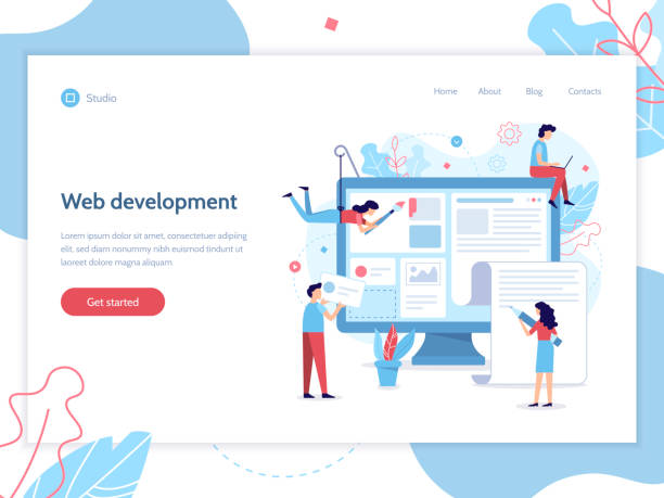
Definition and Importance of Responsive Website Design in Today’s World

In the current era, where the internet has become an inseparable part of daily life, having a website is not merely about online presence, but the quality of this presence has gained significant importance.
#Responsive_Design or Responsive Web Design, is an approach that ensures your website is displayed correctly and with the best #User_Experience on any device, from large desktop monitors to tablets and smartphones of various sizes.
The importance of this issue stems from the fact that statistics show a significant portion of internet users access websites via #Mobile_Devices.
Ignoring this segment of the audience can mean losing business opportunities and a decline in online credibility.
A good responsive design means automatically adjusting the layout, font sizes, images, and other visual elements of the website based on the user’s screen size.
This concept goes beyond simply shrinking or enlarging components; rather, it means intelligently redesigning and optimizing the overall content display.
This approach is crucial, especially for businesses looking to increase accessibility and improve interaction with their customers across diverse platforms.
The absence of this feature can lead to user frustration, an increased Bounce Rate, and ultimately reduce the effectiveness of your website.
For this reason, a deep understanding of the fundamentals and benefits of responsive website design is essential for every business owner or web developer.
This approach is not just a trend, but an industry standard that guarantees the survival of your website in the future.
Did you know that 94% of users’ first impressions of a business are related to its website design? With professional corporate website design by **Rasaweb**, turn this first impression into an opportunity for growth.
✅ Attract more customers and increase sales
✅ Build credibility and trust in the audience’s eyes⚡ Get free website design consultation!
Principles and Technical Foundations of Responsive Design

Implementing responsive website design is based on three main technical principles: #Media_Queries, Fluid Grids, and Flexible Images.
Media queries are CSS rules that allow the browser to detect user device characteristics such as screen width, orientation, and resolution, and apply specific styles accordingly.
For example, you can define rules that change the website layout for widths less than 768 pixels (for tablets) or less than 480 pixels (for mobiles).
This capability allows developers to provide completely different experiences for users with different devices.
Fluid grids use relative units such as percentages instead of fixed pixel units to define the width and height of elements.
This approach allows website elements to automatically adjust based on available space, providing smooth and continuous changes instead of discrete ones.
In addition, flexible images, by using the `max-width: 100%` property in CSS, ensure that images never exceed the width of their container and are scaled correctly, without losing their quality or aspect ratio.
In addition to these three principles, the use of Flexbox and CSS Grid as powerful layout tools has significantly facilitated the implementation of fluid grids and more precise control over elements in responsive design.
Understanding and correctly applying these principles forms the backbone of any successful responsive website design project and is essential for any developer looking to build modern and efficient websites.
Popular Tools and Frameworks for Responsive Design

Today, web developers have numerous tools and frameworks at their disposal for implementing responsive website design, each with its own advantages and features.
Among the most popular of these frameworks are #Bootstrap and #Foundation, which offer a comprehensive set of ready-to-use UI components, flexible grid systems, and JavaScript plugins, significantly accelerating the development process.
These frameworks are highly beneficial for both beginner and professional developers due to their strong documentation and large user community.
In addition to comprehensive frameworks, fundamental CSS technologies like #Flexbox and #CSS_Grid also play a pivotal role in responsive design.
Flexbox is very powerful for one-dimensional layouts (row or column) and controlling alignment and space distribution between items, while CSS Grid is a two-dimensional layout system that allows you to create complex, multi-column layouts with very high precision.
Combining these two with media queries provides unparalleled flexibility in designing for different screen sizes.
Choosing the right tool depends on the project’s complexity, the development team’s preferences, and the timeline.
Below is a table comparing some of these tools:
| Feature | Bootstrap | Foundation | CSS Flexbox | CSS Grid |
|---|---|---|---|---|
| Primary Use | Full UI Framework | Full UI Framework | One-dimensional Layout | Two-dimensional Layout |
| Ease of Learning | Medium (Rich Documentation) | Medium | Medium | Medium to High |
| Flexibility | Good (Customizable) | Very Good | Excellent | Unparalleled |
| File Size | Relatively Large | Relatively Large | Small (Part of CSS) | Small (Part of CSS) |
| Browser Support | Excellent | Excellent | Very Good | Very Good |
Each tool has its own advantages and disadvantages, but their ultimate goal is to facilitate the process of building websites that function correctly on any platform and provide an optimal user experience.
Given the increasing importance of mobile accessibility, mastering at least one of these tools is essential for every web designer and developer.
Impact of Responsive Design on User Experience (UX)

Responsive website design directly impacts and improves the #User_Experience (UX) of a website.
One of the most important aspects is the improvement of content accessibility and readability.
When a website is properly responsive, texts are adjusted to be readable on any screen size, buttons and interactive elements are large enough to be easily touched with a finger, and images are scaled without losing detail or pixelation.
This allows users to easily navigate the site without needing to zoom or horizontal scroll.
Furthermore, responsive design contributes to increased user satisfaction.
Users expect websites to perform identically and look good regardless of the device they are using.
Websites that fail to meet this expectation often experience high bounce rates and low engagement.
A website with responsive design conveys a sense of professionalism and attention to user needs.
Additionally, this approach enhances #accessibility for people with various abilities, as flexible layouts allow browsers and assistive technologies to present content in the best possible way.
Ultimately, a smooth and integrated user experience across platforms leads to increased user retention time on the site, improved conversion rates, and the cultivation of user loyalty.
This is not just a technical advantage, but also a smart business strategy for more effective communication with the audience.
Research shows that 80% of customers trust companies with professional websites more. Does your current website inspire this trust?
With Rasaweb’s corporate website design services, solve the problem of customer distrust and a weak online image forever!
✅ Create a professional image and increase customer trust
✅ Attract more sales leads and grow your business
⚡ Get free consultation
The Role of Responsive Website Design in SEO and Search Engine Optimization

In today’s digital world, responsive website design is not only essential for user experience but also plays a vital role in Search Engine Optimization (SEO).
Google, as the largest search engine, gives high priority to mobile-friendly websites and has updated its algorithms since 2015 to reward these sites.
With the introduction of #Mobile-First Indexing, Google primarily uses the mobile version of your website for ranking and indexing.
This means that if your website is not optimized for mobile, your SEO ranking in search results will be severely harmed.
A website with responsive design has only one URL, which is easier for search engines to crawl and prevents duplicate content issues.
This simplifies SEO management and eliminates the need to maintain two separate versions (desktop and mobile).
Furthermore, lower bounce rates and longer user dwell times on the site, which are direct results of a good user experience on responsive sites, send positive signals to search engines, indicating the quality and relevance of your content to the user’s search.
Improved #Google_Ranking and increased organic traffic are among the most important SEO benefits of responsive website design.
Therefore, investing in this type of design is not only an investment in the user but also an investment in your website’s visibility in search results.
Challenges and Considerations in Implementing Responsive Design
Despite numerous advantages, implementing responsive website design is not without its challenges.
One of the main challenges is managing #Website_Performance and loading speed.
If images and other media assets are not properly optimized, they may have longer loading times on mobile devices, which typically have lower bandwidth.
This can harm the user experience and negatively impact SEO rankings.
The solution to this problem is to use images optimized for each screen size, Lazy Loading, and code compression.
Another challenge is #Code_Complexity and managing CSS styles for different displays.
As the number of breakpoints and different layouts increases, the CSS file can become large and complex.
This makes maintaining and debugging the code difficult.
Using CSS preprocessors like SASS/LESS and following modular coding practices can help manage this complexity.
Furthermore, #Testability of the website across different devices and browsers is a critical and time-consuming step.
Ensuring correct functionality and consistent display across dozens of combinations of screen sizes, operating systems, and browsers requires precise testing strategies and simulation tools.
Responsive website design, although it has complexities, with careful planning, use of appropriate tools, and adherence to best practices, these challenges can be overcome to achieve desired results.
Case Study and Successful Examples of Responsive Design

To better understand how to successfully implement responsive website design, looking at real and successful examples can be very inspiring.
Large companies and organizations worldwide have understood the importance of this topic and designed their websites to be as responsive as possible.
For instance, Apple’s website is a prominent example of responsive design, where the user experience from desktop to mobile is maintained in a seamless and optimized manner.
Product images are scaled well, and content layout changes in such a way that it remains readable and appealing on any screen size.
Another #successful_example is news websites like The New York Times.
These sites manage a large volume of text and image content and, with responsive design, ensure that readers can easily follow the news on any device.
Column layouts, font sizes, and navigation are all adjusted based on screen width to provide the best reading experience.
These #case_studies demonstrate how, by focusing on user needs and correctly applying responsive design techniques, websites can be achieved that are not only visually appealing but also at the peak of functional efficiency.
The success of these websites is testament to the fact that responsive website design is a necessity, not an option.
Below is a table of key features of successful responsive websites:
| Feature | Description | Example |
|---|---|---|
| Optimized Images | Using images of different sizes or Lazy Loading techniques | Apple Website |
| Adaptive Navigation | Hamburger menu on mobile, full menu on desktop | The Guardian Website |
| High Loading Speed | Code and resource compression, using CDN | Google News |
| High Readability | Adjusting font size and line spacing for each device | The New York Times |
| Mobile-Friendly Forms | Simple forms and large buttons for easy touching | Large E-commerce Websites |
The Future of Web Design and the Evolution of Responsive Website Design

The future of #Web_Future is rapidly changing, and responsive website design is no exception.
Although this method is now accepted as an industry standard, its evolution continues.
Concepts such as Adaptive Design, where multiple fixed layouts are created for specific screen sizes, stand alongside responsive approaches to provide an even better user experience.
Also, the emergence of #PWA (Progressive Web Apps) has taken a significant step in merging the capabilities of web and native applications.
PWAs can work offline, send push notifications, and even be installed on the device’s home screen, all of which greatly contribute to improving the user experience on mobile devices.
Furthermore, with the advancement of #AI_in_Design (AI in Design) and machine learning, it can be expected that the #responsive_design process will become more automated and intelligent.
AI-powered tools may be able to automatically optimize layouts based on user data and user behavior across different devices.
Virtual Reality (VR) and Augmented Reality (AR) also create new opportunities for user interaction with web content, requiring new approaches in design.
Ultimately, focusing on high performance, security, and universal accessibility will be the guiding principles for the evolution of responsive website design in the coming years.
This continuous path leads towards a website that not only displays well on any device but also intelligently interacts with the user and the environment.
Does your company’s website create a professional and lasting first impression in the minds of potential customers? Rasaweb, with its professional corporate website design, not only represents your brand’s credibility but also paves a path for your business growth.
✅ Create a powerful and trustworthy brand image
✅ Attract target customers and increase sales
⚡ Get free consultation
Key Tips for Choosing a Responsive Design Specialist or Team

Choosing a designer or specialized team to implement responsive website design for your website is a crucial decision that impacts the long-term success of your project.
The first key tip is to review their #portfolio.
Ensure that their previous projects include websites that are properly responsive and perform well across various devices.
Ask them to provide you with the URLs of the websites so you can examine them yourself on mobile and tablet.
Second, assess the team’s technical ability and knowledge in using the latest #web_standards and modern technologies such as Flexbox, CSS Grid, and Performance Optimization.
The third tip is communication and mutual understanding.
A good #design_team should be able to thoroughly understand your business needs and provide solutions tailored to your goals.
Asking questions about their approach to testability, SEO strategy, and user experience can be helpful in this regard.
Also, transparency in costs and project timelines is very important.
A clear and comprehensive contract prevents future misunderstandings.
Finally, look for a team that not only has coding ability but also cares about visual and aesthetic aspects, because a successful responsive website design must be both functional and visually appealing.
By observing these tips, you can choose a team that will best design a website for you that is efficient and effective in today’s changing world and in the future.
Economic Benefits and Return on Investment of Responsive Design

Investing in responsive website design goes beyond merely adhering to a technical trend; it is a smart strategy for achieving a positive #Return_On_Investment (ROI) and long-term economic benefits.
One of the biggest economic advantages is #reduced_maintenance_costs.
Instead of developing and maintaining two or more separate versions of a website for different devices (such as a desktop version and a mobile version like m.domain.com), a responsive website has only one codebase, which is much simpler and cheaper to manage and update.
This leads to significant savings in development and maintenance time and resources.
Furthermore, responsive design directly impacts #increased_conversion (Conversion Rate) and revenue generation.
When users have an optimized user experience on any device, the likelihood of completing processes such as purchases, newsletter sign-ups, or filling out contact forms increases.
Better accessibility on mobile platforms means audience expansion and increased sales potential.
Improved SEO, as previously mentioned, also leads to increased organic traffic and, consequently, more potential customers, without the need for additional advertising expenses.
In summary, responsive website design not only enhances your brand’s credibility but also contributes to your business’s sustainable growth by increasing operational efficiency and improving marketing results, leading to a significant return on investment.
Frequently Asked Questions
| Question | Answer |
|---|---|
| What is Responsive Web Design? | It is a method for designing and implementing websites that automatically adjusts the layout and content of the page based on the user’s device screen size (desktop, tablet, mobile, etc.) to display in the best possible way. |
| Why is Responsive Design important? | With the increasing use of various devices to access the web, responsive design improves user experience, reduces bounce rate, boosts website SEO, and simplifies website management and maintenance (instead of having separate versions for mobile and desktop). |
| How does Responsive Design work? | This type of design uses techniques such as fluid grids and layouts (Flexbox, CSS Grid), flexible images and media, and most importantly, CSS Media Queries to change page styles and layouts based on screen characteristics (width, height, resolution, etc.). |
| What are the main tools for implementing Responsive Design? | The main tools include HTML5 (for content structure), CSS3 (especially Media Queries, Flexbox, Grid for responsive styling and layout), and sometimes JavaScript for more complex interactions. |
| What are the main benefits of using Responsive Design? | The main benefits include increased user accessibility (covering a wide range of devices), improved user experience, better search engine rankings (especially Google), reduced development and maintenance costs, and an increased conversion rate of visitors into customers. |
And other services of Rasaweb advertising agency in the field of advertising
Smart Conversion Rate Optimization: An innovative platform for improving campaign management with Google Ads management.
Smart Direct Marketing: An effective tool for campaign management with the help of attractive UI design.
Smart Direct Marketing: Revolutionize click-through rates with the help of attractive UI design.
Smart Link Building: A professional solution for digital branding focusing on precise audience targeting.
Smart Website Development: A professional solution for customer acquisition focusing on the use of real data.
And over a hundred other services in the field of internet advertising, advertising consultation, and organizational solutions
Internet Advertising | Advertising Strategy | Advertorial
Resources
Comprehensive Guide to Responsive Website Design on Webram
What is Responsive Design? – Rayaneh Danesh
The Importance of Responsive Design in the Digital Age – Tarhino
Benefits of a Responsive Website – Pars Data
? Rasaweb Afarin, a specialist in digital marketing solutions, helps your business achieve its goals. We are your best partner for success in the digital world, offering WordPress website design, SEO optimization, social media management, and online advertising campaigns. Contact us today for a free consultation and to learn more about our services!
📍 Tehran, Mirdamad Street, Next to Central Bank, Southern Kazeroun Alley, Ramin Alley, No. 6


