
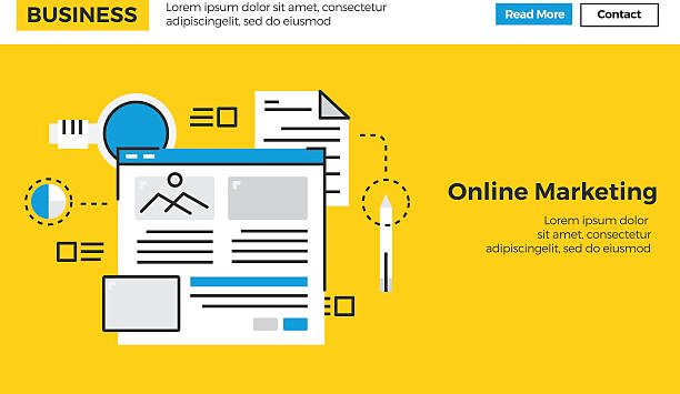
What is Responsive Website Design and Why is it Crucial Today?

In today’s world, where technology is advancing at an incredible pace and internet access is possible through various devices such as smartphones, tablets, laptops, and even smart TVs, having a website that displays correctly on all these platforms is not just an advantage, but an unavoidable necessity.
This is where the concept of responsive website design comes in.
Responsive Web Design (RWD) is an approach in web design that aims to create websites whose content and layout automatically adapt to the screen size and orientation of the user’s device.
This means there’s no longer a need to design separate versions for desktop, tablet, or mobile; instead, a single website can provide an optimal experience on any device.
This approach significantly improves #User_Experience, as users will encounter organized and accessible content regardless of the device they use to access your site.
From an #SEO perspective, Google and other search engines prefer responsive websites in their rankings.
This is a #Modern_Approach and important news for any business that wants to succeed online and attract more organic traffic.
The ultimate goal of responsive web design is to ensure that your content always looks good and functions efficiently, regardless of how users access it.
This is a paradigm shift in how we approach web design.
Are you dissatisfied with your e-commerce site’s low sales?
Rasaweb is your solution for a professional and high-selling e-commerce site.
✅ Significant increase in sales and revenue
✅ Easy and enjoyable shopping experience for customers
⚡ Get free consultation from Rasaweb right now!
The Evolution of Web from Fixed to Responsive Design

Before the advent of responsive website design, websites were primarily designed with fixed layouts optimized for display on desktop monitors with specific dimensions.
However, with the widespread use of mobile devices and tablets in the early 2010s, this approach quickly became inefficient.
Website visitors experienced an unfavorable user experience through smaller screens and touch capabilities; they had to zoom in to view content and perform unnecessary horizontal scrolling.
This situation led to user dissatisfaction and revealed the need for a new solution.
In 2010, Ethan Marcotte introduced the concept of responsive web design with his groundbreaking article in A List Apart.
This idea was based on three fundamental principles: flexible grids, flexible images, and CSS3 media queries.
This new approach allowed a single website to intelligently react and adjust its layout based on the user’s device characteristics (such as screen size, resolution, and orientation).
This evolution was a deep analysis of the growing needs of users and web technologies.
In fact, responsive design is not just a technical solution, but a philosophy for creating future-proof websites.
This paradigm shift forever transformed how we develop and interact with the web, paving the way for integrated and efficient user experiences.
Today, responsive website design has become the industry standard, and any site seeking success and visibility must place this approach at the core of its design.
Fundamental Principles of Responsive Website Design

Successful implementation of responsive website design rests on three main pillars, each playing a vital role in creating a seamless user experience.
The first pillar is Fluid Grids.
Instead of using fixed pixels to define element widths, fluid grids use relative units like percentages.
This causes the website layout to stretch or shrink based on screen size, rather than having fixed dimensions.
This is an important educational concept that designers must master.
The second pillar is Flexible Images.
Images and other media elements must also be designed to be scalable with their container size.
This is typically done by setting `max-width: 100%` in CSS for images, which ensures the image never exceeds its parent’s width and automatically resizes.
This method helps prevent pixelation and content distortion.
The third and perhaps most important pillar is Media Queries.
Media queries allow you to apply different CSS styles based on the user’s device characteristics, such as screen width, resolution, or orientation (horizontal or vertical).
For example, you can define rules that, on smaller screens, columns of a multi-column layout are stacked vertically, or fonts are displayed larger.
This specialized tool forms the core intelligence of responsive website design.
The table below shows an example of common breakpoints for media queries and their application:
| Device Type | Breakpoints (Screen Width) | Usage |
|---|---|---|
| Mobile (Small) | Up to 480px | Larger fonts, single-column layout, large buttons |
| Mobile (Regular) | 481px – 767px | Optimization for medium smart devices |
| Tablet | 768px – 1024px | Two- or three-column layout, dropdown menus |
| Desktop | Above 1024px | Full layout, horizontal menus, display more details |
These three principles form the foundation for creating dynamic and efficient websites that can adapt to any environment.
Endless Benefits of Responsive Design for Businesses

Implementing responsive website design brings significant advantages for any business, regardless of its size or type of activity, extending beyond merely improving the site’s appearance.
One of the most important advantages is SEO Improvement.
Search engines like Google give higher scores to websites that provide a suitable user experience on mobile devices and rank them higher in search results.
Responsive websites, due to having a single, unified URL, prevent duplicate content issues that arise with separate mobile versions, and their crawling and indexing by search bots are easier.
Another advantage is an Increased Conversion Rate.
When users can easily navigate your site and view content without issues, the likelihood of them performing your desired action (such as purchasing, signing up, or filling out a form) significantly increases.
This is a key analysis in digital marketing.
Furthermore, reduced maintenance and development costs are also significant benefits.
By having a single website, there’s no longer a need to update or maintain multiple separate versions, which leads to savings in time and financial resources.
This is practical guidance for businesses to optimize their operations.
Also, an improved user experience leads to a Reduced Bounce Rate and Increased Dwell Time on the site, both of which are positive signals for search engines.
Ultimately, given the increasing use of mobile for internet access, having a responsive website design not only creates a competitive advantage but is essential for survival in today’s digital market.
Do you dream of a thriving online store but don’t know where to start?
Rasaweb is your comprehensive e-commerce website design solution.
✅ Attractive and user-friendly design
✅ Increased sales and revenue⚡ Get free consultation
Tools and Technologies Facilitating Responsive Design

While implementing responsive website design is based on fundamental principles, many modern tools and technologies exist that facilitate and accelerate this process.
One of the most widely used tools is CSS Frameworks.
Frameworks like Bootstrap and Foundation offer a set of CSS classes and JavaScript components designed from the ground up for responsiveness.
These frameworks help developers quickly build responsive websites with minimal coding by providing predefined grids, responsive UI elements, and built-in media queries.
This is practical guidance for web designers.
In addition to frameworks, CSS Preprocessors like Sass and Less also play an important role in the development of responsive website design.
These tools allow the use of variables, functions, and nested rules in CSS, which makes coding more organized, maintainable, and faster, especially in large projects with numerous media queries.
For testing and ensuring the correct functioning of the website on different devices, testing and debugging tools are essential.
Browser tools like Chrome DevTools offer the ability to simulate different devices and test media queries.
Also, online services like BrowserStack and CrossBrowserTesting allow you to test your website on hundreds of real or simulated browsers and devices.
This specialized knowledge of tools is crucial for any developer looking to effectively implement responsive website design.
Intelligent use of these technologies not only simplifies the development process but also significantly enhances the quality and efficiency of the final product.
Challenges and Key Considerations in Implementing Responsive Design

Despite the many advantages of responsive website design, its implementation is not without challenges and requires meticulous planning and sufficient knowledge.
One of the most important challenges is Performance Management of the website.
If heavy images and content are not properly optimized, site loading time on mobile devices with slow internet connections may significantly increase and disrupt the user experience.
Using optimized images, lazy loading, and code compression are solutions to this problem.
Another challenge is the complexity of designing for specific layouts.
Some layouts, such as large data tables or interactive maps, are not easily scalable on small screens and require more creative approaches like horizontal scrolling or displaying summarized content.
This issue creates challenging content for designers on how to best present content without sacrificing information.
Also, support for older browsers can be troublesome, as some of them (like IE8 and below) do not support media queries.
For these cases, solutions like polyfills or providing a simpler layout (graceful degradation) should be considered.
Another key point is content prioritization.
On smaller screens, space is limited, and a decision must be made about which parts of the content are most critical to the user and should be displayed first.
This means careful analysis of user needs and content.
Finally, comprehensive testing on real and simulated devices is essential to ensure the correct functioning of responsive website design in every scenario.
By understanding and addressing these challenges, responsive projects can be successfully completed.
The Mobile First Approach: Cornerstone of Modern Design

In the world of web design, the “Mobile First” approach has emerged as a fundamental philosophy in the development of responsive website design.
This approach means starting the website design and development process from the smallest screens (mobile) and then gradually expanding it towards larger screens (tablet and desktop).
This is contrary to the traditional method where design was first done for desktop and then attempted to adapt it for mobile.
Why is “Mobile First” so important? The answer lies in limitations and priorities.
Mobile devices have limitations including less screen space, variable internet speed, and a need for greater simplicity and efficiency.
By starting the design from these limitations, designers are forced to focus on the most important content and functionalities and avoid adding unnecessary elements that disrupt the user experience on mobile.
This focus on the core experience leads to lighter, faster, and more efficient websites that are beneficial for all users, even on desktop.
This is an analytical and specialized approach that leads to real optimization.
Also, from an SEO perspective, Google has emphasized mobile-first indexing for years, meaning that the mobile version of your website will be the primary basis for your ranking.
This educational approach teaches designers how to optimize the website structure and content from the outset to prioritize mobile needs.
Ultimately, responsive website design with a mobile-first approach ensures that your site not only performs well on mobile but also improves the overall user experience across all devices and prepares you for the future of the web.
| Feature | Mobile First Approach | Desktop First Approach (Traditional) |
|---|---|---|
| Design Starting Point | Smallest screen (mobile) | Largest screen (desktop) |
| Design Philosophy | Progressive Enhancement | Graceful Degradation |
| Content Priority | Only essential content and core functionality | Tendency to add too much content and complexity |
| Performance | Naturally lighter and faster | May be heavy and slow on mobile |
| SEO | Aligned with Google’s mobile-first indexing | Potential problems in mobile ranking |
Testing and Debugging Responsive Website Design
After implementing responsive website design, the testing and debugging phase is of paramount importance.
Without thorough testing, it’s impossible to ensure that the website functions correctly across all devices and browsers and provides an optimal user experience.
One of the first and most accessible tools for testing is Browser Developer Tools.
Most modern browsers like Chrome, Firefox, and Edge have the ability to simulate different devices, allowing you to view your website in various dimensions and orientations.
These tools are very useful for quickly testing media queries and different layouts.
However, simulations cannot fully replicate the behavior of a real device.
Therefore, testing on real devices is essential.
This includes testing on various smartphones, tablets with different operating systems (iOS, Android), and varying screen sizes.
This specialized guidance helps you discover potential errors that only appear in real environments.
For more comprehensive testing, online cross-browser testing services like BrowserStack or CrossBrowserTesting allow you to test your website across thousands of browser, operating system, and device combinations.
These services are invaluable for ensuring full compatibility of your web design.
In addition to appearance, Performance must also be tested.
Tools like Google Lighthouse and PageSpeed Insights can help you identify performance bottlenecks, such as heavy images or unoptimized JavaScript code.
Ensuring proper website loading speed on mobile devices is crucial for retaining users.
Ultimately, the testing and debugging process for responsive website design is a continuous cycle and should be an integral part of the website development and maintenance stages.
Do visitors leave your e-commerce site before making a purchase? Don’t worry anymore! With Rasaweb’s professional e-commerce website design services, permanently solve the problem of not converting visitors into customers!
✅ Significant increase in conversion rate and sales
✅ Unique and attractive user experience
⚡ Contact us now for a free consultation!
The Future of Responsive Website Design and Beyond

The future of responsive website design is not limited to traditional screens; this concept is evolving to adapt to a wider range of devices and contexts.
With the emergence of technologies such as the Internet of Things (IoT), Virtual Reality (VR), Augmented Reality (AR), and Wearables, the need for adaptive and dynamic designs is felt more than ever.
Responsive website design, as a general philosophy for content adaptation, not just to screen size, but to the user’s Context, is progressing.
This means that websites and applications in the future may change their content and user interface based on the user’s location, recent activities, time of day, and even their emotional state.
This concept is known as “Adaptive Design” or “Intelligent User Experience”, which provides us with entertaining yet analytical content.
For example, a shopping website might display very concise and essential information on a smartwatch, have a touch-centric interface on a tablet, and provide full product details and customization options on a large display.
These all fall under the broad umbrella of responsive website design in the future.
Furthermore, advancements in Artificial Intelligence and Machine Learning will also play a significant role in personalizing web experiences, where the site can automatically anticipate user needs and adjust content accordingly.
These news developments indicate that web design is constantly changing and becoming more complex, but the core principles of responsiveness – flexibility and adaptability – will remain its cornerstone.
Practical Guidelines for Successful Responsive Website Design

To achieve successful and efficient responsive website design, adhering to the following practical tips and guidelines is essential.
First, always start with the “Mobile First” approach.
This means starting design and coding from the smallest screen and gradually expanding for larger screens.
This approach ensures your site has optimal performance on mobile devices and focuses on core content from the outset.
This is an important educational point for every designer.
Second, use relative units.
Instead of fixed pixels for element widths, use percentages, `em`, `rem`, or `vw`/`vh` to create flexible grids and scalable fonts.
This ensures your layout naturally adapts to any screen size.
Third, optimize images and media.
Images should have `max-width: 100%` and optimized versions should be provided for different screen sizes (e.g., using the `
Using next-gen image formats like WebP can also help reduce file sizes.
This is specialized guidance for performance improvement.
Fourth, determine Breakpoints based on content.
Instead of using standard breakpoints for specific devices, think about how your content displays at different sizes and place breakpoints where your layout starts to break.
Fifth, don’t forget comprehensive testing.
Regularly test your website on real devices, simulators, and cross-browser testing tools to ensure its correct functioning in every scenario.
By adhering to these principles, you can create a responsive website design that is not only beautiful and functional but also stable and successful in the ever-changing world of the web.
This is a comprehensive explanation of practical steps.
Frequently Asked Questions
| Question | Answer |
|---|---|
| What is responsive website design? | A method in web design where the site adapts to the screen size of different devices (desktop, tablet, mobile). |
| Why is responsive design important? | To provide an optimal user experience on any device the user uses and to improve SEO. |
| What are the main techniques of responsive design? | Using fluid grids, flexible images, and Media Queries. |
| What is a Media Query? | A CSS rule that allows applying different styles based on screen characteristics (such as width or height). |
| What are the benefits of responsive website design? | Increased user satisfaction, improved site ranking in search engines (SEO), reduced maintenance cost compared to having separate versions for each device. |
And other services of Rasaweb Advertising Agency in the field of advertising
Intelligent UI/UX: A fast and efficient solution for attracting customers with a focus on attractive user interface design.
Intelligent Social Media: A creative platform for improving SEO ranking by optimizing key pages.
Intelligent SEO: Transform click-through rate increase with the help of attractive user interface design.
Intelligent Marketplace: Revolutionize SEO ranking with the help of Google Ads management.
Intelligent Brand Identity: A combination of creativity and technology to increase click-through rate by using real data.
And over hundreds of other services in the field of internet advertising, advertising consultation, and organizational solutions
Internet Advertising | Advertising Strategy | Advertorial
Resources
An article on responsive website design in Raya Marketing
What is responsive design? in Sibche
Responsive Website Design in Bartar Ertebat
Advantages of Responsive Website Design in Webramz
? Rasaweb Afarin Digital Marketing Agency is your companion and guide on the challenging path of the digital world. By providing services such as website design with a modern user interface, professional SEO, and specialized content creation, we elevate your business to its peak and establish a powerful online presence for you.
📍 Tehran, Mirdamad Street, next to Bank Markazi, Kazerun Jonubi Alley, Ramin Alley, No. 6
