
Introduction to the Importance of Responsive Design

In today’s world, where various devices with different screen sizes connect to the internet, the importance of responsive website design has become more apparent than ever.
#Mobile #tablet #desktop are among the tools users employ to access web content.
A well-designed responsive site provides a seamless user experience on any device, automatically adapting content to the screen size.
This approach not only increases user satisfaction but also plays a key role in improving search engine rankings.
It’s no longer feasible to expect all users to easily use a fixed website under different conditions and with varying devices.
The current era is one of easy and fast access to information, and your site must meet this need.
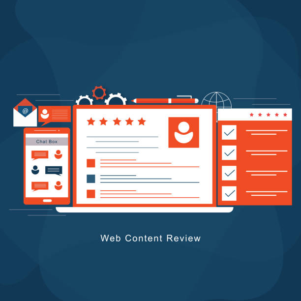
This section, through explanation and instruction, helps the audience better understand the necessity of #responsive_web.
Responsive website design is a solution for our multi-device world.
From smartphones to smart TVs, every device requires a specific layout to display websites, but with responsiveness, a single code is sufficient for all of them.
This reduces development and maintenance costs and ensures your brand looks professional on every platform.
In other words, responsive web design is no longer a luxury option but a necessity for any business that wants to remain competitive in the online space.
Are you dissatisfied with your e-commerce site’s low sales?
RasaWeb is your solution for having a professional and high-selling e-commerce site.
✅ Significant increase in sales and revenue
✅ Easy and enjoyable shopping experience for customers
⚡ Get a free consultation from RasaWeb right now!
Principles and Fundamentals of Responsiveness in Web Design

The basic principles of #responsive_design are based on three main pillars: Fluid Grids, Fluid Images, and Media Queries.
#Fluid_grids mean that web page layouts are built using relative units like percentages, instead of fixed pixel units.
This allows page elements to automatically adjust their size according to the user’s screen width.
Fluid images, using CSS properties like `max-width: 100%`, ensure that images never overflow their containers and scale up or down to fit the available space.
Media Queries, however, are considered the heart of #responsive_website_design.
This CSS3 feature allows designers to apply different styles based on specific device characteristics such as width, height, orientation, and even resolution.
For example, you can specify that a website’s columns be displayed as three columns on wide screens, two columns on tablets, and single columns stacked on phones.
This specialized approach ensures that every user, regardless of their device, has the best visual and functional experience.
A deep understanding of these fundamentals is the cornerstone of any successful responsive website design.
These principles help developers apply necessary optimizations to increase loading speed and improve user experience across various devices, which is a crucial factor in SEO and visitor retention.
Key Techniques and Tools in Responsive Design

For effective #responsive_design implementation, using appropriate techniques and tools is crucial.
One of the most common techniques is the “Mobile First” approach, where design begins with the smallest screen (typically mobile) and then progressively develops for larger screens.
This method ensures that essential and vital content is prioritized, and the site loads quickly on mobile devices.
Using CSS frameworks like Bootstrap or Tailwind CSS also significantly facilitates the #responsive_website_design process.
These frameworks, by providing ready-made components and a flexible grid system, reduce development time and enhance the final quality of the work.
Additionally, more advanced techniques such as Responsive Images, using `
This not only improves visual quality but also increases site speed by loading optimized images.
Browser developer tools (such as Chrome DevTools) are also vital for testing and debugging layouts across various screen sizes.
Understanding and applying these tools and techniques is key to creating an efficient and modern responsive website design.
This instructional and specialized guide helps designers implement best practices in responsive website design.
Comparison of Responsive Design Approaches
| Feature | Responsive Design | Adaptive Design |
|---|---|---|
| Number of Layouts | One fluid layout | Multiple fixed layouts for specific breakpoints |
| Display Method | Flexible, content adapts to any screen size | Best layout is chosen based on device detection |
| Implementation Complexity | Medium to high (requires content flow management) | Medium (requires multiple designs) |
| Advantages | Consistent user experience, more SEO-friendly, easier maintenance | More control over appearance at specific points, can be faster |
| Disadvantages | May be overly flexible in some cases | May not display well on non-standard sizes, more difficult maintenance |
Common Challenges and Solutions in Responsive Design Implementation

Implementing #responsive_website_design, while offering numerous benefits, also comes with its own challenges.
One of the most important challenges is content management and ensuring its correct and accessible display across all screen sizes.
Sometimes, content that looks good on desktop requires complete rearrangement on mobile.
Another challenge relates to site performance and loading speed.
Large images or heavy JavaScript codes can create an undesirable user experience on mobile devices with slow internet.
To overcome these challenges, there are several solutions.
For content management, using techniques like #hiding_elements or #content_prioritization on smaller screen sizes is beneficial.
To improve performance, image optimization (compression, using next-gen formats like WebP), lazy loading for images and videos, and minimizing CSS and JavaScript files are of high importance.
Also, continuous testing on real devices and simulators helps identify and fix potential issues before publication.
This section includes thought-provoking and analytical content that addresses real problems faced by designers in the field of responsive website design and provides practical solutions.
Can one truly have a single design for all devices, and is it always the best option?
Are you tired of your e-commerce website having visitors but no sales? RasaWeb, specializing in professional e-commerce website design, solves your main problem permanently!
✅ Significant increase in sales rate and revenue
✅ High loading speed and unparalleled user experience
⚡ Get a free consultation on e-commerce website design
The Role of User Experience in Responsive Website Design

#User_experience (UX) plays a vital and undeniable role in #responsive_web_design.
The primary goal of implementing responsive website design is to provide a smooth and optimized user experience across all devices.
This means users should be able to easily navigate, read content, and interact with site elements, regardless of the device they are using.
UX design in this context includes ensuring easy touchability of buttons on mobile, readability of fonts across different sizes, and logical organization of content to prevent unnecessary scrolling.
User experience elements such as User Interface (UI) design, Accessibility, and page loading speed are all affected by responsiveness.
A responsive website must have flawless functionality in addition to visual appeal.
For instance, online forms should be easy to fill out at any size, and the purchasing process should not appear complicated on mobile devices.
Paying attention to small details, such as the touch target size of buttons and links (at least 48×48 pixels for finger touch), can make a big difference in user experience.
Ignoring these principles, even with a beautiful #responsive_site_design, can lead to high bounce rates and reduced user engagement.
Therefore, every successful responsive website design must place UX at its core and address it expertly.
SEO Optimization with a Responsive Design Approach

The relationship between #responsive_website_design and #Search_Engine_Optimization (SEO) is very deep and reciprocal.
Google has explicitly stated that it prefers responsive websites over separate mobile sites (m.site.com) or desktop-only websites.
The main reason for this preference is the ease of crawling and indexing content.
With a single codebase for all devices, Google’s crawlers do not need to index multiple versions of a page, which leads to improved efficiency and accuracy in ranking.
Furthermore, page loading speed, which is a crucial Google ranking factor, is highly considered in responsive website design.
Responsive websites, by using optimized images and less code, typically load faster, which is a significant SEO advantage.
Also, a reduction in Bounce Rate and an increase in user time on site, which are direct results of a good user experience (derived from responsive design), indirectly positively impact SEO rankings.
A site that is well-optimized for mobile and provides a good user experience will attract more organic traffic.
This section provides comprehensive guidance and analysis so webmasters can understand how to improve their search ranking with responsive website design.
Case Study of Responsive Design Across Various Industries

Responsive website design is not just a trend; it’s an industry standard applied across various sectors.
For instance, in the #retail and #e-commerce industry, a responsive site is essential because a significant portion of online purchases are made via mobile devices.
Lack of a smooth mobile shopping experience can lead to the loss of many customers.
News and media websites also heavily require responsiveness, as readers consume content at different times of the day and on various devices (from phones on the subway to tablets at home).
The #tourism and #hospitality industry is no exception.
Hotel, flight, and tour bookings are often made on the spot and via mobile.
Therefore, a responsive website with easy booking features and attractive image display can play a key role in attracting customers.
Even in the #online_education sector, where students and instructors access course content via various devices, responsive design for educational platforms is highly important.
This section, presented as news and reviewing real cases, demonstrates how responsive website design is accepted and used as a global solution across all industries.
This adaptability is the key to the success of many online businesses.
Examples of Responsive Design Benefits in Industries
| Industry | Key Benefits of Responsive Design |
|---|---|
| E-commerce | Increased mobile conversion rate, seamless shopping experience, reduced abandoned cart rate |
| Media and News | Increased reading time, improved content sharing capabilities, easy access at any time |
| Tourism | Ease of on-the-spot booking, attractive display of destination images, access to travel information on the go |
| Online Education | Accessibility of lessons and content across various devices, flexibility in learning |
| Financial Services | Security and reliability across various platforms, ease of managing bank accounts from mobile |
The Future of Web Design and the Evolution of Responsiveness

The future of #web_design is moving towards more personalization, deeper interactivity, and more immersive experiences.
#Responsive_design, currently a standard, will gradually align with newer concepts like “Adaptive Content” and “Progressive Web Apps” (PWAs).
PWAs not only make websites responsive but also add native app capabilities like offline access, push notifications, and home screen installation.
This combination blurs the line between web and application.
Emerging technologies like #Artificial_Intelligence (AI) and #Virtual_Reality (VR) will also impact #responsive_web.
In the future, websites may adapt not only to screen size but also to user behavior and preferences, offering personalized content.
This creates new challenges for responsive website design, while also providing unparalleled opportunities to create unprecedented user experiences.
The evolution of responsiveness shows that this concept is dynamic and constantly progressing.
Are we ready to design for this more complex and intelligent future of websites? This section, through analytical and thought-provoking content, addresses the future and challenges ahead in the field of responsive website design.
Are you tired of your e-commerce site having visitors but no sales? RasaWeb solves your main problem by designing professional e-commerce websites!
✅ Significant sales increase with targeted design
✅ Flawless user experience for your customers
⚡ Get a free consultation!
Important Tips and Practical Guide for Web Designers
For web designers seeking to master #responsive_website_design, observing a few practical tips can be very beneficial.
Firstly, always start with a #Mobile_First approach.
This forces you to focus on core content and functionality, avoiding unnecessary clutter on smaller screens.
Secondly, use relative units (like percentages, `em`, and `rem`) instead of fixed pixel units for widths, paddings, and margins.
This ensures the flexibility of your layout.
Thirdly, always optimize images for the web.
Use image compression tools and new formats like WebP, and leverage the `srcset` attribute to provide different image versions.
Fourthly, take mobile navigation experience seriously.
Hamburger Menus or other hidden navigation methods can preserve screen space on mobile.
Fifth, pay attention to fonts and their readability across different screen sizes.
Use appropriate `font-size`s and sufficient `line-height`s to improve readability.
Finally, continuously test your site on real devices.
Simulators are good, but nothing replaces testing on a real device.
These instructional and practical tips are essential for web designers who intend to create professional #responsive websites.
Mastering these techniques will help you deliver the best responsive website design.
Conclusion and New Horizons in Responsive Web

In conclusion, #responsive_website_design is not just a design technique but a philosophy for building websites that remain stable and effective in the ever-changing world of technology.
This approach allows us to build websites that provide a consistent and optimized experience, regardless of the type of device users employ.
From SEO improvement and increased conversion rates to enhanced user satisfaction and reduced development costs, the benefits of responsive website design are countless.
As explained in previous sections, this design method addresses the needs of users in the era of smartphones and device diversity.
New horizons in responsive web are moving towards greater intelligence and experience personalization.
With the advent of technologies like artificial intelligence and machine learning, websites will be able to adapt not only to screen dimensions but also to individual user behavior and preferences.
These advancements promise an entertaining and exciting future for developers and users.
#Responsive_web is not only a current necessity but also the foundation for future developments in web design.
Remember that a good responsive website design is constantly evolving and must be updated in line with new needs and emerging technologies.
Frequently Asked Questions
| Question | Answer |
|---|---|
| What is Responsive Web Design? | Responsive Web Design is an approach that causes a website’s design and layout to change and be displayed optimally based on the user’s device screen size (computer, tablet, mobile, etc.). |
| Why is Responsive Design important? | Its importance stems from the increased use of various devices to access the internet. Responsive design improves user experience (UX), reduces bounce rate, and is beneficial for SEO. |
| What techniques are used in Responsive Design? | Key techniques include using Fluid Grids, Flexible Images, and Media Queries in CSS. |
| What do Fluid Grids mean? | Instead of using fixed pixel units, relative units like percentages or em are used to define the width and height of elements, so the layout remains flexible with changes in screen size. |
| What is the application of Media Queries? | Media Queries allow you to apply different CSS styles based on user device characteristics such as screen width, height, orientation (horizontal or vertical), and resolution. |
And other services of RasaWeb Advertising Agency in the field of advertising
Smart Google Ads: Revolutionize website visits with Google Ads management.
Smart Content Strategy: A professional solution for digital branding focusing on user experience customization.
Smart Website Development: A creative platform to improve user interaction with marketing automation.
Smart Digital Advertising: An effective tool for online growth by optimizing key pages.
Smart Website Development: A combination of creativity and technology for digital branding through precise audience targeting.
And over hundreds of other services in internet advertising, advertising consultation, and organizational solutions
Internet Advertising | Advertising Strategy | Advertorial
References
- Persian Wikipedia: Web Design
- W3C Web Design Standards
- MDN Responsive Design Guide
- Smashing Magazine: Web Design Resources
✅
? To reach the peaks of success in the digital world, RasaWeb Afarin Digital Marketing Agency is by your side with its comprehensive services. With expertise in areas such as WordPress website design, SEO, and social media management, we pave the way for your business growth.
📍 Tehran, Mirdamad Street, next to Bank Markazi, Southern Kazeroon Alley, Ramin Alley No. 6
