
Introduction to Responsive Web Design and its Necessity

In today’s digital world, where users access the internet from various devices such as mobile, tablet, laptop, and even television, responsive web design has become an undeniable necessity.
It’s no longer possible to meet user needs with a fixed website designed only for desktops.
Your website must be adaptable to any screen size and provide a consistent and optimized user experience on any device.
This approach ensures that your content is displayed correctly, navigation is easy, and users can interact with your site without needing to zoom or horizontal scroll.
Responsive Web Design refers to building a website that can intelligently change its layout and content based on the size and characteristics of the device the user is employing. This process involves using fluid grids (Fluid Grids), flexible images (Flexible Images), and media queries (Media Queries) in CSS.
The ultimate goal is to provide an optimal experience for all users, regardless of the device used.
Suppose a user is browsing your website on their smartphone; if your site is not responsive, they will have to constantly zoom in to read text or click buttons, which can lead to an unpleasant experience and site abandonment.
The necessity of this type of design is not only in increasing user satisfaction but also plays a significant role in improving your site’s ranking in search engines.
Google has clearly stated that it prefers responsive websites in its mobile search results.
This is especially crucial given that a significant portion of searches are now conducted via mobile devices.
Therefore, ignoring responsive web design can mean losing a large volume of traffic and potential customers.
This design approach helps businesses reach all platforms with a single design and development effort, eliminating the need to create separate versions for mobile, tablet, and desktop, which saves both time and cost. This is a long-term investment for survival and success in today’s web space.
Does losing customers who have visited your site for a purchase bother you?
Rasaweb is your specialized solution for having a successful online store.
✅ Significant increase in your online sales
✅ Building trust and professional branding with customers⚡ Get a free consultation from Rasaweb experts!
Key Principles of Responsive Design

To achieve an effective responsive website, understanding and applying several key principles is essential.
These principles help developers provide a smooth and consistent experience for users across various devices.
The first principle is the use of fluid grids or Fluid Grids.
Instead of using fixed pixel units for element widths, relative units like percentages are used.
This means that the width of your site’s elements, instead of having a fixed value, is defined as a percentage of the screen width, and thus, as the screen size changes, the elements also resize proportionally.
The second principle is flexible images or Flexible Images. Images are usually sized in pixels and, in a fixed design, might extend beyond their container or not display correctly.
In responsive design, images must also be scalable.
This is often done by setting the `max-width: 100%;` property in CSS, which ensures that the image never exceeds its parent container and is always displayed at the appropriate dimensions.
This approach not only helps with correct image display but also optimizes their loading.
The most important principle and the backbone of responsive web design is the use of media queries (Media Queries). Media Queries in CSS allow us to apply different styles based on device characteristics, such as screen width, height, orientation (landscape or portrait), and resolution.
For example, we can specify that on smaller screens, columns stack vertically instead of side-by-side, or fonts become smaller.
This tool gives developers much more precise control over how the website is displayed across various screen sizes.
In addition to these technical principles, the mobile-first (Mobile-First) mindset is also an important philosophical principle.
This approach means starting design and development for the smallest screens (mobile) and then progressively expanding to larger screens.
This method ensures that the core content and functionality work well on smaller versions, and then more complex details and elements are added for larger screens.
This approach is particularly effective in optimizing performance and loading speed for mobile users who may have slower internet speeds. Finally, continuous testing on various devices to ensure proper functionality and provide an optimal user experience is an integral part of responsive web design principles.
Techniques and Tools for Implementing Responsiveness
Implementing responsive web design requires knowledge and the use of a set of modern web techniques and tools.
After understanding the theoretical principles, it’s time for the technical details of how to implement these principles in actual code.
The most important technique in this regard, as mentioned earlier, is the use of media queries in CSS.
This allows us to define breakpoints, at which points the website’s layout and styles change.
For example, we can define a breakpoint at 768 pixels, suitable for tablet devices, and another at 480 pixels for smartphones.
In addition to standard media queries, CSS frameworks also play a very important role in facilitating the responsive design process.
Bootstrap and Foundation are among the most popular of these frameworks, which greatly simplify developers’ work by providing a pre-built grid system and ready-to-use, responsive components.
Using these frameworks, websites can be built quickly that automatically respond to different screen sizes.
These frameworks include ready-made elements such as navigation bars, forms, buttons, and tables, all designed to be responsive.
To optimize images in a responsive website, in addition to `max-width: 100%;`, techniques such as responsive images using the `srcset` and `sizes` attributes in the `img` tag are also employed.
These attributes allow the browser to load the most optimal image version based on the user’s screen size and device pixel density, which helps improve site performance and enhances user experience.
Also, next-generation image formats like WebP can be used to reduce file size and increase loading speed.
In terms of tools, in addition to code editors and browsers, using browser developer tools (Developer Tools) is essential for simulating different devices and testing website responsiveness. These tools allow developers to see how their website looks at various sizes and resolutions and quickly identify and fix problems.
Also, online code rendering tools and mobile device simulators can be very useful during testing and debugging phases.
Using SVG for graphics and icons is also a smart approach because these formats are scalable and maintain their quality at any size.
| Technique | Description | Advantages | Potential Disadvantages |
|---|---|---|---|
| Media Queries | Applying different CSS styles based on device characteristics (e.g., screen width). | Precise layout control, wide browser support. | Requires defining multiple breakpoints, code complexity in large projects. |
| CSS Frameworks (e.g., Bootstrap) | Pre-built grid systems and responsive UI components. | High development speed, standard and maintainable code, large community. | Larger code size (if not customized), standardized design. |
| Flexbox | One-dimensional layout model for distributing space and aligning items within a container. | High flexibility for complex layouts, ease of vertical and horizontal alignment. | Suitable for one-dimensional layouts (row or column). |
| CSS Grid | Two-dimensional layout model for designing complex page layouts. | Ability to create complex and responsive layouts, full control over dimensions. | More complex concepts for initial learning, browser support (slightly less than Flexbox). |
The Impact of Responsive Design on User Experience (UX)
User experience (UX) is at the core of any website’s success, and responsive web design has a profound impact on it.
A responsive website ensures that users, regardless of the device they use, encounter a familiar, usable, and enjoyable user interface.
When a user encounters a responsive site, they no longer need to zoom, horizontal scroll, or struggle to find information in a cluttered layout.
This directly leads to a reduction in bounce rate and an increase in user time on the site.
One of the most important aspects of improving user experience through responsive design is cross-platform compatibility. Users expect to be able to seamlessly transition from one device to another and for their website experience to remain consistent.
For example, if a user starts browsing an article on their desktop and then wants to continue it on their way home with their mobile phone, a responsive website provides this transition seamlessly and effortlessly.
This consistency in experience greatly contributes to increasing user and brand loyalty.
Site loading speed is another critical factor in user experience that is improved by responsive design.
By using techniques such as flexible images and conditional content loading (only loading content required for the current screen size), loading speed can be significantly increased.
Today’s users expect speed, and any delay can lead to losing them.
Responsive websites meet this expectation by optimizing resources.
Furthermore, website accessibility is also improved with responsive design. By adjusting fonts, button sizes, and spacing between elements to be legible and clickable at any size, the website becomes more accessible to a wider range of users, including those with visual or motor impairments.
This not only contributes to social responsibility but also expands the website’s user base.
Ultimately, focusing on UX through responsive design not only leads to user satisfaction but also increases the conversion rate; because users with a positive experience will be more inclined to take your desired actions, such as purchasing a product or filling out a form.
Do you know that customers’ first impression of your company is your website? Multiply your business’s credibility with a powerful corporate website from Rasaweb!
✅ Custom and eye-catching design tailored to your brand
✅ Improved user experience and increased customer acquisition⚡ Get a free consultation!
The Importance of Responsive Design for SEO and Google Ranking

In the current era, search engine optimization (SEO) is practically impossible without considering responsive web design.
Google, as the largest search engine in the world, has long prioritized responsive and mobile-friendly websites in its ranking algorithms. This means that if your website is not optimized for mobile devices, you likely won’t rank well in mobile search results and will lose a significant portion of organic traffic.
Given that a huge percentage of searches are now conducted via smartphones, this issue becomes critically important.
One of the main reasons for Google’s preference for responsive websites is user experience.
Google aims to provide the best possible experience to its users and knows that a user searching on mobile expects to see a website that is easily usable on their device.
Responsive websites ensure that content is displayed correctly, buttons are clickable, and there’s no need for zooming or extra scrolling.
These factors directly influence bounce rate, user time on site, and their interactions, all of which are important signals for Google’s ranking algorithms.
Furthermore, responsive design helps Google crawl and index your website more effectively. By having a single URL for all devices (unlike separate mobile and desktop versions), Google doesn’t need to crawl multiple versions of a page, which leads to optimal use of crawler resources and increased indexing efficiency.
This URL consistency also helps prevent duplicate content issues, which can harm SEO.
Furthermore, Google has provided tools such as Google Search Console, which allow website owners to check their site’s mobile compatibility.
Receiving a warning in this tool is a clear sign of an issue with the site’s responsiveness and a need for improvement.
Finally, given Google’s Mobile-First Indexing approach, which means indexing and ranking pages based on their mobile version, responsive web design is no longer an option but a requirement for any business that wants to be visible in online searches and remain competitive.
Common Challenges and Solutions in Responsive Web Design

Although responsive web design offers countless benefits, its implementation also comes with challenges.
One of the most common challenges is managing content and layout across different screen sizes. Sometimes, content that looks great on desktop becomes too long or cluttered on mobile.
The solution is to design with a mobile-first approach from the outset and organize content so that it remains meaningful and accessible on the smallest screens.
Using techniques such as collapsible content (Accordion/Collapse) to hide parts of the content on smaller devices can be beneficial.
Another challenge is managing images and other media.
High-quality images optimized for desktop may load very slowly on mobile devices and disrupt the user experience.
Solutions include using responsive images with `srcset` and `sizes`, image compression, and using next-generation formats like WebP.
Also, implementing lazy loading (Lazy Loading) for images and videos, which only load when the user scrolls to them, can significantly improve initial loading speed.
Performance and speed issues on mobile devices are also a major challenge. Large CSS and JavaScript files can slow down loading speed.
Code optimization, reducing HTTP requests, file compression (Gzip Compression), and using Content Delivery Networks (CDN) can help solve this problem.
Also, for responsive web design, it is better to use Minimal CSS and JavaScript, loading only essential codes.
Testing on real devices is also a challenge, as it’s not possible to access all devices and operating systems.
Browser developer tools (like Chrome DevTools) and cloud testing platforms (like BrowserStack) can help with simulation and testing in various environments.
Finally, maintaining and updating responsive websites requires continuous attention. With the emergence of new devices and resolutions, there’s a need for continuous review and adjustment of breakpoints and layouts to ensure the website always provides the best experience.
This process is a continuous cycle of improvement and optimization.
The Future of Responsive Web Design and Emerging Trends

Responsive web design, although an established standard, is still evolving, with emerging trends shaping its future.
One of the most important of these trends is expansion beyond just screen sizes. With the emergence of new devices like smartwatches, virtual/augmented reality (VR/AR) headsets, and even smart cars, the concept of “responsiveness” must include the ability to adapt to a wide variety of interaction methods and user contexts.
This means designing for voice interaction, gestural controls, and even biometric inputs.
Other trends include the increasing use of Progressive Web Apps (PWAs). PWAs are a combination of the best features of websites and mobile applications that can work offline, send push notifications, and be installed on the device’s home screen.
This approach means a much richer, app-like user experience without the need to install from an app store, while also benefiting from the advantages of responsive design for compatibility with various devices.
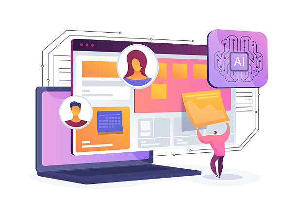
Artificial intelligence (AI) and machine learning (ML) are also gradually entering the field of web design. In the future, we may see tools that automatically optimize layout and content based on user behavior, the device used, and even environmental conditions.
This “Adaptive Design” will be the next step after responsiveness, where the website responds not only to screen size but also to the individual needs of the user.
The focus on performance and speed will remain a top priority for responsive websites. Techniques like Google’s Core Web Vitals show that the importance of loading speed, visual stability, and responsiveness in user interaction is increasing day by day.
Developers will seek ways to provide faster and lighter experiences across all devices, including more optimized use of CSS Grid and Flexbox, and minimizing JavaScript and external resources.
The future of responsive web design is moving towards more personalized, intelligent, and faster experiences across a wider ecosystem of devices and platforms.
| Trend/Technique | Description | Why is it important? |
|---|---|---|
| Beyond Media Queries (Container Queries) | Allow elements to react based on the size of their parent container, not the entire viewport. | Greater flexibility in designing independent and reusable components. |
| AI-Personalized Websites | Using AI to modify content and layout based on user behavior and preferences. | Significant increase in conversion rates and user satisfaction through highly relevant experiences. |
| Unified UX | Designing for a continuous and seamless experience across various devices, from mobile to VR/AR. | Compatibility with the growing ecosystem of interactive devices and platforms. |
| High-Performance Technologies (Core Web Vitals) | Focus on improving metrics for loading speed, visual stability, and interactive responsiveness. | Increased SEO ranking and significant improvement in user experience. |
Successful Case Studies in Responsive Design

Reviewing successful case studies is the best way to practically understand the benefits and potential of responsive web design.
Many leading companies worldwide have witnessed significant improvements in website performance, user experience, and ultimately, business growth by implementing this approach.
One of the most famous examples is The New York Times website, which migrated to a fully responsive design long ago.
This change allowed them to deliver their news content seamlessly across various devices, from desktops to smartphones and tablets.
The result was that mobile users spent more time on the site and interacted more with the content.
Another example is the Netflix website, which has optimized the video watching experience on any device with its responsive design.
Whether the user is watching a movie via a desktop browser, on a tablet on the go, or on their smartphone, the site’s user interface and performance are adjusted to provide the best possible experience.
This level of adaptability is crucial for a content streaming service, which users access from a wide variety of devices, and greatly helps in maintaining customer loyalty.
Retail companies have also been pioneers in adopting responsive design. For example, Amazon, although it started with a different approach, has now designed all its platforms in such a way that the shopping experience is optimized on any device.
E-commerce websites greatly benefit from the advantages of a responsive website due to the need to display a large number of products and complex shopping cart and payment functionalities.
The ability to display products in optimized galleries and a simplified payment process on mobile directly leads to increased conversion rates.
These case studies show that investing in responsive web design is not merely an aesthetic preference, but a strategic business decision that can lead to increased accessibility, improved user experience, enhanced SEO, and ultimately, growth in revenue and customer loyalty.
The success of these companies is a testament to the importance and impact of this approach in today’s web ecosystem.
Does your current e-commerce website design lead to lost customers and sales?
Rasaweb is your solution with modern and user-friendly e-commerce website designs!
✅ Significant increase in conversion rate and sales
✅ Creating strong branding and gaining customer trust⚡ Get a free e-commerce website design consultation from Rasaweb!
How to Become a Responsive Web Design Specialist?

To become a responsive web design specialist, a combination of theoretical knowledge, practical skills, and continuous experience is required.
This path involves continuous learning and staying updated with the latest web technologies and trends.
The first step is mastering the foundational web principles, including HTML5 for content structuring and CSS3 for styling.
In CSS3, one must deeply learn concepts such as media queries, Flexbox, and CSS Grid; these are the backbone of any responsive design.
After mastering HTML and CSS, it’s time for JavaScript.
Although basic responsiveness is mostly achieved with CSS, JavaScript is essential for more complex interactions, dynamic DOM manipulation, and implementing features like hamburger menus on mobile, touch-enabled image galleries, and so on.
Learning one of the popular JavaScript frameworks or libraries like React, Vue, or Angular can also be useful in building more complex and interactive websites, although it is not mandatory for starting responsive web design.
Concepts such as mobile-first (Mobile-First Design), performance optimization (Performance Optimization), and accessibility (Accessibility) should also be an integral part of your approach. You should learn how to optimize images, compress codes, and use tools like Google PageSpeed Insights to evaluate site performance.
Furthermore, familiarity with user experience (UX) and user interface (UI) principles will help you build websites that are not only responsive but also enjoyable and efficient for users.
Another crucial part is practice and building real projects. Start rebuilding existing websites responsively or create personal projects focusing on responsive design.
Use browser developer tools to test your website across different screen sizes.
Join the web developer community, be active in forums, and utilize online learning resources such as Udemy or Coursera courses and Mozilla (MDN Web Docs) documentation.
By gaining experience and keeping your skills updated, you will become a true specialist in responsive web design.
Frequently Asked Questions about Responsive Web Design

In the field of responsive web design, many frequently asked questions arise, the answers to which can clarify ambiguities and provide a deeper understanding of this concept.
One of the most common questions is: “Is responsive design essential for every website?” The emphatic answer is “yes.”
Given the significant increase in mobile device usage for internet access and Google’s prioritization of mobile-friendly websites, responsive design is no longer a luxury choice but a requirement for online survival and success.
Every website, from a personal blog to a large online store, should be responsive.
Another question is: “What is the difference between responsive design and adaptive design?” Responsive design uses a single codebase for all devices and flexibly adjusts content based on screen size.
In contrast, adaptive design has a set of fixed, pre-defined layouts for specific screen sizes, and the website loads the most suitable layout based on the user’s device.
Both approaches have a common goal (providing an optimal experience on different devices), but their implementation methods differ.
Responsive design is more common and flexible.
“Does responsive design mean reducing features on mobile?” No, not necessarily.
The goal of responsive web design is to provide a complete and functional experience on every device.
Sometimes, to improve the user experience on smaller screens, some visual elements or secondary content might be hidden or rearranged, but the core functionality and important content should not be sacrificed.
The mobile-first approach can even help focus on essential features from the outset.
The final question: “Are frameworks like Bootstrap essential for responsive design?” They are not essential, but they can significantly speed up the development process.
You can build a responsive website with pure HTML and CSS alone.
However, frameworks provide pre-built tools and robust grid systems that can drastically reduce the time and effort required for development, especially for larger projects.
The choice is yours whether to use a framework or code manually.
Frequently Asked Questions
| Question | Answer |
|---|---|
| What is responsive web design? | Responsive Web Design is an approach that causes the design and layout of a website to change based on the screen size of the user’s device (computer, tablet, mobile, etc.) and be displayed in the best possible way. |
| Why is responsive design important? | Its importance is due to the increased use of various devices for internet access. Responsive design improves user experience (UX), reduces bounce rate, and is also beneficial for SEO. |
| What techniques are used in responsive design? | The main techniques include the use of Fluid Grids, Flexible Images, and Media Queries in CSS. |
| What do Fluid Grids mean? | Instead of using fixed pixel units, relative units like percentages or em are used to define the width and height of elements so that the layout is flexible with changes in screen size. |
| What is the application of Media Queries? | Media Queries allow you to apply different CSS styles based on user device characteristics such as screen width, height, orientation (horizontal or vertical), and resolution. |
And other services of Rasa Web Advertising Agency in the field of advertising
The role of social networks in strengthening the presence of sellers in the business directory
How to use data analysis to improve ad performance?
Reviewing methods to increase brand credibility in online business directories
How to use targeted advertising to attract specific customers?
The role of providing after-sales services in attracting new customers in the business directory
And over hundreds of other services in the field of internet advertising, advertising consultation, and organizational solutions
Internet Advertising | Advertising Strategy | Advertorial
🚀 Is your business ready to leap into the digital world? Rasaweb Afarin Digital Marketing Agency, by providing comprehensive and innovative solutions, paves the way for your success. From professional website design and SEO optimization to managing targeted advertising campaigns, we are with you at every stage of your business growth.
📍 Tehran, Mirdamad Street, Next to Central Bank, Kazeroun Jonoubi Alley, Ramin Alley, No. 6
