
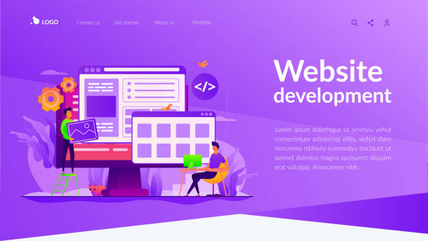
What is the Fundamental Understanding of Responsive Web Design?

In today’s digital world, where users access web content from various devices such as #smartphones, #tablets, laptops, and even smart TVs, Responsive Web Design has become an undeniable necessity.
This advanced approach in web design ensures that your website is displayed optimally regardless of screen size or device type, providing a seamless and optimized user experience.
Its core concept is based on fluidity, flexibility, and adaptability; meaning website elements, images, and texts intelligently adjust themselves to the available space.
This paradigm shift from a traditional “fixed position” approach to “dynamic flow” is the key to website success in the current era.
From an educational perspective, understanding this concept is vital for every developer and business owner who wants to remain competitive in the online space.
This explanation covers the fundamentals of responsive web design, examining how to deliver consistent content across different dimensions without loss of quality.
The main goal is to increase accessibility and improve user experience so that visitors can easily access the content they need without having to zoom or scroll horizontally.
Frustrated with your e-commerce site’s low conversion rate? Rasaweb transforms your e-commerce site into a powerful tool for attracting and converting customers!
✅ Significant increase in visitor-to-buyer conversion rates
✅ Unparalleled user experience to boost customer satisfaction and loyalty⚡ Get a free consultation from Rasaweb!
Why is Responsive Web Design Crucial in the Current Era?
The importance of responsive web design goes beyond mere aesthetics and directly impacts the success and survival of an online business.
Firstly, with the increasing use of mobile devices for online searching and shopping, a website that does not display correctly on mobile will lose a significant portion of its potential audience.
This is an important news fact that statistics confirm daily.
Google and other search engines also give higher scores to responsive websites, and this directly affects your website’s SEO ranking.
In other words, the failure to implement responsive web design can mean being overlooked by search engines and a reduction in organic traffic.
From an analytical perspective, responsive websites reduce maintenance costs because instead of needing multiple versions of a website (e.g., a desktop version and a mobile version), there is only one core code optimized for all devices.
This not only reduces costs but also simplifies content management and updates.
This approach also helps improve conversion rates; users who have a good user experience are more likely to stay on your website, make a purchase, or enter their contact information.
Therefore, investing in responsive web design is a long-term investment in your business’s digital future that will yield significant returns.
This is a comprehensive explanation of the strategic importance of this type of design.
Key Principles of Responsive Website Design

Responsive web design is based on three main pillars, each playing a vital role in creating a flexible user experience: Fluid Grids, Flexible Images, and Media Queries.
Fluid grids mean that instead of using fixed pixels to define element widths, percentages are used.
This approach allows the website layout to dynamically change with the screen size.
As a guideline for developers, using relative units like `em`, `rem`, or percentages for fonts and spacing reinforces this fluidity.
Flexible images ensure that images and multimedia content also adapt to the screen size, preventing cropping or improper scaling.
This is achieved by setting the maximum width (max-width) of images to 100% in CSS, which allows them to shrink or expand while maintaining their aspect ratio.
Media Queries are a core and specialized component of responsive web design.
They allow designers to apply different CSS styles based on device characteristics such as screen width, height, orientation, and resolution.
This powerful tool enables the creation of Breakpoints where the website’s layout significantly changes to display optimally on a specific device.
These principles form the foundation of any modern, responsive website.
| Principle | Explanation | Importance |
|---|---|---|
| Fluid Grids | Using relative units (percentages) instead of fixed pixels for element dimensions. | Website layout automatically adapts to screen size. |
| Flexible Images | Adjusting images to resize automatically and maintain aspect ratio, typically with `max-width: 100%`. | Prevents horizontal scrolling and ensures optimal image display on any device. |
| Media Queries | Applying different CSS styles based on device characteristics (e.g., screen width, resolution). | Enables creation of fully optimized layouts for specific devices at defined breakpoints. |
Advanced Tools and Technologies in Responsive Design

To effectively implement responsive web design, developers need a set of modern tools and technologies.
Among the most important of these are CSS Grid Layout and Flexbox, both of which provide powerful capabilities for element arrangement.
Flexbox is ideal for one-dimensional layouts (rows or columns), and Grid Layout for two-dimensional layouts (rows and columns simultaneously).
These tools allow designers to easily create complex and responsive layouts without the need for floating elements or using old CSS tricks.
This is a specialized aspect of responsive web design that significantly increases development speed and accuracy.
Additionally, CSS frameworks like Bootstrap and Foundation are widely used to accelerate the responsive design process.
These frameworks, by providing a set of predefined CSS classes and JavaScript components, enable rapid construction of responsive websites.
For managing images in responsive environments, techniques such as `srcset` and `
These technologies ensure that images are loaded with the appropriate size for each device, leading to improved loading speed and reduced data consumption.
This is a complete explanation of the tools that help professionals in this field.
Are you dissatisfied with your e-commerce site’s low sales?
Rasaweb is your solution for having a professional and high-selling e-commerce website.
✅ Significant increase in sales and revenue
✅ Easy and enjoyable shopping experience for customers
⚡ Get a free consultation from Rasaweb now!
Impact of Responsive Design on User Experience (UX) and Visitor Engagement

One of the biggest advantages of responsive web design is the significant improvement in User Experience (UX).
When a website is properly responsive, users will feel comfortable and satisfied on whatever device they are using.
This means no need for zooming, unnecessary horizontal scrolling, or encountering broken and disorganized elements.
An optimal user experience directly leads to increased visitor engagement.
Users who can easily read content, fill out forms, and navigate the website will spend more time on it and are more likely to return.
This is a deep analysis of the connection between design and user behavior.
Responsive web design also helps reduce the bounce rate, as users encounter a pleasant experience upon entering the website and see no reason to leave.
On the other hand, this approach guides users to take your desired actions (such as purchasing, registering, or contacting), because the user journey is designed smoothly and logically on every device.
Providing a responsive website truly means showing respect to your users; it signifies that you care about providing the best possible experience for them under any circumstances.
This not only increases customer loyalty but can also help convert ordinary visitors into loyal customers.
This is not an entertaining content, but it is very practical and helpful.
SEO Benefits of Responsive Web Design and Google Ranking

Responsive web design not only improves user experience but is also a crucial factor for success in Search Engine Optimization (SEO).
Google has explicitly stated that it prefers responsive websites and displays them with higher priority in search results, especially for mobile searches.
This prioritization stems from Google’s Mobile-First Indexing algorithm, which means Google primarily considers the mobile version of your website for indexing and ranking.
From a specialized SEO perspective, having a single website optimized for all devices also simplifies SEO management.
Instead of needing to manage SEO for multiple versions (desktop, separate mobile), you only have one URL and one set of content to optimize.
This helps prevent duplicate content issues and makes the link-building process more focused and efficient.
Website loading speed, which is an important Google ranking factor, also often improves with responsive web design, especially if images are optimized and CSS/JavaScript codes are properly managed.
Finally, lower bounce rates and longer user engagement times on responsive websites send positive signals to search engines, helping to improve website rankings.
This is important news for anyone looking to increase their website’s visibility and traffic.
Common Challenges and Solutions in Responsive Website Design

Despite its numerous advantages, responsive web design is not without its challenges.
One of the major challenges is content management for display across different screen sizes.
Content that reads well on a desktop may appear lengthy or cluttered on a small mobile screen.
The solution to this problem requires a questionable content approach, which includes content prioritization, the use of responsive typography, and thoughtful UI/UX design for each breakpoint.
For example, on mobile, information can be presented concisely with “read more” options.
Another challenge is website performance, especially loading speed.
High-resolution images suitable for desktops can slow down loading on mobile.
The solution is to use responsive images with features like `srcset` and `sizes` in HTML so that the browser can select the most appropriate image size based on the user’s device.
File compression (CSS, JS, images) and the use of CDNs are also highly recommended.
Testing and debugging across different devices can also be complex, but tools like Chrome DevTools and BrowserStack facilitate this process.
This is a practical explanation of the obstacles and solutions in implementing responsive web design.
| Challenge | Problem Explanation | Solution |
|---|---|---|
| Content Management | Displaying long or complex content on small mobile screens. | Content prioritization, use of Accordions or Tabs, responsive typography. |
| Performance and Loading Speed | Loading high-resolution images and large files that slow down speed. | Using responsive images (srcset/sizes), file compression, CDN. |
| Complex Navigation | Large menus and complex navigations are difficult on small devices. | Using Hamburger Menu, dropdown or accordion navigations for mobile. |
Future Trends in Responsive Web Design

The world of web is rapidly changing, and responsive web design is no exception.
Future trends focus on making this design more advanced and intelligent.
One of the most important is “adaptive techniques”, which go beyond mere responsiveness and mean a complete change in content or functionality based on the user’s context; for example, displaying different content based on location, time of day, or even the user’s internet speed.
This is a new step in the news and pioneering approach to web design.
Artificial Intelligence (AI) and Machine Learning (ML) will also play a significant role in optimizing responsive experiences in the future, so that websites can automatically adjust layouts and content based on user usage patterns.
Furthermore, the focus on Google’s Core Web Vitals, which include metrics such as loading speed, interactivity, and visual stability, will continue.
This means that responsive web design must not only have an appropriate appearance but also be technically optimized to provide a fast and smooth user experience.
The expansion of wearable devices and the Internet of Things (IoT) will also introduce new adaptation requirements in web design, so that websites must be able to function on very small screens or even without screens.
This paints an entertaining vision of the future of web design.
Did you know that 85% of customers check your company’s website before any interaction?
With Rasaweb, build a corporate website that truly reflects your credibility.
✅ Increase customer credibility and trust
✅ Attract high-quality leads
⚡ Get a free website design consultation now!
Cost and Efficiency Comparison: Why is Responsive Design More Cost-Effective?

At first glance, implementing responsive web design might seem more expensive, as it requires more precise planning and specialized knowledge.
However, from an analytical and long-term perspective, this approach is far more cost-effective than maintaining multiple separate websites (e.g., a desktop version and a mobile version).
The main savings in time and resources relate to management and maintenance.
Instead of needing to update content or apply design changes across two or more separate platforms, everything is managed from a single codebase.
This guidance leads to significant reductions in development and maintenance costs.
Furthermore, as mentioned earlier, responsive web design helps improve SEO.
Higher search engine rankings mean more organic traffic, which ultimately reduces the need for heavy investment in paid advertising.
A higher conversion rate also means better return on investment; a website that offers a better user experience is more likely to convert visitors into customers.
These factors all contribute to reducing marketing costs and increasing profitability.
Therefore, the initial investment in a professional responsive web design will be compensated in the long run by savings in operational costs and increased revenue.
This is an educational perspective for business owners.
Practical Tips for Implementing a Successful Responsive Website

To ensure success in implementing responsive web design, several practical tips are essential.
First, consider a Mobile-First approach.
This means starting the design from the smallest screen (mobile) and then gradually expanding to larger screens (tablet and desktop).
This method ensures that the most important content and functionalities are prioritized and that the mobile experience is optimized.
Second, use optimized images and modern image formats.
Using formats like WebP and SVG, as well as implementing lazy loading for images, can significantly improve loading speed.
This is a crucial guidance for performance.
Third, don’t forget continuous testing and debugging across different devices and browsers.
Emulators and real devices can help identify hidden problems.
Fourth, optimizing fonts and typography is also highly important.
Using relative units like `rem` for font sizes and ensuring text readability across different screen sizes improves the user experience.
Finally, overall website performance optimization, including reducing HTTP requests, compressing codes (CSS, JS), and using caching, should always be on the agenda.
These tips provide a specialized and comprehensive plan for building a robust and efficient responsive website.
Frequently Asked Questions
| Question | Answer |
|---|---|
| What is responsive web design? | A web design approach where the website adapts to the screen size of various devices (desktop, tablet, mobile). |
| Why is responsive design important? | To provide an optimal user experience on any device the user is using and to improve SEO. |
| What are the main techniques of responsive design? | Using fluid grids, flexible images, and media queries. |
| What is a Media Query? | A CSS rule that allows applying different styles based on screen characteristics (such as width or height). |
| What are the benefits of responsive web design? | Increased user satisfaction, improved website ranking in search engines (SEO), reduced maintenance costs compared to having separate versions for each device. |
And other services of Rasaweb Advertising Agency in the field of advertising
How to make ads attractive for chain salons
Benefits of placing ads on specialized industrial websites
How to choose the right timing for industrial ad placement
The role of industrial storytelling in ads for hairdressing equipment
Using search filters on industrial websites for advertising
And over a hundred other services in the field of internet advertising, advertising consultation, and organizational solutions
Internet Advertising | Advertising Strategy | Advertorials
🚀 In today’s competitive world, your powerful online presence gains meaning with Rasaweb Afarin. We are by your side to elevate your business with our expertise in user-friendly website design, SEO, and digital marketing. To start a digital transformation, contact us today.
📍 Tehran, Mirdamad Street, next to Bank Markazi, Southern Kazeroon Alley, Ramin Alley, No. 6


