
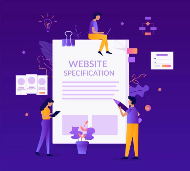
Introduction to Responsive Web Design and its Importance

In today’s world, where users access the internet from various devices, #Responsive_Web_Design is no longer a luxury option but an undeniable necessity.
From smartphones to tablets, laptops, and even smart TVs, web pages must be able to display correctly and optimally on any screen size.
This approach, known as responsive design or responsive website design, ensures that the user experience is always optimized and enjoyable, regardless of the device used.
The importance of this issue is such that search engines like Google also prioritize website rankings based on their mobile compatibility.
Therefore, if you are looking to increase your website’s traffic and improve its position in search results, addressing this issue is vital.
This educational section helps you gain a better understanding of the concept and necessity of responsive website design.
The explanatory content in this section will introduce you to basic concepts and show you why this type of design is essential for the future of the web.
Have you ever wondered how your website looks on a user’s phone? Did you know that most web traffic now comes from mobile devices? These questions further highlight the importance of this design approach.
Is your e-commerce site ready to attract maximum customers and increase sales? Rasaweb transforms your online business with modern and efficient e-commerce website design.
✅ Increased speed and improved SEO
✅ Excellent user experience on mobile and desktop⚡ Get a free consultation for e-commerce website design from Rasaweb!
Principles and Fundamentals of Responsive Design

For successful implementation of responsive website design, familiarity with three key principles is essential: Flexible Grids, Flexible Images, and Media Queries.
Flexible grids mean that your website’s layout is built using relative units like percentages, rather than fixed pixels.
This allows the content to adapt fluidly to any screen size.
Flexible images work on the same principle; images whose size changes based on the screen width to prevent them from being cropped or overly enlarged.
This specialized section emphasizes the importance of using CSS features like `max-width: 100%` for images.
But perhaps the most important pillar of responsive design is media queries.
This CSS capability allows you to apply different styles based on device characteristics such as screen width, orientation (horizontal or vertical), and even resolution.
For example, you can specify that for widths less than 768 pixels, the website menu changes to a hamburger menu.
This section is a comprehensive guide to understanding these fundamental principles and helps you grasp the core structure of a responsive website.
Understanding these fundamentals is the first step to becoming a successful responsive web designer.
Techniques for Implementing Responsive Design

Implementing responsive website design is not limited to theoretical principles; it requires knowledge of practical techniques and tools.
One of the most common approaches is the use of CSS frameworks like Bootstrap or Tailwind CSS, which provide developers with ready-made tools and responsive components.
These frameworks, with their internal grid systems and pre-defined classes, greatly facilitate the design process.
In addition to frameworks, native CSS features like Flexbox and CSS Grid also play a vital role in responsive design.
Flexbox is excellent for one-dimensional content arrangement (row or column), while CSS Grid offers incredible power in creating complex two-dimensional layouts and organizing content across different rows and columns.
This specialized section focuses on using these technologies and shows you how to combine them to create complex yet fully responsive layouts.
The use of breakpoints is another key technique that, using Media Queries, activates layout changes at different screen sizes.
Below is a table of the main features of Flexbox and CSS Grid for implementing responsive website design:
| Feature | Flexbox | CSS Grid |
|---|---|---|
| Design Dimension | One-dimensional (row or column) | Two-dimensional (rows and columns simultaneously) |
| Main Purpose | Arrangement and distribution of space between items | Overall page layout |
| Layout Complexity | Suitable for small components | Suitable for complex structures and main page layouts |
| Hierarchy | Includes parent (container) and children (items) | Includes parent (grid container) and items (grid items) |
These techniques, along with the Mobile-First approach (designing for mobile first and then scaling up), form the foundations of responsive website design.
Popular Tools and Frameworks for Responsive Design

To facilitate the responsive website design process, developers have created numerous tools and frameworks.
These tools provide pre-written code, flexible grid systems, and ready-made components, helping designers create responsive websites more quickly and efficiently.
Among the most popular of these frameworks is Bootstrap, one of the most widely used front-end frameworks in the world.
Bootstrap offers a complete set for web design with its 12-column grid system, various UI components (such as buttons, forms, navigation bars), and JavaScript plugins.
Tailwind CSS is another framework that, with its Utility-First approach, provides a set of utility classes instead of ready-made components, which designers can combine to create their desired designs.
This method offers high flexibility for customization.
This section guides you on which framework is most suitable for your needs.
In addition, frameworks like Foundation and Bulma are also powerful options for responsive design.
Choosing the right framework depends on the project, personal preferences, and the development team.
Some of these tools also offer specialized capabilities, such as previewing on different devices, which simplifies the development process.
Using these frameworks means saving time and less coding, allowing you to focus more on user experience and your website’s content.
Don’t have a corporate website yet and missing out on online opportunities? With a professional corporate website design by Rasaweb,
✅ Double your business credibility
✅ Attract new customers
⚡ Free consultation for your corporate website!
Optimizing Images and Content in Responsive Design
One of the biggest challenges in responsive website design is managing images and content so that they display well on different devices without affecting page loading speed.
Large images can significantly increase page load time and disrupt the user experience, especially on mobile devices with slower internet connections.
To solve this problem, techniques such as “Responsive Images” are essential.
This technique involves using HTML5 attributes like `srcset` and `sizes` within the `` tag, which allows the browser to select and load the best version of an image based on the device’s screen size, resolution, and pixel density.
This prevents loading images with dimensions larger than actually needed and saves the user’s bandwidth.
Also, using optimized image formats like WebP, which offer better compression while maintaining quality, is highly recommended.
Alongside images, optimizing textual content is also important.
Long paragraphs and complex sentences may be difficult to read on small screens.
Therefore, content should be concise, scannable, and organized using subheadings and lists to improve the user experience on all devices.
Lazy Loading for images and videos also helps improve performance; content is only loaded when the user scrolls to it and it becomes visible.
These are specialized solutions that help you create a responsive and fast website.
The ultimate explanatory goal in this section is to ensure that your website not only looks good but also performs optimally on all devices.
Challenges and Solutions in Responsive Website Design

Although responsive website design offers many advantages, its implementation is not without challenges.
One of the main challenges is the challenging aspect of managing complex layouts and maintaining compatibility across a wide range of devices.
Sometimes, what looks beautiful on desktop might appear unreadable or messy on mobile.
Another challenge is performance; responsive websites must be optimized for fast loading speeds, especially for mobile users who might have slower internet connections.
Unoptimized images, large CSS and JavaScript codes, and numerous HTTP requests can significantly impact speed.
The solutions include various approaches.
For layout management, the “Mobile-First” approach is very effective; by designing for the smallest screen first and then scaling up, it ensures that the core user experience is fully optimized on mobile devices.
For performance challenges, techniques such as code minification, using CDN (Content Delivery Network), lazy loading for images and videos, and optimizing fonts and images are essential.
Also, continuous testing and debugging on real devices and browser emulators help identify and resolve issues.
A precise analysis of user behavior on different devices can also help identify weaknesses and necessary improvements in responsive design.
This section shows you how to turn these challenges into opportunities for improvement and provide an exceptional user experience.
Impact of Responsive Design on SEO and User Experience

Responsive website design not only affects the appearance of your website but also plays a vital role in Search Engine Optimization (SEO) and User Experience (UX) improvement.
Google has officially stated that mobile compatibility is one of the ranking factors for websites, especially with the introduction of Mobile-First Indexing, which means Google primarily considers the mobile version of your website for indexing and ranking.
Websites with responsive design usually have one URL and one HTML code for all devices, which helps Google crawl and index content more easily and avoids duplicate content issues.
This is important news for any business looking to gain visibility in the online space.
From a user experience perspective, a responsive website allows users to easily navigate, read, and interact on different devices.
This leads to a lower Bounce Rate, longer time spent on the site, and an increased Conversion Rate.
When users have a positive experience on your website, they are more likely to return and become loyal customers.
An analysis of user data shows that a significant portion of site abandonment is due to lack of mobile compatibility.
Below is a table of the benefits of responsive website design on SEO and UX:
| Factor | Description |
|---|---|
| Improved SEO Ranking | Compatibility with Google’s Mobile-First Indexing, reduced duplicate content issues. |
| Increased Conversion Rate | Smoother user experience across all devices, encouraging users to take desired actions (purchase, registration). |
| Reduced Bounce Rate | Users stay on the website longer due to proper display. |
| Simplified Management | One website for all devices, easier management and updates. |
Therefore, responsive website design is a smart investment that helps you gain visibility in search engines and brings user satisfaction.
The Future of Website Design and the Role of Responsive Design in it
The future of the web is moving towards integrated and ubiquitous user experiences, and responsive website design is at the heart of this transformation.
With the emergence of new technologies such as Progressive Web Apps (PWA) and Accelerated Mobile Pages (AMP), the need for websites that load quickly and provide a strong mobile-centric experience has become more pronounced than ever.
PWAs shape the future of responsive design by offering capabilities similar to native applications, such as offline access and push notifications.
These technologies allow a website to be installed as an application on the user’s device, without needing app stores.
On the other hand, with advancements in Artificial Intelligence and Voice User Interfaces, websites must be able to structure their content in a way that is also optimized for these new interactions.
This means that responsive website design is not limited to resizing elements but includes optimizing content structure and accessibility for a wider range of devices and interaction methods.
This is a deep analysis of the path the web is taking.
News developments in web technologies indicate that compatibility with various devices, from smart TVs to smartwatches, will soon become a standard.
In the future, websites must be able to interact well with any screen, regardless of its size or type, and provide services to their users.
This makes responsive website design an essential and sustainable skill for every web developer.
Do you know that a weak corporate website loses you many opportunities daily? Solve this problem forever with professional corporate website design by Rasaweb!
✅ Create a powerful and trustworthy image for your brand
✅ Attract new customers strategically and increase sales
⚡ [Get free website design consultation]
Testing and Validation of Responsive Design

After implementing responsive website design, the critical stage of testing and validation arrives.
Only through thorough testing can you ensure that your website works correctly across all devices and browsers and provides an optimal user experience.
Browser tools like Chrome DevTools, with their Responsive Design Mode, allow you to view your website at various screen sizes and simulate mobile devices.
This is a practical tutorial for any web designer.
However, emulators cannot always show all the details of website behavior on real devices.
Therefore, testing on various physical devices (smartphones, tablets with different operating systems like iOS and Android) and different browsers (Chrome, Firefox, Safari, Edge) is highly recommended.
Tools like BrowserStack or CrossBrowserTesting can also be useful for testing in cloud environments and on real devices remotely.
In addition to visual testing, functional testing of the website is also essential.
Tools like Google PageSpeed Insights and Lighthouse can evaluate your website’s loading speed, image and code optimization, and provide suggestions for improvement.
This section is a comprehensive guide to ensuring the quality of your website after responsive design.
Also, attention to accessibility for users with special needs is important during the testing phase.
Conclusion and Key Tips for Successful Responsive Website Design
In conclusion, responsive website design is a fundamental cornerstone for success in today’s digital world.
This approach is not limited to the visual aesthetics of the website on different devices but plays a crucial role in attracting and retaining audiences by improving SEO and providing a seamless user experience.
By adhering to Mobile-First principles, correct use of Media Queries, Flexbox, and CSS Grid, and optimizing images and content, you can build a website that is not only responsive but also fast, efficient, and accessible.
Key tips for successful responsive website design include: always start with a “Mobile-First” approach, optimize your CSS and JavaScript code, use responsive images and lazy loading, and continuously test your website on various devices and browsers.
Also, pay attention to your content; your content should be optimized for reading on small screens.
By following these guidelines, you can ensure that your website will be resilient to future technological changes.
This process can be both engaging and challenging, but the final result will be a powerful and user-friendly website.
Responsive website design is an investment in the future of your online business.
Frequently Asked Questions
| Question | Answer |
|---|---|
| What is responsive website design? | A web design approach where the site adapts to the screen size of different devices (desktop, tablet, mobile). |
| Why is responsive design important? | To provide an optimal user experience on any device the user employs and to improve SEO. |
| What are the main responsive design techniques? | Using flexible grids, flexible images, and Media Queries. |
| What is a Media Query? | A CSS rule that allows applying different styles based on screen characteristics (such as width or height). |
| What are the benefits of responsive website design? | Increased user satisfaction, improved website ranking in search engines (SEO), reduced maintenance costs compared to having separate versions for each device. |
And other services of Rasaweb Advertising Agency in the field of advertising
The role of advertisements in increasing commercial investments in HVAC
Investigating the impact of multi-channel advertising on HVAC equipment sales
Listing HVAC vendors’ advertisements in reputable classifieds websites
Effective strategies for attracting customers through classified ads
Key tips for writing attractive ads for HVAC products
And over hundreds of other services in the field of internet advertising, advertising consultation, and organizational solutions
Internet Advertising | Advertising Strategy | Advertorials
🚀 Ready to elevate your business in the digital world? Rasaweb Afarin Digital Marketing Agency, with its expert and creative team, is always by your side to pave your path to success with innovative strategies and comprehensive services. From SEO and optimization to professional e-commerce website design, we are here to turn your digital dreams into reality.
📍 Tehran, Mirdamad Street, next to Bank Markazi, Kazeroun Jonoubi Alley, Ramin Alley, No. 6
