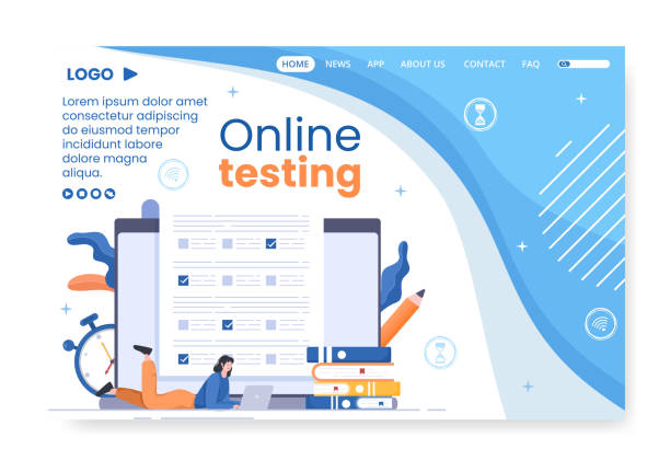
Introduction and Importance of Responsive Website Design in Today’s World

In today’s digital age, simply having a website is not enough; rather, this website must have the ability to display correctly and efficiently on all devices.
This is where the concept of #Responsive_Website_Design becomes important.
#Responsive_Design refers to a method where the layout and content of a website automatically adapt to the screen size of the user’s device (whether it’s a desktop computer, laptop, tablet, or smartphone).
The importance of this approach lies in seamless user experience and improved site performance in search engines.
Users no longer need to zoom or horizontal scroll, which significantly increases #User_Satisfaction.
Recent data indicates that a significant portion of web traffic comes from mobile devices.
Therefore, if your site is not optimized for mobile, you will practically lose a large segment of your potential audience.
#Responsive_Website_Design not only helps improve #Accessibility but also reduces the Bounce Rate and increases user time spent on the site.
These factors directly impact your site’s SEO; especially since Google announced prioritizing #Mobile_First_Indexing.
This is a crucial #Explanatory and #Educational topic that every business must pay attention to in order to make its mark in today’s competitive market.
Beyond the technical aspects, responsive website design means investing in the future of your business.
With technological advancements and the emergence of new devices, a responsive site ensures that your site will always be up-to-date and accessible.
This approach means increasing sales, attracting more customers, and strengthening your online brand.
For this reason, a deep understanding of this concept is essential for any business manager or developer.
Are you concerned about your e-commerce site’s low conversion rate and not achieving your desired sales?
Rasaweb is your specialized solution for a successful e-commerce site.
✅ Significant increase in conversion rates and sales
✅ Professional and user-friendly design to gain customer satisfaction
⚡ Ready to transform your online sales? Get a free consultation!
Key Principles and Concepts in Responsive Design

To fully understand responsive website design, we must become familiar with its key principles and concepts.
The first and most important principle is the #Flexible_Grid.
Instead of using fixed pixel units for element widths, relative units such as percentages (%) are used.
This ensures that the website layout automatically adapts to the screen size, preventing content from being compressed or excessively stretched.
This is a #Specialized and #Educational concept that forms the foundation of any responsive site.
The second principle is #Fluid_Images.
Images, like other elements, should not have fixed widths.
By setting image widths to 100% (max-width: 100%; height: auto;), it’s ensured that images never overflow their containers and scale up or down proportionally with the available space.
This approach significantly helps maintain visual quality and prevent horizontal scrolling.
The third, and perhaps most important concept, is #Media_Queries in CSS.
Media queries allow developers to apply specific CSS rules based on device characteristics such as screen width, height, orientation (portrait or landscape), and even resolution.
For example, you can write a media query that, if the screen width is less than 768 pixels (e.g., for tablets and mobiles), the navigation bar transforms into a hamburger menu or fonts become smaller.
This capability provides the main power in implementing responsive website design and allows for completely different user experiences on various devices.
This is an #Analytical section that requires a deep understanding of CSS and design logic.
Finally, the #Mobile_First concept is crucial.
Instead of designing for desktop and then attempting to adapt it for mobile, the mobile-first approach means starting the design from the smallest screen and then adding complexities for larger screens.
This method often results in a site with better performance and optimized user experience on mobile devices, as the limitations and needs of these devices are considered from the outset.
This is a key #Guideline for any responsive website design project.
Popular Tools and Frameworks for Responsive Design
To facilitate the #Responsive_Website_Design process, numerous tools and frameworks have been developed to help developers quickly and efficiently build responsive websites.
This section, as a #Specialized and #Educational guide, introduces some of these tools.
One of the most popular and widely used frameworks is #Bootstrap.
Bootstrap is a powerful HTML, CSS, and JavaScript framework that includes pre-built components for navigation, forms, buttons, and a responsive grid system.
Using Bootstrap, a fully responsive site can be created without extensive coding.
| Framework/Tool | Key Features | Main Application |
|---|---|---|
| Bootstrap | Strong grid system, UI components, JS plugins | Quickly build responsive and modern websites |
| Tailwind CSS | Utility-First framework, atomic classes | Full control over design, high customization |
| Foundation | Advanced framework, for websites and emails | Large and complex projects, high flexibility |
#Tailwind_CSS is another option that has gained significant popularity in recent years.
Unlike Bootstrap, which has pre-designed components, Tailwind is a Utility-First framework.
This means you build your website from the ground up using small, composable classes (like flex, text-center, md:w-1/2).
This method gives the developer much more control over the final appearance and results in more optimized CSS output.
This approach is very appealing to those looking for deep customization and unique design.
Foundation is also an advanced responsive framework that enables the creation of complex websites and applications.
This framework is a bit heavier than Bootstrap but offers more capabilities and is suitable for large projects.
Choosing the right tool depends on the project’s needs and the development team’s preferences.
Each of these frameworks offers its own specific advantages for effectively implementing responsive website design and can help accelerate the development process.
Challenges and Solutions for Implementing Responsive Design

Implementing #Responsive_Website_Design, despite its many advantages, can come with challenges.
Understanding these challenges and finding appropriate solutions for them is an important part of the #Analytical and #Guidance process in web design.
One of the main challenges is maintaining site performance and loading speed across different devices.
High-quality images suitable for desktop can severely slow down a site on mobile devices.
The solution to this problem is using Responsive Images, which involves techniques such as srcset and sizes in the <img> tag so that the browser can load the most appropriate image size based on the user’s device.
Another challenge is #Testing and #Debugging across a wide range of devices and browsers.
Given the countless devices with different screen sizes, ensuring the site displays correctly on all of them is difficult.
Using browser simulation tools, testing on real devices, and online testing platforms like BrowserStack or CrossBrowserTesting is essential.
This process is a vital part of quality assurance in #Responsive_Design and requires high precision.
Managing complex content and layouts can also be a challenge.
Sometimes, content that displays well on desktop needs to be rearranged or have parts hidden on mobile.
Creative design for content adaptability, such as using tabs, accordions, or only displaying essential information in mobile view, can solve this problem.
This is a #Thought_Provoking content aspect: How can we provide the best experience with the least space?
Finally, #Optimizing_JavaScript and CSS files for different devices is also important.
Large CSS and JS files can significantly slow down your site.
Techniques such as Minification, Concatenation, and Lazy Loading for images and scripts greatly help improve performance.
Implementing responsive website design goes beyond mere coding; it is a comprehensive process involving detailed planning, continuous testing, and performance optimization.
Did you know that 94% of a company’s first impression relates to its website design?
Rasaweb, by providing professional corporate website design services, helps you create the best first impression.
✅ Create a professional and trustworthy image for your brand
✅ Easier attraction of potential customers and improved online standing
⚡ Get a free corporate website design consultation!
Impact of Responsive Design on SEO and Google Ranking

One of the most important reasons businesses are moving towards #Responsive_Website_Design is its direct impact on SEO and ranking in search engines, especially Google.
This topic, as an #Important news item and a #Specialized analysis, plays a vital role in the online success of any website.
Google has clearly stated that #Responsiveness is an important ranking factor.
Since 2015 with “Mobilegeddon” and then with the introduction of “Mobile-First Indexing” in 2018, Google has explicitly shown that mobile user experience is of high importance to them.
This means that Google first examines your site’s mobile version for content indexing and ranking.
If your site is not responsive and provides a poor mobile user experience, not only will your ranking in mobile search results suffer, but you may also face a drop in ranking in desktop search results.
Responsive website design ensures that your site displays well on any device, which in turn leads to improved user behavior metrics.
Metrics such as reduced Bounce Rate, increased Time on Site, and increased number of pages visited per session are all positive signals for Google.
Also, having a responsive site means having a single URL for all versions of the site (unlike separate mobile and desktop sites).
This simplifies #SEO_Management, as there’s no need to manage multiple URLs or worry about duplicate content issues.
Inbound links (Backlinks) also point to a single URL, which gives it more SEO power.
This is an important #Analytical aspect that demonstrates the long-term benefits of #Responsive_Design in the field of SEO.
In summary, #Responsive_Website_Design is no longer an option but a necessity for achieving top rankings in search engines and attracting organic traffic.
Investing in this area is an investment in the future and online success of your business and should be considered a priority in your digital marketing strategy.
User Experience (UX) in Responsive Website Design

User Experience (UX) is the core of responsive website design.
The ultimate goal of responsive design is to provide a flawless and enjoyable experience to the user, regardless of the device they are using.
This section details the #Educational and #Specialized aspects of UX in responsive design.
The first step in improving UX is ensuring content readability and accessibility.
Fonts should be legible at various screen sizes and have sufficient contrast.
Buttons and links should be large enough to be easily tapped with a finger, especially on touch devices.
#Navigation is also a vital element in responsive UX.
The main site menu, which might have multiple items on desktop, doesn’t have enough space on mobile.
Converting it into a #Hamburger_Menu, a dropdown menu, or tabbed navigation at the bottom of the page are common solutions.
This change should be intuitive and understandable for the user so they can easily navigate the site.
Responsive website design means anticipating user needs in different scenarios and providing appropriate solutions.
Forms and interactions should also be optimized for touch devices.
Input fields should be large enough, appropriate keyboards for the input type (e.g., numeric keyboard for phone numbers) should appear, and error messages should be clear and visible.
These seemingly small details have a big impact on user satisfaction and Conversion Rate.
The #Thought_Provoking content is: How can we ensure that complex interactions are equally user-friendly at any screen size?
Finally, site #Loading_Speed, as mentioned earlier, plays a decisive role in UX.
Today’s users are impatient, and a slow-loading site is quickly abandoned.
Optimizing images, CSS, and JavaScript codes, and using a CDN (Content Delivery Network) are essential for reducing loading times.
An excellent user experience in responsive website design not only keeps users satisfied but also converts them into loyal customers and brings significant Return on Investment (ROI).
Case Study and Successful Responsive Design Examples

To better understand the effectiveness of #Responsive_Website_Design, looking at successful examples and real case studies can be very #Engaging and #Analytical.
These examples show how large and small businesses have been able to improve their user experience and achieve positive business results by correctly implementing responsive design.
One of the most famous examples is the The Boston Globe website, which was one of the first major media outlets to fully adopt responsive design.
They not only optimized their layout for various devices but also managed to reduce maintenance costs and improve loading times with a single codebase.
This was #Important news at the time.
| Website/Brand | Reason for Responsive Success | Lesson Learned |
|---|---|---|
| The Boston Globe | Pioneer in using Responsive Design for news media | Integrated user experience across different platforms |
| Airbnb | Seamless booking UX from any device | Ease of use and high accessibility |
| GitHub | Full support for complex interactions on mobile | Displaying complexities in a user-friendly manner |
Another example is Airbnb.
This accommodation booking platform, with its responsive website design, has been able to provide a seamless user experience in the process of searching and booking accommodation on both mobile and desktop.
This has greatly contributed to their increased conversion rates and customer satisfaction.
Users can easily view accommodation details, photos, and reviews on any device.
Even developer-focused platforms like GitHub benefit from responsive design.
Despite significant technical complexities, GitHub has managed to provide a version of its site that is usable even on mobile, allowing developers to manage their code.
These cases demonstrate that responsive website design is not just for simple websites but can also be applied to complex platforms with extensive interactions.
These examples serve as a practical #Guidance for any business looking to invest in this area.
The Future of Website Design and the Role of Responsiveness

The future of #Website_Design is rapidly evolving, and #Responsiveness plays a pivotal role in this journey.
This section, as a #Thought_Provoking analysis, examines how responsive website design is evolving and its role in emerging technologies.
With the advent of new devices such as smartwatches, smart TVs, and even virtual/augmented reality, the concept of responsiveness goes beyond merely adapting to screen size.
In the future, design must also be adaptable to entirely different environments and interaction methods.
One important trend is Progressive Web Apps (PWAs).
PWAs are websites that bring the capabilities of mobile applications (such as offline functionality, push notifications, and installation on the home screen).
#Responsive_Design is the foundation of PWAs, as they must be accessible and functional on any device.
This combination provides a rich and versatile experience for users, blurring the line between website and application.
Also, the use of Artificial Intelligence (AI) and Machine Learning (ML) in responsive website design is increasing.
Tools that can automatically optimize layouts based on user data and browsing behavior, or dynamically adjust content based on the user’s device, are under development.
This trend can make the design process smarter and more efficient.
#Experiential_Design is also a growing trend, focusing on creating immersive and personalized experiences for users.
This requires a flexible approach that can adapt not just to screen size but also to individual user tastes and preferences.
The future of #Responsive_Website_Design is not just about device responsiveness but also about adapting to changing user needs and expectations and new technologies.
This is an exciting #Explanatory and #News horizon for all professionals in this field.
Are your e-commerce site visitors leaving before purchasing? Don’t worry anymore! With Rasaweb’s professional e-commerce website design services, solve the problem of converting visitors into customers forever!
✅ Significantly increase conversion rates and sales
✅ Unrivaled and attractive user experience
⚡ Contact us now for a free consultation!
Professional Tips for Optimizing Responsive Website Performance

After implementing #Responsive_Website_Design, the next step is #Optimizing its performance.
If a responsive site is slow, its benefits are severely diminished.
This section provides a #Specialized and #Educational guide for improving the speed and efficiency of responsive websites.
The first tip is #Image_Optimization.
In addition to using responsive images with srcset and sizes, images should be compressed to reduce their size.
New formats like WebP can offer high quality with smaller file sizes.
Also, using the #Lazy_Loading technique for images and videos ensures that content is loaded only when the user needs it, which significantly improves the initial page load speed.
#Optimizing_CSS and #JavaScript codes is also vital.
Large CSS and JS files can literally slow down your site.
Techniques such as Minification, which involves removing whitespace, comments, and unnecessary characters from the code, and Concatenation, to reduce the number of HTTP requests, help improve speed.
Using non-blocking CSS and JS also allows the browser to render HTML faster.
#Caching is another powerful tool.
By caching static resources like images, CSS, and JS in the user’s browser, the next time the user visits the site, there’s no need to reload these files, which significantly increases speed.
Using a CDN (Content Delivery Network) is also very effective for faster content delivery to users worldwide.
CDNs store your site’s content on various geographical servers, and content is delivered from the server closest to the user.
Finally, #Continuous_Performance_Monitoring with tools like Google PageSpeed Insights and Lighthouse is crucial.
These tools identify your site’s weaknesses and provide suggestions for performance improvement.
Responsive website design is great, but a fast and optimized responsive site is what truly makes a difference and provides an unparalleled user experience.
The Importance of Testing and Experimentation in Responsive Website Design

Testing and experimentation are the cornerstones of success in #Responsive_Website_Design.
Without a robust testing process, it’s impossible to ensure that the site functions correctly across all devices and browsers.
This section, as an #Educational and #Guidance resource, discusses the importance and methods of testing in responsive design.
The first and most important reason for testing is ensuring #Cross_Browser_Compatibility and #Cross_Device_Compatibility.
Each browser and device may have subtle differences in how they interpret CSS and JavaScript, which can lead to visual or functional issues.
Methods of testing include:
- Browser Emulation: Many browsers (like Chrome DevTools) have device simulation tools that allow you to view the site at various screen sizes and on different devices.
This method is very useful for initial and quick testing, but it is not a substitute for real device testing. - Real Device Testing: This method is the most essential step.
No simulation can fully replicate the behavior of a real device.
Testing the site on multiple smartphones, tablets, and laptops with different operating systems and browsers ensures an optimal real user experience. - Cloud Testing Platforms: Tools like BrowserStack and CrossBrowserTesting allow you to test your site across hundreds of different browser and device combinations in a cloud environment, without needing to physically purchase all these devices.
Beyond functional testing, #User_Experience_Testing (UX Testing) is also important.
This includes testing the ease of navigation, content readability, and form functionality on various devices.
Even with flawless #Responsive_Website_Design, if users cannot easily interact with the site, the design will not be successful.
This section provides a practical explanation for any web developer and designer looking to provide the best experience for their users.
Continuous testing and end-user feedback are key to sustained success in this area.
Frequently Asked Questions
| Question | Answer |
|---|---|
| What is responsive website design? | It is a web design approach aimed at creating websites that can automatically adapt to the screen size and device of the user (computer, tablet, mobile) and provide the best user experience. |
| Why is responsive design important? | Its importance has increased due to the growing variety of devices people use to access the internet. This design improves user experience, increases search engine rankings (SEO), and reduces maintenance costs. |
| How is responsive design implemented? | Using CSS techniques such as Media Queries, which allow you to change styles based on device characteristics (like screen width), Fluid Grids, and Flexible Images. |
| What are the key principles of responsive design? | The three main principles are: Fluid Grids (using relative units like percentages instead of pixels for widths), Flexible Images (adapting image sizes to available space), and Media Queries (applying different styles based on screen characteristics). |
| What are the benefits of having a responsive website? | Providing a unified user experience across all devices, improved SEO, increased user time on site, reduced bounce rate, and easier site management and updates (only one codebase exists). |
And other services of Rasaweb Advertising Agency in the field of advertising
The role of ads in introducing after-sales services for accessories
How to better understand your target market with ads
Techniques for writing attractive headlines for classified ads
How ads lead to increased conversion rates
The importance of diversity in publishing accessory ads
and hundreds of other services in the field of internet advertising, advertising consultation, and organizational solutions
Internet Advertising | Advertising Strategy | Advertorial
🚀 In today’s highly competitive world, a powerful online presence is key to success. Rasaweb Afarin Digital Marketing Agency, by providing comprehensive and innovative solutions, including professional website design and targeted marketing strategies, accompanies your business on its path to growth and prominence.
📍 Tehran, Mirdamad Street, next to Bank Markazi, Kazeroun Jonoubi Alley, Ramin Alley, No. 6
