
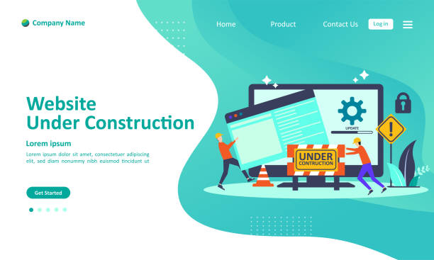
Introduction to Responsive Website Design: Its Concept and Necessity

In today’s digital world, where users access the internet through various devices such as mobile phones, tablets, laptops, and even smart TVs, #Responsive #Website #Design is no longer a luxury choice, but a vital necessity.
Responsive Web Design is an approach that ensures your website is displayed in the best possible way on any screen size.
This means providing a seamless and optimized user experience, regardless of the user’s device type.
This specialized concept goes beyond merely resizing elements; it includes flexible layouts, scalable images, and intelligent use of CSS Media Queries.
Failure to adhere to this principle can lead to losing a large segment of your audience, as a website that doesn’t display correctly on mobile will quickly be abandoned by users.
In fact, Google also considers the importance of this issue in its search result rankings.
Websites with responsive design have a higher chance of achieving better rankings in mobile searches, which in turn means increased traffic and visibility.
Therefore, implementing a professional responsive website design is a significant investment in the online success of any business or individual looking to have an effective presence on the web.
Does your company’s website create a professional and lasting first impression in the minds of potential customers? Rasaweb, with its professional corporate website design, not only reflects your brand’s credibility but also paves the way for your business growth.
✅ Create a powerful and reliable brand image
✅ Attract target customers and increase sales
⚡ Get a free consultation
The Evolution and Urgent Need for Responsive Websites in the Digital Age

The history of websites shows that the initial focus was primarily on desktop display, but with the rapid emergence and expansion of smartphones and tablets, the urgent need for a new approach to website design was felt.
Before the advent of responsive website design, developers were forced to create separate versions of websites for different devices, a process that was both time-consuming and difficult to maintain.
However, with the introduction of the responsive website concept by Ethan Marcotte in 2010, a major revolution occurred in how websites are built.
This was good news for all web designers, as it allowed for the creation of a single codebase compatible with all devices.
Today, statistics show that a large portion of web traffic originates from mobile devices.
This doubles the importance of responsive website design; because users expect a seamless and smooth experience on any device.
If a website does not load correctly on mobile or requires frequent zooming, the user will quickly abandon it and turn to a competitor who offers a better experience.
This issue not only affects the bounce rate but can also harm brand credibility and website SEO.
Therefore, it can be said that responsive website design is not just a design technique but a vital strategy for survival and success in today’s competitive online market.
Every website, from a personal blog to a large online store, urgently needs this type of design to present its content in the best way and reach more audiences.
Key Principles and Technologies Behind Responsive Website Design

Implementing a successful responsive website design requires a deep understanding of three key principles and their associated technologies.
These principles include Fluid Grids, Flexible Images, and Media Queries, which work in harmony to display content optimally across various screen sizes.
Fluid Grids: Instead of using fixed pixels, this approach uses relative units like percentages.
This means that the width of page elements is determined by a specific percentage of their parent’s width, rather than a fixed value.
This automatically adapts the page layout to the user’s screen width.
This is an explanatory and crucial approach for the foundation of any responsive design.
Flexible Images: Images can often create many layout bugs in responsive design.
To solve this problem, images must be coded to automatically adapt their size to their container.
This is usually done by using the CSS property `max-width: 100%;` for images, which ensures that the image never overflows its container and always remains within its parent’s bounds.
Media Queries: This is the most powerful tool in responsive website design.
Media Queries allow developers to apply different CSS styles based on device characteristics such as screen width, height, orientation (portrait or landscape), and even resolution.
For example, you can define rules to display the website layout differently on mobile devices with a width less than 768 pixels compared to desktops.
This allows the designer to optimize the user experience for each breakpoint.
This is an educational and vital part for every developer.
These three principles, along with other techniques like Mobile First Design, enable the creation of websites that not only look good on any device but also perform well and offer an optimal user experience.
Table 1: Key Principles and Components of Responsive Design
| Key Principle | Description | Related Technology |
|---|---|---|
| Fluid Grids | Using relative units (percentages) for element layout instead of fixed pixels. | CSS (Width in %) |
| Flexible Images | Automatic scaling of images to adapt to the display size. | CSS (max-width: 100%), srcset |
| Media Queries | Applying different CSS styles based on device characteristics (e.g., screen width). | CSS @media Rule |
Countless Benefits of Implementing Responsive Design

Investing in responsive website design is not only a technical decision for web development but also brings numerous strategic benefits for businesses and organizations.
The first and most important advantage is the significant improvement in User Experience (UX).
A website that displays correctly on any device and is easy to use keeps users satisfied and increases their likelihood of returning.
This positive user experience directly impacts the Conversion Rate, whether the goal is product sales, information gathering, or increased engagement.
Another crucial advantage is the improvement of SEO and search engine rankings.
Google has explicitly stated that it considers responsive design a significant factor in website rankings, especially for mobile searches.
Websites with responsive design have lower bounce rates, users spend more time on the site, and they experience better click-through rates, all of which are positive signals for Google’s algorithms.
Additionally, having a single URL for all devices ensures that link equity and domain authority are concentrated in one place, rather than being divided among different versions of the website.
In terms of cost and maintenance, responsive website design is far more cost-effective than developing and maintaining several separate versions of a website for different devices.
A single codebase means easier content management, faster updates, and centralized bug fixes.
This reduction in development and maintenance costs is a practical guidance for businesses.
Furthermore, this approach is also forward-thinking; as new devices with different screen sizes emerge, your website will remain compatible, eliminating the need for frequent redesigns.
This analytical aspect of costs and benefits highlights the importance of this approach.
Are you falling behind in the competition with large online stores?
Rasaweb, with its professional e-commerce website design, brings your business online and increases your market share!
✅ Boost brand credibility and customer trust
✅ Easy shopping experience leading to more sales
⚡ Contact us now for a free website design consultation!
Common Challenges and Pitfalls in Responsive Website Design

Despite numerous advantages, implementing responsive website design is not without its challenges, and developers may encounter several obstacles.
One of the main challenges is Performance Management.
Responsive websites might perform slowly on mobile devices with slow internet connections due to loading all assets designed for desktops.
This includes high-resolution images and heavy scripts that are unnecessary or too large for mobile users.
Solving this issue requires techniques such as image optimization (using next-generation formats, compression, and Lazy Loading) and proper management of CSS and JavaScript files.
Another challenge is the Complexity of Testing and Debugging.
Ensuring that a website functions correctly across hundreds of different combinations of screen sizes, browsers, and operating systems is not an easy task.
This requires a comprehensive testing strategy that includes the use of simulators, browser developer tools, and testing on real devices.
Any small change in the code can have unintended effects on the layout at a specific screen size, which is time-consuming to discover and fix.
Content and User Experience Compatibility can also be a pitfall.
Simply resizing elements does not guarantee a good user experience.
Content and user interface must be optimized for mobile interaction, such as touch-based navigation.
This is a thought-provoking content question: how to create the best balance between simplicity and functionality for each screen size.
Designing for “Mobile First” can help solve this problem, but there is still a need for careful planning on how users will view and interact with content across different screen sizes.
Finally, the challenge of browser compatibility also persists, as some new CSS features may not be supported in older browsers and may require Polyfills or alternative solutions.
These challenges indicate that responsive website design goes beyond mere coding and requires strategic thinking.
Popular Tools and Frameworks for Responsive Website Design

To facilitate the complex process of responsive website design, numerous tools and frameworks have been developed to help designers and developers create responsive websites with greater speed and efficiency.
These tools are primarily based on CSS and JavaScript and provide capabilities for creating fluid grids, adaptable UI components, and managing Media Queries.
Bootstrap: Undoubtedly, Bootstrap is one of the most popular HTML, CSS, and JS frameworks used for developing responsive and mobile-first websites.
This framework includes a collection of CSS and HTML-based design templates for typography, forms, buttons, tables, navigation, and other UI components.
Its grid system is highly flexible and allows for the creation of complex layouts with minimal effort.
Bootstrap is an excellent choice for various projects due to its excellent documentation and large user community.
CSS Flexbox and Grid: These two powerful modern CSS modules have revolutionized how elements are laid out on the web and are highly effective tools for responsive website design.
– Flexbox (Flexible Box): is ideal for one-dimensional layouts (row or column) and is very efficient for distributing space between items and aligning them within a container.
– CSS Grid Layout: is designed for two-dimensional layouts (rows and columns) and allows for the creation of more complex layouts by explicitly defining rows and columns.
These tools are native to browsers and eliminate the need for external frameworks in many cases.
Foundation: Another leading framework in responsive design is Foundation.
Like Bootstrap, this framework also offers a set of tools and UI components, but it is often preferred by developers seeking more precise control over the final output due to its more “customizable” approach and lighter weight.
Using these tools and frameworks can significantly accelerate the design and development process and allow teams to focus more efficiently on the engaging and creative aspects of the project, while ensuring adherence to the principles of responsive website design.
User Experience (UX) in Responsive Design: Special Considerations

Responsive website design is not just about resizing visual elements; it is deeply intertwined with User Experience (UX).
A truly responsive website should not only look good on various screen sizes but also be equally usable and enjoyable.
This is where specialized UX considerations come into play.
One of the most important considerations is Navigation.
Navigation menus that work well on desktops might occupy too much space or be difficult to use on mobile devices.
Common solutions include Hamburger Menus, Off-canvas Menus, or simplified navigation.
The goal is to make it easy for mobile users to access different parts of the site without excessive scrolling.
Button and Link Sizes are also of high importance.
On touch devices, buttons and clickable elements should be large enough for users to easily tap them without accidental errors.
The minimum recommended size for touch target areas is typically 48×48 pixels.
Content and Readability: The way content is displayed should be optimized for every screen size.
This includes font size, line height, and column width.
On smaller screens, it might be necessary to stack columns vertically and adjust font sizes to maintain readability without requiring zooming.
Additionally, images and videos should be responsive and load and display without issues on any device.
This aspect of guidance moves towards designing content for ubiquitous access.
Inputs and Forms: Filling out forms on mobile devices can be challenging.
Designing mobile-first forms with larger input fields, appropriate keyboards (such as a numeric keyboard for phone number fields), and clear validation improves the user experience.
Table 2: User Experience Considerations in Responsive Design
| UX Element | Considerations in Responsive Design | Common Solutions |
|---|---|---|
| Navigation | Menu complexity on small screens, limited space. | Hamburger menu, off-canvas menu, simplified navigation. |
| Touchable Elements | Small buttons/links for finger touch. | Minimum size of 48×48 pixels, sufficient padding. |
| Content Readability | Inappropriate font size, line height, and column width on different sizes. | Responsive fonts (rem/em), Fluid Typography, Media Queries. |
| Forms and Inputs | Difficulty filling forms on mobile. | Larger fields, appropriate keyboards, clear labels. |
With these considerations, responsive website design is not merely a technical exercise but an art of balancing aesthetics and functionality in any environment.
This is an engaging yet challenging aspect of web design.
Performance Optimization for Responsive Websites

As previously mentioned, website performance on mobile devices can be a major challenge in responsive website design.
Slow website loading not only disrupts the user experience but can also severely harm SEO rankings and conversion rates.
Therefore, performance optimization should be considered from the very beginning of the design and development process for a responsive website.
One of the most crucial aspects of optimization is Image Management and Optimization.
Images are often the biggest culprit for slow website loading.
To address this, the following techniques can be employed:
– Image Compression: Using compression tools to reduce file size without significant loss of quality.
– Using Next-Gen Image Formats: Formats like WebP and AVIF that offer better compression compared to JPEG and PNG.
– Responsive Images: Using HTML5 attributes like `srcset` and `sizes` in the `` tag or the `
– Lazy Loading: Loading images and videos only when they are within the user’s viewport.
This technique can significantly reduce the initial page load time.
CSS and JavaScript Optimization: Large and uncompressed CSS and JS files can harm website performance.
Techniques such as Minification (removing extra spaces and comments), Concatenation (combining files), and Deferring (postponing the loading of non-essential scripts) can help improve speed.
Also, extracting Critical CSS and inlining it in the `
Using Caching: Utilizing browser cache and server-side cache to temporarily store website resources reduces the number of requests to the server and improves loading times for repeat visits.
These are important guidelines to ensure optimal performance of a responsive website.
Attention to detail at every stage of responsive website design, especially concerning performance, is essential for delivering a flawless user experience and achieving success in the competitive web space.
Does your current website build the trust that potential customers should have in your business? If the answer is no, it’s time to get your professional and impactful corporate website with Rasaweb.
✅ Fully custom design tailored to your brand identity
✅ Increased lead generation and business credibility in the eyes of customers⚡ Contact us for a free consultation!
Testing and Debugging Responsive Websites: Tools and Methods

After implementing responsive website design, the crucial stage of testing and debugging begins.
Ensuring that your website functions correctly across all devices, browsers, and screen sizes requires a systematic approach.
This process is essential for a stable and flawless responsive website design and is a specialized and highly important aspect.
Browser Developer Tools: Almost all modern browsers (such as Chrome, Firefox, Edge) have built-in developer tools that allow you to simulate a website at various screen sizes.
These tools offer “Responsive Mode” or “Device Mode” capabilities, enabling you to adjust screen dimensions, pixel density, and even simulate touch.
This is an excellent starting point for initial tests.
Testing on Real Devices: While simulators are useful, nothing can replace testing on actual physical devices.
There are subtle differences in browser rendering, touch interactions, and hardware performance that are only visible on a real device.
It is recommended to have a collection of popular devices (several smartphone models, tablets, and desktops with various resolutions) available for testing.
Online Testing Tools: Websites like Responsive Design Checker or Google Resizer offer online tools that allow you to view your website in multiple screen sizes simultaneously.
These tools can quickly reveal visual imperfections.
Using Performance Testing Tools: Tools such as Google Lighthouse, PageSpeed Insights, and GTmetrix not only evaluate website performance but also provide recommendations for improving loading speed and user experience on mobile devices.
These tools can help identify issues related to images, CSS, and JS.
Testing Navigation and Touch Interactions: Ensure that navigation menus, forms, and other interactive elements function correctly on touch devices.
Check the size of buttons, touchable areas, and form inputs from the perspective of a mobile user.
This is a crucial analytical section.
The testing and debugging process should be continuous throughout the website’s lifecycle, especially with content updates or the addition of new features.
This precision ensures that the website with responsive website design always delivers the best performance.
The Future of Responsive Website Design and Beyond
With technological advancements and changing user habits, the field of responsive website design is also constantly evolving.
While its fundamental principles remain constant, new approaches and technologies are emerging that further enhance the user experience.
This is a thought-provoking content on what the future holds for us.
Progressive Web Apps (PWAs): PWAs combine the best features of websites and mobile applications.
They load quickly, have offline capabilities, can be added to the home screen, and even send Push Notifications.
These technologies elevate the user experience to a higher level and blur the line between web and native applications.
Implementing PWA can be the next step in the evolution of a website with responsive website design.
Adaptive Design vs. Responsive: While responsive design focuses on a fluid layout, adaptive design involves creating entirely separate, fixed versions for specific screen sizes.
Some believe that combining both approaches (sometimes called “hybrid design”) can yield better results in certain specific cases, especially for websites that require very precise control over the layout at each breakpoint.
This is a deeper analysis of the approaches.
Web Components and Microservices: As websites break down into reusable components, web development becomes more efficient.
Web Components allow for the creation of independent UI components that can be used across different projects, facilitating responsive design management on a larger scale.
AI and Machine Learning in Design: In the future, artificial intelligence may play a significant role in automatically optimizing layouts and content for different users, making the user experience even more personalized and adaptable.
Attention to Accessibility: Alongside responsiveness, accessibility for users with special needs is also becoming a major priority.
A website with responsive website design must ensure that its content and functionality are accessible to everyone, including users with disabilities.
These developments show that responsive website design is a dynamic and changing field that requires continuous learning and adaptation to stay at the forefront of technology.
Frequently Asked Questions
| Question | Answer |
|---|---|
| What is Responsive Web Design? | It is a method for website design that ensures web pages are displayed correctly and legibly on various devices and screen sizes (such as desktop, tablet, and mobile). |
| Why is Responsive Web Design important? | Improved user experience on different devices, higher search engine rankings (SEO), and savings in time and cost compared to building separate mobile or tablet versions. |
| What technologies are used in responsive design? | The main technologies include HTML for structure, CSS for styling (especially Media Queries), and the use of flexible images and grids. |
| What is a Media Query? | A Media Query is a CSS technique that allows applying different styles based on the characteristics of the device the user is using (such as screen width, orientation, and resolution). |
| What is the Mobile First concept in responsive design? | It means starting the design and development of a site first for mobile devices with small screens, and then scaling it up for larger devices (such as tablets and desktops). This method ensures a focus on user experience on smaller devices. |
And other services of Rasaweb Advertising Agency in the field of advertising
The Role of Quality Certificates in Advertorials for Cosmetic Products
How to Use Advertorials to Attract Loyal Customers
Utilizing Classified Websites with Active Forums
The Role of Comparative Content in Advertorials for Cosmetic Products
How to Configure Advertorials for Multi-Purpose Classified Websites
And more than a hundred other services in the field of internet advertising, advertising consultation, and organizational solutions
Internet Advertising | Advertising Strategy | Advertorial
🚀 Ready to propel your business into the digital world? Rasaweb Afarin Digital Marketing Agency, specializing in SEO, content marketing, and website design with a modern user interface, is with you to reach the pinnacles of success.
📍 Tehran, Mirdamad Street, next to Bank Markazi, Kazeroun Jonoubi Alley, Ramin Alley, Plaque 6


