
1. Why is Responsive Website Design Critically Important?
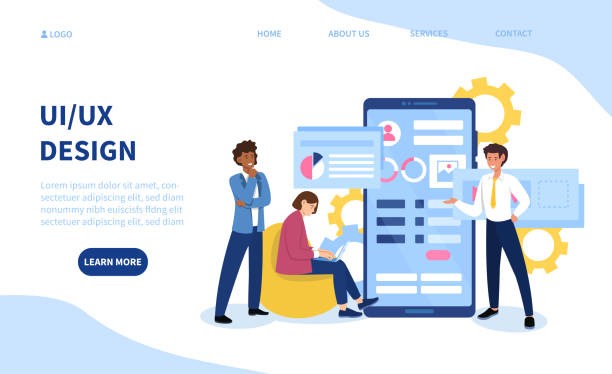
In today’s rapidly advancing world, merely having a website is not enough; your website must be compatible with all devices.
This is where the concept of #Responsive_Website_Design comes into play.
Responsive Web Design means building a website whose appearance and functionality automatically adjust to the screen size of the user’s device, whether it’s a large desktop computer, a laptop, a tablet, or a smartphone.
This is an explanatory and educational fundamental concept for anyone who wants to have a successful online presence.
Not having a responsive website can lead to the loss of potential visitors and customers, as many users browse the web through their mobile devices.
In fact, statistics show that a significant portion of web traffic currently comes from mobile.
Therefore, ensuring a seamless and optimized user experience on every device is not just a desirable feature, but a business necessity.
This approach greatly helps in #Improving_User_Experience and #Search_Engine_Optimization.
Are you worried that your company’s old website will drive away new customers? Rasaweb solves this problem with modern and efficient corporate website design.
✅ Increases your brand’s credibility.
✅ Helps attract targeted customers.
⚡ Contact Rasaweb for a free consultation!
2. What Are the Fundamental Principles of Responsive Website Design?
To deeply understand responsive website design, we must become familiar with its three basic principles: Fluid Grids, Flexible Images, and Media Queries.
These principles are the main pillars of any #specialized approach in responsive design.
Fluid grids use relative units like percentages instead of fixed pixels to define the width and height of elements.
This feature allows the page layout to dynamically change with the screen size.
Flexible images, using properties like max-width: 100%, ensure that images do not overflow their containers and their size adjusts proportionally to the available space.
Media queries are the most important part of responsive website design that allow designers to apply different CSS styles based on device characteristics such as screen width, height, orientation, and even resolution.
This is a powerful #educational tool for precise control over the website’s appearance on different devices.
This approach enables developers to provide a truly optimized and user-friendly experience and leverage the unique capabilities of each device.
3. Benefits of Responsive Website Design for Users and SEO
Responsive website design not only improves user experience but also has a significant impact on Search Engine Optimization (SEO).
From a user’s perspective, a responsive website means easy and hassle-free access to content on any device.
This helps reduce the Bounce Rate and increases the user’s time spent on the site, both of which are positive signals for search engines.
Google has also explicitly stated that it considers #Responsive_Website_Design as the preferred method for #Mobile_Compatibility and prioritizes responsive websites in its search results ranking, especially for mobile searches.
This is an important #analytical news for all webmasters and business owners.
Having a single URL for all devices also helps prevent duplicate content issues and makes managing links and sharing content easier.
Below is a table comparing the benefits of SEO and user experience.
| Feature | SEO Benefits | User Experience (UX) Benefits |
|---|---|---|
| Single URL | Prevents duplicate content, easier search engine crawling | Easier link sharing, compatibility across all devices |
| Loading Speed | Ranking factor, reduced bounce rate | Increased user satisfaction, faster access to content |
| Bounce Rate | Positive signal for search engines | Reduced user frustration, increased engagement |
| Easy Management | Single codebase for all platforms | Reduced maintenance costs, easier updates |
4. Responsive Design Approaches: Mobile-First vs. Desktop-First

In implementing responsive website design, there are two main approaches: Mobile-First and Desktop-First.
The choice between these two can significantly impact the design and development process and is a question-provoking content debate among designers and developers.
The Desktop-First approach, as its name suggests, means that designers first design the website for larger screens (desktop) and then adapt it for smaller devices using media queries.
This approach is more traditional but can lead to bulkier CSS code and, in some cases, may not optimize the mobile user experience.
In contrast, the Mobile-First approach, which has become increasingly popular, focuses on designing and developing the website first for mobile devices and then scaling it up for larger screens.
This approach, due to mobile limitations (screen size, processing power, bandwidth), forces the team to focus on essential content and core functionality, resulting in a lighter and faster user experience.
Google has also prioritized the Mobile-First approach in its indexing, which is an explicit guidance for choosing this method.
Did you know that a weak corporate website loses many opportunities for you daily? Solve this problem forever with professional corporate website design by Rasaweb!
✅ Create a powerful and reliable image for your brand
✅ Attract targeted new customers and increase sales
⚡ [Get a free website design consultation]
5. Popular Tools and Frameworks in Responsive Design

To effectively implement responsive website design, numerous tools and frameworks are available that greatly simplify the work for developers.
Understanding these tools is an important guidance and educational part.
Among the most popular frameworks is Bootstrap, a powerful CSS framework that includes a set of ready-to-use components, fluid grids, and JavaScript for responsive design.
Bootstrap is widely used and enables fast and efficient development.
Flexbox and CSS Grid are also two powerful CSS modules used for more complex and responsive layouts.
Flexbox is ideal for one-dimensional layouts (row or column), and Grid is for two-dimensional layouts (row and column).
Proper use of these tools for #Responsive_Website_Design and also #Responsive_Optimization, can make a big difference in the speed and final quality of the project.
Additionally, browser responsive testing tools also help developers test their website across various screen sizes and ensure its full compatibility.
6. Common Challenges and Solutions in Responsive Design

While responsive website design offers many benefits, its implementation can come with challenges that require #specialized and analytical approaches.
One of the biggest challenges is performance management.
Loading large images and extra CSS and JavaScript code can slow down website loading speed on mobile devices.
Solutions such as image optimization (using next-gen formats, compression), lazy loading (Lazy Loading) for off-screen content, and optimizing CSS and JS codes are essential.
Another challenge is testing complexity.
With the countless variety of devices and screen sizes, ensuring the website functions correctly on all of them is difficult.
Using responsive testing tools and manual tests on real devices is crucial.
Also, extensive content and #responsive_design for it can be problematic.
In some cases, removing or reordering content for smaller devices is necessary.
Managing ads and pop-up elements is also challenging on smaller screens and can disrupt the user experience.
This is an important #news item for developers that they should always pay attention to.
7. Impact of Responsive Website Design on Business and Marketing

Responsive website design goes beyond a technical discussion and has a direct impact on business success and marketing strategies.
This is a question-provoking content aspect of how a technical decision can change the entire course of a business.
A well-responsive website will have a higher Conversion Rate, as users can effortlessly fill out forms, browse products, and make purchases.
This is especially crucial for e-commerce businesses.
Furthermore, a positive user experience contributes to brand credibility and makes users trust your site and return to it.
From a marketing perspective, having a responsive website allows you to reach a wider audience, regardless of the device they use.
This makes digital marketing campaigns, especially content marketing and mobile advertising, more efficient.
Reduced bounce rate and improved SEO also mean greater visibility in search results and attracting more organic traffic.
Below is an analytical table of its key impacts on business and marketing.
| Area | Positive Impact | How |
|---|---|---|
| Conversion Rate | Significant increase | Seamless user experience, ease in purchase process and forms |
| Brand Credibility | Improved public image | Professionalism, attention to user needs, accessibility |
| Audience Reach | Market expansion | Compatibility with all devices and platforms |
| Digital Marketing | Increased campaign effectiveness | Optimization for mobile ads, better SEO, accessible content |
| Competitiveness | Superiority over competitors | Providing a better experience, keeping up with modern technology |
8. Future Trends in Responsive Website Design
The world of web design is constantly evolving, and responsive website design is no exception.
A look into the future shows new trends emerging that will affect how we interact with websites.
One such trend is the use of Artificial Intelligence (AI) and Machine Learning for further personalization of the user experience across different devices.
This approach can take #Responsive_Website_Design to a new level of adaptability.
For example, a website can dynamically change its content and layout based on previous user behavior or even geographical location.
Augmented Reality (AR) and Virtual Reality (VR) are also entering the web and will require new responsive approaches to display content well on these platforms.
A greater focus on performance and speed, especially in areas with lower bandwidth, will also continue.
This is a #news and entertaining section for the future of web design, showing how these technologies can transform the user experience.
With technological advancements, new tools and frameworks are also expected to be introduced to simplify the process of developing responsive websites.
Research shows that 80% of customers trust companies with professional websites more. Does your current website earn this trust?
With Rasaweb’s corporate website design services, solve the problem of customer distrust and weak online image forever!
✅ Create a professional image and increase customer trust
✅ Attract more sales leads and grow your business
⚡ Get a free consultation
9. Step-by-Step Guide to Implementing Responsive Design
To successfully implement responsive website design, following a step-by-step process is essential.
This is an #educational and guidance practical guide to help you.
First, the planning and design phase begins.
In this phase, you should choose the approach (mobile-first or desktop-first) and design mockups and wireframes for different screen sizes.
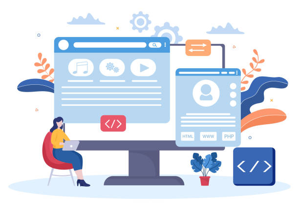
Then, it’s time for the development phase.
In this section, HTML is used for content structuring and CSS (along with Flexbox, Grid, or frameworks like Bootstrap) is used to apply responsive styles.
Correct use of media queries to define breakpoints (Breakpoints) where the layout changes, is very important.
After development, the testing and optimization phase arrives.
This phase includes testing the website on real devices and simulators, checking performance (loading speed), and fixing any bugs or inconsistencies.
Finally, after ensuring proper functionality on all devices, the website is ready for launch.
Continuous maintenance and updates are also vital to ensure the stability of #Responsive_Website_Design against browser and device changes.
10. The Future of Your Business with Responsive Website Design

Ultimately, responsive website design is more than a fleeting trend in the web world; it is a long-term investment in the future of your business.
With the continuous increase in mobile device usage for internet access, ignoring the importance of a responsive website can mean losing a huge portion of the market.
A website with proper #Responsive_Design not only significantly improves user experience and adds to your brand’s credibility, but also ensures your business’s visibility by optimizing for search engines.
This is an important explanatory and analytical aspect that every business should take seriously.
From easy access to information for potential customers to simplifying the purchase process, every aspect of user interaction with your website is affected by this decision.
In an era where online competition is fierce, ensuring your website looks great and performs well on every device is a crucial competitive advantage.
Therefore, it’s time to prioritize #Responsive_Website_Design in your digital strategy to shape a successful future for your business.
Frequently Asked Questions
| Question | Answer |
|---|---|
| What is responsive website design? | A web design method where the site adapts to the screen size of different devices (desktop, tablet, mobile). |
| Why is responsive design important? | To provide an optimal user experience on any device the user uses and to improve SEO. |
| What are the main techniques of responsive design? | Using flexible grids, flexible images, and media queries. |
| What is a Media Query? | A CSS rule that allows applying different styles based on screen characteristics (such as width or height). |
| What are the benefits of responsive website design? | Increased user satisfaction, improved site ranking in search engines (SEO), reduced maintenance costs compared to having separate versions for each device. |
And other services of Rasaweb Advertising Agency in the field of advertising
Creative ways to showcase features of hairdressing equipment in advertorials
How to make advertorials appealing to the general audience?
Using special offers to attract attention in advertorials
Important tips for evaluating the effectiveness of hairdressing equipment advertorials
How to use infographics in hairdressing advertorials?
And over hundreds of other services in the field of internet advertising, advertising consultation, and organizational solutions
Internet advertising | Advertising strategy | Advertorial
🚀 Are you looking to take your business to new heights in the digital world? Rasaweb Afarin Digital Marketing Agency helps you shine online and achieve your goals by providing comprehensive SEO-optimized website design services. With us, experience a powerful and memorable online presence.
📍 Tehran, Mirdamad Street, next to Bank Markazi, Kazerun Jonubi Alley, Ramin Alley, No. 6
