
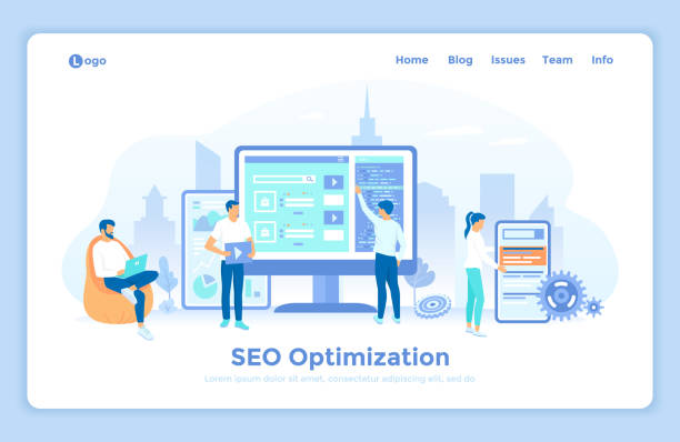
Introduction to Responsive Website Design and Its Importance
In today’s world, where various devices with diverse screen sizes, from smartphones to tablets and laptops, are used to access the internet, the importance of #Responsive_Website_Design has become more evident than ever.
Optimal #User_Experience and easy #Content access on any device are key principles for a website’s success.
Responsive Web Design is an approach that ensures your website automatically adjusts its layout and content to the user’s device screen size.
This means that regardless of what tool the user accesses your site with, the website will be displayed in the best possible way and maintain its functionality.
This descriptive and educational approach is vital for developers and business owners because it not only leads to improved user experience but also directly impacts the site’s ranking in search engines.
Today, almost half of web traffic comes from mobile devices, so ignoring responsive design means losing a large segment of potential audience.
A well-designed responsive site can help with Search Engine Optimization (SEO), as Google and other search engines give higher scores to websites that provide a better mobile experience.
Also, maintaining and updating just one version of the website optimized for all devices is far simpler and less costly than developing and maintaining multiple separate versions.
Ultimately, investing in responsive website design is an investment in the future of your online business.
Do you know that your customers’ first impression of your company is your website? With a powerful corporate site from Rasawab, multiply your business’s credibility!
✅ Custom and eye-catching design tailored to your brand
✅ Improved user experience and increased customer acquisition
⚡ Get a free consultation!
Technical Principles of Responsive Web Design

For a website to display correctly on different devices, it must follow specific technical principles.
The three main pillars of #Responsive_Web_Design include #Media_Queries, #Fluid_Grids, and #Flexible_Images.
Media Queries, which are part of CSS3, allow the browser to apply different CSS rules based on device characteristics such as screen width, orientation, and resolution.
This specialized capability forms the core of a website’s adaptability to various environments.
For example, you can define rules that on smaller screens, website columns stack instead of being side-by-side, or fonts become larger to improve readability.
Fluid grids mean using relative units like percentages (%) instead of fixed units (like pixels) to define the width and height of elements.
This causes the website layout, instead of being fixed, to continuously reshape itself with changes in screen size and adapt to the available space.
This is a key educational approach to achieving the necessary flexibility.
Flexible images also use CSS to adjust their width so that they do not exceed their parent container while maintaining their quality.
This is typically done by setting `max-width: 100%` for the `img` tag.
These technical principles, along with the use of the Viewport Meta Tag, which tells the browser how to control page dimensions, form the backbone of any responsive design project.
A deep understanding of these concepts is essential for any developer intending to build modern and efficient websites.
Benefits of Responsive Website Design for Users

Responsive Web Design is not just a technical necessity for websites; it directly impacts #User_Experience (UX) and offers significant benefits for visitors.
The first and most important advantage is seamless #Access to content.
Users can easily view and interact with all information on any device without needing to zoom, horizontal scroll, or resize the browser window.
This is especially critical for mobile users who are looking for quick guidance and easy access.
This descriptive feature helps increase user satisfaction.
| Feature | Responsive Website | Non-Responsive Website |
|---|---|---|
| Mobile User Experience | Excellent, content is optimized | Poor, requires zooming and scrolling |
| Loading Speed | Usually faster (with optimization) | May be slower (full desktop load) |
| Text Readability | Readable text and appropriate font size | Small and unreadable text on mobile |
| Navigation | Simple and accessible menus | Complex and touch-unfriendly menus |
| Bounce Rate | Lower (more satisfied users) | Higher (users get frustrated) |
Furthermore, site loading speed also improves on mobile devices due to this type of design.
Responsive websites typically load only the resources necessary for the current screen, which helps reduce loading time and data consumption.
This is an important analysis that helps users save on their internet costs.
Not requiring separate versions (like m.example.com) means users always have access to a single URL, which makes sharing and saving links easier.
In summary, a responsive site leads to greater #Customer_Satisfaction, reduced Bounce Rate, and increased user interaction with content, all of which are results of successful responsive website design.
Impact of Responsive Design on SEO and Businesses

One of the most important reasons businesses should invest in #Responsive_Design for their site is its direct impact on #Search_Engine_Optimization (SEO) and, consequently, increased online visibility.
Since 2015, Google has explicitly stated that “mobile-friendliness” is one of the ranking factors for websites in search results.
This was significant news for websites, and since then, responsive websites have gained an advantage in search result rankings, especially in mobile searches.
This translates to increased organic traffic and, ultimately, more opportunities for businesses.
In addition to SEO, responsive design significantly impacts a website’s Conversion Rate.
When users have a good experience on your site, they are more likely to take your desired action – whether it’s purchasing a product, filling out a form, or signing up for a newsletter.
A responsive site ensures that the purchasing or registration process is smooth and problem-free on any device, which is a precise analysis of user behavior.
This means more revenue and a better return on investment for businesses.
Reduced #Maintenance_Cost is another significant economic benefit.
Instead of designing and maintaining two or more versions of a website for different devices, a responsive website has only one codebase that needs updating and maintenance.
This not only saves on initial development costs but also simplifies and reduces the cost of maintenance, debugging, and content publishing processes.
Ultimately, website compatibility with various devices helps businesses keep pace with continuous changes in technology and user habits, and maintain their competitive position in the digital market.
Are you tired of your company’s website not being seen as it deserves, and losing potential customers? Solve this problem forever with professional and effective website design by Rasawab!
✅ Increase brand credibility and earn customer trust
✅ Attract targeted sales leads
⚡ Contact us now for a free consultation!
Challenges and Solutions for Implementing Responsive Website Design

Although designing and implementing a responsive website offers many advantages, it also comes with challenges that must be addressed.
One of the major questions and challenges is website #Performance management.
Responsive websites must load content and images in a way that is optimized for different devices.
This means that a high-quality image that looks great on desktop displays might not only be unnecessarily large on a smartphone but also severely increase loading time.
To overcome this challenge, it is essential to use techniques such as “Responsive Images” with the `<picture>` tag or `srcset` attribute, as well as Lazy Loading for images and videos.
Another challenge is the complexities of #User_Interface_Design (UI) for different layouts.
Designing a seamless user experience that is logical and user-friendly across all screen sizes can be difficult.
For example, a navigation menu that works well on desktop might require a “hamburger menu” on mobile.
The solution is to use a “Mobile-First” approach.
In this approach, design is first done for the smallest screen (mobile) and then gradually scaled up for larger screens.
This ensures that the core content and functionality are displayed optimally on more constrained devices and avoids unnecessary complexities.
Finally, #Testing_and_Debugging a responsive website can also be time-consuming.
The need to test across a wide range of devices and browsers complicates this process.
Using browser simulator tools and regular testing on real devices are key guidelines for overcoming these challenges.
With careful planning and the right tools, an excellent performing and unparalleled user experience responsive website can be created.
Popular Tools and Frameworks in Responsive Website Design

To facilitate and speed up the responsive website design process, developers use various tools and frameworks.
These tools provide ready-made templates and components that make building device-compatible websites much simpler.
One of the most popular and well-known frameworks is #Bootstrap.
Bootstrap is a powerful CSS, JavaScript, and HTML framework that includes a collection of design templates for typography, forms, buttons, navigation, and other user interface elements.
With its 12-column grid system, responsive layouts can be easily created.
Another popular framework is #Foundation.
Foundation is also a responsive framework that adopts a mobile-first approach, allowing developers to design websites and web applications quickly and expertly.
Foundation emphasizes flexibility and high customization, making it suitable for projects that require more tailored designs.
In addition to frameworks, #CSS libraries like Tailwind CSS have also become increasingly popular.
Tailwind is a utility-first CSS framework that, instead of pre-built components, provides low-level CSS classes so developers can build completely custom and responsive designs without having to write CSS from scratch.
This is a new educational approach that leads to greater flexibility.
Also, many Content Management Systems (CMS) like WordPress offer numerous responsive themes and plugins that greatly simplify the process of converting a website into a responsive site.
Choosing the right tool depends on project needs, team skill level, and developer preferences, but all these tools are designed to facilitate and improve the process of designing modern and efficient websites.
Best Practices and Principles of Responsive Design

To create a successful #Responsive_Design, simply using tools is not enough; one must also adhere to best practices and design principles.
One of the most important principles is the #Mobile-First approach.
Instead of designing for desktop first and then trying to shrink it for mobile, design for the smallest screen (mobile) first and then gradually expand for larger screens.
This method ensures that essential elements and core content are prioritized and that the user experience is optimized on mobile devices, which often face limitations such as smaller screens and slower internet connections.
This is a complete explanation of this method.
| Principle | Explanation | Importance |
|---|---|---|
| Mobile-First | Design for the smallest screen first. | Improved mobile UX, SEO |
| Fluid Grid | Use relative units (percentages) for element widths. | Layout flexibility for any screen size. |
| Flexible Images | Images adjust their width using CSS to fit the screen. | Maintain quality and prevent horizontal scrolling. |
| Breakpoints | Points where the site layout changes for different sizes. | Precise control over site appearance on various devices. |
| Touch Friendliness | Interactive elements are large enough for finger touch. | Increased usability for touch users. |
#Content_Prioritization is also a vital principle.
In the limited space of mobile, you must decide which parts of the content are most essential for the user and prioritize them.
Unnecessary elements can be hidden or displayed in a more condensed form.
This is a practical guide for content management.
Also, paying attention to #Whitespace and avoiding clutter helps with readability and design aesthetics.
Using readable fonts and appropriate text sizes, especially on small devices, is very important.
Finally, continuous testing on real devices and simulators is essential to ensure correct functionality and optimal user experience in any environment.
These principles help developers build websites that are not only visually appealing but also perform optimally across all devices.
Testing and Debugging in the Responsive Design Process

After implementing #Responsive_Design, the testing and debugging process is of vital importance.
A website is considered fully responsive only when it functions correctly and provides a consistent user experience across all devices and screen sizes.
This is a specialized and educational stage that should not be overlooked.
The first step in testing is to use browser’s built-in #Simulator_Tools.
Most modern browsers like Chrome, Firefox, and Edge have developer tools that allow you to view the website at different screen sizes and simulate various devices.
Chromium DevTools allows you to test different device modes, including custom sizes, PPI, and even touch simulation.
However, relying solely on simulators is not enough.
The actual user experience on a #Real_Device is always the best measure.
There are differences in rendering, speed, and touch interaction between simulators and physical devices.
Therefore, it is recommended to test the website on several real devices, including smartphones and tablets with different operating systems (Android and iOS).
These tests help identify touch-related issues, loading speed problems on mobile networks, and device-specific display issues.
Debugging in responsive web design also requires attention to detail.
Common problems include content overflowing its container, inappropriate images, and UI elements that break at specific sizes.
Using CSS debugging capabilities in browser developer tools can help quickly identify the source of these problems.
Also, Performance Testing is crucial to ensure appropriate loading speeds on mobile devices and slower networks.
Tools like Google PageSpeed Insights can help identify performance bottlenecks.
The testing and debugging process should be an iterative and continuous process throughout the website development lifecycle.
Does your current company website present a worthy image of your brand and attract new customers?
If not, transform this challenge into an opportunity with Rasawab’s professional corporate website design services.
✅ Significantly improves your brand’s credibility and image.
✅ Paves the way for attracting targeted sales leads and new customers.
⚡ Contact Rasawab now for a free and specialized consultation!
The Future of Web Design and Device Compatibility

The world of web is constantly evolving, and #Device_Compatibility will remain a central theme in the future of web design.
With the emergence of new technologies, the concept of responsive website design will also evolve.
One significant trend is the advancement in #Artificial_Intelligence (AI) and Machine Learning, which can help automate certain aspects of responsive design and optimization.
Imagine an AI system that can automatically adjust a website’s layout based on user behavior and device characteristics, or even intelligently present content for a better experience.
This is an entertaining and yet analytical idea that is becoming a reality.
The rise of #New_Platforms such as #Virtual_Reality (VR) and Augmented Reality (AR headsets), as well as Wearables, creates new challenges for web designers.
Designing for these platforms requires thinking beyond two-dimensional screens and includes three-dimensional aspects, motion-based, and voice interactions.
Although these technologies are still in their early stages, web designers must be prepared for a future where users interact with the web through smart glasses or virtual environments.
This is new information that shows the future direction of design.
Furthermore, with increasing concerns about privacy and data security, responsive websites must not only be visually and functionally optimized but also robust in terms of security.
The increasing use of Progressive Web Apps (PWAs), which combine the best features of web and native applications, also indicates the path the web is heading.
PWAs offer capabilities such as offline work, push notifications, and home screen installation, all of which contribute to improving the user experience across different devices.
The future of the web will be integrated and optimized for every type of interaction and device, and device compatibility is at the heart of this transformation.
Conclusion and the Ongoing Importance of Responsive Website Design

As discussed in this article, responsive website design is no longer a luxury option but an absolute necessity for any website that wants to succeed in today’s online space.
From improving #User_Experience on any device to increasing search engine rankings and reducing maintenance costs, the benefits of this approach are numerous.
Websites that are properly responsively designed can significantly help increase #User_Loyalty and #Conversion_Rate for businesses.
This is a descriptive summary of the topic’s importance.
The digital world is rapidly changing, and users expect websites to keep pace with their dynamic lives.
From browsing a site on the subway with a smartphone to working on a tablet at home, and accessing information via a laptop at work, the website must provide a seamless and flawless experience.
This need has made responsive website design a fundamental factor for competitiveness in the online space.
Despite technical and design challenges, modern tools and frameworks, along with best development practices, have made implementing this type of design easier than ever.
Investing in responsive website design is, in fact, an investment in the future of your business and ensures the dynamism of your website amidst technological changes.
This is a definitive guide for anyone who wants to have an effective presence in today’s digital world and be prepared for a future where devices and platforms will become increasingly diverse.
Ultimately, focusing on providing the best possible user experience, regardless of the device they use, is the key to sustainable success on the internet.
Frequently Asked Questions
| Question | Answer |
|---|---|
| What is responsive website design? | Responsive Web Design is an approach that ensures a website’s design and layout adapt to the user’s device screen size (computer, tablet, mobile, etc.), displaying optimally. |
| Why is responsive design important? | Its importance stems from the increasing use of various devices to access the internet. Responsive design improves user experience (UX), reduces bounce rate, and is beneficial for SEO. |
| What techniques are used in responsive design? | Key techniques include the use of Fluid Grids, Flexible Images, and Media Queries in CSS. |
| What do Fluid Grids mean? | Instead of fixed pixel units, relative units like percentages or ems are used to define the width and height of elements, making the layout flexible as the screen size changes. |
| What is the application of Media Queries? | Media Queries allow you to apply different CSS styles based on user device characteristics such as screen width, height, orientation (horizontal or vertical), and resolution. |
And other services of Rasa Web Advertising Agency in the field of advertising
Strategies to increase traffic and conversions in ads for pet supply sellers
The role of after-sales service in the success of commercial ads for pet supplies
How to use storytelling in commercial ads for pet supplies
Examining the difference between B2B and B2C ads in pet supplies sales
How to use analytical data to improve commercial ads for pet supplies
And over hundreds of other services in the field of internet advertising, advertising consultation, and organizational solutions
Internet Advertising | Advertising Strategy | Advertorial
🚀 Are you ready to grow your business in the digital world? Rasaweb Afarin, a leading digital marketing agency, will be your guide to success by providing comprehensive services including fast website design, SEO, and content marketing strategies. With us, have a powerful presence on the web.
📍 Tehran, Mirdamad Street, next to Central Bank, Southern Kazeroun Alley, Ramin Alley, No. 6


