
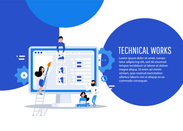
Introduction to Responsive Web Design: What Is It and Why Is It Vital?

#Responsive_Web_Design, or Responsive Web Design, is a vital approach in today’s web world, aiming to create websites that can be displayed optimally on various sizes and devices, from small mobiles to tablets and large desktops.
Instead of building separate versions for each device, this technique develops a single website that intelligently adjusts its content layout and visual elements based on the user’s screen dimensions.
In recent years, with the significant increase in mobile device usage for internet access, the importance of responsive website design has doubled.
It’s no longer possible to design a website that is only optimized for desktops; such a website will quickly lose its mobile users.
Responsive web design is not just a trend, but an essential standard for any business that wants to have an effective online presence.
This approach ensures that users have a smooth and pleasant experience, regardless of the device they use.
The content of this educational section introduces you to the basic concepts and necessity of this type of design, so you can fully understand its importance.
Are your e-commerce site visitors leaving before purchasing? Don’t worry anymore! With Rasaweb’s professional e-commerce website design services, solve the problem of converting visitors into customers forever!
✅ Significant increase in conversion rates and sales
✅ Unparalleled and attractive user experience
⚡ Contact us now for a free consultation!
The Evolution of Web Design and the Necessity of a Responsive Approach

The world of web design has undergone significant changes since its early emergence.
Initially, websites were designed solely for desktop displays, assuming that all users would access the internet via a personal computer.
But with the advent of #smartphones and #tablets, this assumption was completely transformed.
Suddenly, users began browsing the web from a wide range of devices with different screen sizes.
This is where the need for responsive website design was strongly felt.
Traditional websites were unusable on smaller devices; horizontal scrolling, constant zooming, and loss of content sections severely diminished the user experience.
This analytical section examines how we reached this point and why mobile-friendly design is inevitable.
The “Mobile-First” approach is no longer just an option; it’s a key strategy where design and development begin with the smallest screen and then gradually scale up for larger devices.
This paradigm shift not only improves the user experience but is also crucial for Search Engine Optimization (SEO), as Google prioritizes mobile-friendly websites in its rankings.
This news trend shows how the world has moved towards more flexible websites.
Fundamental Principles and Techniques of Responsive Website Design

To implement responsive website design, there are three key principles: Flexible Grids, Fluid Images, and Media Queries.
These principles allow developers to create websites that dynamically adapt their content to the screen size.
Flexible grids use relative units like percentages for element widths instead of fixed pixels, causing the website layout to automatically resize.
Fluid images, similarly, adjust their width relative to their parent container, preventing them from becoming too large and breaking the layout.
Media queries are the heart of #responsive_design.
They allow you to apply different CSS styles based on device characteristics such as screen width, height, orientation (horizontal or vertical), and even resolution.
For example, you can display a column on a desktop and hide it on mobile, or change font sizes for better readability on smaller devices.
This specialized section provides a comprehensive guide to understanding these tools.
| Principle | Description | Application |
|---|---|---|
| Flexible Grids | Use of relative units (percentage, em, rem) instead of fixed pixels. | Page layout automatically adjusts with browser resizing. |
| Fluid Images | Images use CSS to adjust their width based on the parent container. | Images display correctly on different screen sizes and prevent overflow. |
| Media Queries | Conditional CSS rules applied based on device characteristics. | Changing layout, font size, showing/hiding elements for different screen sizes. |
Popular Tools and Frameworks for Responsive Web Design

Today’s web developers have access to a set of tools and frameworks that can significantly reduce the time and effort required to build responsive websites, thereby facilitating the process of responsive website design.
Among the most popular of these frameworks are Bootstrap and Foundation.
These frameworks provide a collection of pre-built UI (user interface) components and grid systems that automatically adapt to different screen sizes.
They help you build a responsive website without needing to write extensive CSS from scratch.
In addition to complete frameworks, CSS3 techniques like #CSS_Grid and #Flexbox have also revolutionized how elements are laid out on a page.
Flexbox is incredibly powerful for one-dimensional layouts (e.g., in a row or column), and CSS Grid is great for two-dimensional layouts (like magazine pages), providing native and efficient tools for responsive design.
These tools enable the management of the most complex layouts with less and more readable code.
The choice of the right tool depends on the project’s complexity and the development team’s preferences, but mastering these techniques is essential for any web designer, and this section provides guidance for getting started.
Is your e-commerce site ready to attract maximum customers and increase sales? Rasaweb revolutionizes your online business with modern and efficient e-commerce website design.
✅ Increased speed and improved SEO
✅ Excellent user experience on mobile and desktop⚡ Get a free e-commerce website design consultation from Rasaweb!
User Experience (UX) in Responsive Websites

The ultimate goal of responsive website design is to improve User Experience (UX).
A responsive website not only displays well on various devices but also ensures that users can easily interact with the content, regardless of the device type.
This includes aspects like text readability, appropriate button and link sizes for touch (Touch Targets), easy navigation, and fast page loading.
When a website is not responsive, mobile users face problems such as unnecessary horizontal scrolling, needing to zoom to read text, or clicking on small links, which quickly leads to them abandoning the site.
Optimal user experience in a #responsive_website means providing an intuitive and efficient user interface at any screen size.
This includes paying attention to visual hierarchy, prioritizing content for smaller devices, and using images and videos optimized for mobile.
Designing a website with a responsive approach not only increases user satisfaction but also indirectly positively impacts conversion rates and customer loyalty.
This analytical section shows how an intelligent approach can provide an entertaining yet functional experience for all users.
SEO Benefits of Responsive Website Design
In today’s competitive world, presence in the top ranks of search engines like Google is vital.
One of the most important factors Google considers for ranking websites is #mobile_compatibility.
Responsive website design directly and positively impacts your website’s SEO and brings numerous benefits.
Google has explicitly stated that it prefers responsive websites due to their provision of a unified user experience across all devices.
Having a single URL for all versions of the site (instead of subdomains or m.site.com versions) makes it easier for search engine crawlers to crawl and index your website, which in turn helps improve rankings.
This explanatory approach shows why a mobile-compatible website is important.
Furthermore, lower bounce rates and longer user dwell times on the site, which result from a better user experience, send positive signals to search engines.
With responsive website design, you no longer need to manage two separate versions of content, which both simplifies SEO work and prevents duplicate content issues.
This specialized section provides you with the necessary guidance to optimize your responsive website for search engines.
Common Challenges and Solutions in Responsive Development

Despite its many advantages, implementing responsive website design can also come with challenges that need to be carefully addressed.
One of the biggest challenges is performance management.
Responsive websites must be optimized for various devices, including mobiles with slower internet connections.
Loading high-resolution images on mobile devices can lead to slow site speeds.
Solutions include using Responsive Images with `srcset` and `sizes` attributes in HTML or optimizing images before loading.
Another challenge relates to the complexity of #responsive_layouts; ensuring that all elements are correctly positioned at every screen size and maintain their interactivity.
For this purpose, thorough testing on various devices and using browser tools to simulate different screen sizes are essential.
Additionally, managing JavaScript for device-specific interactions and ensuring that scripts do not negatively impact performance is another challenge.
This thought-provoking content section seeks to provide practical solutions for these issues, so developers can proceed with responsive website design projects with greater confidence.
| Challenge | Explanation | Proposed Solutions |
|---|---|---|
| Performance Management | Slow loading speed on mobile devices and weak networks. | Image optimization (compression, next-gen formats), Lazy Loading, CSS and JS optimization. |
| Layout Complexity | Ensuring correct display of elements across all screen sizes. | Using CSS frameworks (like Bootstrap), Flexbox and CSS Grid, continuous testing in simulators and real devices. |
| Testing and Debugging | Identifying and fixing display issues on multiple devices. | Using browser developer tools, online responsive testing services, physical devices for testing. |
Future Trends in Responsive Design and Compatible Websites

The world of the web is constantly evolving, and responsive website design is no exception.
In the future, we will witness the evolution of this approach with the advent of new technologies.
One significant trend is the increased focus on #Progressive_Web_Apps (PWA).
PWAs offer an experience similar to native applications through a web browser and can work offline, send notifications, and even be installed on the mobile home screen, all of which contribute to improving the user experience on mobile devices.
Furthermore, the emergence of Virtual Reality (VR) and Augmented Reality (AR) on the web will create new challenges for responsive design.
How can we design VR/AR content to work well on various devices, from advanced headsets to mobile browsers? Artificial Intelligence (AI) will also play an increasing role in personalizing the user experience and automatically optimizing layouts for different devices.
This news and entertaining section looks at the future of responsive websites and how they will evolve with technological advancements, demonstrating how progressive web, as part of responsive website design, gains importance.
Does your current website convert visitors into customers or drive them away? Solve this problem forever with professional corporate website design by Rasaweb!
✅ Building strong credibility and branding
✅ Attracting target customers and increasing sales⚡ Get a free consultation now!
Case Studies of Successful Responsive Design Implementations

To better understand the importance and potential of responsive website design, examining successful examples of websites that have well implemented this approach is highly beneficial.
Many major global brands, including prominent news media, e-commerce platforms, and technology companies, have designed their websites responsively to ensure their users have the best experience on any device.
For example, The Guardian website is a leading example of responsive design, which not only beautifully displays its news content across various screen sizes but has also optimized the reading experience on mobile so that the user does not need to zoom or scroll excessively.
Apple also showcases its products attractively on all devices with its minimal and highly responsive design.
Retail websites like ASOS have also made the purchasing process on mobile as easy and pleasant as on desktop, by using #responsive_design.
This entertaining and analytical section, by presenting these case studies, will not only inspire web designers but also demonstrate how investing in responsive website design can contribute to business success in the digital world.
Conclusion and the Bright Future of Responsive Website Design

In conclusion, it can be stated that responsive website design is no longer a luxury option, but an undeniable necessity for any business or individual seeking an effective and successful online presence.
Given the growing trend of using mobile devices to access the internet, neglecting this approach could mean losing a large segment of audiences and business opportunities.
Responsive websites not only significantly improve User Experience (UX) but also offer numerous SEO benefits, helping your website achieve better rankings in search engines.
Investing in responsive website design is an investment in the future; a future where flexibility, accessibility, and optimal performance are considered key pillars of success for any online platform.
By adopting this explanatory and guiding approach, your website will be able to keep pace with future technological changes and user behavior, consistently providing an efficient and engaging experience for your audience.
Now is the time for businesses and developers to understand the importance of this principle and place it at the core of their web design strategies.
Frequently Asked Questions
| Question | Answer |
|---|---|
| What is responsive website design? | A web design method that automatically adjusts and optimally displays the layout and content of a site across various devices (mobile, tablet, desktop). |
| Why is responsive design important? | Due to the variety of devices users employ to access the web; better user experience, stronger SEO, and reduced bounce rate are among its benefits. |
| What are the main techniques in responsive design? | Using Media Queries in CSS, Fluid Grids, and Flexible Images. |
| What is a Media Query? | A CSS rule that allows you to apply different styles based on device characteristics (such as screen width, height, display orientation). |
| Is responsive design different from Mobile-First design? | Mobile-First is an approach within responsive design where the site is initially designed for the smallest screen (mobile) and then gradually improved for larger screens. |
And other advertising services of Rasaweb Advertising Agency in the field of advertising
Custom ad design for attracting various customers
The role of oil ads in strengthening brand trust
Reviewing methods for measuring the success of oil ads
The impact of using discounts and special offers in oil ads
Examining the trend of digital advertising changes in the oil industry
And over hundreds of other services in the field of online advertising, advertising consultation, and organizational solutions
Online Advertising | Advertising Strategy | Advertorial
🚀 Are you ready for your business to grow and shine in the digital world? Rasaweb Afarin Digital Marketing Agency paves your path to success by providing comprehensive and professional services including custom website design, Search Engine Optimization (SEO), and content marketing strategies. Build a bright future for your brand with us and take a big step towards progress.
📍 Tehran, Mirdamad Street, next to Bank Markazi, Kazeroun Jonoubi Alley, Ramin Alley No. 6
