
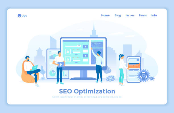
Introduction and the Necessity of Responsive Website Design

In today’s world, where #Smart_Devices are found in every home and hand, having a website that displays correctly on all screens is an undeniable necessity.
The concept of #Web_Design #Responsive or Responsive Web Design, precisely addresses this need.
This design approach enables the website to fully adapt itself with flexibility to the screen size, resolution, and orientation of the user’s device (whether desktop, laptop, tablet, or smartphone).
There are no longer separate websites for mobile; a single #Responsive_Website_Design provides a unified and optimized user experience.
Global statistics show that a large portion of internet traffic occurs via mobile devices.
This issue doubles the importance of responsive design.
A non-responsive site can quickly disappoint mobile users and increase the Bounce Rate, resulting in lost customers and a lower ranking in search engines.
Therefore, investing in responsive website design is not just an option, but a vital requirement for survival and success in today’s digital space.
Does your current website build the trust that potential customers should have in your business? If the answer is no, it’s time to have your professional and impactful corporate website with Rasav.
✅ Fully custom design tailored to your brand identity
✅ Increased lead generation and business credibility in the eyes of customers⚡ Contact us for a free consultation!
Principles and Fundamentals of Responsive Design
To achieve an #Adaptive and efficient #Web_Design, it is necessary to become familiar with its fundamental principles.
The three main pillars of #Responsive_Website_Design are: #Media_Queries, #Fluid_Grids, and #Flexible_Images.
Media Queries are considered the heart of responsive design; this CSS3 feature allows developers to apply different styles based on device characteristics such as screen width, height, orientation, and resolution.
For example, it can be specified that for widths less than 768 pixels, the column layout changes or font sizes become smaller.
Fluid Grids also mean using relative units (like percentages) instead of fixed units (like pixels) to define widths and margins.
This approach causes page elements to automatically scale with changes in screen size.
Finally, flexible images mean that images must also be able to resize to prevent them from overflowing their container.
Using `max-width: 100%;` in CSS for images is the most common solution for this issue.
Also, the `` tag in the `
Commonly Used Tools and Frameworks

In implementing a #Responsive_Website_Design, numerous tools and frameworks can help developers accelerate and simplify the process.
Among the most popular of these tools is Bootstrap, a comprehensive HTML, CSS, and JavaScript framework that provides a collection of ready-made components and a powerful grid system for building responsive websites.
Bootstrap, by defining ready-to-use classes, enables fast and standard design.
In addition to Bootstrap, frameworks like Tailwind CSS, which follows a utility-first approach and provides small utility classes for applying styles instead of pre-built components, have also gained significant popularity.
At the native CSS level, CSS Grid and Flexbox are very powerful tools that provide unprecedented control over the layout and alignment of elements in responsive website design.
Flexbox is ideal for one-dimensional layouts (a single row or column), while CSS Grid is designed for more complex two-dimensional layouts (both rows and columns).
Choosing the right tool depends on the project’s complexity, developer preferences, and specific needs of responsive website design.
Table 1: Comparison of Responsive Design Approaches
| Approach | Description | Advantages | Potential Disadvantages |
|---|---|---|---|
| Media Queries | Applying styles based on device characteristics (width, height, orientation) | Precise control over display at different breakpoints, high flexibility | Increased CSS size with design complexity |
| Fluid Grids | Using relative units (percentage, em, rem) for dimensions and spacing | Natural and scalable design, automatic space filling | Requires high precision in calculations, less control over exact pixel details |
| Flexible Images | Adjusting image sizes proportionate to the parent container | Prevents horizontal scrolling, improves user experience | Lower image quality on high-resolution devices if not optimized |
| Mobile-First Approach | Starting design from the smallest screen and then expanding to larger ones | Better performance on mobile, forcing content prioritization | Requires a mindset shift in the design and development process |
Challenges and Solutions of Responsive Design

Despite all the advantages of #Responsive_Website_Design, its implementation is not without #Challenge.
One of the biggest concerns is #Site_Performance on mobile devices.
Websites designed for desktop may contain high-resolution images, heavy scripts, and multiple fonts, which will be slower and time-consuming to load on mobile networks.
The solution to this issue includes image optimization (using new formats like WebP or the srcset attribute), lazy loading for images and videos, and compressing CSS and JavaScript files.
Another #Challenge is maintaining a consistent and high-quality #User_Experience across all devices.
A layout that looks good on desktop might become unreadable or unusable on mobile.
This is where the need for strategic thinking about Breakpoints and designing for content instead of devices arises.
#Testability of the website across a wide range of devices and browsers is also an important challenge.
Using browser emulators and testing on real devices is essential.
Also, managing navigation on mobile, optimizing forms for touch input, and ensuring content accessibility for all users are other aspects that must be addressed in a successful #Responsive_Web_Design.
Is your e-commerce site ready to attract maximum customers and increase sales? Rasav transforms your online business by designing modern and efficient e-commerce websites.
✅ Increased speed and improved SEO
✅ Excellent user experience on mobile and desktop⚡ Get a free e-commerce website design consultation from Rasav!
User Experience (UX) and Responsive Design

#Responsive_Website_Design is not merely about resizing website elements; rather, it is deeply intertwined with #User_Experience (UX) and how users interact with content on different devices.
The #Mobile_First approach is particularly important in this regard.
This approach means starting the design process from the smallest screen (usually mobile) and then expanding it towards larger screens (tablet and desktop).
With this method, developers are forced to focus on core content and functionality and avoid adding unnecessary elements that could cause problems on smaller devices.
In mobile design, site navigation should be simple and accessible; using patterns like hamburger menus or tab bars is common.
Also, font and button sizes should be appropriate for finger touch, and text readability should be maintained on small screens.
#Breakpoints must be carefully determined so that content is displayed in the best possible way at every screen size, and no part of it is cut off or appears jumbled.
Ultimately, a successful #Responsive_Website_Design is not only visually appealing but also provides a smooth and intuitive user experience on any device, leading to increased user satisfaction and higher conversion rates.
Optimizing Performance of Responsive Websites

Website performance, especially for #Mobile_Sites and #Responsive_Website_Design, is one of the critical factors in #Search_Engines ranking and user satisfaction.
Today’s users expect websites to load quickly, especially on mobile networks which may have slower speeds.
#Image_Optimization is one of the most important steps; using next-gen formats like WebP, compressing images without noticeable quality loss, and serving images with appropriate dimensions for each device (using `srcset` and `
#Lazy_Loading also means loading images and videos only when they enter the user’s viewport, which significantly helps reduce initial page load time.
In addition to images, Minification of CSS and JavaScript files, removing unnecessary code, and optimizing CSS delivery (such as using critical CSS for initial render) are other important measures.
Using browser and server caching, as well as using a CDN (Content Delivery Network) to deliver content from the closest server to the user, significantly increases loading speed.
All these measures together help build a fast and efficient #Responsive_Website that provides an excellent user experience on any device.
Case Study of Successful Websites and Statistics
To better understand the importance and impact of #Responsive_Website_Design, looking at successful examples and global statistics can be very illuminating.
Many technology giants and large news websites, including Google, BBC, and major e-commerce sites like Amazon and Digikala, utilize responsive design to provide a unified user experience across all devices.
These sites are not only visually appealing at any size but are also optimized for performance and accessibility.
Recent statistics show that over 60% of global web traffic occurs via mobile devices, and this share is increasing.
In some countries, this figure even reaches 80%.
These statistics clearly show that if your website is not optimized for mobile, you will lose a huge portion of your audience.
Search engines like Google have also shifted their prioritization towards Mobile-First Indexing, meaning they use the mobile version of your website as a criterion for ranking in search results.
These developments have turned the #Importance_of_Responsive_Website_Design into a vital factor for #Online_Success, not just an extra feature.
Successful sites using this design have managed to increase customer loyalty and improve their conversion rates.
Table 2: Global Mobile Internet Usage Statistics (Estimated)
| Year | Percentage of Web Traffic from Mobile | Number of Mobile Internet Users (Billions) |
|---|---|---|
| 2015 | ~30% | ~3.6 |
| 2018 | ~50% | ~4.5 |
| 2021 | ~55% | ~5.2 |
| 2024 (Estimated) | ~60%+ | ~6+ |
* These statistics are estimated and may vary based on different sources.
The overall trend of mobile internet access growth is stable.
The Future of Web Design and the Role of Responsiveness

With the rapid advancement of technology, the #Future_of_Web_Design is also transforming.
However, amidst this, the role of #Responsive_Website_Design as a fundamental principle remains steadfast.
The emergence of new devices such as foldable phones, smartwatches, and even car displays further emphasizes the importance of design adaptability.
The main challenge in the future will be designing for the unknown; devices with screen dimensions and characteristics that are not yet widely used.
Progressive Web Apps (PWAs), which offer a combination of the best features of the web and native applications, are an example of this future that require a fully responsive design.
Additionally, the increased use of #Artificial_Intelligence in web design and development can help automate parts of the responsiveness process, but its core, which is understanding user experience and adaptability to different environments, will remain the task of designers.
Therefore, continuous education and updating in the field of responsive website design is essential for every web developer and designer to remain a leader in this competitive space.
Are you worried about your e-commerce site’s low conversion rate and not achieving your desired sales?
Rasav is your specialized solution for having a successful e-commerce website.
✅ Significant increase in conversion rates and sales
✅ Professional and user-friendly design to attract customer satisfaction
⚡ Ready for a transformation in online sales? Get a free consultation!
Important Tips for Implementing a Successful Responsive Website Design

To ensure the successful implementation of a #Responsive_Website_Design, several key tips are essential.
First, thorough #Planning before starting coding.
This includes defining main #Breakpoints and designing Mockups for various screen sizes.
Prioritize the Mobile-First approach to focus on user experience on smaller devices from the outset.
Second, #Image_Optimization and media.
Images and videos can be the main cause of slow site performance on mobile.
Using `srcset`, `
Third, #Continuous_Testing.
Test your website not only in browser emulators but also on various physical devices (mobile, tablet, desktop) with different sizes and resolutions to ensure its correct functionality in all cases.
Fourth, pay attention to Accessibility.
Ensure that your site is usable on all devices for people with disabilities as well.
Fifth, consider #Simplicity.
Complex layouts and extra elements can confuse users on small screens.
A good #Adaptive_Web_Design prioritizes simplicity and efficiency to provide a smooth and intuitive user experience.
Conclusion and the Importance of Longevity on the Web
In conclusion, it can be said that #Responsive_Website_Design is no longer a luxury option, but rather an industry standard and a fundamental necessity for any business that wants to have an effective and lasting online presence.
This approach not only improves user experience and increases customer satisfaction but also plays a significant role in #Search_Engine_Optimization (SEO) and boosting website rankings.
Given the increasing use of mobile devices for internet access, having a #Responsive_Web_Design that flawlessly displays your content on any screen and device is no longer negligible.
Investing in responsive website design means investing in the future of your business.
It enables you to reach a wider audience, increase your conversion rates, and be flexible against future technological changes.
In the dynamic world of the web, adaptability is the key to success and survival, and responsive website design precisely brings this adaptability.
Frequently Asked Questions
| Question | Answer |
|---|---|
| What is Responsive Web Design? | It is a method for designing and implementing websites that ensures the layout and content of the page automatically adjust and display optimally based on the user’s device screen size (desktop, tablet, mobile, etc.). |
| Why is responsive design important? | With the increasing use of various devices to access the web, site responsiveness improves user experience, reduces bounce rate, strengthens site SEO, and makes site management and maintenance easier (instead of having separate versions for mobile and desktop). |
| How does responsive design work? | This type of design uses techniques such as flexible grids and layouts (Flexbox, CSS Grid), flexible images and media, and most importantly, CSS Media Queries to change the page’s styles and layout based on screen characteristics (width, height, resolution, etc.). |
| What are the main tools for implementing responsive design? | The main tools include HTML5 (for content structure), CSS3 (especially Media Queries, Flexbox, Grid for responsive styling and layout), and sometimes JavaScript for more complex interactions. |
| What are the main advantages of using responsive design? | The main advantages include increased user accessibility (covering a wide range of devices), improved user experience, better site ranking in search engines (especially Google), reduced development and maintenance costs, and increased visitor-to-customer conversion rates. |
And other services of Rasa Web advertising agency in the field of advertising
How to design advertorials for international audiences?
Using customer reviews in home appliance advertorials
How to highlight the brand logo in home appliance advertorials?
Important tips for scheduling advertorial publication on classifieds websites
How to use video in home appliance advertorials?
And over hundreds of other services in the field of internet advertising, advertising consultation, and organizational solutions
Internet Advertising | Advertising Strategy | Advertorial
🚀 For significant growth of your business in the digital world, Rasav Afarin offers you comprehensive digital marketing solutions. With our professional services, from WordPress website design to SEO and social media management, experience a powerful and impactful presence.
📍 Tehran, Mirdamad Street, next to the Central Bank, South Kazeroon Alley, Ramin Alley No. 6
