
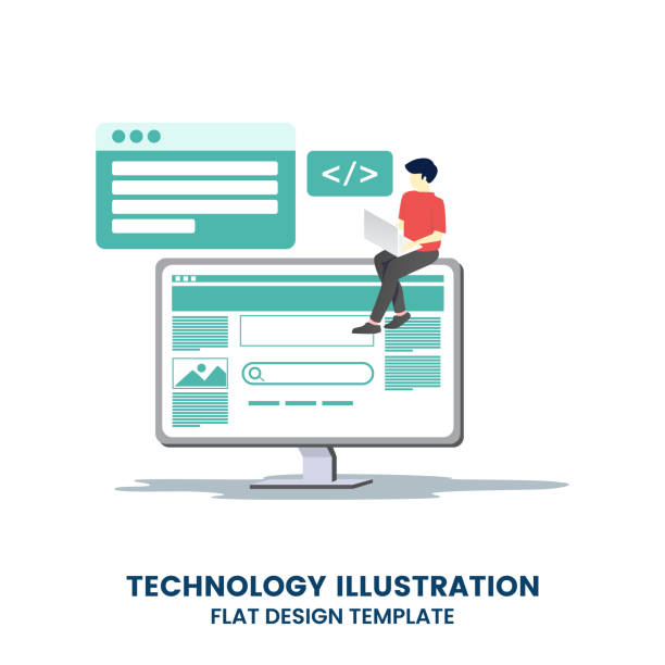
Introduction to Responsive Website Design and its Importance

In today’s world, where users access the web from diverse devices such as #smartphones, tablets, and desktops, having a website that displays correctly on all these devices is of vital importance.
This is where the concept of #Responsive_Web_Design comes into play.
Responsive website design refers to an approach that enables websites to adjust their layout and appearance based on the screen size and orientation of the user’s device.
This capability not only significantly improves #User_Experience (UX) but also offers considerable advantages from a Search Engine Optimization (SEO) perspective.
Google and other search engines prefer responsive websites over those that offer a poor user experience on mobile devices.
The main goal of responsive design is to provide a seamless and optimized user experience for all visitors, regardless of the device they use.
This approach eliminates the need to maintain multiple separate versions of a website (e.g., one for desktop and one for mobile) and drastically reduces maintenance and development costs.
In an era where mobile internet usage is on the rise, investing in responsive website design is a business necessity, not merely an option.
Are you tired of losing business opportunities due to not having a professional corporate website?
Rasaweb helps you by designing a professional corporate website:
✅ Build a powerful and reliable image for your brand
✅ Convert website visitors into loyal customers
⚡ Get a free consultation now!
Principles and Fundamentals of Responsive Design

Responsive website design is built upon three fundamental principles, each playing a crucial role in creating a consistent web experience: Media Queries, Fluid Grids, and Flexible Images.
Media Queries are the core of this approach.
They allow developers to apply different CSS rules based on device characteristics, such as screen width, height, orientation, and resolution.
This means a website can change its layout; for instance, it might have three columns on a large screen and transform into a single column on a small screen.
Fluid Grids use relative units like percentages (٪) instead of fixed pixel (px) units.
This approach ensures that page elements dynamically adjust themselves to the screen size, rather than remaining fixed at a specific size.
For example, if a column occupies 10% of the total page width, it will always maintain 10% of that width, regardless of how large or small the screen is.
Flexible Images work similarly.
By setting CSS properties like `max-width: 100%` for images, they ensure that images never overflow their parent container and are always displayed in appropriate dimensions.
These three principles together form the framework of a responsive website design, allowing the website to deliver the best appearance and performance on any device.
A deep understanding of these fundamentals is essential for anyone planning to implement a modern and user-friendly website.
Tools and Frameworks Aiding Responsive Design

Implementing responsive website design from scratch can be time-consuming and complex, which is why developers use various tools and frameworks to accelerate and simplify this process.
One of the most popular and well-known frameworks is Bootstrap.
Bootstrap is a powerful HTML, CSS, and JavaScript framework that provides a collection of ready-to-use components and a responsive grid system.
By using Bootstrap, developers can quickly build responsive websites without needing to write all the CSS from scratch.
| Framework | Key Features | Strengths | Weaknesses |
|---|---|---|---|
| Bootstrap | 12-column grid, ready-made UI components, JS plugins | Large community, comprehensive documentation, quick start | Relatively large file size, repetitive appearance (without customization) |
| Tailwind CSS | Utility-first CSS framework, highly customizable | Creation of unique designs, low final CSS size | Requires writing many classes in HTML, initial learning curve |
| Foundation | Advanced framework, mobile-first, high accessibility | Suitable for large projects, focus on UX and Accessibility | Smaller community than Bootstrap, more complexity |
Tailwind CSS is another option with a different approach.
Instead of ready-made components, this framework provides a set of utility classes that developers can combine directly in their HTML to build custom UIs.
This approach gives designers more freedom to create unique designs.
In addition to frameworks, tools like Chrome DevTools are also very useful for testing and debugging responsive website design.
These tools allow you to simulate your website on various screen sizes and identify and resolve layout issues.
Choosing the right tool depends on the project’s needs and the developer’s preference, but all of them ultimately contribute to creating an excellent web experience on any device.
Challenges and Solutions for Implementing Responsive Design

Although responsive website design offers numerous benefits, its implementation is not without challenges.
One of the biggest challenges is managing website performance.
When a website needs to function across a wide range of devices with varying processing capabilities and internet connections, ensuring optimal loading speed becomes particularly important.
High-quality images suitable for desktops can be heavy and slow on mobile devices.
The solution to this challenge is to use Responsive Images with HTML5 features like <picture> and the srcset attribute, which allow the browser to load the appropriate image based on screen size and resolution.
Another challenge is managing complex content and layouts.
Designing a layout that looks good on both wide and narrow screens can be difficult.
It might be necessary to hide some elements or change their order on smaller sizes.
For this purpose, the Mobile-First approach is recommended, meaning the design is first done for small devices and then gradually expanded for larger screens.
This approach helps prevent clutter and content overload in mobile versions.
Additionally, browser compatibility and testing on real devices are also significant challenges.
Each browser may exhibit different behaviors in rendering responsive website design.
Therefore, thorough testing across different browsers and devices is essential.
With careful planning, the use of appropriate tools, and adherence to best practices, these challenges can be overcome to create an efficient and responsive website.
Did you know that a weak corporate website costs you many opportunities daily? Solve this problem forever with professional corporate website design by Rasaweb!
✅ Create a powerful and reliable image for your brand
✅ Attract targeted new customers and increase sales
⚡ [Get a free website design consultation]
The Impact of Responsive Design on User Experience (UX)

Responsive website design plays a pivotal role in improving user experience (UX), and this is one of the main reasons for its popularity and necessity.
When a user encounters a website that does not display correctly on their device – for example, requiring constant zooming to read text or endless horizontal scrolling – the user experience is severely harmed.
This leads to an increased bounce rate and decreased user engagement.
In contrast, a responsive website design ensures that the website’s content and interactive elements are always easily accessible and readable, regardless of screen size.
This adaptability contributes to increased user satisfaction, improved usability, and ultimately, a higher conversion rate.
Users tend to stay and interact with websites that are easy and enjoyable to use.
With a responsive website, users can easily make purchases, find necessary information, or fill out forms via their mobile devices, without encountering navigation issues or inappropriate layouts.
Furthermore, responsive website design helps maintain visual identity and brand consistency across all platforms.
Instead of having separate versions that might have different looks and feels, a single, flexible design preserves brand cohesion.
This consistency helps users easily recognize and trust your website on any device.
Ultimately, focusing on UX through responsive design is an investment in customer loyalty and the long-term success of your business.
SEO Optimization with Responsive Website Design
In today’s digital world, Search Engine Optimization (SEO) plays a vital role in your website’s visibility.
Responsive website design not only improves user experience but also directly impacts your website’s ranking in search results.
Google, as the largest search engine, has officially announced its preference for responsive websites over separate mobile and desktop versions.
The reason for this is Google’s “Mobile-First Indexing” approach, meaning Google primarily considers your website’s mobile version for indexing and ranking.
A website with responsive website design uses only one URL, which helps Google crawl and index your content more easily.
This prevents the issue of duplicate content, which can arise if separate mobile and desktop versions exist.
Furthermore, lower bounce rates and longer user engagement times on responsive websites (which result from a better user experience) send positive signals to search engines.
Given the increasing number of mobile searches, having a mobile-friendly website is no longer an option but a necessity for maintaining and improving SEO rankings.
Websites with a poor mobile experience may face a drop in search results, especially for searches conducted on mobile devices.
Therefore, investing in responsive website design means investing in the future of SEO and your business’s online visibility.
This approach not only reduces the burden of website management but also directly impacts your organic traffic and online success.
The Future of Responsive Website Design and New Trends

Responsive website design is a proven approach, but the web world is constantly evolving, and new trends are emerging that will shape the future of this field.
One such trend is “Adaptive Design,” which is sometimes confused with responsive design.
While responsive design allows a single layout to fluidly adapt to different screen sizes, adaptive design provides a set of fixed layouts for specific screen sizes.
The future will likely see a combination of these two approaches, where websites use the flexibility of responsive design for details and the adaptive structure for key breakpoints.
| Feature | Responsive Design | Adaptive Design |
|---|---|---|
| Number of layouts | A single, fluid layout | Multiple fixed layouts for specific breakpoints |
| Basis of reaction | Fluid changes based on screen size | Predefined layout presentation based on device |
| Implementation complexity | Medium to high (managing fluid layout) | High (designing and maintaining multiple layouts) |
| Performance | May require precise optimization | Usually faster (loading only necessary content) |
Other trends include the increasing use of Progressive Web Apps (PWAs), which offer a mobile app experience through the browser and can also work offline.
These approaches do not diminish the need for responsive website design; rather, they strengthen it, as PWAs also require flexible design to provide the best experience on any device.
Furthermore, Google’s focus on Core Web Vitals has doubled the importance of optimizing speed and interactivity in responsive design.
With the emergence of new devices like smartwatches and foldable screens, the need for responsive website design will only increase, and this field will continue to evolve to meet the needs of users in the future.
Review of Successful Responsive Website Design Examples
To better understand the concept and impact of responsive website design, examining successful examples can be very inspiring.
These websites demonstrate how to provide an unparalleled user experience across all devices by correctly implementing responsive principles.
For instance, many large news websites and e-commerce platforms are prime examples of responsive website design.
A successful news website with responsive website design might have multiple columns for articles, videos, and advertisements on a desktop screen.
However, the same website on a smartphone automatically transforms into a single-column layout, where titles are larger, images are optimized, and navigation buttons are larger for easier finger access.
The text is adjusted so that no zooming is required, making it easy to read.
E-commerce websites are another prominent example.
In a responsive online store, product lists and filters might appear side-by-side on desktop, while on mobile, filters convert into a dropdown menu and products are displayed in a grid format optimized for touch navigation.
The checkout process is also designed to be simpler and more optimized for smaller devices.
The common feature of all these successful examples is their user-centric approach.
They show how responsive website design helps businesses connect with their audience anytime, anywhere, and deliver their services or content in the best possible way.
These examples inspire designers and developers to build websites that are not only beautiful but also highly functional and inclusive.
Are you tired of your company’s website not being seen as it deserves, and losing potential customers? Solve this problem forever with professional and effective website design by Rasaweb!
✅ Increase brand credibility and gain customer trust
✅ Attract targeted sales leads
⚡ Contact us now for a free consultation!
Key Tips for Testing and Debugging Responsive Design
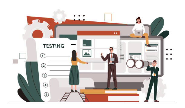
After implementing responsive website design, the testing and debugging phase is of particular importance.
Without thorough testing, it’s impossible to ensure that your website functions correctly across all devices and browsers and provides an optimal user experience.
One of the first and most commonly used tools for testing is browser developer tools, such as Chrome DevTools or Firefox Developer Tools.
These tools allow you to simulate your website on various screen sizes, inspect media queries, and identify layout or rendering issues.
However, simulation is only part of the job.
For complete assurance, you must also test your website on real devices.
This includes testing on various smartphones (Android and iOS), tablets, and different desktop sizes.
Touch behavior, animations, and HTML and CSS interactions may not be accurately displayed in simulators.
Using online responsive testing services can also be beneficial.
These services display your website on multiple screen sizes simultaneously and can provide a good overview of its responsiveness.
Furthermore, optimizing Page Load Speed across all devices is crucial.
Tools like Google PageSpeed Insights can help identify performance bottlenecks and provide solutions for speed improvement.
Remember that responsive website design is an ongoing process.
Given the emergence of new devices and browser updates, regular testing and maintenance of your website are essential to always ensure an excellent user experience.
Cost and Return on Investment of Responsive Website Design

Investing in responsive website design might initially seem costly, but with a careful analysis of the Return on Investment (ROI), you will realize that it is a smart and strategic decision for any business.
In the past, many companies had to maintain two or more separate websites (one for desktop and another for mobile).
This approach meant double development costs, more complex maintenance, and greater effort to keep content and SEO consistent across different platforms.
With responsive website design, you have only one website that performs optimally on all devices.
This means that initial development costs might be slightly higher, but maintenance, updates, and content management costs are significantly reduced.
Instead of managing multiple codebases, you will deal with only one version.
This frees up your time and resources to focus on improving content quality and user experience.
From a marketing perspective, responsive website design contributes to improved SEO (as mentioned earlier), increased traffic from mobile devices, and consequently, increased sales and conversion opportunities.
A higher conversion rate means more revenue for your business.
Ultimately, having a website that works well on any device enhances your brand’s credibility and introduces you as a modern and customer-oriented business.
These factors lead to sustainable growth and greater profitability in the long run, proving that investing in responsive design is not just an expense, but a profitable investment.
Frequently Asked Questions
| Question | Answer |
|---|---|
| What is responsive website design? | A method in web design that automatically adjusts and optimizes the layout and content of a website to display correctly on different devices (mobile, tablet, desktop). |
| Why is responsive design important? | Due to the variety of devices users employ to access the web; it offers a better user experience, stronger SEO, and reduced bounce rate. |
| What are the main techniques in responsive design? | Using CSS Media Queries, Fluid Grids, and Flexible Images. |
| What is a Media Query? | A CSS rule that allows you to apply different styles based on device characteristics (such as screen width, height, display orientation). |
| Is responsive design different from Mobile-First website design? | Mobile-First is an approach within responsive design where the website is initially designed for the smallest screen (mobile) and then gradually improved for larger screens. |
And other advertising services of Rasaweb Advertising Agency:
- Smart Custom Software: Designed for businesses seeking user engagement through attractive UI design.
- Smart SEO: A creative platform for improving online growth with intelligent data analysis.
- Smart Reportage: A novel service for enhancing digital branding through exclusive programming.
- Smart Website Development: An effective tool for user interaction by customizing user experience.
- Smart UI/UX: A combination of creativity and technology to increase website traffic through Google Ads management.
And over hundreds of other services in internet advertising, advertising consultation, and organizational solutions
Internet Advertising | Advertising Strategy | Advertorials
Sources
What is Responsive Website Design?What is Responsive Website Design?Responsive Website Design on VirgoolWhat is Responsive Design?
? Ready to transform your business in the digital world? Rasaweb Afarin Digital Marketing Agency paves your way to success by offering comprehensive services including custom website design, SEO, and online advertising.
📍 Tehran, Mirdamad Street, next to Bank Markazi, Southern Kazeroon Alley, Ramin Alley, No. 6

