
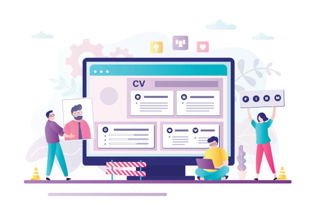
Introduction to Responsive Website Design and its Importance in the Digital Age

In today’s world, where mobile technology has permeated every aspect of our lives, having a website that displays well on every device is not just an advantage, but a necessity.
This is where the concept of #Responsive_Website_Design or #Responsive_Design comes into play.
Responsive website design means creating a website whose appearance and functionality automatically adjust to the screen size of the user’s device, whether that device is a large desktop computer, a laptop, a tablet, or a smartphone.
This approach means saying goodbye to the need for creating separate versions for mobile and desktop.
The importance of responsive website design lies in the fact that users today use multiple devices to access the internet and expect a seamless and optimized user experience.
If your website does not display correctly, users will quickly leave it and move to your competitors.
This issue not only harms #User_Experience but also negatively affects your #SEO and website ranking in search engines.
Google and other search engines prioritize websites that are optimized for mobile, which means responsive website design directly impacts your visibility in the online space. We will delve deeper into this topic and explore its various aspects below.
Did you know that 85% of customers check your company’s website before any interaction?
With Rasavweb, build a corporate website worthy of your reputation.
✅ Increase credibility and customer trust
✅ Attract high-quality leads
⚡ Get a free website design consultation
Principles and Fundamentals of Responsive Design: Understanding Beyond Screen Dimensions

To understand how responsive website design works, it is necessary to become familiar with its three main pillars: Fluid Grids, Flexible Images, and Media Queries.
Fluid grids use relative units such as percentages for element widths instead of fixed pixel units.
This allows the website layout to change fluidly and smoothly as the screen size changes.
For example, if a column occupies 20% of the page width, on a smaller screen, that 20% will be proportionally smaller relative to the overall page width.
Flexible images operate in the same way; meaning that image sizes adjust with changes in display dimensions to prevent them from overflowing or becoming pixelated.
This is typically achieved by setting the `max-width: 100%` property for images in CSS.
However, the key element that brings these two concepts together is Media Queries.
This CSS3 capability allows developers to apply different styles based on device characteristics such as screen width, height, orientation (horizontal or vertical), and even resolution.
For example, you can define that if the screen width is less than 768 pixels, the navigation menu should be displayed vertically instead of horizontally, or fonts should be smaller.
Intelligent use of these principles forms the core of any successful responsive website design. This approach not only improves the visual experience but also increases site speed by optimizing element loading based on device needs, which is crucial for users and search engines.
These fundamentals are a solid foundation for any modern responsive design.
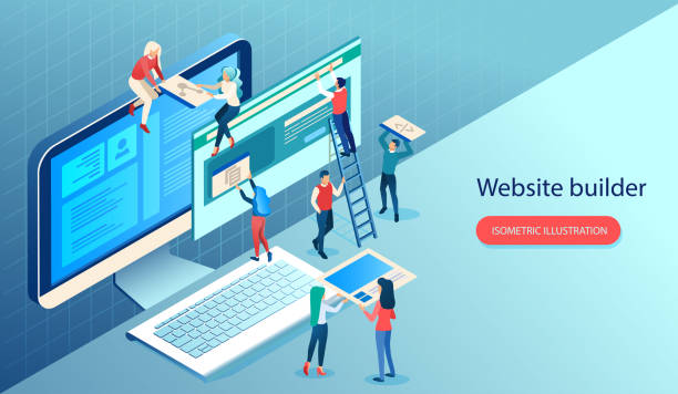
Popular Tools and Frameworks for Building Responsive Websites
Implementing responsive website design can be significantly eased by using various tools and frameworks.
These tools provide a collection of CSS, JavaScript, and HTML codes that accelerate the development process and help developers build high-performance responsive websites.
Among the most popular frameworks is Bootstrap, one of the most widely used front-end frameworks.
Bootstrap includes a set of ready-to-use components such as a grid system, typography, forms, buttons, and navigation elements, all designed responsively.
This framework is very suitable for speeding up development, especially for projects that need quick deployment.
Another framework worth mentioning is Foundation, which is similar to Bootstrap in terms of capabilities but is considered more flexible by some developers.
In addition to these frameworks, native CSS techniques like CSS Grid and Flexbox have also revolutionized responsive web layout. Flexbox is excellent for one-dimensional layouts (row or column), while CSS Grid has incredible power for two-dimensional layouts (rows and columns simultaneously) and enables the creation of complex and responsive designs with less code.
Choosing the right tool depends on the project’s complexity, the developer’s preference, and the specific needs of the website.
Using these frameworks or native CSS techniques makes the implementation of a responsive website design significantly simpler and more efficient.
The table below compares some features of these tools:
| Tool/Technique Name | Type | Key Advantages | Suitable Use Cases |
|---|---|---|---|
| Bootstrap | CSS/JS Framework | High development speed, ready-made components, large community | Quick projects, corporate websites, admin panels |
| Foundation | CSS/JS Framework | High flexibility, deep customization, Mobile-First approach | Large and complex projects, websites with specific needs |
| Flexbox | CSS Module | One-dimensional layout, alignment and space distribution, suitable for individual components | Navigation menus, product cards, forms |
| CSS Grid | CSS Module | Two-dimensional layout, full control over overall layout, reduces HTML needs | Main page layouts, image galleries |
User Experience (UX) and User Interface (UI) in Adaptive Design

Responsive website design is not just about resizing elements; at its core, it means providing an excellent User Experience (UX) and an optimized User Interface (UI) on any device.
In a responsive website, the design must ensure that even with changes in screen dimensions, user interaction with the site remains comfortable and logical.
This includes aspects such as ease of navigation, font clarity, sufficient size of buttons and links for clicking (especially on touch devices), and fast loading times.
For instance, in mobile design, where space is often limited, content prioritization becomes particularly important. Designers must decide which information is more vital and should be displayed to the user at first glance, and which items can be placed in more hidden sections (like hamburger menus).
Additionally, the target size for clickable elements on touch devices should be large enough to prevent user error; a minimum of 48 by 48 pixels is recommended.
In terms of UI, choosing fonts that remain readable at different sizes, a color palette with appropriate contrast, and using enough white space to prevent clutter all contribute to improving the user experience.
A successful responsive website design is not only aesthetically pleasing but also provides an intuitive and frictionless experience by considering user behaviors across different devices.
This approach ensures that users, regardless of the device they use, can easily access information and interact with the site.
Are you worried about losing customers because you don’t have a professional e-commerce website?
With e-commerce website design by Rasavweb, forget these worries!
✅ Significant increase in sales and conversion rate from visitor to customer
✅ Professional and user-friendly design that builds customer trust
⚡ Get a free consultation from Rasavweb
SEO and Responsive Website Design: Why Google Loves Responsive Design?
The relationship between SEO and responsive website design is of paramount importance, and Google has clearly stated its preference for responsive websites over separate mobile websites.
The main reason for this preference is Google’s “Mobile-First Indexing” algorithm, which has been widely implemented since 2018.
This means that Google primarily uses the mobile version of your website for crawling and indexing and uses it to determine your website’s ranking in search results, even if the user is using a desktop.
A website with responsive design has several key SEO benefits. Firstly, having a single URL for all devices makes managing backlinks and content sharing much easier.
There is no need to maintain two separate sites with different URLs (such as m.example.com), which can lead to the dispersion of link equity.
Secondly, the improved user experience that responsive design provides helps reduce the bounce rate and increase the user’s dwell time on the site.
These two factors are also important positive signals for Google.
Thirdly, crawling is easier for Googlebots, as they only need to crawl one version of the site, leading to greater efficiency and, consequently, better indexing.
Finally, site loading speed, which is an important Google ranking factor, usually performs better on responsive websites by optimizing images and CSS/JS codes for different devices.
For these reasons, investing in responsive website design is crucial not only for users but also for visibility and success in search engines.
Common Challenges and Solutions in Implementing Responsive Design

Despite numerous benefits, implementing responsive website design is not without its challenges.
One of the biggest hurdles is image management.
High-quality images that are excellent for desktop displays may be too large on mobile devices, significantly increasing loading times.
The solution to this challenge is to use responsive image techniques, such as using the <picture> tag or the `srcset` attribute in the <img> tag, which allows the browser to load the appropriate image based on screen size and resolution.
Additionally, using next-generation image formats like WebP can reduce file size.
Another challenge is complex layouts.
Converting a multi-column desktop layout to a single-column or stacked layout for mobile, can lead to clutter or a loss of visual appeal.
The use of Flexbox and CSS Grid has largely solved this challenge, but it still requires careful planning and a “Mobile-First” design approach.
Testing is also a significant challenge.
With the vast diversity of devices, browsers, and operating systems, ensuring the website functions correctly in all conditions is difficult.
Using responsive testing tools, simulators, and testing on actual physical devices is essential.
Finally, performance and loading speed should always be a priority.
Even an excellent responsive website design will lose users if it is slow.
Code optimization, reducing HTTP requests, file compression, and using Content Delivery Networks (CDNs) are solutions to address these challenges.
These problems are challenging but solvable with the right approach.
Case Study: Business Success with Responsive Website Design

Many businesses, both large and small, have seen significant improvements in their online performance by implementing responsive website design.
These success stories demonstrate the power and impact of this approach in the digital world.
For example, Google itself is one of the biggest proponents and implementers of responsive design.
Google’s various service websites, including search, are fully responsive to provide a seamless experience on any device.
This is crucial not only for users but also for Google’s own credibility as a leader in web technology.
Another example is the BBC.
Considering its vast audience who access news and content from various devices, the BBC has implemented a sophisticated and efficient responsive website design.
This approach has helped them optimally deliver their content to millions of users worldwide, regardless of their device, and maintain high viewership.
Starbucks is also an example of success in e-commerce using responsive design.
Their website is designed so that customers can easily view the menu, place orders, or find the nearest store, whether they are on the go with their phone or at home with their laptop.
By adopting responsive design, these companies have not only improved user experience but also increased web traffic, conversion rates, and ultimately, their revenue. These cases show that responsive website design is a strategic investment for the future of any business.
| Company/Website Name | Industry | Key Achievement with Responsive Design | Impact on Business |
|---|---|---|---|
| Technology/Search Engine | Pioneering Mobile-First Indexing, seamless user experience | Maintaining market leadership, providing services to billions of users | |
| BBC | Media/News | Delivering optimized content to a wide range of devices | Increased access to news, maintaining and growing global audience |
| Starbucks | Coffee Shop/E-commerce | Ease of ordering and finding stores on mobile | Increased online sales, improved customer satisfaction |
The Future of Web Design with a Focus on New and Advanced Approaches
The future of responsive website design is not merely limited to screen resizing; it is moving towards more advanced and comprehensive approaches.
Concepts like Progressive Web Apps (PWAs) and Accelerated Mobile Pages (AMP) represent the evolution of this field.
PWAs are websites that function like native applications; they can work offline, send notifications, and even be installed on the user’s phone home screen, without needing to be downloaded from app stores.
This approach significantly improves user experience and increases accessibility, while still adhering to responsive principles.
AMP is also a Google project aimed at creating web pages with very fast loading times on mobile devices.
Although AMP has some design limitations, it is very useful for news and content-heavy websites where loading speed is critical.
Furthermore, the emergence of technologies like WebAssembly and Artificial Intelligence in web design brings new potentials for creating incredible and personalized user experiences.
These technologies allow developers to run more complex web applications with high performance, which can further improve the functionality and responsiveness of websites.
Finally, focusing on accessibility for people with disabilities is also gaining increasing importance, and future web designers should consider this aspect alongside responsive website design.
Does your current corporate website present a worthy image of your brand and attract new customers?
If not, turn this challenge into an opportunity with Rasavweb’s professional corporate website design services.
✅ Significantly improves your brand’s credibility and image.
✅ Paves the way for attracting leads and new customers.
⚡ Contact Rasavweb now for a free and specialized consultation!
Key Tips for Choosing a Professional Responsive Website Designer

Choosing the right web designer or agency to implement responsive website design for your business is a crucial decision.
This choice can be the difference between a successful website and a disappointing experience.
Here are some key tips to consider when selecting a professional.
First and foremost, look at their portfolio.
Are their previous projects truly responsive? Test them on different devices to see how they perform.
Do the layout, images, and content adapt well to various screen sizes? Having experience in responsive website design for industries similar to yours is also an advantage. Secondly, evaluate their knowledge of User Experience (UX) and User Interface (UI).
A good designer doesn’t just focus on the website’s appearance but considers how users will interact with the site and how they can have the best experience.
Ask them about their approach to mobile-first design and how they ensure navigation and content access are optimized on smaller devices.
Thirdly, check their technical skills and familiarity with the latest technologies and frameworks (such as Flexbox, CSS Grid, PWA).
A professional designer should be up-to-date and able to use the appropriate tools for your project.
Fourth, communication and post-design support are very important. Ensure that your chosen designer or agency provides continuous support and necessary updates to keep your website always efficient.
A specialized responsive website designer will be a strategic partner for your online success.
Conclusion and Next Steps for Optimizing Your Website

As we’ve seen in this comprehensive article, responsive website design is no longer a luxury option but an undeniable necessity for any business that wants to remain competitive in the digital age.
From improving user experience and user interface to directly impacting SEO and search engine rankings, the benefits of a responsive website are vast.
This approach allows you to reach a wide range of devices and users with a single codebase, providing a seamless and optimized experience.
The next step for your business, whether you are launching a new website or planning to optimize your existing one, is to carefully examine your needs and choose the right approach for implementing responsive website design.
If your current website is not responsive, this is a critical priority that needs to be addressed as soon as possible.
Use online tools to test your site’s responsiveness and identify weaknesses.
Optimizing images, using appropriate frameworks, and paying attention to loading speed are among the actions you can take.
Also, always keep an eye on new trends and technologies in web design.
The web world is rapidly changing, and what is considered optimal today may need updating tomorrow.
By investing in responsive website design, you not only meet the current needs of your users but also lay a solid foundation for your business’s future growth and success in the online space.
Frequently Asked Questions
| Question | Answer |
|---|---|
| What is responsive website design? | It is a web design approach that ensures websites display well and are usable across various screen sizes (mobile, tablet, desktop). |
| Why is responsive design important? | Due to the increasing use of diverse devices with different screen sizes (such as mobile and tablet) by users to access websites. |
| What are the main technologies used in responsive design? | Techniques such as Media Queries in CSS, Flexible Grids, and Flexible Images are used. |
| What are the benefits of responsive design? | Provides a better user experience across all devices, improves site SEO, reduces maintenance costs (compared to having a separate mobile site). |
| Is responsive design necessary for all websites? | Mostly yes, as it ensures your site is accessible and functional for a wide range of users and the devices they use. |
And other services of Rasavweb Advertising Agency in the field of advertising
Smart Custom Software: A professional solution for customer acquisition with a focus on SEO-driven content strategy.
Smart Sales Automation: A novel service for increasing sales through marketing automation.
Smart Data Analysis: Transform SEO ranking improvement with the help of marketing automation.
Smart Content Strategy: A creative platform for improving customer behavior analysis with marketing automation.
Smart Reportage: Transform sales growth with the help of intelligent data analysis.
And over hundreds of other services in the field of internet advertising, advertising consulting, and organizational solutions
Internet Advertising | Advertising Strategy | Advertorial
Resources
The Future of Responsive Design
Future Web Design Trends
Modern Business Websites
The Importance of Responsive Design
? To reach the pinnacle of digital success, Rasavweb Afarin Digital Marketing Agency is with your business, offering specialized services such as SEO-optimized website design.
📍 Tehran, Mirdamad Street, next to the Central Bank, Kazeroun Jonoubi Alley, Ramin Alley, No. 6
