
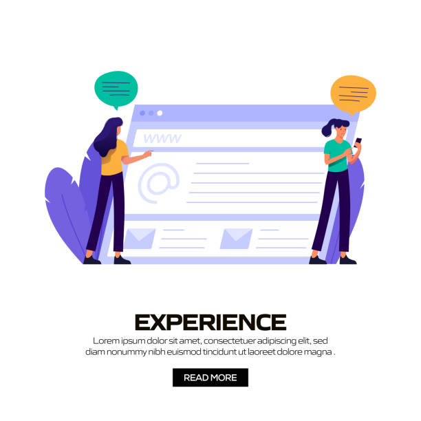
Introduction to Responsive Website Design and its Importance

In today’s world, where #internet_access is done through various devices such as mobile phones, tablets, laptops, and even smartwatches, the importance of #responsive_website_design is more evident than ever.
This approach is not just a fleeting trend, but an #explanatory and fundamental necessity for the success of any online business.
Responsive website design means that your website is able to intelligently adapt its layout and content to the user’s screen size, without compromising the quality of the user experience (UX) or hiding important information.
This dynamic adaptability ensures that, regardless of the device a user accesses your site with, they have a smooth and pleasant experience.
In fact, this type of design is such that the visitor feels no difference in the site’s performance and display between a large computer screen and a small mobile screen; the only thing that changes is the arrangement of elements to optimize readability and accessibility.
Google has also emphasized the importance of this issue for years and prefers responsive websites in its search results, which itself is a sign of its profound impact on SEO and the visibility of businesses in the competitive digital space.
Does your current website showcase your brand’s credibility as it should? Or does it drive away potential customers?
Rasawb, with years of experience in designing professional corporate websites, is your comprehensive solution.
✅ A modern, beautiful website tailored to your brand identity
✅ Significant increase in lead generation and new customers
⚡ Contact Rasawb now for a free consultation on corporate website design!
Basic Principles of Responsive Design

#Responsive_design is built upon three fundamental principles that every developer must master for its correct implementation: #fluid_grids, #flexible_images, and #media_queries.
These principles are the backbone that allows websites to dynamically and efficiently adapt to various screen dimensions.
1.
Fluid Grids: Instead of using fixed pixels to define element widths, relative units such as percentages are used.
This #specialized approach causes element widths to automatically change with the user’s screen size.
For example, if a section of the site occupies 50% of the total width, on a larger screen, its width will be greater than on a smaller screen, but it will still occupy half of the available space.
This flexibility is the foundation of a responsive website structure.
2.
Flexible Images: Images should be incorporated into the design in such a way that they never exceed the width of their container.
This is typically achieved by setting the `max-width: 100%;` property in CSS.
This approach ensures that images, no matter how large, always fit correctly into the available space and do not break the layout on smaller devices.
Using more advanced techniques such as `srcset` and `picture` in HTML5 also allows for providing different versions of an image based on screen size and pixel density, which significantly helps improve performance and loading speed.
3.
Media Queries: These CSS3 capabilities allow designers to apply different CSS rules based on device characteristics such as screen width, height, orientation (landscape or portrait), and even resolution.
For example, it can be specified that if the screen width is less than 768 pixels, the navigation menu should transform into a hamburger icon instead of a horizontal bar.
This powerful #educational tool allows designers to optimize the user experience for each breakpoint and have precise control over how content is displayed on different devices.
By mastering these three principles, you can take effective steps in implementing responsive website design.
Tools and Techniques for Implementing Responsive Design

For the successful implementation of #responsive_website_design, there is a set of #guidance tools and techniques that facilitate and accelerate the development process.
The choice of appropriate tools depends on the project’s complexity, the development team’s preferences, and the ultimate goals.
One of the most popular tools includes CSS frameworks such as Bootstrap and Tailwind CSS.
These frameworks, by providing ready-made grid systems and responsive UI components, help designers build a responsive website without the need to write extensive CSS code from scratch.
Bootstrap significantly speeds up development with its rich set of predefined classes and styles, while Tailwind, with its Utility-First approach, offers more flexibility for customization.
Also, the use of CSS preprocessors like Sass and Less can improve the process of organizing and managing CSS code.
These tools allow for the use of variables, functions, and nested rules, which help maintain cleaner and more reusable code.
For testing and debugging responsive website design, browser developer tools are very useful.
These tools allow for simulating various devices with diverse screen sizes, enabling designers to see how their website looks on different devices and identify potential issues.
Furthermore, Content Management Systems (CMS) like WordPress, with responsive themes and dedicated plugins, have made the implementation of responsive design easy even for non-technical users.
Many modern WordPress themes are designed from the outset to be compatible with various devices and do not require complex settings for correct display on mobile and tablet.
Finally, using the Mobile-First Design approach is an important technique.
In this approach, design is first done for the smallest screens and then gradually developed for larger screens.
This method ensures that the most important content and functionalities are also available in mobile versions and prevents unnecessary loading for smaller devices.
Table 1: Comparison of Popular Frameworks for Responsive Design
| Feature | Bootstrap | Tailwind CSS |
|---|---|---|
| Approach | Component-based | Utility-First |
| Customization | Medium (by changing variables) | High (by combining utility classes) |
| File Size (approx.) | Larger (includes many components) | Smaller (only used classes) |
| Initial Development Speed | High (ready-made components) | Medium (requires combining classes) |
| Learning Curve | Easier (predefined rules) | Requires more time to master |
Challenges and Solutions in Responsive Design

Although #responsive_website_design offers numerous benefits, its implementation is not without challenges.
The #questionable_content is how can we turn these challenges into opportunities for improvement?
One of the main problems is managing #performance of the website on various devices.
Responsive websites must load quickly on mobile devices with lower bandwidth.
The solution is to use image optimization techniques (such as compression and using modern formats like WebP), optimizing CSS and JavaScript codes, and employing lazy loading for off-screen content.
CDN (Content Delivery Network) can also help reduce loading times.
Another challenge is managing #navigation on small screens.
Large desktop menus become unusable on mobile.
Common solutions include using hamburger menus, dropdown menus, or tabbed menus.
It is important for navigation to be simple, accessible, and intuitive so users can easily move around the site.
Content prioritization is also a significant challenge in responsive website design.
On a small screen, there is limited space to display content.
Designers must decide which parts of the content are more critical for users on smaller devices and prioritize them.
This may involve hiding some less important elements or changing their layout.
This is an important #analytical part of the design process.
Also, testing across different devices and various browsers can be time-consuming.
Using test automation tools and simulators can be helpful in this regard.
However, nothing replaces actual testing on physical devices to ensure the user experience is optimal in all scenarios.
Finally, the complexity of designing for a large number of devices with different screen sizes can be high.
However, by adhering to basic principles and using standard frameworks, this complexity can be managed, and an efficient and sustainable responsive website design can be created.
These challenges require strategic thinking and precise planning to utilize the maximum potential of responsive design.
Is your e-commerce site ready to attract maximum customers and increase sales? Rasawb transforms your online business with modern and efficient e-commerce website design.
✅ Increased speed and improved SEO
✅ Excellent user experience on mobile and desktop⚡ Get a free e-commerce website design consultation from Rasawb!
User Experience (UX) in Responsive Website Design

#User_Experience (UX) in #responsive_website_design holds special importance, as the ultimate goal of this design is to provide a seamless and enjoyable experience for the user, regardless of the device they use.
The most #specialized aspect of UX here is understanding user needs and behaviors in different environments.
One of the main components of UX is Interactivity.
Buttons and links must be large enough and spaced appropriately to be easily clickable on a mobile touch screen.
Optimal use of whitespace helps with readability and ease of navigation.
Also, visual Affordances should be clear; meaning the user should understand without thinking which element is clickable or what action can be performed with it.
Site loading speed directly impacts UX.
Mobile users have less patience for waiting for a page to load.
Therefore, optimizing images, using concise and compressed codes, and utilizing caching and CDN (Content Delivery Network) techniques are essential to reduce loading time.
This part of responsive website design is directly related to user satisfaction.
Accessibility is also an important aspect of UX.
The website should be usable for people with special needs, such as those with visual or motor impairments.
This includes using semantic HTML tags, alt texts for images, and sufficient contrast between text and background.
Also, forms should be optimized for mobile use.
Using numeric keypads for phone number fields, and appropriately adjusting the size of fields and buttons, improves the form-filling experience.
By considering these #educational tips, a responsive website design can be created that is not only visually appealing but also provides an unparalleled user experience on any device and helps achieve your business goals.
A strong UX increases user loyalty and improves conversion rates.
Impact of Responsive Design on SEO

The connection between #responsive_website_design and #Search_Engine_Optimization (SEO) is inseparable today.
A precise #analysis shows that responsive websites benefit from significant SEO advantages that help them achieve better rankings in search results.
These advantages are due to full compliance with current and future Google standards.
The most important factor is Google’s Mobile-First Indexing approach.
For years, Google has announced that it considers the mobile version of websites as the primary version for indexing and ranking.
This means that if your website is not optimized for mobile (i.e., not responsive), you may lose your ranking in search results, even if its desktop version is excellent.
A responsive website design is exactly what Google needs for indexing and ranking.
Furthermore, responsive websites generally have better loading speeds.
As mentioned earlier, site speed is an important ranking factor for Google.
Sites that load faster provide a better user experience, and this is positively evaluated by Google’s algorithms.
A responsive website also helps reduce bounce rate and increase user dwell time on the site.
When users have a good experience on your site and can easily find the content they are looking for, the likelihood of them staying on the site and visiting more pages increases.
These positive user signals are also interpreted by Google as an indication of site quality and can help improve SEO rankings.
The existence of a single URL for all devices (unlike separate mobile and desktop sites) also simplifies the crawling and indexing process for search engines.
This prevents issues with duplicate content and the need for complex redirects, which can harm SEO.
Overall, investing in responsive website design is a direct investment in your SEO and long-term online success.
This not only helps you keep pace with Google’s requirements but also ensures that your users receive the best possible experience.
Review of Successful Responsive Design Examples

To better understand how to effectively implement #responsive_website_design, looking at some successful and inspiring examples in this field can be very #entertaining and #informative.
These websites demonstrate how a flawless user experience can be provided across all devices with creative approaches.
One prominent example is the Forbes website.
This news site, with its extensive and complex content, has successfully implemented a responsive design.
Its page layouts intelligently adapt to different screen sizes, images are optimized, and mobile navigation transforms into a simple and efficient hamburger menu.
This adaptability allows users to follow news content seamlessly on any device.
The Apple website is also an excellent example of responsive design with a focus on aesthetics and simplicity.
Apple’s products are inherently very visual, and their website maintains this characteristic.
Product images automatically adjust to screen size, and the layout of elements changes to remain appealing and usable at all times.
This approach emphasizes detail and providing an excellent visual experience on any platform.
The Amazon website, as one of the world’s largest online stores, is also an example of responsive website design for a large scale.
Despite countless products and features, Amazon provides a seamless shopping experience across various devices.
This website has managed to combine the complexities of an e-commerce platform with simplicity and efficiency on mobile, allowing users to easily search, view, and purchase products.
These examples show that responsive website design is implementable not only for simple blogs but also for complex news platforms, large e-commerce sites, and corporate websites with rich content.
The key to success lies in a deep understanding of user needs and prioritizing content and functionalities for each touchpoint.
Table 2: Common Features of Successful Responsive Design Examples
| Feature | Description |
|---|---|
| High Loading Speed | Image and code optimization for a fast mobile experience. |
| Simple and Intuitive Navigation | Mobile-friendly menus (hamburger, tabbed) and easy access to main sections. |
| Flexible Images and Videos | Media automatically adapts to screen size. |
| High Readability | Appropriate font size, sufficient line spacing, and good contrast on all devices. |
| Seamless User Experience | Providing consistent brand feel and functionality across all platforms. |
The Future of Responsive Website Design and New Trends
#Responsive_website_design has never been static and is constantly evolving.
An #analysis of recent trends shows that the future of this field is tied to new advancements in CSS and HTML, as well as the emergence of new technologies.
These developments can elevate the design and user experience to higher levels.
One of the most important advancements is the expanded use of CSS Grid Layout and Flexbox.
These CSS modules allow for the creation of more complex and flexible layouts with less and more readable code.
Grid is particularly powerful for two-dimensional and complex layouts, providing precise control over how elements are placed in the grid, which goes beyond the capabilities of Flexbox.
Another new and exciting trend is Container Queries.
Currently, Media Queries operate based on the viewport size (the entire screen).
But Container Queries allow developers to apply specific styles based on the size of an element’s parent container.
This means a component can be responsive, regardless of where it is placed on the page and what the overall page dimensions are.
This capability allows designers to build more modular and reusable components that intelligently adapt to the available space.
Also, we are seeing an increased focus on #performance and #personalized_user_experience.
This includes the use of Progressive Web Apps (PWAs) to provide a native app-like experience on the web, as well as optimizing loading for slower networks.
These approaches emphasize creating a #responsive_website_design that not only looks good on different screen sizes but also performs with high speed and efficiency under any network conditions.
Adaptive Design techniques are also evolving.
While responsive design focuses on fluidity, adaptive design typically offers a set of fixed layouts for specific, predefined breakpoints.
The future may involve a smart combination of both approaches, allowing designers to have more precise control over the design on different devices while maintaining the necessary flexibility.
Finally, with the advancement of artificial intelligence and machine learning, design tools are expected to become smarter and capable of automatically suggesting responsive layouts based on content and user behavior, which could revolutionize the design process.
Did you know a weak corporate website costs you many opportunities daily? Solve this problem forever with professional corporate website design by Rasawb!
✅ Create a powerful and trustworthy image for your brand
✅ Targeted attraction of new customers and increased sales
⚡ [Get Free Website Design Consultation]
Key Tips for Choosing a Responsive Website Designer

Choosing the right #responsive_website_designer is a crucial decision that can ensure the success of your online project.
#Guidance for making the right choice requires attention to several key points that will help you distinguish a true professional from ordinary individuals.
1.
Having a Strong and Diverse Portfolio: The first and most important step is to review the designer’s or company’s previous work.
Look for projects that clearly demonstrate their ability to implement responsive design for various devices.
Do the websites they designed work well on mobile, tablet, and desktop? Do the layouts adapt correctly?
2.
Mastery of Responsive Principles: A skilled designer must have a deep understanding of Flexbox, CSS Grid, and Media Queries principles.
They should be able to explain how they apply these techniques to create a seamless user experience across all devices.
Knowledge of Mobile-First Design is also a significant advantage.
3.
Attention to User Experience (UX) and SEO: Responsive website design is not limited to visual appeal; it must be efficient and usable.
Your chosen designer should be aware of UX concepts and the impact of design on SEO.
They should be able to explain how their design helps increase site speed, improve navigation, and ultimately achieve better rankings in search engines.
4.
Communication and Support Skills: Web design projects require continuous communication.
The designer must be able to listen to your needs, provide constructive feedback, and maintain transparency in the workflow.
Additionally, post-delivery support for resolving potential issues is very important.
5.
Utilizing Up-to-Date Technologies: The web landscape is rapidly changing.
A professional designer must be familiar with the latest tools and technologies, such as modern CSS frameworks, preprocessors, and performance optimization tools.
By observing these tips, you can find a suitable #web_designer for your responsive website design and ensure the success of your online project.
Conclusion and the Importance of Responsive Design Sustainability

In conclusion, #responsive_website_design is no longer just a luxury option, but a fundamental pillar for any successful online presence.
This #explanatory approach allows you to reach millions of users, regardless of the device they use to browse your website.
From smartphones to large desktop monitors, a responsive website provides a seamless, fast, and efficient experience.
The importance of sustainability in responsive website design is also key.
Your website should be designed to be compatible not only today but also in the future with emerging devices and technologies.
This sustainability is achieved through the use of web standards, clean and maintainable code, and an approach that focuses on flexibility and scalability.
Investing in a responsive design is an investment in the future of your business.
Given that Google and other search engines are increasingly emphasizing the mobile experience, and users also expect every website to work well on every device, ignoring responsive design means missing out on great opportunities.
This not only affects your SEO ranking but also directly impacts conversion rates and customer loyalty.
Ultimately, responsive website design is an ongoing process that requires monitoring and optimization.
By following new trends, continuously updating content and underlying technologies, and paying attention to user feedback, you can ensure that your website always remains at its peak performance and provides the best possible experience to your audience.
This comprehensive approach will guarantee success in the digital world of today and tomorrow.
Frequently Asked Questions
| Question | Answer |
|---|---|
| What is responsive website design? | Responsive Web Design is an approach where the design and layout of a website change based on the user’s device screen size (computer, tablet, mobile, etc.) to display in the best possible way. |
| Why is responsive design important? | Its importance stems from the increasing use of various devices to access the internet. Responsive design improves user experience (UX), reduces bounce rate, and is also beneficial for SEO. |
| What techniques are used in responsive design? | The main techniques include using Fluid Grids, Flexible Images, and Media Queries in CSS. |
| What does Fluid Grids mean? | Instead of using fixed pixel units, relative units such as percentages or ems are used to define the width and height of elements, allowing the layout to be flexible with changing screen sizes. |
| What is the application of Media Queries? | Media Queries allow you to apply different CSS styles based on the user’s device characteristics such as screen width, height, orientation (horizontal or vertical), and resolution. |
And other services of Rasawb Advertising Agency in the field of advertising
Smart Advertising Campaign: Revolutionize user engagement with precise audience targeting.
Smart Conversion Rate Optimization: A professional solution for user engagement focusing on custom programming.
Smart Advertising Campaign: A new service for increasing digital branding through key page optimization.
Smart Custom Software: A creative platform to improve customer acquisition with Google Ads management.
Smart Data Analysis: A dedicated service for growth in click-through rate based on marketing automation.
And over a hundred other services in the field of internet advertising, advertising consulting, and organizational solutions
Internet Advertising | Advertising Strategy | Advertorial
Resources
What is Responsive Web Design? A Complete Guide
Important Tips in Responsive Website Design
Principles of Responsive Design for the Web
Advantages of Responsive Website Design
? Are you ready to transform your business in the digital world? Rasawb Afarin Digital Marketing Agency, specializing in responsive website design, SEO, and online campaign management, is your comprehensive solution for growth and visibility. For consultation and taking big steps towards success, contact us today.
📍 Tehran, Mirdamad Street, next to Bank Markazi, Kazerun Jonubi Alley, Ramin Alley, No. 6
