
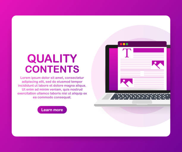
Introducing Responsive Website Design and its Importance in the Current Era

In today’s world, where diverse devices with different screen sizes have become the main tool for users to access the internet, responsive website design has transformed from an option into an undeniable necessity.
This approach in web design allows websites to intelligently adapt to the user environment and provide an optimal visual experience for the audience, regardless of whether the user is on a desktop computer, tablet, or mobile.
The main goal of this method is to provide a consistent and optimal user experience on every device.
The most important feature of responsive website design is its content and layout flexibility.
Responsive websites, instead of having separate versions for each device, have only one base code that adapts to screen dimensions using techniques like Media Queries and Fluid Grids.
This approach not only saves time and cost in development and maintenance but also offers significant advantages from an SEO perspective.
Search engines like Google rank websites optimized for mobile higher in their search results.
Therefore, responsive web development is crucial for any business seeking visibility in the online space.
This is an explanatory and educational topic that forms the foundation of modern web approaches.
Does your current site represent your brand’s credibility as it should? Or does it drive away potential customers?
Rasaweb, with years of experience in designing professional corporate websites, is your comprehensive solution.
✅ A modern, beautiful website tailored to your brand identity
✅ Significant increase in lead generation and new customers
⚡ Contact Rasaweb now for a free consultation on corporate website design!
Principles and Technical Foundations of Responsive Design

To gain a deeper understanding of the specialized concepts of responsive website design, it is necessary to become familiar with its technical principles.
The three main pillars that form the backbone of this type of design are: Fluid Grids, Flexible Images, and Media Queries.
Fluid Grids means that instead of defining fixed dimensions for page elements (like pixels), relative units such as percentages are used.
This ensures that the page layout automatically adjusts without breaking when the screen size changes.
Flexible Images also work with the same logic; that is, images are defined with relative units (usually max-width: 100%) so that they do not exceed the boundaries of their container and are displayed correctly at any size.
Media Queries, however, are the most powerful tool among these.
This CSS3 capability allows developers to apply different styles based on device characteristics (such as screen width, height, orientation, or resolution).
For example, it can be specified that on small screens, content columns stack one below the other, while on large screens, they appear side-by-side.
These key techniques form the foundation of every responsive website design project, and mastering them is essential for any web developer.
In fact, learning these concepts is an educational and specialized content that helps you build websites that are not only beautiful but also perform well on any device.
This modern method in website creation brings a flawless experience to users and is therefore highly regarded by many web designers and developers.
Modern Tools for Implementing Responsive Design

To effectively implement responsive website design, developers utilize numerous tools and frameworks that make the development process faster and more efficient.
One of the most well-known and widely used frameworks is Bootstrap.
Bootstrap is a collection of HTML, CSS, and JavaScript tools that are highly suitable for building responsive and Mobile-First websites.
Other frameworks like Foundation and Bulma are also popular options, each with its own specific features and design philosophy.
In addition to frameworks, testing and debugging tools also play a vital role in ensuring the correct functioning of responsive design.
Tools such as Chrome DevTools with its Device Mode capability, allow developers to test their website across various screen sizes and simulate mobile devices.
Furthermore, platforms like BrowserStack and CrossBrowserTesting provide the ability to test websites on real browsers and devices, which is crucial for ensuring full compatibility.
The use of Content Management Systems (CMS) like WordPress, with responsive themes and plugins, has also facilitated the implementation of responsive websites for non-technical users.
These tools and frameworks, along with the necessary technical knowledge, help us design websites that are not only responsive but also deliver an excellent user experience.
This section provides explanatory information and guidance for choosing the best tools in the responsive website design journey.
| Framework Name | Key Features | Advantages | Potential Disadvantages |
|---|---|---|---|
| Bootstrap | Largest and most popular, 12-column grid system, ready-made UI components, wide compatibility | Fast development, large user community, comprehensive documentation | High code volume, generic and repetitive appearance if not customized |
| Foundation | High customizability, Mobile-First, powerful Flexbox | High flexibility, suitable for large and custom projects | Slightly more difficult to learn than Bootstrap |
| Bulma | Flexbox-based framework, CSS only, no JavaScript | Lightweight and fast, easy to learn, readable syntax | Interactive components require custom JS |
User Experience (UX) in Responsive Website Design

Responsive website design focuses not only on technical aspects but also specifically on User Experience (UX).
The ultimate goal of this design is to ensure that users on any device can easily and pleasantly use your website.
This means content should be readable and accessible, navigation should be intuitive and simple, and buttons and links should be large enough to be easily clickable on touch devices.
Mobile-First Design is a key strategy in this area.
In the Mobile-First approach, designers first design the website for the smallest screens (mobile) and then gradually expand it for larger sizes (tablet and desktop).
This method ensures that the most important content and functionalities are prioritized, and the user experience is optimized on mobile devices, which usually have limitations such as less screen space and slower internet connections.
Mobile optimization includes items such as reducing image size, minimizing JavaScript and CSS code, and using readable fonts.
One of the significant challenges in responsive design UX is managing a large amount of content.
How can a large volume of information be displayed efficiently on a small screen? Solutions such as using accordions, tabs, and dropdown (hamburger) menus can help organize content.
UX evaluation at various stages of design, including through usability tests, is essential to ensure that the responsive website truly meets user needs.
This section is a practical analysis and guidance on how to improve user experience.
Are you bothered by losing customers who visited your site to buy?
Rasaweb is your specialized solution for a successful online store.
✅ Significant increase in your online sales
✅ Building trust and professional branding with customers⚡ Get a free consultation from Rasaweb experts!
SEO and Responsive Website Design: An Inseparable Link
One of the biggest advantages of responsive website design is its positive and direct impact on Search Engine Optimization (SEO).
Google and other search engines increasingly emphasize mobile user experience.
In fact, since 2015, Google introduced its Mobile-Friendly Algorithm, which gives better rankings in mobile search results to websites optimized for mobile.
This means that if your website is not responsive, your ranking in mobile searches will likely decrease.
There are several reasons why search engines prefer responsive website design.
Firstly, having only one URL for a website (instead of separate URLs for mobile and desktop versions) makes content crawling and indexing easier for search engines.
This also prevents duplicate content issues.
Secondly, responsive websites usually have faster loading speeds on mobile devices, which is an important Google ranking factor.
Thirdly, the bounce rate on responsive websites that provide a good user experience is usually lower.
Users spend more time on the site and view more pages due to the correct and easy display of content.
These positive signals indicate to search engines that your website has valuable content, and consequently, they assign it a better rank.
SEO optimization alongside implementing responsiveness is a specialized and explanatory approach that is essential for the success of any website in today’s online space.
Challenges and Solutions in Responsive Design

Although responsive website design has many advantages, like any other approach, it also comes with challenges that designers and developers must address.
One of these challenges is performance management.
Loading high-resolution images on mobile devices with slow internet can lead to long loading times and a poor user experience.
The solution to this is to use Responsive Images, which only load the appropriate image size for the displaying device, or to use Lazy Loading techniques, which only load images when they enter the user’s viewport.
Another challenge is the complexity of coding and testing.
Designing for different devices requires high precision and extensive testing to ensure correct display across all sizes and browsers.
Using frameworks and automated testing tools can help reduce this complexity.
Also, defining appropriate breakpoints for Media Queries can be a challenge; should breakpoints be defined for every screen size or only for major categories (mobile, tablet, desktop)?
Sometimes, designers may face the dilemma of excessive content that is not manageable on small screens.
In such cases, prioritizing content and deciding which sections should be hidden on mobile or displayed differently is essential.
These challenges lead us to the important question of whether responsive design is always the best solution, or if in some cases, a separate mobile version (Adaptive Design) is more suitable? This is an analytical discussion that requires careful consideration of project needs.
Reviewing Successful Examples of Responsive Website Design

To better understand the effectiveness of responsive website design, it is worthwhile to look at successful and famous examples in this field.
Websites such as New York Times, GitHub, and Microsoft are all prominent examples of successful responsive design implementation.
These websites not only display well across various screen sizes but also provide an unparalleled user experience on every device.
For example, the New York Times website, using a fluid grid and Media Queries, artfully organizes its news content across different devices.
On desktop, you see multiple columns and large images, while on mobile, content is arranged into single columns and smaller images for better readability.
GitHub, with its clean and organized user interface, demonstrates how a complex, high-performance website can be designed responsively while maintaining all its functionalities.
Websites active in E-commerce also heavily rely on website responsiveness.
Websites like Amazon or Digikala (Iranian) with responsive design ensure that customers can easily search, view, and purchase products, regardless of the device they use.
These examples show that responsive website design is not only aesthetically appealing but also critically important from a functional and business perspective.
This news and entertaining content effectively showcases the potential of this type of design.
| Website Name | Industry | Highlights in Responsiveness | Lessons Learned |
|---|---|---|---|
| The New York Times | News/Media | Fluid layout, font optimization for mobile readability, efficient ad management | Focus on content and readability, even with a high volume of information. |
| GitHub | Technology/Development | Clean and functional UI at any size, adaptive navigation menus | Complex websites can also perform excellently with responsive design. |
| Microsoft | Technology/Corporate | Optimized combination of graphic and text elements, smooth animations | Shows how a large brand presents a modern and professional image through optimized design. |
| Amazon / Digikala | E-commerce | Seamless mobile shopping process, optimized product images, user-friendly navigation | For online businesses, mobile UX directly impacts sales. |
The Future of Web Design with a Focus on Responsiveness

As technology rapidly advances, responsive website design must also adapt to new trends.
The future of web design is moving towards more personalization, voice interactions, and Virtual/Augmented Reality (VR/AR) experiences.
How can responsive design encompass these technologies? Should websites only react to screen size, or should they also be responsive to the user’s environment, wearables, and even user emotions? These are thought-provoking questions that simultaneously open new horizons in the analysis of the future of the web.
One of the future trends is Atomic Design, which focuses on building small, reusable components instead of designing complete pages.
This approach can help create more flexible design systems that are easily scalable for new devices and platforms.
Also, with the emergence of Progressive Web Apps (PWAs), which combine the best features of web and native applications, the line between websites and mobile applications is blurring.
These advancements indicate that the concept of responsive web design will go beyond merely adjusting layouts for different screen sizes.
Future websites should be able to react to their surroundings, integrate with artificial intelligence and big data, and provide entirely personalized experiences.
For a designer, this means constantly learning and adapting to new tools and technologies to meet the evolving needs of users and devices.
This field is constantly changing and requires continuous analysis.
Are you losing business opportunities because of an outdated website? With Rasaweb, permanently solve the problem of not attracting potential customers through your website!
✅ Attracting more high-quality leads
✅ Increasing brand credibility in the eyes of customers
⚡ Get a free corporate website design consultation
Choosing the Best Approach for Your Project

Given all the discussions, the question might arise as to which responsive website design approach is most suitable for your specific project? Should you choose the Mobile-First approach, or is focusing on desktop and then optimizing for mobile (Desktop-First) more logical? The answer to this question depends on several factors, including the target audience, type of content, budget, and project timeline.
This section provides specialized guidance for choosing the right strategy.
If most of your users access the website via mobile (which is very common today), the Mobile-First approach is almost always the best option.
This method ensures that the most important features and content are optimized for small devices, and the user experience on these platforms will be excellent.
Also, from a performance perspective, it usually loads lighter and faster.
In contrast, if your website is a complex organizational portal with data that is primarily used by users with desktop computers and large screens, a Desktop-First approach might be more logical.
However, even in this scenario, neglecting mobile users is a big mistake, and you should at least provide a responsive or mobile-compatible version.
Choosing a website design strategy requires careful analysis of website traffic data and sufficient user knowledge.
Also, the technical capabilities of the development team and available tools should be considered.
The ultimate goal is to achieve an optimized and efficient website for all users.
Conclusion and Key Recommendations

In summary, responsive website design is no longer a competitive advantage but a fundamental necessity for survival and success in today’s web space.
This approach allows websites to dynamically adapt to any screen size, provide a consistent and optimal user experience across different devices, and significantly positively impact the site’s SEO.
From technical principles like Media Queries and fluid grids to development tools like CSS frameworks and content management systems, all these components work together to create flexible and efficient websites.
The key recommendation for anyone looking to build or update their website is to place responsive design at the core of their strategy.
This means considering the mobile user experience from the outset, optimizing website performance for fast loading speeds, and continuous testing across various devices and browsers.
Remember that the future of the web is tied to the diversity of devices and access methods, and your website must be ready to embrace this diversity.
By adhering to these principles, you can not only ensure that your website looks and functions at its best but also expand your reach to a wider audience and improve your ranking in search engines.
Responsive website design is an investment that will yield significant returns.
This is an explanatory and educational summary that encapsulates all the important points of this article and prepares you to embark on this path.
Frequently Asked Questions
| Question | Answer |
|---|---|
| What is Responsive Web Design? | It is an approach that makes your website layout display well on any device (such as mobile, tablet, and desktop) and adapt to the user’s screen size. |
| Why is responsive design important? | Improved user experience across different devices, increased traffic and conversion rates, improved search engine ranking (SEO), and reduced need for developing separate mobile versions. |
| How is responsive design implemented? | By using CSS Media Queries to apply different styles based on device characteristics (such as screen width), using Fluid Grids and Flexible Images. |
| What are the main technologies used in responsive design? | HTML5, CSS3 (especially Media Queries), and JavaScript. |
| What are the main advantages of responsive design? | Seamless user experience across devices, easier website maintenance, better SEO (because Google prefers responsive sites), and cost and time savings compared to developing a mobile app or a separate site. |
And other advertising agency services by Rasaweb in the field of advertising
Smart Google Ads: Revolutionize click-through rates with SEO-driven content strategy.
Smart Marketing Automation: A professional solution for improving SEO ranking with a focus on attractive UI design.
Smart Marketplace: An innovative service for increasing online growth through the use of real data.
Smart Marketing Automation: Designed for businesses looking to manage campaigns through marketing automation.
Smart Brand Identity: A professional solution for analyzing customer behavior with a focus on precise audience targeting.
And more than hundreds of other services in the field of internet advertising, advertising consultation, and organizational solutions
Internet Advertising | Advertising Strategy | Sponsored Articles
Resources
Responsive Web Design
Importance of Responsive Web Design
Responsive Web Design Guide
Responsive Web Design Tutorial Video
? Are you ready for your business to grow and shine in the digital world? Rasaweb Afarin Digital Marketing Agency paves your way to success by offering comprehensive and professional services, including custom website design, Search Engine Optimization (SEO), and content marketing strategies. Build a brilliant future for your brand with us and take a big step towards progress.
📍 Tehran, Mirdamad Street, next to Bank Markazi, Kazeroun Jonubi Alley, Ramin Alley, No. 6
