
Introduction to Responsive Web Design and Its Necessity in the Current Era

In today’s digital world, where smart devices have become an inseparable part of our daily lives, the concept of #Responsive_Web_Design or Responsive Web Design has become more important than ever.
You can no longer design a website that only displays correctly on a desktop screen.
Users access web content through a wide range of devices, from smartphones and tablets to laptops and smart TVs.
Responsive Web Design is the answer to this challenge; an approach that ensures your website provides an optimal and consistent experience regardless of screen size or device type.
This approach not only improves #User_Experience but also plays a vital role in #SEO and your website’s ranking in search engines, especially with Google’s emphasis on the #Mobile_First strategy.
A website with responsive design automatically adjusts its layout, optimizes images and texts, and configures navigation to suit each device.
This means users don’t need to zoom or scroll horizontally, which significantly helps increase satisfaction and reduce the Bounce Rate.
In fact, Responsive Web Design is a necessity for any #Modern_Web and user-friendly site to have a say in today’s competitive market.
This transformation requires a deeper understanding of how users interact with content and pushes developers towards more flexible thinking.
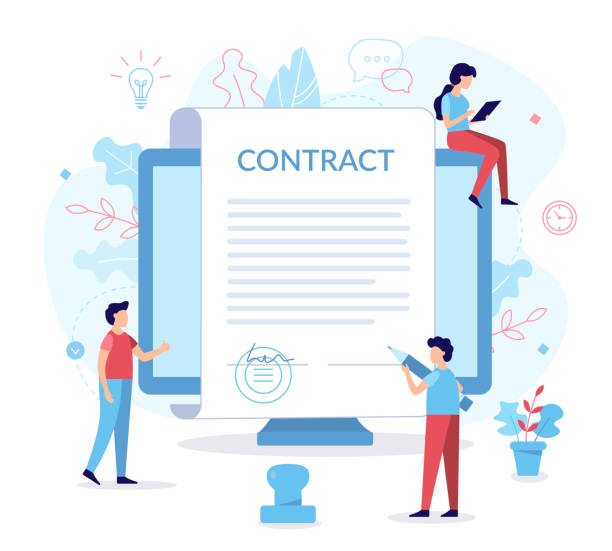
Did you know that 94% of users’ first impressions of a business are related to its website design? With professional corporate website design by **Rasweb**, turn this first impression into an opportunity for growth.
✅ Attract more customers and increase sales
✅ Build credibility and trust in the audience’s eyes⚡ Get a free website design consultation!
Key Principles of Responsive Design and Implementation Techniques
Responsive Web Design is built upon three fundamental principles that every developer should understand: Fluid Grids, Flexible Images, and Media Queries.
Fluid grids mean that your site’s layout is built on percentage ratios instead of fixed pixels.
This ensures that column widths and elements adjust proportionally as the screen size changes.
For example, if a column occupies 20% of the total page width, it will maintain that ratio on any device.
Flexible images, by using properties like max-width: 100% in CSS, ensure that images never overflow their container and are always scaled appropriately.
This technique helps images maintain their quality across different devices and optimally occupy screen space.
But perhaps the most important element in Responsive Web Design is Media Queries.
This CSS3 feature allows you to apply different styles based on device characteristics, such as screen width, height, orientation (portrait or landscape), and even resolution.
For example, you can specify that for widths less than 768 pixels, the navigation menu transforms into a hamburger icon and a two-column layout changes to a single column.
This approach enables you to create a dynamic responsive website design that truly responds to the needs of each device.
Correct implementation of these principles requires a deep understanding of CSS and HTML, as well as “Mobile-First” thinking, where design starts from the smallest screen and expands to larger ones.
Challenges and Practical Solutions in Responsive Website Design
Despite its countless advantages, implementing Responsive Web Design also comes with challenges that developers need to be aware of.
One of the biggest challenges is content and element management across different screen sizes.
A data table might display well on a desktop, but on a small mobile screen, it might require horizontal scrolling or its readability might decrease.
A practical solution for this is to use specific techniques for tables, such as converting them into single cards or using horizontal scrolling with navigation capability.
Another challenge is website performance.
High-resolution images optimized for desktops can slow down site loading on mobile devices.
To address this, Responsive Images using HTML attributes like srcset and sizes, or Lazy Loading techniques are employed.
Managing fonts and icons is also important; using optimized web fonts and SVG icons can contribute to better performance.
Finally, testing and debugging across different devices and browsers can be time-consuming.
Browser developer tools (like Chrome DevTools) and simulator testing platforms (like BrowserStack) are very useful for this purpose.
Responsive Web Design requires a comprehensive approach that covers all aspects to provide a flawless user experience.
Below is a comparison table between different web design approaches for device compatibility:
| Feature | Responsive Design | Adaptive Design | Separate Mobile Site |
|---|---|---|---|
| Number of versions | One version (with different layouts) | Multiple fixed versions based on breakpoints | Two or more completely separate versions |
| URL Address | Same | Same (server-side change) | Different (e.g., m.example.com) |
| Implementation Complexity | Medium to High (requires fluid thinking) | Medium (requires design for each size) | High (requires maintaining two codebases) |
| SEO | Excellent (Google’s recommendation) | Good | Poor (duplicate content issues) |
| Flexibility | High (supports any size) | Medium (limited to defined sizes) | Low (mobile-only) |
The Importance of User Experience (UX) in Responsive Web Design

User Experience (UX) is at the heart of every successful website and gains double importance in Responsive Web Design.
The main goal of responsive design is to provide a seamless and optimal user experience, regardless of the device used.
When a user accesses your site via a smartphone, they expect the content to be easily readable, buttons large enough to be tapped with a finger, and navigation logical and simple.
Responsive Web Design makes it possible to meet all these needs.
A poor UX on mobile devices can lead to high bounce rates, reduced user engagement, and ultimately, loss of customers.
Conversely, a site that is well-optimized for mobile with responsive design encourages users to stay on the site longer, view more pages, and engage with content.
This means increased Conversion Rate, increased customer satisfaction, and strengthening your brand.
Responsive Web Design not only adapts the site’s appearance to different screen sizes but also affects how the user interacts with the site.
For example, on mobile, forms should be simpler and have fewer fields, or menus should be designed to be collapsible.
These small but crucial details significantly improve the user experience and show how Responsive Web Design goes beyond mere aesthetics and directly impacts user interaction and satisfaction.
Do you have an e-commerce site, but your sales aren’t what you expect? Rasweb solves your problem forever with professional e-commerce website design!
✅ Significant increase in conversion rates and sales
✅ Unparalleled user experience for your customers
⚡ Click here for a free consultation with Rasweb!
Impact of Responsive Design on SEO and Website Ranking

One of the most important reasons businesses and developers should adopt Responsive Web Design is its direct and positive impact on SEO and website ranking in search engines.
Google, as the world’s largest search engine, officially announced in 2015 that it ranks mobile-friendly websites higher in its mobile search results.
This policy culminated with the introduction of Mobile-First Indexing in 2018, meaning Google uses the mobile version of your site for indexing and ranking, even if the user is searching on a desktop.
A website with responsive design has only one URL for all devices, which helps Google crawl and index your content more easily.
This is in contrast to the approach of separate mobile sites (like m.example.com) which can lead to duplicate content issues and crawling complexities.
Furthermore, lower bounce rates and longer user dwell times on responsive sites (resulting from a better user experience) act as positive signals for search engines and help improve site rankings.
Responsive Web Design also loads faster on mobile devices, which is also an important SEO factor.
Ultimately, by using Responsive Web Design, you not only improve the user experience but also gain a significant competitive advantage in SEO and ensure your website is ready for the future of the web.
The Future of Responsive Web Design and New Trends

Responsive Web Design, while itself an accepted standard, continues to evolve, and new trends are emerging that shape its future.
One such trend is the move towards Core Web Vitals and Performance Optimization.
Google is increasingly emphasizing the loading speed and visual stability of websites, which doubles the importance of precise optimization in responsive design.
Using next-generation image formats (like WebP and AVIF), lazy loading for off-screen elements, and optimizing CSS and JavaScript are among the crucial aspects in this area.
Another trend is the emergence of Component-Based Architecture and the use of modern JavaScript frameworks like React, Vue, and Angular, which provide better structuring for developing responsive websites.
These approaches enable modular and reusable development, accelerating the design and development process.
Also, the discussion around Container Queries, as the next generation of Media Queries, is gaining traction, allowing developers to set styles based on the parent container’s size instead of the Viewport size, creating more flexibility in Responsive Web Design.
The W3C is also working on these standards.
Furthermore, Artificial Intelligence (AI) and Machine Learning (ML) could also be used in the future to automatically optimize layouts and content based on user behavior on different devices, adding new dimensions to Responsive Web Design.
Popular Tools and Frameworks for Responsive Website Design

To effectively implement Responsive Web Design, developers can use a wide range of tools and frameworks that simplify and accelerate the development process.
One of the best-known and most widely used frameworks is Bootstrap.
Bootstrap includes a collection of HTML, CSS, and JavaScript designed for rapid development of responsive and mobile-first websites.
Its powerful grid system, pre-built UI components (like navigation, forms, buttons), and high customization capabilities make it an excellent choice for starting new projects.
Another framework that has gained significant popularity is Tailwind CSS.
Unlike Bootstrap, which offers component-oriented classes, Tailwind CSS is a utility-first CSS framework.
This means you control the appearance and behavior of elements directly in your HTML using small, composable classes.
This approach offers high flexibility and allows developers to create highly customized designs without needing to override default styles.
For larger and more complex projects, using Content Management Systems (CMS) like WordPress with responsive themes and plugins is also common.
Additionally, browser developer tools (like Chrome DevTools) are crucial for simulating different devices and debugging.
Below is a comparative table between popular tools and frameworks for Responsive Web Design:
| Tool/Framework Name | Type | Advantages | Primary Use |
|---|---|---|---|
| Bootstrap | CSS/JS Framework | Quick start, ready-made components, strong documentation | Rapid prototyping, budget-constrained projects |
| Tailwind CSS | Utility-First CSS Framework | High flexibility, small final CSS size, full customization | Custom projects, teams experienced with CSS |
| Flexbox & Grid CSS | Native CSS Features | Precise layout control, no external framework needed | Implementing complex layouts, full code control |
| Chrome DevTools | Browser Developer Tool | Device simulation, live debugging, performance analysis | Testing and troubleshooting during development |
Successful Examples of Responsive Website Design and Lessons Learned

Examining successful examples of Responsive Web Design can be inspiring and teach valuable lessons to developers and designers.
Websites like New York Times, Apple and GitHub are prominent examples of successful responsive design implementation.
The New York Times website, for example, demonstrates how a large volume of text and image content can be presented in a readable and organized manner across various screen sizes.
This site uses fluid grid techniques and media queries to adjust its layout, ensuring that the news reading experience on a smartphone is as enjoyable as on a large monitor.
Apple also clearly shows the importance of Responsive Web Design in their product website designs.
Their website, with high-quality images and subtle animations, scales perfectly on any device, maintaining a focus on a seamless and engaging visual experience.
The lesson learned from these sites is the emphasis on performance and image optimization.
While visual appeal is important, it should not come at the cost of loading speed.
GitHub, with its complex user interface, also demonstrates that even high-functionality and dense information sites can be optimized with Responsive Web Design and provide a good user experience across all devices.
These examples prove that responsive website design is an effective and essential solution not only for blogs and small corporate sites but also for complex and content-rich platforms and should be considered from the very beginning of the design process.
Did you know that 94% of the first impression of a company is related to its website design?
Rasweb, by providing professional corporate website design services, helps you create the best first impression.
✅ Create a professional and trustworthy image for your brand
✅ Easily attract potential customers and improve your online presence
⚡ Get a free corporate website design consultation!
How to Convert an Old Website to Responsive? Step-by-Step

Converting an old website designed for desktop to a responsive site, can be challenging but not impossible.
This process requires a step-by-step approach and careful planning.
The first step is to assess the current state of the site.
You need to review the existing HTML structure, CSS styles, and any JavaScript scripts.
Determine which sections have fixed widths and need to be converted to flexible units (percentages or em/rem).
The second step is to add the Viewport Meta Tag.
This tag is placed in the <head> section of the HTML page and tells the browser to adjust the page dimensions according to the device width: <meta name="viewport" content="width=device-width, initial-scale=1.0">.
The third step is to convert the layout to a flexible grid.
This can be done using Flexbox or CSS Grid, which are powerful tools for creating responsive layouts.
All fixed widths should be converted to percentage widths or by using em and rem units.
The fourth step is to optimize images and media.
Images should have max-width: 100% and utilize techniques like srcset or Lazy Loading.
The fifth step is to add Media Queries.
Media queries allow you to define specific styles for different Breakpoints (e.g., for tablets and mobiles).
For example, for widths less than 768 pixels, you can reduce font sizes or stack columns vertically.
The sixth step is testing and debugging across different devices and browsers.
Using browser developer tools for mobile simulation is essential.
Converting an old site to Responsive Web Design is a feasible project worth investing in.
Summary and a Bright Outlook for Modern Web Design
In this article, we comprehensively examined Responsive Web Design, covering its necessity in the digital age, key principles, challenges, its impact on SEO, and related tools.
It is clear that responsive design is no longer a luxury choice but an essential standard for any modern and successful website.
With the increasing proliferation of diverse devices and users’ expectations for seamless content access, websites that provide an optimal user experience across all platforms will not only survive but also lead the competition.
The future outlook for Responsive Web Design is bright and dynamic.
With the advancement of web technologies like Container Queries and continuous improvements in browser performance, new possibilities for greater flexibility and optimization will become available.
The focus on Core Web Vitals and Google’s Mobile-First approach ensures that developers will continue to pay special attention to speed and user experience on mobile devices.
Investing in Responsive Web Design means not only following current trends but also building a sustainable and future-proof digital platform that can keep pace with technological changes.
Ultimately, Responsive Web Design helps you attract a wider audience, increase your conversion rates, and establish a strong and effective online presence.
This is a comprehensive approach that affects all aspects of a website and should be considered as a foundation in every new web project.
Frequently Asked Questions
| Question | Answer |
|---|---|
| What is Responsive Web Design? | Responsive Web Design is an approach where the design and layout of a website automatically adjust to the screen size and device of the user (such as desktop, tablet, mobile) to provide the best user experience. |
| Why is Responsive Web Design important? | With the increasing use of mobile devices and tablets for browsing the internet, responsive design ensures that your website displays well on any size and users do not need to zoom or scroll horizontally, which leads to improved user experience and reduced bounce rate. |
| What are the main techniques used in responsive design? | The three main techniques include Flexible Grids, Flexible Images, and Media Queries in CSS. |
| What is a Media Query? | A Media Query is a CSS feature that allows you to apply different styles based on the characteristics of the user’s device such as screen width, height, orientation (portrait or landscape), and resolution. |
| What is the impact of responsive design on SEO? | Google prefers responsive websites and ranks them higher in mobile search results. Additionally, improved user experience leads to a lower bounce rate and longer user dwell time on the site, which are positive signals for search engines. |
And other advertising services of Rasa Web Advertising Agency
Smart Content Strategy: A new service to increase user engagement through the use of real data.
Smart UI/UX: A professional solution for digital branding focusing on optimizing key pages.
Smart Digital Branding: A dedicated service for growth in sales increase based on marketing automation.
Smart Content Strategy: A dedicated service for growth in click-through rate increase based on user experience customization.
Smart Google Ads: A fast and efficient solution for user engagement focusing on custom programming.
And more than hundreds of other services in the field of online advertising, advertising consultation, and organizational solutions
Online Advertising | Advertising Strategy | Advertorial
Resources
Webramz: What is Responsive Web Design?
HamyarWeb: What is Responsive Web Design and Why is it Important?
Novin: Benefits of Responsive Web Design
Farshid: Responsive Design
🚀 With Rasweb Afarin, your business takes flight in the digital world! We create a powerful and lasting presence for you with comprehensive digital marketing services, including SEO-optimized website design. For portfolio viewing and free consultation, contact us now.
📍 Tehran, Mirdamad Street, next to Central Bank, Kazeroun Jonoubi Alley, Ramin Alley, No. 6
