
Introduction: What is Responsive Web Design and Why is it Important?

In today’s world, where users access the internet from a variety of devices including smartphones, tablets, laptops, and even smart TVs, #Responsive_Web_Design has become a critical necessity.
This design approach ensures that your website displays in the best possible way, regardless of the user’s device screen size, providing an optimal user experience.
The main goal of responsive web design is to create flexibility in the layout and visual elements of a site so that content intelligently adapts itself to different dimensions.
This not only includes resizing fonts and images but also encompasses reorganizing elements, navigation, and even functionalities.
Today, statistics show that a significant portion of web traffic comes from mobile devices.
Therefore, if your website is not optimized for these devices, you will effectively lose a large segment of your audience.
A responsive website not only helps improve user experience but also plays a crucial role in your site’s SEO.
Search engines like Google rank websites with a good mobile user experience higher in search results.
This topic is an important explanatory and educational aspect of digital marketing strategies.
Optimization for various devices is no longer a luxury choice but a fundamental requirement for any business that wants to remain competitive in the online space.
Ignoring this issue can lead to decreased visits, high bounce rates, and ultimately, lost business opportunities.
Therefore, a deep understanding of the principles and correct implementation of responsive web design is essential for every developer and business owner.
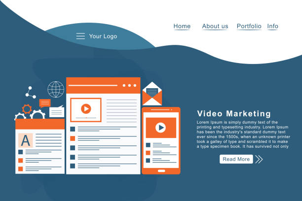
Do you have an online store, but your sales aren’t what you expected? Rasaweb solves your problem forever with professional e-commerce website design!
✅ Significant increase in conversion rates and sales
✅ Unparalleled user experience for your customers
⚡ Click to get a free consultation with Rasaweb!
Why Responsive Design is Crucial for SEO and User Experience

The importance of responsive web design goes beyond website aesthetics; it directly impacts SEO (Search Engine Optimization) and User Experience (UX).
From an SEO perspective, Google has explicitly stated that it prefers mobile-friendly websites in its mobile search results.
This means that a website that is not well-adapted to smaller screens may rank lower in searches, even if its content is very valuable.
A responsive design is effective in SEO because instead of having multiple versions of a site (e.g., one for desktop and a separate one for mobile), there is only one URL and one codebase.
This helps Google crawl and index your site more easily, preventing issues related to duplicate content.
On the other hand, an improved user experience is the backbone of any website’s success.
When a user encounters a website that doesn’t display correctly on their device – out-of-frame images, tiny text, or difficult navigation – they quickly leave the site.
This high Bounce Rate not only indicates a poor user experience but can also be a negative signal for search engines.
Responsive web design, by providing a fluid and adjustable layout, ensures that users, regardless of their device, have easy and hassle-free access to content.
This analysis and guide not only increases user satisfaction but also extends the user’s time on site, both of which are important factors in SEO rankings.
An adaptive website helps businesses maintain a stronger and more stable presence in the digital space and respond to the diverse needs of users in the best possible way.
Key Principles and Techniques in Responsive Web Design
For effective implementation of responsive web design, there are three key principles: Fluid Grids, Flexible Images, and Media Queries.
Fluid Grids use percentages and relative units (like em or rem) instead of fixed pixel units to determine the width and height of elements.
This approach allows the website’s layout to automatically adapt to the screen size.
Flexible images, using CSS properties such as max-width: 100%, ensure that images never overflow their container and scale up or down to fit the available space.
These educational and technical techniques form the foundation for building an adaptive website.
The most important tool available to responsive web designers is Media Queries.
Media Queries allow you to apply different CSS rules based on specific device characteristics, such as screen width, orientation (portrait or landscape), and even resolution.
For example, you can define one set of styles for screens larger than 992 pixels and another set for screens smaller than 768 pixels.
This capability gives you precise control over how elements are displayed on different devices and forms the core of responsive web design.
Proper use of these techniques means creating a seamless user experience, where your site not only looks good but also performs excellently.
Below is a table of common Breakpoints in Media Queries that can serve as a useful guide in your responsive design.
| Device Type | Screen Width (Example) | CSS Media Query |
|---|---|---|
| Smartphones (Portrait) | Up to 576px | @media (max-width: 576px) |
| Smartphones (Landscape) & Small Tablets | 577px to 768px | @media (min-width: 577px) and (max-width: 768px) |
| Tablets (Portrait) & Small Laptops | 769px to 992px | @media (min-width: 769px) and (max-width: 992px) |
| Desktop | 993px to 1200px | @media (min-width: 993px) and (max-width: 1200px) |
| Large Desktops | More than 1200px | @media (min-width: 1201px) |
The Role of User Experience (UX) in the Success of Responsive Web Design

The success of a responsive website is not limited to its correct coding; it heavily depends on the User Experience (UX) it provides to its audience.
In responsive web design, the ultimate goal is for the user, regardless of the device they use, to feel comfortable and satisfied.
This means that navigation should be clear and accessible, content should be easily readable, and all interactive elements (buttons, forms, links) should be easily clickable or touchable.
A good UX design also considers page loading time, as mobile users often have access to slower networks.
Focusing on UX in responsive web design includes stages such as “Mobile-First Design”.
In this approach, design begins with the smallest screens (mobile) and then gradually expands for larger devices.
This method ensures that the most important content and functionalities are available first for mobile users and prevents clutter and information overload on smaller screens.
This is a guidance and technical approach that helps designers prioritize the essential needs of mobile users.
Furthermore, user testing on various devices, collecting user feedback, and analyzing their behavior are critical steps for continuous optimization of an adaptive website’s user experience.
A website with strong UX not only attracts users but also encourages them to return and interact more with your brand.
Does your current website convert visitors into customers, or does it drive them away? Solve this problem forever with professional corporate website design by Rasaweb!
✅ Build strong credibility and branding
✅ Attract target customers and increase sales
⚡ Get a free consultation now!
Optimizing Performance and Speed in Responsive Web Design

One of the biggest challenges in responsive web design is maintaining website performance and loading speed across different devices.
Mobile users are often connected to slower internet networks and have little patience for page loading times.
Every second of delay can lead to lost users and decreased SEO rankings.
Therefore, performance optimization should be considered from the very beginning of the design process for a responsive site.
This includes image compression, CSS and JavaScript code optimization, browser caching, and using Content Delivery Networks (CDNs).
For images, using modern formats like WebP, appropriate quality compression, and also employing the srcset and sizes attributes in HTML to provide images with the right resolution for each device, is crucial.
This is a technical and educational aspect of image optimization.
CSS and JavaScript optimization, through minification and file concatenation, also helps reduce file sizes and the number of HTTP requests.
Furthermore, techniques like lazy loading for images and videos, which only load content when the user needs it (by scrolling towards it), can significantly improve initial page loading speed.
Proper implementation of these principles in responsive web design not only improves user experience but also leads to higher rankings in search engines, as site speed is an important Google ranking factor.
A fast website is a sign of attention to user needs and providing the best possible experience.
Popular Tools and Frameworks in Responsive Web Design

In the current era, numerous tools and frameworks have been developed to facilitate and accelerate the process of responsive web design.
These tools help developers build responsive and efficient websites without the need to write all the code from scratch.
Among the most popular of these frameworks are Bootstrap, Foundation, and Tailwind CSS.
Bootstrap, one of the most widely used frameworks, offers a comprehensive set of ready-made UI components, a responsive grid system, and JavaScript plugins that significantly speed up the design process.
Foundation is another powerful framework that emphasizes customization and flexibility, suitable for larger and more complex projects.
Tailwind CSS, unlike traditional frameworks with pre-built components, is a Utility-First CSS framework.
This means that instead of classes like .btn, it provides a set of small utility classes (such as .flex, .pt-4, .text-center) that can be combined to build any custom user interface.
This technical approach gives the developer a great deal of control.
In addition to frameworks, other tools such as Responsive Viewers (browser extensions) and browser developer modes (like Chrome DevTools) are essential for testing and viewing how a website displays on different devices.
Choosing the right tool in responsive web design depends on project needs, the development team’s skills, and design complexity, but all contribute to the common goal of creating a seamless user experience.
Testing and Debugging Responsive Websites
After implementing responsive web design, the testing and debugging phase is of particular importance.
A well-designed website must function correctly across all devices, browsers, and operating systems.
This educational and guidance step can be challenging due to the wide variety of devices and browsers.
The first step is to use browser developer modes, which allow you to simulate the site’s display across different screen dimensions.
These tools enable you to examine styles, layout changes, and responsive behavior.
However, simulations are not enough; actual testing on physical devices is essential.
This includes testing on various smartphones (Android and iOS), tablets, and desktops with different resolutions.
Online testing tools are also available that can help you see how the website displays on different devices, although they do not replace physical testing.
Debugging CSS and JavaScript issues, such as problems with element alignment, font sizes, or navigation, requires precision and experience.
There may be issues with how media queries are applied or conflicts in styles that require careful code review.
A comprehensive approach to testing in responsive web design ensures that your users always have the best possible experience and prevents potential problems that could harm the site’s credibility and performance.
This final step is a seal of approval for the quality and stability of your responsive design.
The Future of Responsive Web Design and Upcoming Challenges

The future of responsive web design continues to evolve with technological advancements and the emergence of new devices.
With the advent of wearables, smart TVs with web capabilities, and even curved or foldable screens, new challenges arise for web designers.
How can a website be made responsive for a very small screen device or in an entirely different environment like Augmented Reality (AR) or Virtual Reality (VR)? This thought-provoking and news-related content indicates that the need for innovative thinking and new approaches in responsive web design is more critical than ever.
One of the main challenges is content management for different devices.
Should all content be viewable on all devices? Or should content be optimized based on device type and user needs? The concept of “Content-out” versus “Device-in” in design suggests that instead of starting design from the device, we should start from the content and then adapt it for various devices.
This analytical and technical approach means your content must be inherently flexible.
Artificial intelligence and machine learning can also play a significant role in the future of responsive web design, for example, by predicting user needs and automatically adjusting the user interface.
However, maintaining simplicity and usability amidst the complexities of new technologies, will be a fundamental challenge.
Readiness to embrace and integrate these emerging technologies into design strategies is essential for maintaining competitiveness in the future of the web.
| Framework | Approach | Key Features | Advantages | Disadvantages |
|---|---|---|---|---|
| Bootstrap | Component-based | Grid System, UI Components, JavaScript Plugins | Comprehensive, strong documentation, large community, high development speed | Similar default styles, relatively large file size |
| Foundation | Component-based | Flexible Grid, Customization Options, Motion UI | High flexibility, suitable for large projects, SEO-friendly | Harder to learn than Bootstrap, smaller community |
| Tailwind CSS | Utility-First | Low-level utility classes, Highly customizable | Full control over design, very small final file size (with PurgeCSS) | Requires writing many classes in HTML, different learning curve |
Did you know that 94% of users’ first impressions of a business are related to its website design? With professional corporate website design by **Rasaweb**, turn this first impression into an opportunity for growth.
✅ Attract more customers and increase sales
✅ Build credibility and trust in the eyes of your audience⚡ Get a free website design consultation now!
Comparing Responsive Design and Adaptive Design
In the discussion of website design for different devices, two terms are often raised: “Responsive Design” and “Adaptive Design,” which, although both serve a similar goal, have different approaches.
Responsive web design, as previously explained, is based on a fluid and flexible layout that continuously adapts to the screen size.
This means that a responsive website typically has one codebase and uses media queries and relative units to fluidly and continuously change its appearance.
In contrast, Adaptive Design, or adaptive web design, presents the website based on a set of fixed, predefined layouts for specific breakpoints (e.g., 320px, 768px, 992px, and 1200px).
In other words, instead of “fluidly” changing, the website “jumps” to fit one of the predetermined layouts.
When a user accesses the site, the server or browser identifies the device and loads the appropriate layout.
This technical and explanatory approach can in some cases provide more control over content display at each specific breakpoint and may lead to faster page loading, as only the code required for that screen size is loaded.
However, managing multiple layouts can be more complex and requires additional work for each new breakpoint.
Ultimately, both methods can result in a good user experience, but responsive web design is generally considered the preferred approach due to its simplicity in maintenance and coverage of a wider range of screen dimensions.
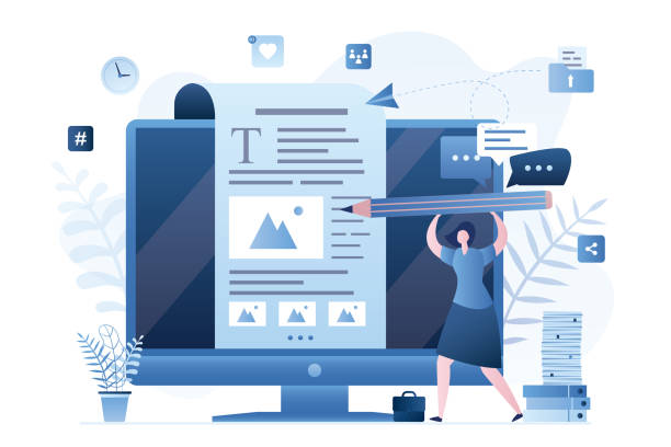
The Importance of Content and its Strategy in Responsive Design
In the success of responsive web design, content and its strategy play a vital role.
Even if your website is technically fully responsive, without appropriate and optimized content, it cannot provide a desirable user experience.
Content must not only be optimized for search engines but also designed to be easily readable and understandable across various screen sizes.
This means avoiding long blocks of text and making greater use of short paragraphs, lists, and subheadings that improve readability.
This educational and analytical aspect is of great importance.
Content strategy for a responsive site must be defined from the outset.
What content is essential on smaller devices, and what content can be hidden or displayed differently? For example, some heavy graphical elements might be removed from the mobile version of the site to improve loading speed.
Also, using lower quality (but still clear) images for mobile users can help reduce data consumption.
In this regard, the concept of “Content Priority” is introduced, based on which the most important information is placed at the top of the page and easily accessible.
This not only helps improve the user experience but also allows users to quickly access what they need.
Content optimized for responsive web design should be such that it remains engaging and effective even on the smallest screens.
This approach ensures that your website not only looks good but also provides the necessary information to the audience in all conditions.
Frequently Asked Questions
| Question | Answer |
|---|---|
| What is Responsive Web Design? | It is a method for designing and implementing websites that causes the layout and content of the page to automatically adjust and display optimally based on the user’s device screen size (desktop, tablet, mobile, etc.). |
| Why is responsive design important? | With the increasing use of various devices to access the web, a responsive site improves user experience, reduces bounce rate, strengthens site SEO, and makes site management and maintenance easier (instead of having separate versions for mobile and desktop). |
| How does responsive design work? | This type of design uses techniques such as flexible grids and layouts (Flexbox, CSS Grid), flexible images and media, and most importantly, CSS Media Queries to change page styles and layout based on screen characteristics (width, height, resolution, etc.). |
| What are the main tools for implementing responsive design? | The main tools include HTML5 (for content structure), CSS3 (especially Media Queries, Flexbox, Grid for responsive styling and layout), and sometimes JavaScript for more complex interactions. |
| What are the main benefits of using responsive design? | The main benefits include increased user accessibility (covering a wide range of devices), improved user experience, improved site ranking in search engines (especially Google), reduced development and maintenance costs, and increased conversion rates from visitors to customers. |
And other advertising services of Rasa Web Advertising Agency:
Smart Marketplace: A fast and efficient solution to increase sales with a focus on Google Ads management.
Smart Social Media: An effective tool to increase sales through custom programming.
Smart Marketplace: Designed for businesses looking to manage campaigns through the use of real data.
Smart Direct Marketing: A combination of creativity and technology to improve SEO ranking by optimizing key pages.
Smart Custom Software: A dedicated service for growth in sales based on Google Ads management.
And over a hundred other services in the field of internet advertising, advertising consultation, and organizational solutions.
Internet Advertising | Advertising Strategy | Advertorials
Resources
Comprehensive Guide to Responsive Design
The Future of Web and Responsive Design
New Approaches in Responsive Design
Best Practices for Responsive Design
? Are you ready to transform your business in the digital world? Rasaweb Afarin Digital Marketing Agency, with expertise in responsive web design, SEO, and online campaign management, is your comprehensive solution for growth and visibility. For consultation and taking big steps towards success, contact us today.
📍 Tehran, Mirdamad Street, next to Bank Markazi, Kazeroun Jonoubi Alley, Ramin Alley, Plaque 6


