
Introduction to Responsive Web Design and its Necessity

In today’s world, where users access the internet using various devices such as smartphones, tablets, laptops, and even smart TVs, #website design requires extraordinary flexibility.
This is where the concept of Responsive Web Design comes into play.
This approach is a specialized method in website design and development, aiming to create websites that can automatically and intelligently adjust their layout and content to the user’s device screen size.
There is no longer a need for separate mobile or desktop versions; a single, optimized site is provided for all devices.
This explanatory approach not only improves user experience but also reduces maintenance costs.
From an educational perspective, responsive web design goes beyond merely resizing elements; this concept includes altering structure, repositioning elements, and even hiding or displaying certain content based on available space.
The necessity of this type of design stems from users’ expectation of a consistent and optimized user experience on any device.
A website that does not display well on mobile quickly loses users and will have a high bounce rate.
Therefore, investing in responsive web design is no longer a luxury option, but a vital requirement for online survival and success.
This professional approach helps businesses ensure their accessibility to a wider audience using various tools and present a modern, user-friendly image of themselves.
Are you frustrated with your online store’s low conversion rate?
Rasawab is your definitive solution with professional e-commerce website design!
✅ Increase your sales and revenue
✅ Unrivaled user experience for your customers
⚡ Get a free consultation now!
Principles and Fundamentals of Responsive Design

To gain a deeper understanding of responsive web design, it is necessary to become familiar with its basic principles.
These principles include Fluid Grids, Flexible Images, and Media Queries, each playing a key role in site adaptability.
Fluid Grids, instead of using fixed pixel units, use relative units like percentages for element widths, so that the site’s layout changes with screen size.
This is a fundamental educational principle whose understanding is essential for every web designer.
Furthermore, Flexible Images ensure that images do not display beyond the available space and scale proportionally with screen size changes, without a significant loss in quality.
This aspect of responsive website design is particularly important on mobile devices where bandwidth may be limited.
Media Queries are the main engine of responsive web design.
These CSS commands allow designers to apply different style rules based on device characteristics such as screen width, height, orientation (portrait or landscape), and even resolution.
For example, it can be specified that on screens smaller than 768 pixels, the navigation menu transforms into a hamburger icon or fonts are displayed smaller.
This specialized and analytical approach empowers designers with precise control over how content is displayed in any environment.
These techniques together create a complete responsive website that not only adapts its size and layout but also optimizes the user experience based on the device.
Understanding these principles is the first step in successfully implementing a fully responsive website that functions correctly on any platform.
Popular Tools and Frameworks in Responsive Design
To facilitate the responsive web design process, numerous tools and frameworks have been developed that have made the work significantly easier for developers.
Frameworks like Bootstrap and Foundation are among the most popular options, offering a set of CSS styles and JavaScript components designed from the ground up for responsiveness.
Using these frameworks is a practical guide for building responsive websites quickly and efficiently, especially for projects with tight deadlines.
Bootstrap, with its 12-column grid system and pre-designed components, allows for the creation of complex layouts with minimal coding.
These tools help streamline the process of designing and developing websites that respond to diverse user needs.
In addition to comprehensive frameworks, native CSS techniques such as CSS Grid and Flexbox also play a very important role in responsive web design.
Flexbox is ideal for one-dimensional layouts (rows or columns), while CSS Grid offers unparalleled power in creating complex two-dimensional layouts (rows and columns simultaneously).
These specialized CSS techniques provide much greater control over element layout compared to frameworks and are ideal options for projects requiring high customization.
Below, we provide a brief comparison between some of these tools and frameworks in a table format:
| Tool/Framework Name | Type | Advantages | Disadvantages |
|---|---|---|---|
| Bootstrap | CSS/JS Framework | Comprehensive, ready-made components, strong documentation, large community | May add extra code volume, similar overall appearance |
| Foundation | CSS/JS Framework | Flexible, high performance, suitable for large projects | More complex than Bootstrap |
| CSS Grid | CSS Module | Full control over two-dimensional layout, less code | Initial learning requires time, older browser support |
| Flexbox | CSS Module | Powerful one-dimensional layout, space distribution, easy alignment | Not suitable for complex two-dimensional layouts |
Choosing the right tool depends on the project’s needs and the development team’s expertise level.
Some projects may benefit from a combination of frameworks and native CSS techniques to achieve the best results in responsive web design.
User Experience (UX) and Responsive Design

One of the most important aspects of responsive web design is User Experience (UX).
A good responsive website doesn’t just mean displaying well on different sizes; it means providing a consistent and satisfying user experience on any device.
This includes aspects such as ease of navigation, content readability, loading speed, and element interactivity.
From an analytical perspective, websites with poor user experience on mobile devices quickly lose their users, which can lead to low conversion rates and loss of customers.
Therefore, when implementing responsive web design, focusing on UX is as important as coding and visual design.
One of the key approaches in optimizing UX for responsive sites is “Mobile-First”.
This explanatory approach states that site design and development should begin with the smallest screens and then gradually optimize for larger screens.
The reason for this is that on mobile devices, screen space and bandwidth are more limited, so core content and essential functionalities must be prioritized.
It’s questionable why some developers still start with a “desktop-first” approach, when statistics show that a significant portion of web traffic comes from mobile.
Mobile-first design ensures that the site performs and looks flawlessly on smaller devices, and then enriches the user experience by adding extra details and content for larger devices.
Ultimately, the success of a responsive web design depends on users’ satisfaction with interacting with it across all platforms.
Are you bothered by losing customers who visited your site to make a purchase?
Rasawab is your specialized solution for having a successful online store.
✅ Significant increase in your online sales
✅ Building trust and professional branding with customers⚡ Get a free consultation from Rasawab specialists!
SEO and the Benefits of Responsive Design for Ranking

In addition to improving user experience, responsive web design offers significant advantages for Search Engine Optimization (SEO).
Google has explicitly stated that it prefers responsive websites, and these types of sites rank higher in mobile search results.
This is important news for any business looking to increase its online visibility.
Having a single URL for all devices, instead of separate versions (e.g., m.example.com), prevents duplicate content issues and simplifies SEO management.
Google’s algorithms can more effectively crawl and index a responsive website, as there is no need to crawl multiple versions of a single page.
The SEO benefits of responsive web design are not limited to direct ranking.
This type of design also indirectly impacts SEO.
For example, improved user experience leads to a reduced bounce rate and increased time spent by users on the site, which are considered positive signals by search engines and can improve site rankings.
Site loading speed is also an important factor in SEO, and responsive websites that are properly optimized can achieve high speeds.
This is an analytical approach and practical guide that shows why you should incorporate responsive web design into your SEO strategy.
In today’s competitive world, any SEO advantage can make a significant difference in attracting traffic and new customers, and responsive design is one of the most powerful tools in this regard.
Challenges and Considerations in Implementing Responsive Design

Despite numerous advantages, implementing responsive web design is not without challenges and requires careful considerations.
One of the main challenges is managing performance and loading speed across different devices.
A website optimized for desktop may contain high-resolution images and heavy scripts, which can lead to slow loading and high data consumption on mobile devices.
It’s a questionable content whether all desktop content should also be loaded on mobile, even if not displayed? The solution to this problem is to use techniques such as Lazy Loading for images and media, optimizing images for different devices, and reducing the size of CSS and JavaScript files.
This is a specialized aspect of design that requires high precision.
Another challenge is browser and device compatibility.
While most modern browsers support responsive web design features, there may still be differences in rendering that require extensive testing.
Testing the website on various devices and browsers, including older ones, is essential to ensure a consistent user experience.
Additionally, designing interactions and user interface (UI) elements that work well with both mouse and touch requires careful planning.
This includes designing appropriately sized buttons for touch and ensuring that important elements are accessible and clickable.
Ultimately, successful responsive web design requires a balance between aesthetics, functionality, and efficiency across all environments.
Case Study of Successful Responsive Web Designs

To better understand the potential and successful implementation of responsive web design, looking at real and successful examples can be very inspiring.
Many large brands and global news websites have been using this approach for years and have achieved positive results.
For example, New York Times was one of the pioneers in implementing responsive design.
Their site adjusts well on different devices and provides a seamless news reading experience.
This type of entertaining yet explanatory content demonstrates how a complex website can be designed responsively.
Another prominent example is websites like Apple, which, with minimalist visual design and a focus on high-quality images, have succeeded in presenting a very beautiful and efficient responsive web design.
They intelligently optimize their layout for different screen sizes using Flexbox and CSS Grid techniques.
Examining these successful websites provides an analytical perspective on how responsive design principles can be used to achieve business goals and excellent user experience.
The table below highlights some key features of successful responsive websites:
| Feature | Description | Importance |
|---|---|---|
| Fast Loading | Short time to fully display content on all devices | Reduced bounce rate, improved SEO, positive user experience |
| Simple and Intuitive Navigation | Easy access to different parts of the site on any screen size | Increased user engagement time, reduced confusion |
| Optimized Images | Using appropriate quality and low-volume images for each device | Reduced loading time, user data saving |
| Sufficient White Space | Using empty space to improve readability and visual appeal | Reduced eye fatigue, improved content comprehension |
These case studies emphasize that responsive web design is not just a technique, but a design philosophy based on prioritizing user experience in all conditions.
This news and analytical approach can be a good guide for future projects.
The Future of Web Design and the Role of Responsiveness

With the continuous advancement of technology and the emergence of new devices, the future of web design is strongly intertwined with the concept of responsiveness.
It is expected that in the coming years, the importance of responsive web design will not only not diminish but will take on new dimensions.
With the advent of technologies like Progressive Web Apps (PWA) and Accelerated Mobile Pages (AMP), websites must pay increasing attention to mobile-centric performance and user experience.
PWAs provide native app-like functionalities within the web environment, and AMP significantly increases mobile page loading speed.
This analytical approach indicates that merely being responsive is not enough; websites must also be optimized for performance.
Furthermore, the emergence of wearable smart devices and the Internet of Things (IoT) has created new challenges and opportunities for web design.
How can a website be designed for a smartwatch or a refrigerator screen? This is questionable and indicates that the concept of responsiveness is expanding beyond traditional screens.
Artificial intelligence and machine learning can also play a significant role in the future of responsive web design, for example by predicting user needs and optimizing content based on their device and behavior.
These new developments in the world of technology are all moving towards a versatile web compatible with any platform, meaning responsiveness will remain at the core of web design.
A website that can adapt to all this diversity in the future will certainly be more successful.
Does your current e-commerce website design not generate the expected sales for you?
Rasawab specializes in professional e-commerce website design!
✅ An attractive and user-friendly site aimed at increasing sales
✅ High speed and security for an ideal shopping experience⚡ Get a free online store design consultation with Rasawab!
Key Tips for Successful Responsive Design

To achieve successful responsive web design, adhering to several key tips is essential.
First, prioritize the mobile-first approach.
As previously mentioned, starting design with the smallest screens ensures that the most important content and functionalities are always accessible.
This is a fundamental guide for any web design project.
Second, focus on optimizing images and media.
Using appropriate image formats (like WebP), optimizing image sizes, and implementing lazy loading can make a significant difference in loading speed and user experience.
This is a specialized aspect that many designers might overlook.
Third, don’t forget extensive and continuous testing.
Test your website on various devices and browsers to ensure its proper functionality.
Use tools like Google Chrome DevTools to simulate different devices and perform quick tests.
Fourth, pay special attention to usability and navigation across different screen sizes.
Navigation menus should be accessible and intuitive on mobile (like a hamburger menu).
Buttons and links should be large enough to be easily touched.
This is an educational content that helps designers avoid common mistakes.
Finally, always think about efficiency and performance.
Optimize your CSS and JavaScript code and use minimal plugins.
A responsive web design that is slow can be as frustrating for users as a non-responsive site.
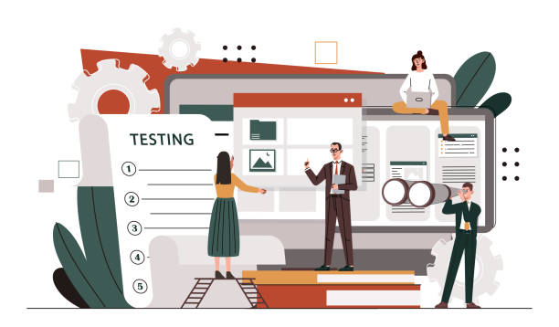
Importance of Testing and Feedback in Responsive Design

After implementing responsive web design, the process of testing and collecting user feedback is of paramount importance.
A complete user experience cannot be achieved solely based on assumptions and simulators.
The website must be genuinely tested on numerous physical devices, including smartphones, tablets, and desktops with various screen sizes.
This is an essential guide for any development team.
Many automated and manual testing tools can help identify layout, performance, and interactivity issues in different environments.
Ensuring the correct functioning of all elements, including forms, buttons, and navigation menus, on every screen size is crucial.
Gathering direct feedback from real users also plays a significant role in improving responsive web design.
This can be done through surveys, focus groups, or Usability Testing.
User feedback can reveal weaknesses that designers and developers might have overlooked.
For example, users might encounter difficulties using a specific element on a mobile device, or their navigation experience on tablets might not be optimized.
It is a questionable content whether a truly user-friendly website can be achieved without user feedback? The answer is definitely no.
Ultimately, responsive web design is an ongoing process, and given the continuous evolution of devices and browsers, it requires continuous updates and optimizations to always provide the best user experience.
Frequently Asked Questions
| Question | Answer |
|---|---|
| What is responsive web design? | A web design approach that automatically adjusts and optimizes the layout and content of a site to display optimally across various devices (mobile, tablet, desktop). |
| Why is responsive design important? | Due to the diversity of devices users employ to access the web; better user experience, stronger SEO, and reduced user bounce rate are among its advantages. |
| What are the main techniques in responsive design? | Using Media Queries in CSS, Fluid Grids, and Flexible Images. |
| What is a Media Query? | A CSS rule that allows you to apply different styles based on device characteristics (such as screen width, height, display orientation). |
| Is responsive design different from Mobile-First design? | Mobile-First is an approach within responsive design that initially designs the site for the smallest screen (mobile) and then gradually improves it for larger screens. |
And other advertising agency services from Rasa Web in the field of advertising
Smart Google Ads: A professional solution for improving SEO ranking with a focus on optimizing key pages.
Smart Direct Marketing: A creative platform for improving SEO ranking through marketing automation.
Smart Marketing Automation: A novel service for increasing digital branding through SEO-focused content strategy.
Smart SEO: An effective tool for user engagement with the help of custom programming.
Smart Advertising Campaign: A novel service for increasing customer acquisition through marketing automation.
And over a hundred other services in the field of internet advertising, advertising consultation, and organizational solutions
Internet Advertising | Advertising Strategy | Advertorial
Resources
Importance of Responsive Web Design
Challenges of Responsive Website Design in Today’s World
Comprehensive Guide to Responsive Web Design
Advantages of Responsive Web Design and Its Importance
Are you ready to transform your business in the digital world? Rasawab Afarin Digital Marketing Agency, by providing innovative and specialized solutions, including fast website design and professional optimization, assists you on the path to growth and success. For a powerful online presence and attracting more customers, contact us today.
📍 Tehran, Mirdamad Street, next to the Central Bank, South Kazeroun Alley, Ramin Alley, No. 6
