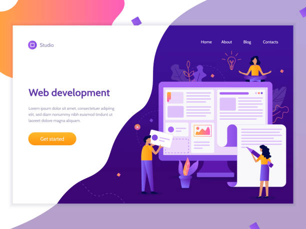
An Introduction to Responsive Web Design and Its Importance

In today’s fast-paced world, where users access the internet from various devices, #websites must be more adaptable than ever.
From smartphones and tablets to laptops and wide monitors, each device has its unique display characteristics.
This is where the concept of #responsive_web_design comes into play.
Responsive Web Design is an approach that ensures your website is displayed in the best possible way, regardless of screen size or type, providing a seamless user experience.
This approach is not just a luxury feature; it is an absolute necessity for any business or individual with an online presence.
The main goal of this type of design is to deliver consistent content and functionality with a layout and appearance tailored to the user’s device.
This approach helps your #audience easily navigate your site and access the information they need, without having to zoom or scroll excessively.
The importance of this issue is reflected not only in user satisfaction but also in your site’s ranking in search engines.
A well-optimized and responsive website has a higher chance of being seen in search results.
This is a vital step towards a future where access to information is available anytime, anywhere, without any obstacles.
Did you know that 94% of users’ first impressions of a business are related to its website design? With professional corporate website design by **Rasawweb**, turn this first impression into an opportunity for growth.
✅ Attract more customers and increase sales
✅ Build credibility and trust in the eyes of your audience⚡ Get a free website design consultation!
Key Principles of Responsive Design

To achieve a fully responsive website, several key principles must be adhered to.
The first and perhaps most important principle is the use of Fluid Grids.
Instead of using fixed pixels to define element widths, responsive design uses relative percentages.
This means that the width of a column or an image automatically adjusts based on the user’s screen size.
The second principle is the use of Flexible Images.
Images should not overflow their containers and must have the ability to automatically resize to fit their container’s dimensions without significant quality loss.
This is typically achieved by setting `max-width: 100%` for images in CSS.
The third and most powerful tool in this journey is Media Queries.
These CSS rules allow you to apply different styles based on device characteristics such as screen width, height, orientation, and even resolution.
For example, you can define that on screens with a width less than 768 pixels, the navigation menu should appear as a hamburger menu instead of horizontally.
The “Mobile-First” approach is also a vital principle in responsive web design, where the design is initially created for the smallest screen, and then progressively enhanced for larger screens.
These principles together ensure a consistent and optimized structure for the website across different devices.
Benefits of Responsive Design for Businesses

Using responsive web design is not only a smart choice for user experience but also brings significant business benefits.
One of the most important advantages is improved SEO and search engine rankings.
Google has explicitly stated that it prefers responsive websites because they have a single URL for all devices, which makes crawling and indexing easier for Google bots.
This means increased visibility and greater access to potential customers.
In addition to SEO, the conversion rate also significantly increases.
When users can easily navigate your site and content is displayed correctly, they are more likely to take your desired action (such as purchase, registration, or contact).
Furthermore, maintaining and managing a responsive website is much simpler and more cost-effective than maintaining multiple separate versions (e.g., a desktop version and a mobile version).
This translates into savings in time and resources.
Ultimately, responsive site design helps strengthen your brand by showing that you care about your users’ needs and provide a modern, professional user experience.
These benefits combined yield a significant Return on Investment (ROI) for businesses.
Comparison of Web Design Approaches
| Feature | Responsive Design | Adaptive Design | Fixed Design |
|---|---|---|---|
| Number of versions | One version for all devices | Several fixed versions for specific widths | One fixed version (usually for desktop) |
| Flexibility | Very High (fully fluid) | Medium (only at specific breakpoints) | Low (only one width) |
| URL Management | One URL for all devices | Different URLs or rewriting | One main URL |
| SEO Impact | Very Positive (Google’s recommendation) | Positive (but requires precise configuration) | Negative (poor mobile user experience) |
| Implementation Complexity | Medium to High (requires fluid thinking) | High (design for each breakpoint) | Low (fixed design) |
Challenges and Solutions in Implementing Responsive Design
Despite its numerous benefits, implementing responsive web design is not without its challenges.
One of the main concerns is website performance and loading speed.
When a website is designed for a wide range of devices, it may include high-resolution images and more CSS and JavaScript resources, which can lead to slow loading times on devices with limited bandwidth or weaker processors.
The solution to this problem includes using techniques such as Lazy Loading for images, optimizing images (compression and using modern formats like WebP), and compressing CSS and JS files.
Another challenge is the complexity of testing and debugging.
Ensuring that the site works correctly across all browsers and devices requires simulator tools and thorough testing.
Using browser developer tools and third-party testing services can be helpful in this regard.
Content management can also be a challenge, as content must be designed to remain readable and accessible across different screen sizes.
Sometimes, there is a need to #hide or reorder elements for smaller devices, which must be done carefully.
Careful planning from the outset, choosing the right framework, and focusing on a mobile-first approach can effectively mitigate many of these challenges and smooth the path for implementing responsive web design.
Did you know a poor corporate website loses you many opportunities daily? Solve this problem forever with professional corporate website design by Rasawweb!
✅ Create a powerful and trustworthy image for your brand
✅ Attract targeted new customers and increase sales
⚡ [Get free website design consultation]
Popular Tools and Frameworks in Responsive Design

To facilitate the process of responsive web design, a set of tools and frameworks have been developed that help developers create websites compatible with various devices more quickly and efficiently.
One of the most popular and well-known frameworks is Bootstrap.
This CSS, HTML, and JS framework provides a collection of predefined UI components and a powerful grid system that are responsively designed by default.
Using Bootstrap, complex and responsive layouts can be quickly implemented without the need to write a lot of CSS from scratch.
Another framework that has gained significant popularity is Flexbox, which is a layout module in CSS3.
Flexbox allows developers to flexibly arrange and distribute items within a container, which is very useful for building navigation bars, galleries, and one-dimensional layouts.
CSS Grid Layout is another powerful tool that enables the design of more complex two-dimensional layouts, giving developers full control over the position and size of elements within the grid.
These tools, along with advanced code editors and browser testing tools, transform the responsive site development process into an efficient and enjoyable experience, allowing designers and developers to easily handle the varying complexities of screen sizes and build modern, optimized websites.
Impact of Responsive Design on SEO and Google Ranking

Search engines, especially Google, play a vital role in a website’s visibility, and responsive web design directly impacts a site’s ranking in search results.
Since 2015, Google officially announced that it considers website responsiveness as a ranking factor and places mobile-friendly websites higher in mobile search results.
This importance has doubled in recent years with the introduction of Mobile-First Indexing.
This means Google primarily considers your site’s mobile version for indexing and ranking content, even for desktop searches.
If your site has a poor mobile user experience, you will likely rank lower in search results.
Optimizing your site for mobile through responsive design helps search engines crawl and index your content more effectively, as there is a single URL for all devices, preventing duplicate content and simplifying backlink management.
Furthermore, the bounce rate is lower on responsive websites because users have a positive experience and stay on the site longer, which is a positive signal for Google.
Given that a significant portion of searches are conducted via mobile devices, ensuring your site works well on mobile is no longer a competitive advantage but a fundamental requirement for SEO success and maintaining organic traffic.
The Role of User Experience (UX) in Responsive Design

Responsive web design is not limited to visual layout; it is deeply intertwined with the concept of User Experience (UX).
A successful responsive website, beyond simply adapting to screen dimensions, must provide a pleasant and efficient experience on every device.
This means that not only the site’s appearance but also its functionality, usability, and interactivity must be optimized for both mobile and desktop users.
Important UX elements in responsive web design include high readability across all sizes (font size, line spacing), clickable buttons and links (especially for mobile touchscreens), simple and accessible navigation, and fast loading times.
For example, on a smartphone, navigation might be condensed into a hamburger menu, while on a desktop, it might appear as a full navigation bar.
Ensuring that images and videos are properly scaled and compressed to guarantee fast loading is a crucial part of UX.
Also, visual and functional feedback should be consistent across all devices so that the user does not feel confused.
Ultimately, the goal of a responsive and user-centric design is for the user, regardless of the device they use, to easily achieve their goal on the site and experience a positive and unparalleled visit every time.
This approach means thoughtful and empathetic design towards user needs in every environment.
User Experience Considerations in Responsive Design
| UX Factor | Description | Importance in Responsiveness |
|---|---|---|
| Readability | Font size, contrast, line spacing | Essential; text must be readable on any screen. |
| Touch Targets | Size and spacing of buttons and links | Crucial for mobile users. |
| Navigation | Ease of finding one’s way around the site | Must be concise on mobile and complete on desktop. |
| Input Forms | Ease of completing forms | Large fields, appropriate keyboard for mobile. |
| Load Time | Speed of content display | Very Important, especially on mobile with slow connections. |
The Future of Web Design and New Trends

Despite the maturity of responsive web design, the web world never stands still, and new trends are emerging that shape the future of web design.
One of these trends is the development of Progressive Web Apps (PWAs).
PWAs offer a native app-like experience in a web browser, including offline capabilities, push notifications, and installation on the device’s home screen.
This technology is a kind of evolution of responsive web design, as it focuses on providing a flawless experience on any device, with more advanced capabilities.
Another is Accelerated Mobile Pages (AMP), designed to load web pages extremely fast on mobile, especially for news content.
Although AMP has design limitations, it offers unparalleled speed.
Also, with the advancement of voice technologies such as voice assistants and smart speakers, design for Voice User Interfaces (VUIs) is also increasing.
Dark Mode is another popular trend that allows users to change the UI to dark colors, which is both easier on the eyes and reduces battery consumption on OLED devices.
These new trends, along with continuous advancements in CSS and JavaScript, ensure that responsive web design is always evolving and improving, elevating the user experience to new levels.
Losing potential customers due to an unprofessional website? Rasawweb is your answer! With our specialized corporate website design services:
✅ Enhance your business’s credibility and standing
✅ Experience more targeted new customer acquisition
⚡ Act now to get a free consultation!
Step-by-Step Guide to Responsive Design for Beginners

If you intend to enter the world of responsive web design, you don’t need to worry.
With a step-by-step approach, you can learn the basics and build your sites compatible with various devices.
The first step is to understand the concept of #Viewport.
In HTML, add a meta viewport tag in the head section of your page so that the browser knows how to adjust the page width based on the device width: <meta name="viewport" content="width=device-width, initial-scale=1.0">.
The second step is to use Relative Units in CSS.
Instead of fixed pixels (px) for sizes, use relative units like percentages (%), em, or rem for measuring widths, heights, and font sizes.
This ensures that your elements scale dynamically.
The third step is to apply Media Queries.
By using @media (max-width: 768px) { /* CSS rules for screens up to 768px */ }, you can apply different styles for specific screen sizes.
For example, you can change a columnar layout to a single-column layout.
The fourth step is Image Flexibility.
By adding img { max-width: 100%; height: auto; } to your CSS, ensure that images do not exceed their container’s boundaries.
Finally, don’t forget testing and debugging.
Use your browser’s developer tools (such as Chrome’s responsive mode) to simulate various devices and check how your site is displayed.
By practicing and implementing these principles, you will soon be able to build responsive and modern websites.
Frequently Asked Questions About Responsive Web Design
On the path to understanding responsive web design, various questions may arise for users and developers.
Here, we answer some of the most common questions to clarify existing ambiguities.
Is responsive design necessary?
Yes, in the current era, where a large portion of web traffic comes from mobile devices, responsive design is not just an advantage, but a necessity for providing an appropriate user experience and maintaining search engine rankings.
Google also prefers responsive websites.
What is the difference between responsive and adaptive design?
Responsive design is a completely fluid approach that adapts itself to any screen size with a single codebase.
Adaptive design, however, creates several fixed versions of the layout for specific screen sizes and switches between them.
Responsive is more flexible.
Does responsive design affect site speed?
If not implemented correctly, yes.
Loading large images or unnecessary CSS/JS files can slow down the speed.
However, with proper image optimization, code compression, and techniques like lazy loading, a responsive and fast site can be achieved.
Can an old site be converted to responsive?
Yes, in many cases it is possible, but it may require extensive revisions to the existing CSS and HTML.
Sometimes, starting from scratch is more efficient to achieve the best result.
What is the best way to test a responsive site?
Using browser developer tools, device simulators (like Responsinator), and testing on actual physical devices are the best methods to ensure proper site functionality across all dimensions.
These answers help in a deeper understanding of responsive web design and clarify common ambiguities, providing guidance for starting or optimizing websites.
Frequently Asked Questions
| Question | Answer |
|---|---|
| What is responsive web design? | A web design approach that automatically adjusts and optimizes a site’s layout and content for display on various devices (mobile, tablet, desktop). |
| Why is responsive design important? | Due to the variety of devices users employ to access the web; better user experience, stronger SEO, and reduced bounce rate are among its benefits. |
| What are the main techniques in responsive design? | Using Media Queries in CSS, Fluid Grids, and Flexible Images. |
| What is a Media Query? | A CSS rule that allows you to apply different styles based on device characteristics (such as screen width, height, display orientation). |
| Is responsive design different from Mobile-First design? | Mobile-First is an approach within responsive design where the site is initially designed for the smallest screen (mobile) and then progressively enhanced for larger screens. |
And other services of Rasawweb Advertising Agency in the field of advertising
Smart Google Ads: A combination of creativity and technology to improve SEO ranking through proprietary programming.
Smart Conversion Rate Optimization: A fast and efficient solution for digital branding focusing on attractive UI design.
Smart Customer Journey Map: An innovative service to increase click-through rates by optimizing key pages.
Smart Data Analysis: A fast and efficient solution for digital branding focusing on attractive UI design.
Smart Data Analysis: An innovative service to improve SEO ranking through attractive UI design.
And over hundreds of other services in internet advertising, advertising consultation, and organizational solutions
Internet Advertising | Advertising Strategy | Advertorials
Resources
Responsive Design Tutorial on WebsimaBasic UX Principles in WebsitesFuture of Web Design with a Focus on the UserLatest UI/UX Trends in Iran
? To reach the peaks of success in the digital world, Rasawweb Digital Marketing Agency offers services such as website design with a modern user interface and professional optimization, by your side.
📍 Tehran, Mirdamad Street, next to Bank Markazi, Southern Kazeroon Alley, Ramin Alley, No. 6


