
1. Introduction and the Necessity of Responsive Web Design in Today’s World
In the current digital age, where users access the internet from various devices such as smartphones, tablets, laptops, and even smart TVs, the importance of #Responsive_Web_Design has become more apparent than ever.
This approach in #Web_Design allows websites to automatically adjust their size and layout to the user’s screen size, providing an optimal and seamless experience.
The main goal of #Responsive_Design is to present content without the need for zooming in, zooming out, or horizontal scrolling.
This feature not only improves User Experience (UX) but also plays a vital role in Search Engine Optimization (SEO).
Google has officially announced that it prefers responsive websites in its search results, especially with the shift to “mobile-first indexing”.
This algorithm change has forced website owners to rapidly move towards responsive web design to maintain their ranking and visibility.
Ignoring this necessity can lead to the loss of traffic and potential customers.
Therefore, a deep understanding of the principles and fundamentals of responsive web design is crucial for any web developer and online business owner.
This section explained its concept and necessity.
Research shows that 80% of customers trust companies with professional websites more. Does your current site inspire this trust?
With Rasaweb’s corporate website design services, permanently solve the problem of customer mistrust and a weak online image!
✅ Create a professional image and increase customer trust
✅ Attract more sales leads and grow your business
⚡ Get Free Consultation
2. Principles and Fundamentals of Responsive Web Design
Responsive web design is based on three key principles: Fluid Grids, Flexible Images, and Media Queries.
Fluid Grids use relative units like percentages for element widths instead of fixed pixel units.
This approach helps the layout automatically adjust based on screen size, providing a seamless user experience.
Flexible Images also use CSS to resize themselves to fit their parent container, preventing overflow or excessive shrinkage.
This is typically done by setting the `max-width: 100%;` property for images.
Media Queries are the heart of responsive design.
These CSS commands allow the browser to detect user device characteristics such as screen width, height, orientation, and resolution, and apply specific styles accordingly.
For example, a media query can be used to specify that a column appears next to the main content on large screens, but moves below it on smaller screens.
The concept of “Breakpoints” also originates here; these points are specific screen widths at which the website’s layout or appearance changes to adapt to the current device.
Accurate understanding and correct application of these principles form the backbone of every successful responsive web design, enabling the creation of websites that look great and perform flawlessly on any device.
This section specifically addressed the fundamentals of this design.
3. Challenges and Solutions for Implementing Responsive Design
Implementing responsive web design, while offering numerous benefits, also comes with challenges.
One of the biggest challenges is Performance.
Loading all resources (high-resolution images, CSS, and JavaScript) for all devices, even those that don’t need them, can significantly reduce site loading speed, especially on mobile devices with slower internet connections.
The solution to this challenge involves techniques such as Lazy Loading for images and videos, optimizing and compressing CSS and JavaScript files, and providing images appropriate to device size (Responsive Images).
Another challenge is content management and prioritization.
On smaller screens, there is less space to display content, and decisions must be made about which information is more critical and how it should be displayed.
This requires a precise content strategy that specifies what content should be displayed at what screen size and how it should be organized.
Using design patterns like Off-Canvas Navigation or Accordion Lists can help manage limited space.
Also, testing and debugging across different devices and browsers can be time-consuming due to the wide variety.
Using simulator tools and actual testing on physical devices is essential.
Ultimately, responsive web design requires a “mobile-first” approach; meaning, designing first for the smallest screen and then expanding it to larger sizes.
This analytical section addresses its challenges and solutions.
| Approach | Advantages | Disadvantages | Best for |
|---|---|---|---|
| Mobile-First | Better mobile performance, focus on essential content, more SEO-friendly | May be difficult for designers initially, requires different thinking | New projects, sites with high mobile traffic |
| Desktop-First | More common and familiar for many designers, starting from larger space | Complexity in removing or hiding elements for mobile, poorer mobile performance | Redesigning old sites, projects with primary focus on desktop |
4. Impact of Responsive Web Design on User Experience

Responsive web design directly and significantly impacts user experience, transforming it.
The most important advantage is providing a seamless and hassle-free navigation experience across all devices.
Users no longer need to constantly zoom in or out to read text or view images.
This leads to reduced user fatigue and increased satisfaction.
When a website responds well to any screen size, users feel that the website was designed for them and their needs were considered.
This conveys a sense of trust and professionalism.
Furthermore, responsive design also helps improve Accessibility.
Content that is properly laid out and has a font size appropriate for the screen is more usable for individuals with visual or motor impairments.
Buttons and links become larger and more touch-friendly, which is very important for mobile users with their fingers.
The Bounce Rate decreases because users see no need to leave the site due to a poor user experience.
In contrast, the Conversion Rate increases; because users can easily find the information they need and perform desired actions, whether it’s purchasing a product or filling out a form.
Ultimately, an improved user experience leads to greater customer loyalty and brand strengthening.
This section elaborated on the impact of this design on UX.
Is your e-commerce site ready to attract maximum customers and increase sales? Rasaweb transforms your online business with modern and efficient e-commerce website designs.
✅ Increased speed and improved SEO
✅ Excellent user experience on mobile and desktop⚡ Get free e-commerce website design consultation from Rasaweb!
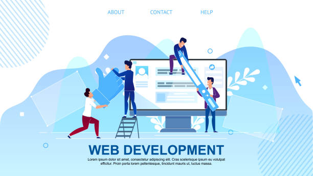
5. Popular Tools and Frameworks in Responsive Web Design

To facilitate the responsive web design process, numerous tools and frameworks have been developed to help developers more efficiently create websites compatible with various devices.
One of the most popular and well-known frameworks is Bootstrap.
Bootstrap is a comprehensive collection of CSS, JavaScript, and HTML, which includes ready-made components for navigation, forms, buttons, and a powerful Grid System.
Its use speeds up the design process and ensures that the website displays correctly across different browsers and devices.
Another widely used framework is Foundation, which promotes a “mobile-first” approach and offers high flexibility in customization.
In addition to frameworks, CSS libraries such as Flexbox and CSS Grid are also powerful tools for creating responsive layouts.
Flexbox is ideal for one-dimensional layouts (rows or columns), and CSS Grid for two-dimensional layouts (rows and columns), providing unparalleled flexibility for controlling page elements.
Responsiveness testing tools like Google Chrome Developer Tools or Responsinator are also very useful for previewing and testing websites at different screen sizes.
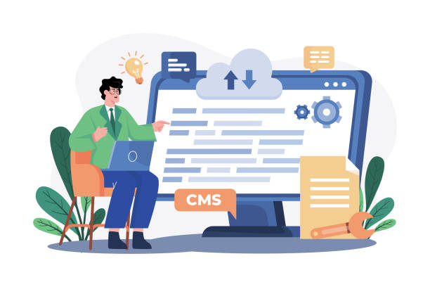
Furthermore, using Content Management Systems (CMS) like WordPress with responsive themes has made the process of creating a mobile-compatible website easy even for non-technical users.
This section provided guidance on using tools and frameworks in responsive web design.
6. Responsive Web Design and Search Engine Optimization (SEO)
The relationship between responsive web design and Search Engine Optimization (SEO) is very close and critical.
Since 2015, Google officially announced that responsiveness is an important ranking factor for websites, especially for searches performed via mobile.
This decision was inevitable given the significant increase in the number of mobile users.
Responsive websites, by having a single URL for all devices, make the process of crawling and indexing much easier for search engines.
In contrast, separate mobile sites (like m.example.com) require more complex settings and maintenance and may encounter issues such as duplicate content, which negatively impacts SEO rankings.
Furthermore, responsive web design also indirectly affects SEO.
A better user experience (as explained earlier) leads to a lower bounce rate and increased user time on site.
These metrics signal to search engines that your site’s content is high-quality and relevant, thereby improving your ranking.
Loading speed is also an important ranking factor, and responsive websites (if properly optimized) can offer higher loading speeds.
Given Google’s “mobile-first indexing” approach, where the mobile version of the site is considered the primary version for evaluation and ranking, having a responsive web design is no longer an option, but a necessity for visibility in search results.
This specialized section addressed the connection between this design and SEO.
7. The Future of Responsive Web Design and Upcoming Developments
The future of responsive web design is constantly evolving with technological advancements and the emergence of new devices.
Beyond smartphones and tablets, we are entering an era where wearables, Virtual Reality (VR) and Augmented Reality (AR) displays, and even screens embedded in cars and home appliances are becoming new tools for accessing web content.
This increasing diversity of devices further highlights the need for a more adaptable design.
The future focus may shift from mere “responsiveness” to “Contextual Adaptability,” where the website reacts not only to screen size but also to other factors such as user location, internet speed, ambient light, and even the user’s emotional state, and presents content in the best possible way.
The use of Artificial Intelligence and Machine Learning can play a key role in personalizing the user experience in this regard.
Also, with the advent of 5G networks and the Internet of Things (IoT), device speed and connectivity will increase dramatically, enabling the loading of richer and more interactive content.
These developments indicate that responsive web design is not a static concept but an evolving philosophy that must constantly keep pace with technological innovations.
Websites must be flexible enough to adapt to future form factors, not just today’s devices.
This informative and thought-provoking section addresses the future of design.
| Trend/Technology | Description | Impact on Responsive Web Design |
|---|---|---|
| Virtual/Augmented Reality (VR/AR) | New immersive and interactive experiences | Need for 3D and spatial UI, navigation challenges |
| Internet of Things (IoT) | Smart devices connected to the internet | Design for small and screenless displays, voice control |
| AI and ML in UX | Content and user experience personalization | Dynamic UIs adaptable to user behavior, automatic optimization |
| Progressive Web Apps (PWAs) | Websites with mobile app capabilities | Offline experience, notifications, home screen installation, increased speed |
8. Case Study of Successes and Failures in Responsive Web Design

Case studies of websites that have succeeded or failed in responsive web design teach us valuable lessons.
Successful examples are usually websites designed with a “mobile-first” approach from the outset, offering high performance and a flawless user experience across all devices.
For instance, major news websites like BBC News or The New York Times are prominent examples of responsive web design that display their complex content in an understandable and engaging way on any screen.
They have made access to information very easy for users by using flexible layouts, optimized images, and efficient navigation menus.
These sites also place great importance on loading speed, which is crucial for maintaining mobile users’ attention.
In contrast, failures often result from ignoring basic principles.
Websites that merely try to be responsive by shrinking desktop content for mobile often provide a disastrous user experience.
Texts become small and unreadable, buttons are too tiny to tap, and images take a long time to load.
Some websites may perform well at one screen size but become messy at others, indicating inappropriate breakpoints or insufficient testing.
These failures not only lead to reduced user satisfaction but also result in lower search engine rankings and ultimately, loss of traffic and revenue.
The main lesson from these analyses is that responsive web design goes beyond mere CSS adjustments; it requires a comprehensive consideration of content, performance, and user experience.
This analytical and engaging section reviewed examples.
Did you know that your company’s website is the first point of contact for 75% of potential customers?
Your website is the face of your brand. With **Rasaweb**’s corporate website design services, build an online presence that earns customer trust.
✅ Create a professional and lasting image for your brand
✅ Attract target customers and increase online credibility
⚡ Get free consultation from **Rasaweb** experts!
9. Key Tips for Successful Responsive Web Design

To ensure success in responsive web design, several key tips are essential.
First, prioritize detailed planning and a mobile-first approach.
From the outset, instead of trying to port a desktop design to mobile, design the website for the smallest screen and then scale it up.
This approach helps you focus on essential content and avoid unnecessary clutter on mobile devices.
Second, take image and media optimization seriously.
Large, uncompressed images can severely reduce site loading speed.
Use appropriate image formats, quality compression, and techniques like Lazy Loading for images.
Also, using `srcset` and `sizes` in HTML to serve images with different resolutions based on screen size is very effective.
Third, test, test, and test again! Test your website on real devices and various simulators to ensure its correct functionality in all scenarios.
Use browser developer tools to simulate different screen sizes and pay attention to user feedback.
Fourth, design navigation to be simple and intuitive.
On mobile, there’s less space for complex menus, so use hamburger menus or other navigation patterns that take up minimal space.
Finally, pay attention to accessibility; ensure that the website is usable for all users, including individuals with disabilities.
This section provided guidelines for a successful responsive web design.
10. Conclusion and General Outlook of Responsive Web Design

In this article, we thoroughly discussed responsive web design, its necessity, fundamental principles, implementation challenges and solutions, its impact on user experience and SEO, related tools and frameworks, and its future.
It is clear that responsive design is no longer a competitive advantage, but an industry standard and a prerequisite for survival in today’s web space.
Given the growing trend of mobile device usage and constant changes in the digital ecosystem, websites that cannot adapt to any screen size will quickly fall behind in today’s competitive market.
The ultimate goal of responsive web design is to provide a flawless and seamless user experience, regardless of the device the user employs to access content.
This approach not only increases user satisfaction but also significantly contributes to business success by improving search engine rankings and reducing maintenance costs (due to a single codebase).
The future outlook indicates that web design is moving towards greater adaptability and content personalization based on the platform and user needs.
With the emergence of new technologies such as AI and IoT, web developers and designers must constantly learn and update their knowledge to build websites that are suitable not only for today but also for the future of the web.
Responsive web design is the foundation of this future.
This informative section provided a summary of the discussions and a general outlook.
Frequently Asked Questions
| Question | Answer |
|---|---|
| What is Responsive Web Design? | Responsive Web Design is an approach that causes a website’s design and layout to change based on the user’s device screen size (computer, tablet, mobile, etc.) and be displayed optimally. |
| Why is Responsive Design important? | Its importance stems from the increasing use of various devices to access the internet. Responsive design improves User Experience (UX), reduces Bounce Rate, and is beneficial for SEO. |
| What techniques are used in Responsive Design? | The main techniques include using Fluid Grids, Flexible Images, and Media Queries in CSS. |
| What does Fluid Grids mean? | Instead of using fixed pixel units, relative units such as percentages or ems are used to define the width and height of elements, so that the layout is flexible with changes in screen size. |
| What is the use of Media Queries? | Media Queries allow you to apply different CSS styles based on user device characteristics such as screen width, height, orientation (horizontal or vertical), and resolution. |
And other services of Rasa Web Advertising Agency in the field of advertising
Smart Sales Automation: A new service for increasing sales through marketing automation.
Smart UI/UX: A combination of creativity and technology to improve SEO ranking through custom programming.
Smart Custom Software: An innovative service for increasing user engagement through user experience customization.
Smart Brand Identity: An effective tool for analyzing customer behavior with the help of precise audience targeting.
Smart SEO: An innovative service for increasing website traffic through SEO-driven content strategy.
And more than a hundred other services in the field of online advertising, advertising consultation, and organizational solutions
Online Advertising | Advertising Strategy | Advertorials
Sources
Comprehensive Guide to Responsive Design in Webkade Article: The Future of Web Technologies in IranICT Modern Web Design Trends in Parsian Web Responsive Site Development by Tarahsazan
? Are you ready for your business to leap forward in the digital world? Rasaweb Afarin Digital Marketing Agency, by offering services such as website design with a modern user interface, professional SEO, and social media management, paves the way for your business’s growth and prominence in the online space. For a free consultation and to learn more about our services, contact us now.
📍 Tehran, Mirdamad Street, next to Bank Markazi, Southern Kazeroon Alley, Ramin Alley, No. 6


