
Introduction to Responsive Website Design and its Importance in the Digital Age

In today’s world, where smart devices have become an integral part of our lives, the importance of #responsive_website_design has become more apparent than ever.
You can no longer satisfy users with a static website optimized only for desktop screens.
This #educational approach in web development ensures that your website is displayed correctly and with the best user experience on any device, from small mobile phones to tablets and large desktop monitors.
But what exactly is #responsive_website_design and why is it vital for your business? Did you know that Google also prioritizes responsive websites in its search results rankings? This is an important #analytical point that cannot be ignored.
Non-responsive websites may provide a poor user experience, causing users to quickly leave your site, which in turn leads to an increased bounce rate and decreased site credibility in the eyes of search engines.
The main goal of implementing this type of design is to provide a seamless and optimal user experience for all visitors, regardless of the device they use.
This approach not only increases website accessibility but also helps you gain a competitive advantage in the competitive web space.
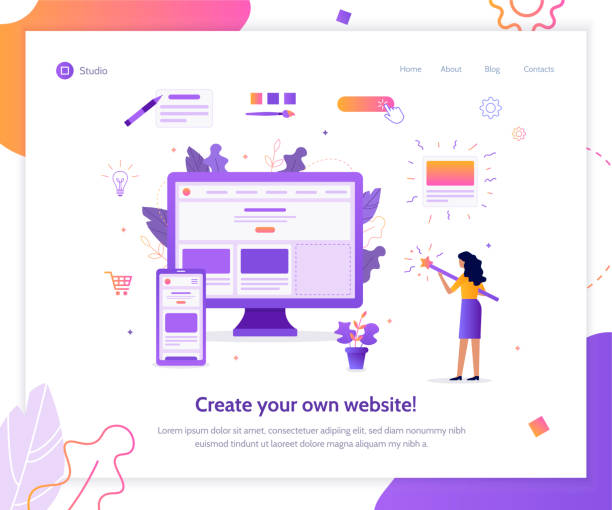
Does your current corporate website not reflect your brand’s credibility and power as it should? Rasawob solves this challenge for you with professional corporate website design.
✅ Increase credibility and visitor trust
✅ Attract more targeted customers
⚡ Click for a free consultation!
Key Principles of Responsive Design: Introduction to Media Queries

To deeply understand responsive website design, we must become familiar with its underlying principles.
One of the most important tools for this is “Media Queries” in CSS.
This #technical section explains how, using Media Queries, we can apply different styles based on device characteristics such as screen width, height, orientation (horizontal or vertical), and even resolution.
For example, you can define that if the screen width is less than 768 pixels (typically for tablets and mobiles), font sizes should be smaller, columns should stack instead of sitting side-by-side, and images should display at full width.
This capability allows us to have a single HTML file and optimize the website for different devices simply by changing the CSS. Have you ever wondered how a website can adapt itself to different dimensions in an instant? This is the power of Media Queries.
A correct understanding of this tool is essential for any developer intending to enter the field of modern web design.
Furthermore, the use of relative units such as percentages, `em`, and `rem` instead of fixed pixel units, alongside Media Queries, plays a vital role in creating a flexible and responsive design.
This is an #explanatory and #educational guide to getting started with responsive design principles.
Comparing Fixed, Fluid, and Responsive Web Design Approaches
In the world of web design, there are three main approaches to structuring pages: Fixed Layout, Fluid Layout, and Responsive Design.
In this #analytical section, we will compare these three to gain a deeper understanding of the position and benefits of responsive website design.
| Feature | Fixed Design | Fluid Design | Responsive Design |
|---|---|---|---|
| Page Width | Fixed (pixels) | Relative (percentage) | Both fixed and relative (based on Media Queries) |
| Device Compatibility | Low (only one size) | Medium (size changes proportionally with width) | Excellent (best experience on all devices) |
| Implementation Complexity | Low | Medium | High |
| Need for Media Queries | No | No | Yes, main element |
| User Experience | Poor on various devices | Medium for specific sizes | Optimized and seamless |
Fixed design, as its name suggests, has a fixed width designed for a specific screen size (usually desktop).
This type of design quickly breaks on smaller devices, creating a terrible user experience.
Fluid design uses relative units like percentages to scale page elements as the browser width changes.
This approach performs better than fixed, but can still cause visual problems at very small or very large sizes.
However, responsive website design offers a comprehensive solution by combining the flexibility of fluid design with the intelligent use of Media Queries.
This advanced approach not only scales content but also adapts the overall layout and appearance of the page based on the device’s needs.
Choosing responsive website design is a strategic decision for sustainability and success in today’s digital landscape.
Mobile First: A New Strategy in Responsive Design

The concept of “Mobile First” is a #guideline and a key philosophy in responsive website design that initially focuses on designing for the smallest screen (mobile) and then gradually adds capabilities and complexities for larger screens.
This approach literally means “mobile first.”
Why should we design this way? The answer is simple: the majority of internet users today access websites through their mobile devices.
If your website is optimized for mobile first, it provides a better user experience for this vast segment of the audience. This approach not only leads to faster and more efficient websites but also helps the team focus on essential content and core functionality during the design and development process.
By starting with the limitations of mobile screens, designers and developers are compelled to be creative and deliver the core content and functionality without unnecessary frills and additions.
They can then gradually add richer and more complex visual elements for desktop.
This is a significant paradigm shift that directly impacts the improvement of SEO and user experience.
Implementing a Mobile First strategy is a sign of maturity and a deep understanding of modern user behavior, and it is vital for any website seeking long-term success.
This is a #technical and very important discussion in today’s world.
Does your current e-commerce website not generate the expected sales for you?
Rasawob is an expert in professional e-commerce website design!
✅ An attractive and user-friendly site aimed at increasing sales
✅ High speed and security for an ideal shopping experience⚡ Get a free consultation for online store design with Rasawob!
Responsive Fonts and Images: Visual Optimization for All Devices

An important part of responsive website design is optimizing fonts and images.
Imagine having a website that looks beautiful on a desktop, but on a mobile device, the images are so large they break the layout, and the text is so small it’s unreadable.
This is where the importance of making visual elements responsive becomes clear.
For fonts, using relative units like `em` or `rem` instead of `px`, allows the browser to adjust text size based on the root or parent element’s size.
Additionally, different font sizes can be defined for various breakpoints using Media Queries.
This ensures that your text is legible and clear on any screen size. Regarding images, the challenge is greater.
A high-quality image suitable for desktop can have a large file size, severely reducing site loading speed on mobile.
#Technical solutions include using the `srcset` and `sizes` attributes in the `img` tag, which allow the browser to load the most appropriate image version based on screen size and pixel density.
It is also recommended to use next-generation image formats like WebP, which have smaller file sizes.
Another method is to use vector images (SVG) for icons and logos, which are scalable to any size without losing quality.
These aspects of responsive website design are so critical that ignoring them can completely destroy the user experience and render your website unusable.
This is an important #guidance and #explanatory aspect for improving your website’s performance.
Optimizing Speed and Performance in Responsive Design
Website loading speed is one of the most vital factors in user experience and SEO ranking, especially in the era of responsive website design.
When users access your website via mobile devices, sometimes with weak internet connections, every millisecond counts.
A slow website can lead to high bounce rates and loss of audience.
Optimizing speed in a responsive website requires a multifaceted approach.
First and foremost, image optimization (as explained in the previous section) plays a huge role.
Using Lazy Loading for images and videos also means that content is loaded only when the user scrolls to that part of the page, which significantly increases initial loading speed.
Compressing CSS and JavaScript files, removing unnecessary code, and using a CDN (Content Delivery Network) to deliver content from the closest server to the user are other #technical methods to improve performance.
Additionally, using browser cache to store static files like CSS, JS, and images ensures that on subsequent visits, the site loads much faster.
This is an #analytical issue that needs continuous monitoring.
Did you know that even a one-second delay in loading can negatively impact your conversion rate by 7%? This is #news statistics from recent studies.
Ensuring high speed in responsive website design is not just a competitive advantage, but a necessity for survival in the digital space.
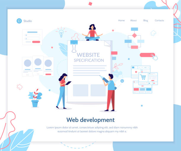
Popular Tools and Frameworks for Responsive Website Design

To effectively implement responsive website design, developers use a set of tools and frameworks that facilitate and speed up the work.
This section introduces you to the main tools and popular frameworks in this field.
| Tool/Framework Name | Type | Main Use | Key Benefits for Responsive Design |
|---|---|---|---|
| Bootstrap | CSS Framework | Rapid website UI development | Strong grid system, ready-made components, Mobile-First |
| Flexbox | CSS Module | Arrangement of elements in one dimension | Flexible layout, space distribution, content alignment |
| CSS Grid | CSS Module | Arrangement of elements in two dimensions | Full layout control, creation of complex responsive designs |
| Foundation | CSS Framework | Alternative to Bootstrap framework | Focus on customization, Mobile-First, Semantic HTML |
| Sass/Less | CSS Preprocessors | CSS preprocessors | Easier CSS code management, use of variables and functions |
| Figma/Adobe XD | Design Tools | UI design tools | Responsive design with multi-dimension preview capability |
Frameworks like Bootstrap and Foundation are collections of pre-written CSS and JavaScript files that allow you to build a responsive website without writing a lot of code.
These frameworks have built-in Grid Systems that automatically adjust content based on screen size.
Additionally, design tools like Figma and Adobe XD allow designers to create and simulate responsive designs before coding.
Using CSS Preprocessors such as Sass or Less also significantly helps in managing CSS code, making the responsive website design development process more organized and efficient.
A correct understanding of these tools is essential for any developer working in the field of modern web design.
This is an #educational and #technical guide for choosing the right tools.
New Standards in Responsive Design: CSS Grid and Flexbox

In recent years, two powerful CSS modules, Flexbox and CSS Grid, have brought about a major revolution in how responsive website design is implemented.
These two tools offer much more advanced and flexible methods for arranging elements on web pages, making work significantly easier for developers.
Flexbox (Flexible Box Layout) is designed for arranging elements in one dimension (row or column).
This tool is very powerful for distributing space between items, aligning them, and changing their display order, and it’s excellent for components like navigation bars, cards, or forms.
In contrast, CSS Grid Layout is designed for two-dimensional layouts (both rows and columns).
This tool allows you to control the entire page layout with high precision and create more complex arrangements.
The intelligent combination of Flexbox and CSS Grid enables the creation of highly complex and fully responsive layouts that were previously only possible with CSS tricks or JavaScript.
As a #guideline, it should be noted that Flexbox is more suitable for components within a section, and Grid is better for the overall page structure.
Using these two new standards not only makes coding more readable but also improves site performance and elevates the user experience.
This is a #technical discussion that demonstrates the continuous evolution in the field of web design.
Have you ever wondered how web pages can adapt themselves so quickly? This is the art of these two powerful standards.
Does your current website display your brand’s credibility as it should? Or does it drive potential customers away?
Rasawob, with years of experience in professional corporate website design, is your comprehensive solution.
✅ A modern, beautiful website tailored to your brand identity
✅ Significant increase in lead and new customer acquisition
⚡ Contact Rasawob now for a free corporate website design consultation!
Common Challenges and Solutions in Responsive Website Design

Like any advanced technology, responsive website design has its own challenges.
Familiarity with these challenges and knowing common solutions to overcome them is crucial for any developer and business planning to implement a responsive website.
One of the biggest challenges is managing complex and voluminous content.
How can a large table or a complex chart be displayed correctly on a small mobile screen? Solutions such as horizontal scrolling for tables, or using JavaScript libraries to convert charts into optimized mobile versions, can be useful.
Another challenge is maintaining performance and loading speed, which we discussed in previous sections.
Unoptimized images and extra code can severely reduce site speed.
Solutions include compression, Lazy Loading, and using a CDN.
Testing and debugging on different devices is also a significant challenge.
Despite simulators in browsers, the best solution is actual testing on multiple physical devices.
Online tools like BrowserStack can also be used for testing in various environments.
The complexity of code maintenance and updates may also increase.
Using frameworks and organizing code modularly reduces this challenge.
This is an #analytical section that helps you approach responsive website design with a more open mind and prevent potential problems.
This is a #thought-provoking discussion that helps you consider various aspects of the project before starting.
The Future of Responsive Website Design and the Role of AI in It

Responsive website design itself is an evolving technology, and its future looks very exciting.
With significant advancements in Artificial Intelligence (AI) and Machine Learning (ML), we are witnessing the emergence of new tools and approaches that can transform the process of designing and developing responsive websites.
Imagine AI-powered tools that can automatically suggest the best layout and style for your content on any screen size, or even generate responsive CSS code based on your visual inputs.
This is #news and a promising approach for the future.
AI can play a role in automatic image optimization, predicting user behavior to provide personalized experiences, and even creating fully responsive websites with minimal human intervention.
Newer CSS modules are also under development that will provide even more flexibility for designers. The future of web design is moving towards greater personalization, higher performance, and a more integrated user experience across all devices.
Responsive website design will continue to be the foundation of these transformations, but its tools and methods will become smarter and more efficient.
This is an #entertaining and #analytical perspective on the horizons ahead in the world of web, showing us how technology is reshaping how we interact with the internet.
Frequently Asked Questions
| Question | Answer |
|---|---|
| What is Responsive Web Design? | It’s a web design approach that ensures web pages display correctly and legibly across various devices and screen sizes (such as desktop, tablet, and mobile). |
| Why is Responsive Web Design important? | It improves user experience across different devices, increases search engine rankings (SEO), and saves time and cost compared to building separate mobile or tablet versions. |
| What technologies are used in Responsive Design? | The main technologies include HTML for structure, CSS for styling (especially Media Queries), and the use of flexible images and grids. |
| What is a Media Query? | A Media Query is a CSS technique that allows applying different styles based on the characteristics of the device the user is using (such as screen width, orientation, and resolution). |
| What is the Mobile First concept in Responsive Design? | It means starting the design and development of a website primarily for mobile devices with small screens, and then scaling it up for larger devices (such as tablets and desktops). This method ensures a focus on user experience on small devices. |
And other services of Rasawob Advertising Agency in the field of advertising:
Smart SEO: A fast and efficient solution to increase website traffic with a focus on attractive UI design.
Smart Website Development: A creative platform to boost sales growth with intelligent data analysis.
Smart Custom Software: Transform digital branding with custom programming.
Smart SEO: A blend of creativity and technology for online growth through Google Ads management.
Smart Social Media: A dedicated service for sales growth based on SEO-driven content strategy.
And over hundreds of other services in internet advertising, advertising consultation, and organizational solutions.
Internet Advertising | Advertising Strategy | Advertorial
Sources
What is Responsive Web Design?
Complete Guide to Responsive Website Design
Responsive Web Design
The Future of Web Design
? Are you ready to revolutionize your business in the digital space? Rasawob Afarin Digital Marketing Agency, by providing specialized and integrated solutions, including advanced WordPress website design services, helps you have a powerful and remarkable presence in the online world.
📍 Tehran, Mirdamad Street, next to Bank Markazi, Southern Kazerun Alley, Ramin Alley No. 6
