
Introduction to the Importance of Responsive Web Design in Today’s World
In the current digital age, where users access web content from various devices such as smartphones, tablets, laptops, and desktop monitors, the concept of #responsive_web_design has become more important than ever.
It is no longer possible to expect an optimal user experience with a fixed design for all screen dimensions.
Responsive Web Design is an approach that ensures your website automatically and intelligently adjusts to the screen size of the user’s device.
This not only contributes to the aesthetic appeal of the website but also significantly improves #usability and #user_experience.
This educational and explanatory approach represents a profound evolution in how websites are built.
Today, a website that is not responsive virtually loses a large portion of its audience, as search engines like Google also prioritize the ranking of mobile-friendly websites.
These important #news-worthy changes have prompted developers and business owners to migrate towards responsive web design.
Ignoring this aspect of web design can lead to reduced traffic, increased bounce rates, and ultimately, loss of potential customers.
Therefore, familiarity with the principles and benefits of responsive web design is essential for anyone operating in the digital space.
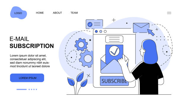
Did you know that poor online store design can drive away up to 70% of your potential customers? Rasaweb transforms your sales with professional and user-friendly e-commerce website designs.
✅ Significant increase in sales and revenue
✅ Full optimization for search engines and mobile
⚡ [Get free consultation from Rasaweb]
Principles and Foundations of Responsive Design for Developers

Responsive web design is based on three key principles: Fluid Grids, Flexible Images, and Media Queries.
Fluid grids use relative units like percentages for element widths instead of fixed pixels.
This approach ensures that your website’s layout scales correctly regardless of screen size.
Flexible images, by using the CSS property max-width: 100%;, ensure that images do not exceed the width of their parent element and resize correctly.
The specialized and fundamental part are Media Queries, which allow developers to apply different CSS rules based on device characteristics such as screen width, orientation, and resolution.
This means you can change the layout, fonts, and even the display of certain elements for different devices.
In essence, these three principles work together to provide a seamless and optimized user experience on any device.
A deep understanding of these principles is crucial for anyone intending to work in responsive web design.
These foundations not only contribute to your site’s stability and flexibility but also play a significant role in optimizing performance and user experience.
Tools and Techniques for Implementing Responsive Design

To implement responsive web design, developers utilize numerous tools and techniques.
The use of CSS frameworks like Bootstrap and Tailwind CSS is very common due to their provision of predefined grid systems and responsive components.
These frameworks make the work much easier for developers and significantly reduce development time.
Furthermore, adopting a Mobile-First approach in design means starting the design for the smallest screen size and then expanding it towards larger sizes.
This method ensures that your site works well on mobile devices, and desktop optimizations are added later.
This is considered a key guideline for modern designs.
In CSS, in addition to media queries, the use of Viewport units (like vw and vh), Flexbox, and CSS Grid is also very useful for creating more complex and responsive layouts.
These techniques offer more control over element arrangement across different pages.
Below, a comparison table of some of the most popular responsive frameworks is provided to help you choose the right tool for your next project.
This specialized section helps you make smarter choices in your design.
| Framework Name | Type | Strengths | Weaknesses | Use Case |
|---|---|---|---|---|
| Bootstrap | CSS/JS Framework | Comprehensive, strong documentation, large community, ready-made components | High file size, similar designs, requires extensive customization | Rapid prototyping, business websites |
| Tailwind CSS | Utility-First CSS Framework | High flexibility, fully customizable, small final build size | Initial learning curve, cluttered HTML | Custom projects, unique user interfaces |
| Foundation | CSS/JS Framework | Powerful, SEO-friendly, for complex applications | Less documentation, smaller community | Enterprise websites and applications |
Benefits of Responsive Web Design for Businesses and SEO
Responsive web design offers numerous benefits for businesses, among the most important of which are improved SEO and User Experience (UX).
From an SEO perspective, Google has officially stated that it prefers responsive websites, and these websites achieve better rankings in search results.
This has gained increasing importance, especially with Google’s Mobile-First Indexing.
Having a single URL for all devices also prevents search engine confusion and simplifies the indexing process.
This analytical aspect shows how proper design can directly impact your digital success.
From a user experience perspective, a responsive site allows users to access your content on any device, without needing to zoom in or scroll horizontally.
This easy access leads to increased user retention time, reduced bounce rates, and ultimately, improved Conversion Rates.
Furthermore, maintaining a responsive website is significantly easier than maintaining multiple separate versions for different devices, which reduces website management costs and time.
These benefits are educational for every online business.
Does your current e-commerce website design not generate the expected sales for you?
Rasaweb is an expert in professional e-commerce website design!
✅ An attractive and user-friendly site aimed at increasing sales
✅ High speed and security for an ideal shopping experience⚡ Get a free online store design consultation with Rasaweb!
Challenges and Solutions of Responsive Design in Practice

Despite its many advantages, implementing responsive web design also comes with challenges that require specialized solutions.
One of the main challenges is ensuring optimal website performance across all devices, especially mobile devices with lower bandwidth.
This issue relates to Page Load Speed.
To solve this problem, Image Optimization, Code Minification, and the use of Content Delivery Networks (CDN) are of high importance.
Another challenge is designing a User Interface (UI) and User Experience (UX) that performs well across different devices.
For example, designing navigation menus that are easily accessible on both desktop and mobile is a key consideration.
Using a “Hamburger Menu” for mobile and a “Horizontal Menu” for desktop is a common guideline in this area.
Additionally, ensuring that elements are easily tappable (Tap Targets) and that font sizes are appropriate for readability on smaller screens is crucial.
These challenges create thought-provoking content for developers on how to choose the best solution for each specific situation.
Finally, continuous testing and experimentation on physical devices and simulators are essential to discover and resolve potential issues before the final release.
User Experience (UX) in Responsive Web Design and Its Importance

User Experience (UX) is one of the main pillars of any website’s success, and responsive web design plays a crucial role in enhancing it.
A poor user experience, even with excellent content, can lead to user loss.
Responsive design ensures that users, regardless of the device they are using, can easily navigate the site, read content, and interact with elements.
This includes adjusting font sizes, element layouts, and the ease of using forms across various screen sizes.
Explanation on this: If a user visits a site on their mobile phone and has to zoom in to read text or click on small links, they will likely leave the site quickly.
Responsive design resolves these issues by providing a smooth and hassle-free experience.
This, in turn, leads to increased user satisfaction, greater loyalty, and ultimately, an improved conversion rate.
This analytical section shows how every design decision can impact the user’s journey.
Furthermore, a positive user experience encourages users to return to your site and recommend it to others, which is a powerful marketing strategy in itself.
Therefore, when designing a responsive site, user experience should always be prioritized.
The Future of Web Design and the Role of Responsive Design

The future of responsive web design is moving towards greater complexity and intelligence.
With the emergence of new devices such as smartwatches, smart TVs, and even virtual/augmented reality, the need for design flexibility is felt more than ever.
New approaches such as Adaptive Design, where the website has several fixed versions for specific screen sizes, and responsive design, which has a more fluid approach, are evolving.
The ‘Mobile-First’ concept, mentioned earlier, has become an industry standard.
This means that websites are designed first for the smallest screen and then for larger devices.
This approach ensures that the site’s core content and functionality are prioritized, and the user experience on mobile devices is optimized.
This is important news for every web developer.
Also, the future use of CSS Custom Properties (CSS variables) and concepts like Container Queries will give developers more control over the responsiveness of internal elements, not just the responsiveness of the entire page.
These specialized and advanced techniques enable the creation of highly dynamic and responsive user interfaces.
Below is a table of important statistics and future trends in responsive design.
| Trend | Description | Impact on Responsiveness |
|---|---|---|
| Mobile-First Design | Designing websites first for mobile devices and then for desktops | Standardization and optimization of mobile user experience |
| Container Queries | Responsiveness based on the size of the parent container, not the overall Viewport | Greater flexibility for independent components |
| Progressive Web Apps (PWAs) | Combining the best features of web and native applications | Increased offline capabilities and app-like experience in the browser |
| Dark Mode Toggle | Option to switch to dark mode to reduce eye strain | Increased personalization options for user experience |
Key Differences Between Responsive Design and Adaptive Design

In the discussion of responsive web design, it is often confused with the concept of Adaptive Design.
Although both approaches are created with the goal of providing an optimal user experience on various devices, their methods of operation differ and require a precise explanation.
Responsive Design uses a single, fluid layout that dynamically adapts to any screen size.
This means that one HTML and CSS code, using media queries, adjusts across all devices.
In contrast, Adaptive Design creates several fixed versions of a layout for specific screen sizes (predefined breakpoints).
When a user accesses an adaptive website, the server or browser identifies the screen size and delivers the most appropriate pre-designed version.
This analytical approach shows that while adaptive design may offer more control over each breakpoint, it has less flexibility than responsive design and can be challenging with the emergence of new screen sizes.
The choice between the two depends on project needs and available resources, but generally, responsive design is preferred due to its flexibility and ease of maintenance in the long run.
Does your company’s website perform as it deserves for your brand? In today’s competitive world, your website is your most important online tool. Rasaweb, a specialist in professional corporate website design, helps you to:
✅ Build credibility and customer trust
✅ Convert website visitors into customers
⚡ Get a free consultation!
Tips for Optimizing Responsive Site Performance

One of the critical aspects of responsive web design is Performance Optimization.
Even the best design, if it loads slowly, can severely degrade the user experience.
To ensure the speed and efficiency of a responsive site, there are several guidelines and specialized tips.
Firstly, image optimization is crucial.
Using modern image formats like WebP, compressing images without losing quality, and Lazy Loading images (loading images only when they are in the user’s view) can significantly increase loading speed.
Secondly, optimizing CSS and JavaScript codes by removing unnecessary code, minifying files, and concatenating them helps reduce HTTP requests and overall page size.
Thirdly, using Browser Caching to store static files in the user’s browser makes pages load faster on subsequent visits.
Fourthly, choosing a powerful hosting provider and using a CDN (Content Delivery Network) to deliver content from the closest server to the user improves speed.
These are challenging questions for many developers to continuously monitor their site’s performance.
Continuous monitoring with tools like Google Lighthouse and PageSpeed Insights is also essential for identifying and resolving performance bottlenecks.
Challenging Content in Responsive Design and Solutions

Responsive web design, despite all its advantages, can sometimes raise questions about how certain types of content are displayed.
For example, displaying complex data tables, maps, or graphical charts on small mobile screens can be a challenging content area.
How can this content be presented in a way that is both readable and functional? For tables, techniques such as Horizontal Scroll for large tables, hiding certain columns on mobile and displaying them only on desktop, or converting the table into a card list on the mobile screen can be used.
For maps, ensuring that zooming and panning capabilities work correctly on mobile and that maps are fully viewable is crucial.
Charts may also require simpler or more interactive versions for smaller screens.
This guidance helps you overcome these challenges.
Also, the issue of ad and banner sizes in a responsive layout is relevant.
Ensuring that ads scale correctly and do not disrupt the user experience is very important.
This engaging aspect of design requires creativity and out-of-the-box thinking to find the best solution for each unique content and to create adaptive content design.
Frequently Asked Questions
| Question | Answer |
|---|---|
| What is responsive web design? | Responsive Web Design is an approach where the design and layout of a website automatically adjust to the screen size and device of the user (such as desktop, tablet, mobile) to provide the best user experience. |
| Why is responsive web design important? | With the increasing use of mobile devices and tablets for internet browsing, responsive design ensures that your website displays well at any size, and users do not need to zoom or scroll horizontally, which leads to an improved user experience and reduced bounce rate. |
| What are the main techniques used in responsive design? | The three main techniques include Flexible Grids, Flexible Images, and Media Queries in CSS. |
| What is a Media Query? | A Media Query is a CSS feature that allows you to apply different styles based on the user’s device characteristics such as screen width, height, orientation (portrait or landscape), and resolution. |
| What impact does responsive design have on SEO? | Google prefers responsive websites and ranks them higher in mobile search results. Also, an improved user experience leads to a reduced bounce rate and increased user time on site, which are positive signals for search engines. |
And other advertising services of Rasaweb Advertising Agency in the field of advertising
Smart Customer Journey Map: A combination of creativity and technology for campaign management through custom programming.
Smart Sales Automation: An innovative platform to improve click-through rates by optimizing key pages.
Smart SEO: A combination of creativity and technology to increase sales by customizing user experience.
Smart Social Media: An innovative service for increasing digital branding through intelligent data analysis.
Smart Google Ads: A combination of creativity and technology for campaign management through attractive UI design.
And over hundreds of other services in the field of internet advertising, advertising consultation, and organizational solutions
Internet Advertising | Advertising Strategy | Advertorials
Sources
Responsive Web Design Tutorial from Zero to One Hundred
What is Responsive Design and Why is it Important?
Responsive Design
What is Responsive Design and Why is it Important?
? In today’s highly competitive world, a strong online presence is vital for every business. Rasaweb Afarin Digital Marketing Agency, by offering comprehensive services including fast website design, professional SEO, social media management, and targeted advertising campaigns, paves your way to reaching the pinnacles of success. With us, your business will be seen at its peak.
📍 Tehran, Mirdamad Street, next to Bank Markazi, Southern Kazeroon Alley, Ramin Alley, No. 6

