
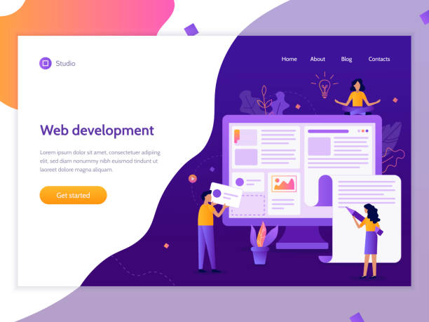
Introducing Responsive Web Design: Why is this concept revolutionary?
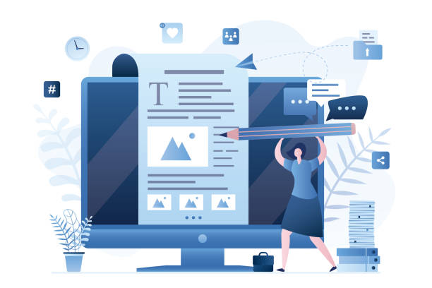
In today’s world, where users access the web through diverse devices such as smartphones, tablets, laptops, and even smart TVs, #web_design and #user_experience have gained unprecedented importance.
This is where the concept of Responsive Web Design emerges as a vital necessity.
Responsive Web Design is an approach that ensures your website automatically adapts its layout and content to the size of the user’s device screen.
This approach is not just a technical capability, but a comprehensive strategy for #SEO_optimization and delivering the best possible #user_experience.
Previously, separate versions of a website were designed for each device, which was not only costly but also very difficult to maintain and update.
Responsive Web Design resolves these issues by offering a single, flexible solution, allowing websites to have a unified and strong presence across all platforms, saving time and cost.
This educational concept is for all developers and business owners to have an efficient presence in the digital world.
Do you know that your website is your customers’ first impression of your company? Boost your business’s credibility with a powerful corporate website from Rasavab!
✅ Custom and eye-catching design tailored to your brand
✅ Improved user experience and increased customer attraction
⚡ Get a free consultation!
History and Evolution of Web Design: From Desktop to Mobile

Before the advent of Responsive Web Design, websites were primarily designed for desktop monitors with fixed dimensions.
However, with the explosion of smartphones and tablets in the early 2010s, the need for websites to adapt to different screen dimensions became more pressing than ever.
This period initiated a deep analysis in the web industry.
Until then, many companies offered separate, often more limited, versions of their websites for mobile devices with subdomains (e.g., m.example.com).
While this “mobile-first” approach was a step forward, it was costly and inefficient due to the need to maintain two separate codebases.
In 2010, Ethan Marcotte published an article titled “Responsive Web Design,” which quickly became important news in the developer community and revolutionized the field.
In this article, he pointed out the necessity of creating websites that could automatically react to the user’s environment and device.
This evolution led to a significant reduction in development costs and an increase in user satisfaction.
The importance of Responsive Design lies not only in its visual aspects but also in improving site performance and loading speed across various devices, which is crucial for user experience and SEO.
This paradigm shift required a specialized approach to website architecture.
Fundamental Principles of Responsive Design: Fluid Grids and Flexible Images

Responsive Web Design is built upon three fundamental principles, each playing a critical role in creating an adaptable website: Fluid Grids, Flexible Images, and Media Queries.
Fluid grids mean that the website’s layout uses relative units like percentages instead of fixed pixel dimensions.
This ensures that website elements scale correctly on any screen size.
Flexible images, by using the `max-width: 100%` CSS property, ensure that images never overflow their container and always scale down or up to fit the available space.
These two principles give your website the ability to change dimensions without losing quality.
Media queries are the backbone of Responsive Web Design.
They allow developers to apply different CSS rules based on device characteristics such as screen width, height, orientation (portrait/landscape), and resolution.
This specialized capability allows for defining a different appearance for the website at each specific “breakpoint.”
For example, you can change font sizes, column order, or even show/hide certain elements for mobile devices.
These principles are not only essential training for developers but also important for anyone who wants to optimize their website.
Comparison of Fixed and Fluid Layouts in Web Design
| Feature | Fixed Layout | Fluid Layout |
|---|---|---|
| Measurement Unit | Pixels (px) | Percentage (%), em, rem, vw, vh |
| Adaptability | Low (only for one screen size) | High (compatible with various screen dimensions) |
| Maintenance | Complex (requires separate versions) | Simpler (one codebase for all devices) |
| User Experience | Variable (may display inappropriately on different devices) | Consistent and optimized across all devices |
| SEO Optimization | Weaker (duplicate content, high bounce rate) | Better (single URL, lower bounce rate, positive Google signals) |
Countless Benefits of Responsive Web Design for Your Business

Adopting Responsive Web Design is not just a choice, but a strategic necessity for any business in the digital age.
The first and most important advantage is improved user experience (UX).
A website that displays well and is highly usable on any device keeps users satisfied and increases their likelihood of returning.
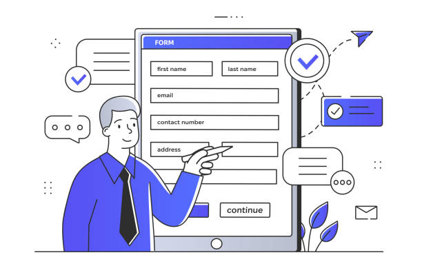
This directly leads to an increase in Conversion Rate, as users can achieve their goals on the site without any obstacles, whether it’s purchasing a product, completing a form, or contacting you.
Furthermore, Responsive Web Design is a crucial factor for Search Engine Optimization (SEO).
Google has explicitly stated that it prefers responsive websites, and since 2015, “mobile-friendliness” has been considered an official ranking factor in mobile search results.
As most searches are currently conducted via mobile, having a responsive website is absolutely essential for visibility in search engines.
A responsive website avoids having separate URLs for desktop and mobile versions, which simplifies SEO management and prevents duplicate content issues.
Reduced maintenance and development costs are also key benefits.
With a single codebase, there is no need to spend time and money developing and maintaining two or more versions of the website, which is a practical and smart guidance for resource management.
This analysis shows that investing in Responsive Web Design is a long-term, profitable decision.
Does your current website convert visitors into customers or drive them away? Solve this problem forever with a professional corporate website design by Rasavab!
✅ Create powerful credibility and branding
✅ Attract target customers and increase sales
⚡ Get a free consultation now!
Technical Aspects of Implementing Responsive Design in Coding
Implementing Responsive Web Design requires a deep understanding of HTML, CSS, and sometimes JavaScript.
In the HTML section, the most important step is adding the `` tag within the `
This tag tells the browser that the page width should match the device width and the initial zoom level should be 1.0, so content scales correctly.
This is a basic explanation to start with.
In CSS, using relative units like percentages (%), `em`, `rem`, `vw` (viewport width), and `vh` (viewport height) instead of fixed pixels is the cornerstone of fluid grids.
For example, for a column in a layout, instead of `width: 300px;`, you should use `width: 33%;` to adjust its width relative to its parent container.
But the backbone of Responsive Web Design is Media Queries.
Using the `@media` rule, different CSS rules can be applied for different screen sizes.
For instance:
@media (max-width: 768px) {
    .column {
        width: 100%;
    }
    .navigation {
        flex-direction: column;
    }
}
This specialized code snippet shows that when the screen width is less than 768 pixels, columns will occupy the full screen width and the navigation bar will be displayed vertically.
In some cases, JavaScript is also used to manage more complex interactions, such as hamburger menus for mobile or conditional content loading based on screen size.
Overall, these technical aspects of coding ensure that your website provides a seamless experience on any device.
The guidance for developers is to adhere to Mobile-First principles.
Common Challenges and Solutions in Responsive Web Design

Despite numerous advantages, implementing Responsive Web Design can come with challenges that require an analytical approach and specialized solutions.
One of the biggest concerns is website performance on mobile devices.
Loading high-resolution images optimized for desktop can be time-consuming on smartphones with slow internet connections.
The solution to this challenge is to use Responsive Images with the `
Another challenge is content management.
Sometimes, content suitable for desktop appears too cluttered or loses readability on small mobile screens.
This is where the question of questionable content arises: Should certain content be hidden on mobile? The answer depends on the website’s goal and the importance of that content.
The guidance is to first prioritize content and display essential content optimally across all devices.
Navigation can also be a challenge.
Traditional desktop menus occupy too much space on mobile.
Common solutions include hamburger menus, dropdown menus, or bottom navigation.
Also, managing ads and third-party tools in responsive layouts can be complex.
Ensuring that ads scale correctly and do not disrupt the user experience requires care in implementing Responsive Web Design.
An explanation and examination of these challenges helps developers approach the project with greater readiness and prevent potential problems.
Popular Tools and Frameworks for Building Responsive Websites
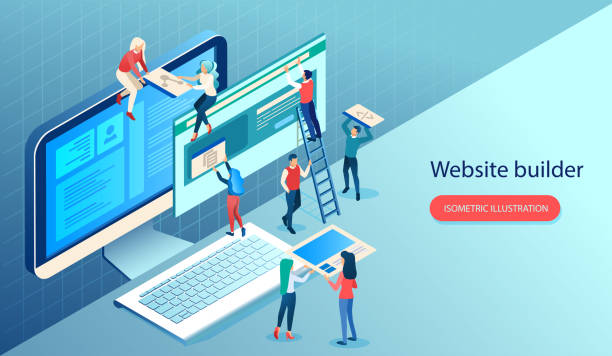
To facilitate the Responsive Web Design process, numerous tools and frameworks have been developed that greatly simplify the work for developers.
These frameworks provide a set of pre-written CSS and JavaScript files that include grid systems, UI components (such as buttons, forms, navigation bars), and interactive plugins.
The most popular ones include:
1.
Bootstrap: Undeniably, Bootstrap is one of the most widely used front-end frameworks in the world.
This framework includes a fully responsive 12-column grid system that makes it easy to build complex layouts.
It also has a rich library of components and JavaScript plugins that significantly speed up the development process.
Bootstrap is an excellent choice for projects that require rapid and standardized development and is an essential training for every developer.
2.
Tailwind CSS: Unlike Bootstrap, which is a component-based framework, Tailwind CSS is a Utility-First framework.
This means that instead of ready-made components, it provides a vast set of small utility classes that allow developers to design the UI directly in their HTML.
Tailwind is ideal for developers who seek high flexibility and full control over the design.
3.
Foundation: Foundation is also a responsive and Mobile-First framework developed by ZURB.
This framework is known for its Semantic approach and advanced capabilities for building complex websites, making it suitable for large and enterprise projects.
Using these frameworks not only accelerates the Responsive Web Design process but also helps ensure design consistency and standards.
The choice of framework depends on your project’s needs and complexity.
This is a complete explanation of the available tools.
Comparison of Popular Responsive Design Frameworks
| Feature | Bootstrap | Tailwind CSS | Foundation |
|---|---|---|---|
| Approach | Component-based | Utility-First | Component-based and Semantic |
| Design Control | Medium (with default styles) | High (with utility classes) | High (good flexibility) |
| Learning Curve | Relatively easy for beginners | Requires getting used to Utility-First approach | Slightly more complex than Bootstrap |
| File Size | Larger (includes many components) | Smaller (only used classes are loaded) | Medium |
| Use Cases | General and quick projects | Custom and performance-oriented projects | Enterprise and complex projects |
Testing and Validation of Responsive Design: Ensuring Full Compatibility
After implementing Responsive Web Design, the next critical step is testing and validating it.
Ensuring that the website displays correctly and performs well across various devices and browsers is essential for delivering an excellent user experience and preventing SEO issues.
This section provides comprehensive guidance for conducting effective tests.
One of the most basic tools for testing responsiveness is Browser Developer Tools.
Most modern browsers like Google Chrome, Firefox, and Edge have a Device Emulation Mode that allows you to view your website at different screen sizes and simulate specific devices.
These tools also have the ability to throttle network speeds, helping you simulate and analyze website performance at various internet speeds.
However, emulation can never replace Real Device Testing.
There are differences in how elements are rendered, touch is managed, and performance on real devices that cannot be detected in emulators.
Using tools like BrowserStack or LambdaTest, which provide the ability to test on hundreds of real devices, can be very beneficial.
Focusing on the Breakpoints you have defined in your media queries is crucial.
Each breakpoint should be carefully checked to ensure that layout changes are applied correctly and that there are no visual disruptions or inconsistencies.
This is the most specialized part of the quality assurance process for Responsive Web Design.
Does your current corporate website present a worthy image of your brand and attract new customers?
If not, convert this challenge into an opportunity with Rasavab’s professional corporate website design services.
✅ Significantly improves your brand’s credibility and image.
✅ Paves the way for attracting leads and new customers.
⚡ For a free and specialized consultation, contact Rasavab now!
The Future of Responsive Design: Beyond Today
Responsive Web Design has proven to be a dynamic and evolving concept, and its future will be full of innovation and change.
With the emergence of new technologies and growing user expectations, new approaches are taking shape that push the boundaries of web design.
One of these newsworthy and exciting trends is the use of Artificial Intelligence (AI) in web design.
AI-powered tools can dynamically and personally optimize site layouts and content for each user and device by analyzing user behavior and data.
This goes beyond traditional responsiveness and moves towards Adaptive Design, where the site reacts not only to screen size but also to user preferences.
Progressive Web Apps (PWAs) also play a significant role in the future of Responsive Web Design.
PWAs offer a combination of the best features of web and mobile applications, such as offline functionality, push notifications, and installation on the device’s home screen, all of which significantly improve the user experience.
Furthermore, it is expected that with the proliferation of Wearables, Virtual Reality (VR), and Augmented Reality (AR), the need for responsive design will expand in a different way than what we know today.
Websites will need to be able to interact with these new form factors and multi-modal experiences.
This analysis indicates that Responsive Web Design is just a starting point, and its evolutionary path will be very exciting.
Future websites will be much smarter and more adaptable to environments and individual user needs.
Why You Should Adopt Responsive Web Design Today?

At the end of this comprehensive review, the question arises: why is Responsive Web Design no longer a luxury choice, but an undeniable necessity for the survival and growth of any business in the digital space?
From what has been explained in previous chapters, it is clear that there are compelling reasons for this change.
Firstly, user behavior has drastically changed.
Most people use mobile devices to search, shop, and interact with brands.
If your website provides a poor mobile user experience, you not only lose customers but also damage your brand’s credibility.
A non-responsive website will not only have a high Bounce Rate but will literally drive customers towards competitors.
Secondly, search engines, especially Google, prefer responsive websites.
With Google’s “mobile-first” indexing approach, if your website is not optimized for mobile, your ranking in search results will drop, meaning a loss of organic traffic and business opportunities.
Thirdly, efficiency and cost savings.
With Responsive Web Design, you have one website that works on all devices, eliminating the need to manage multiple versions of the website or develop separate mobile applications.
This is very important guidance for reducing operational costs and increasing Return on Investment (ROI).
Ultimately, investing in Responsive Web Design is an investment in the future of your business.
This ensures that your website remains relevant, accessible, and effective for years to come.
Frequently Asked Questions
| Question | Answer |
|---|---|
| What is Responsive Web Design? | Responsive Web Design is an approach that causes a website’s design and layout to change and display optimally based on the user’s device screen size (computer, tablet, mobile, etc.). |
| Why is Responsive Design important? | Its importance is due to the increased use of various devices to access the internet. Responsive design improves user experience (UX), reduces bounce rate, and is beneficial for SEO. |
| What techniques are used in Responsive Design? | Key techniques include using Fluid Grids, Flexible Images, and Media Queries in CSS. |
| What do Fluid Grids mean? | Instead of using fixed pixel units, relative units such as percentages or em are used to define the width and height of elements, making the layout flexible with screen size changes. |
| What is the application of Media Queries? | Media Queries allow you to apply different CSS styles based on the user’s device characteristics such as screen width, height, orientation (horizontal or vertical), and resolution. |
And other advertising services from Rasavab Advertising Agency
Smart Customer Journey Map: An innovative platform for improving campaign management with marketing automation.
Smart Sales Automation: A specialized service for increasing website visits based on attractive UI design.
Smart Customer Journey Map: A specialized service for increasing website visits based on marketing automation.
Smart Advertising Campaign: A combination of creativity and technology to increase website visits through Google Ads management.
Smart Conversion Rate Optimization: Designed for businesses looking for online growth through custom programming.
And over a hundred other services in internet advertising, advertising consultation, and organizational solutions
Internet Advertising | Advertising Strategy | Advertorials
Resources
Responsive Design Guide
Persian Web Trends
Modern Web Development
SEO and Responsive Design
? With Rasavab Afarin, specialists in corporate website design, SEO, and digital marketing, have a powerful and impactful online presence.
📍 Tehran, Mirdamad Street, next to Bank Markazi, Kazerun Jonubi Alley, Ramin Alley, Plaque 6

