Introduction to the Importance of User-Friendly Website Design
#WebsiteDesign #UserExperience #CustomerSatisfaction
In the current digital age, where competition for users’ attention has become more intense than ever, user-friendly website design is no longer a luxury choice, but a vital necessity.
This phrase goes beyond mere visual aesthetics; it means creating a smooth, logical, and enjoyable experience for every visitor.
A well-designed website not only provides information to users easily but also guides them towards their goals, such as purchasing a product, finding information, or establishing contact.
At first glance, user-friendly website design might seem to be limited to menu arrangement and page coloring, but in reality, this process involves a deep understanding of user psychology, recognizing behavioral patterns, and anticipating their needs.
Every click, every scroll, and every interaction should convey a sense of purpose and efficiency to the user.
Imagine entering a store where nothing is in its place, finding the desired product is almost impossible, and the cashier is cold; naturally, you would not return to that store.
The same thing happens in the online world.
If a website is complex, slow, or inaccessible, users will quickly leave it and go to your competitors.
It is a statistical fact that poor user experience (UX) can directly lead to a decrease in conversion rates and customer loss.
Therefore, investing in user-friendly website design is not just an expense, but a smart investment for the future of your business.
The ultimate goal is for the user to achieve what they want without any confusion or frustration, and this requires careful attention to details that may seem minor at first glance, but collectively make a big difference.
This approach ensures that your website is not only seen but also remembered for its unique experience.
Does your current corporate website not reflect your brand’s credibility and strength as it should? Rasaweb solves this challenge for you with professional corporate website design.
✅ Increase visitor credibility and trust
✅ Targeted attraction of more customers
⚡ Click for a free consultation!
Key Principles of User Experience Design
#UserInterface #Usable #Satisfying
To achieve a truly user-friendly website design, a set of fundamental principles must be considered that shape the user’s interaction experience with the website.
The first principle is efficiency; meaning the website should help users accomplish their tasks quickly and easily.
This includes easy navigation, simple and responsive forms, and effective search.
Can users find what they are looking for without spending too much time and energy? This is a fundamental question that must be answered during design.
The second principle is understandability.
The design should be visual and intuitive.
Users should not need training or a manual to understand how the website works.
Using simple language and clear images, familiar icons, and standard design patterns helps with this.
Imagine a user visiting your website for the first time; is everything logical and predictable for them?
The third principle is consistency.
Design elements, including fonts, colors, layout, and interactive behavior, must be uniform throughout the website.
This consistency makes users feel comfortable and familiar, eliminating the need to re-learn patterns on every page.
The fourth principle is appropriate feedback.
The system should react to user actions, whether this reaction is a confirmation message, an indication of progress, or an error notification.
This feedback assures the user that their request has been received and is being processed.
Finally, Usability Heuristics such as error prevention, flexibility and efficiency, and minimizing user memory load are also of particular importance.
A user-friendly design transforms a website into a place where users are not only not forced to use it, but also have a desire to return to it.
These principles not only help increase customer satisfaction but also directly impact business success in the digital space.
Information Architecture and Intuitive Navigation in User-Centric Websites

#Navigation #SiteStructure #InformationArchitecture
A crucial component of user-friendly website design is Information Architecture (IA) and navigation system design.
IA deals with organizing and labeling content in such a way that users can easily find and understand the information they need.
Without strong information architecture, even the best content can get lost among a flood of data.
This stage involves logically categorizing information, creating clear hierarchies, and using understandable language for headings and labels.
The navigation system is, in fact, a roadmap that guides users from one point to another on the website.
Navigation must be simple, consistent, and predictable.
Main menus should be clearly visible, and submenus should be logically categorized.
The use of “breadcrumbs” can also help users understand their position in the website’s hierarchy and easily return to higher-level pages.
For example, have you ever visited a site where the menus were confusing and illogical? Such an experience quickly leads to frustration and leaving the site.
An excellent navigation system gives the user a sense of control and keeps them on the right path.
This proper information architecture and navigation design is the foundation of a successful user-centric website that not only attracts users but also keeps them on the site for longer.
It is this attention to detail that sets your website apart from competitors and transforms it into a platform that users trust and return to.
Table 1: Comparison of Good and Bad Navigation Elements
| Feature | Good Navigation | Bad Navigation |
|---|---|---|
| Clarity and Understandability | Clear and meaningful menu titles | Vague or specialized titles |
| Consistency | Consistent menu position and style across all pages | Changing menu location or style on different pages |
| Hierarchy | Logical categorization and organized submenus | Lack of categorization or cluttered, disorganized submenus |
| Visual Feedback | Active links, color change on hover | Lack of visual cues for active links |
Visual Design and Aesthetics in User Experience

#Aesthetics #UserInterface #VisualIdentity
Visual design, although only a part of user-friendly website design, plays an irreplaceable role in initially attracting users and creating a sense of trust and credibility.
This aspect of design includes the selection of colors, fonts, images, icons, and the overall arrangement of visual elements.
An attractive and professional visual design can have a profound impact on user perception of your brand and create a positive first impression.
Colors can evoke different emotions; blue often conveys trust and calm, while red can evoke passion and energy.
Choosing a suitable color palette that aligns with brand identity and website goal is highly important.
The use of appropriate typography is also very important.
Fonts should be legible, and line spacing and size should be adjusted so that text is easily scannable and readable.
Inappropriate or small fonts can quickly cause eye fatigue for users and create a negative experience.
Images and videos should also be high quality and relevant to the content.
Poor quality or irrelevant images can make your website appear unprofessional.
Beyond mere aesthetics, visual design must be purposeful.
Visual elements should help guide the user’s eye, highlight important points, and assist with navigation.
White space (also known as negative space) is a key element in visual design that gives the eye a rest and allows content and primary elements to breathe, preventing clutter and confusion.
A website with excellent visual design not only looks beautiful but also performs better and improves the overall user experience, as users subconsciously trust websites that are visually organized and pleasant more.
Did you know that poor online store design can drive away up to 70% of your potential customers? Rasaweb transforms your sales with professional and user-friendly e-commerce website designs.
✅ Significant increase in sales and revenue
✅ Full optimization for search engines and mobile
⚡ [Get a free consultation from Rasaweb]
The Importance of User-Friendly Content and its Strategy

#Content #Readability #ContentSEO
Alongside eye-catching visual design and flawless navigation, content is the backbone of a website with an optimal user interface.
Your content should not only be informative and relevant but also presented in a way that is easily understandable and digestible for users.
This means adhering to principles of readability and proper content structuring.
Avoid long paragraphs and dense blocks of text.
Instead, use short sentences, small paragraphs, clear subheadings, lists, and bullet points to make the text more scannable.
The language of content also holds tremendous importance.
Avoid complex technical terms that may be incomprehensible to a general audience, unless your audience is highly specialized.
The tone of the content should align with your brand identity and be appealing to the target audience.
Does your content answer users’ questions? Does it address their problems? Content that provides real value encourages users to stay on your site longer and even share it with others.
Another important aspect is content optimization for search engines (SEO).
Using relevant keywords, attractive meta descriptions, and internal and external linking helps your content be seen.
However, never sacrifice content quality for SEO.
The main goal is to provide value to the user; SEO is merely a tool to achieve that goal.
Fresh, engaging, and high-quality content not only improves your SEO ranking but also attracts users to your user-friendly website design and converts them into loyal customers.
Responsive Design and Mobile-First Approach
#Responsive #MobileFirst #Accessibility
In today’s world, where smartphone usage for internet access is increasing, Responsive Design is no longer an optional feature, but an absolute requirement for a user-friendly website design.
Responsive design means that your website should be able to automatically adapt its layout and elements to the screen size of the device the user is using (whether desktop, tablet, or mobile).
This ensures that users have an optimal experience on any device, without the need for zooming or horizontal scrolling.
Beyond responsiveness, the concept of Mobile-First emerges.
This approach means designing first for smaller screens and then expanding it for larger screens.
The reason for this is that designing for mobile forces designers to focus on core content and functionality and avoid adding unnecessary elements that could disrupt the user experience.
This approach helps you create a cleaner and more efficient user experience that is suitable for all devices.
Navigating through the website on mobile should be simple and hassle-free.
Buttons should be large enough to be easily touched with a finger, and forms should be concise and simple.
Fast page loading on mobile is also crucial, as mobile users are usually impatient and will quickly leave the site if it is slow.
Google also places great emphasis on prioritizing mobile-friendly sites in its search results rankings.
Therefore, a website that is well-optimized for mobile not only provides an excellent user experience but also significantly helps improve your SEO and visibility in the online space.
The Importance of Load Speed and Performance Optimization
#SpeedOptimization #UXSpeed #Lighthouse
Website load speed is a critical factor in user-friendly website design that directly impacts user satisfaction and even the site’s SEO ranking.
In today’s fast-paced world, users expect websites to load instantly.
Any delay, even a few seconds, can lead to user loss.
Studies have shown that an increase of just one second in page load time can significantly reduce conversion rates and increase the bounce rate.
This issue translates to potential revenue loss for businesses.
For a user-centric website, speed optimization involves several aspects.
Image compression, browser caching, minimizing CSS and JavaScript code, and choosing powerful hosting are among the important measures.
Using Content Delivery Networks (CDNs) can also help reduce load times for users in different geographical regions.
Tools like Google PageSpeed Insights and Lighthouse can help you identify performance bottlenecks and provide recommendations for improvement.
A fast website not only provides a smoother user experience but also helps improve your ranking in search results, as search engines consider site speed a significant ranking factor.
Ultimately, load speed is a symbol of your website’s efficiency and professionalism and assures users that your site is reliable and up-to-date.
Table 2: Impact of Page Load Time on User Behavior and Business
| Load Time (seconds) | Impact on Bounce Rate | Impact on Conversion Rate | User Perception |
|---|---|---|---|
| 1-3 seconds | Lowest bounce rate | Best conversion rate | Professional, efficient |
| 3-5 seconds | Moderate increase in bounce rate | Slight decrease in conversion | Acceptable, but room for improvement |
| More than 5 seconds | Sharp increase in bounce rate (above 30%) | Significant decrease in conversion | Slow, unreliable, outdated |
Accessibility and Inclusivity in Web Design

#Accessibility #InclusiveDesign #Disability
A vital and ethical aspect of user-friendly website design is Accessibility.
Accessibility means designing a website that can be used by all individuals, regardless of their abilities or disabilities.
This includes people with visual, auditory, motor, or cognitive impairments.
Ignoring accessibility not only deprives a segment of society from online services but can also lead to lost business opportunities and even legal issues.
To ensure accessibility, attention must be paid to points such as using alt text for images (which is essential for screen readers), appropriate color contrast for text and background, keyboard navigation (for individuals who cannot use a mouse), and providing captions or transcripts for audio and video content.
Forms should be designed to be understandable for assistive tools, and errors should be displayed clearly with appropriate guidance.
Web Content Accessibility Guidelines (WCAG) are an international standard that provides detailed guidance for creating accessible websites.
Following these guidelines not only helps you reach a larger community of users but often also contributes to overall SEO improvement and user experience for everyone.
Inclusive Design goes beyond meeting minimum standards and means considering a wide range of human needs and preferences from the very beginning of the design process, to truly create a website for all.
Does your current e-commerce website design lead to losing customers and sales?
Rasaweb is your solution with modern and user-friendly e-commerce website designs!
✅ Significant increase in conversion rates and sales
✅ Strong branding and building customer trust
⚡ Get a free e-commerce website design consultation from Rasaweb!
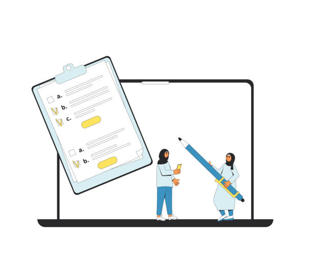
User Testing and Continuous Feedback

#UserTest #Feedback #ContinuousImprovement
After all the efforts towards designing a website with an excellent user experience, the work is not yet finished.
One of the most important stages in the user experience design process is User Testing and continuous feedback collection.
Even the best designers cannot fully predict the experience of real users.
Real users, with different needs, behavioral patterns, and environments, can provide valuable insights that are not obtained at any other stage of design.
User testing can be conducted in various ways; including Usability Testing, where users are asked to perform specific tasks on the website, surveys, interviews, or even indirect observation of user behavior through web analytics tools (like Google Analytics).
The main goal is to identify and resolve design flaws, confusions, or potential obstacles that users encounter.
Key questions are: Do users easily achieve their goals? Do they have any problems? What do they like or dislike?
Continuous user feedback allows you to continuously improve your website.
This is an iterative process where you implement changes, re-test, and gather feedback again.
This approach ensures that your website is always aligned with user needs and expectations and evolves over time.
User testing is not only essential for improving the user experience but also helps you base your design decisions on real data rather than just assumptions, ultimately leading to greater business success.
New Tools and Technologies in Web Design
#DesignTools #Frameworks #NewTechnologies
In the digital age, the field of web design is rapidly evolving, and new tools and technologies are constantly becoming available to improve the process of efficient and optimized website design.
Understanding and utilizing these tools can help designers and developers create higher quality websites, in less time, and with better performance.
For User Interface (UI) and User Experience (UX) design, tools such as Figma, Adobe XD, and Sketch are very popular.
These tools enable collaborative design, interactive prototyping, and user flow testing.
In front-end development, JavaScript frameworks like React, Angular, and Vue.js play a key role.
These frameworks enable developers to build complex and dynamic user interfaces in an organized and efficient manner, resulting in faster and more interactive websites.
Additionally, Content Management Systems (CMS) such as WordPress, Joomla, and Drupal, by offering various templates and plugins, have simplified the design and content management process for non-technical users as well, indirectly contributing to a better user experience.
Emerging technologies like Artificial Intelligence (AI) and Virtual/Augmented Reality (VR/AR) are also entering the web design domain.
AI can play a role in optimizing user experience personalization and analyzing user behavior.
For example, AI-powered chatbots can provide instant support.
AR/VR also have the potential to create entirely new and immersive user experiences, although they are still in their early stages on the web.
By intelligently using these tools and technologies, the quality and efficiency of websites can be continuously increased, providing an unparalleled experience for users.
Frequently Asked Questions
And other services of Rasaweb Advertising Agency in the field of advertising
Smart Reportage: An innovative service for increasing campaign management through marketing automation.
Smart Website Development: A professional solution for increasing click-through rates by focusing on smart data analysis.
Smart Marketing Automation: An innovative service for improving SEO ranking through optimizing key pages.
Smart Data Analysis: A fast and efficient solution for increasing sales by focusing on attractive user interface design.
Smart Brand Identity: An effective tool for analyzing customer behavior with the help of precise audience targeting.
And over hundreds of other services in the field of internet advertising, advertising consultation, and organizational solutions
Internet Advertising | Advertising Strategy | Advertorial
Resources
- UI and UX Website Design Training — From Zero to Hundred Faradars
- Modern and Mobile-Friendly Website Design – Virgool
- User-Friendly Website Design – Webramz
- What is Modern Website Design? – Seorooz
? Are you ready for your business to grow and shine in the online space? Rasaweb Afarin Digital Marketing Agency, with expertise in areas such as personal website design, SEO, and content marketing, is your guide to success.
📍 Tehran, Mirdamad Street, next to Bank Markazi, Southern Kazeroun Alley, Ramin Alley, No. 6

