
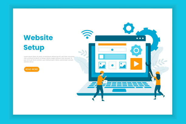
Introduction to Responsive Web Design and its Importance in the Current Era

In today’s world, where users access the internet from various devices such as smartphones, tablets, laptops, and even smart TVs, the correct and optimal display of websites on any screen size is of paramount importance.
#Responsive Web Design is the answer to this growing need; an approach that ensures your website has flawless performance and appearance, regardless of the user’s device screen size or type.
This means the automatic and dynamic adjustment of layouts, images, and fonts to provide a seamless and optimized #user experience.
There is no longer a need to develop separate versions for mobile and desktop, as a website with responsive design alone fulfills all these requirements.
This approach not only increases user satisfaction but also plays a vital role in maintaining and increasing website traffic and improving its ranking in search engines.
The importance of this issue is such that today, not implementing this approach can lead to the loss of a significant portion of the audience and business opportunities.
This is an explanatory and educational approach to understanding the foundations of this technology.
Does your current corporate website not reflect your brand’s credibility and strength as it should? Rasawp solves this challenge for you with professional corporate website design.
✅ Increased credibility and visitor trust
✅ Targeted attraction of more customers
⚡ Click to receive a free consultation!
Foundational Principles of Responsive Design: Fluid Grids, Flexible Images, and Media Queries

To deeply understand how a responsive website works, it is necessary to become familiar with its three main pillars: Fluid Grids, Flexible Images, and Media Queries.
Fluid Grids use relative units such as percentages to define the width and height of elements, instead of fixed pixels.
This means that a 10% column on a larger screen occupies more space than the same column on a smaller screen, but retains its proportion.
Responsive web design utilizes this concept to create dynamic layouts.
Flexible Images also ensure, by using the max-width: 100% property in CSS, that images never overflow their container and are always scaled proportionally.
This prevents layout disruption and ensures faster image loading on smaller devices.
Media Queries are the backbone of responsiveness logic.
This CSS3 feature allows developers to apply different styles based on device characteristics such as screen width, orientation (horizontal or vertical), and resolution.
For example, you can define rules that on smaller screens, columns stack vertically instead of side-by-side, or font sizes change.
This combination of principles enables the creation of a seamless and highly specialized and educational web experience.
Benefits of Responsive Design for Users and Businesses

Implementing responsive site design goes beyond merely adapting to different screen sizes; this approach brings significant benefits to both end-users and business owners.
From the user’s perspective, an improved User Experience (UX) is the most significant advantage.
A website that displays well on any device leads to a reduced Bounce Rate, increased user dwell time, and ultimately, higher satisfaction and loyalty.
Users no longer need to zoom or scroll horizontally, which adds to ease of use.
From a business perspective, the benefits are much broader.
Firstly, your site SEO significantly improves.
Google and other search engines prefer responsive websites over separate mobile and desktop sites, which leads to better ranking in search results.
Secondly, maintaining and updating a single website instead of multiple versions reduces costs and simplifies the content management process.
Thirdly, an increased Conversion Rate is another key benefit; when users can easily navigate and interact with your site, the likelihood of desired actions such as purchasing a product or filling out a contact form increases.
This section is presented with deep analysis and practical guidance.
| Feature | Responsive Website | Non-Responsive Website (Desktop-specific) |
|---|---|---|
| User Experience | Excellent on all devices | Poor on mobile and tablet |
| SEO and Google Ranking | Better (Google recommended) | Weaker (penalized in mobile results) |
| Development and Maintenance Cost | One codebase, lower cost | Multiple codebases, higher cost |
| Conversion Rate | Higher due to ease of use | Lower on mobile devices |
Key Technologies and Tools in Responsive Site Design
For effective implementation of responsive web design, familiarity with a set of standard web tools and technologies is essential.
HTML5, as the latest version of the web markup language, provides new semantic tags (such as <header>, <nav>, <section>, <footer>) that make the website structure clearer and more accessible, which is crucial for responsiveness and SEO.
CSS3 provides the core of responsive capabilities.
Media Queries, as previously explained, were introduced in CSS3.
Additionally, features like Flexbox (Flexible Box Layout) and CSS Grid Layout are powerful tools for creating complex and fully flexible layouts that were previously difficult or impossible with standard CSS.
Flexbox is ideal for one-dimensional design (row or column), and Grid for two-dimensional design (rows and columns).
JavaScript can also be used to add more advanced interactions, manage lazy loading of images, and improve performance on various devices.
To accelerate the development process and ensure compatibility, using popular frameworks like Bootstrap or Foundation is very common.
These frameworks, by providing a set of pre-built responsive components and grid systems, help developers design responsive websites quickly and with high quality.
This specialized and educational knowledge is vital for any developer working in web design.
Are you lagging behind large online stores in competition?
Rasawp, with professional e-commerce website design, brings your business online and increases your market share!
✅ Increased brand credibility and customer trust
✅ Easy shopping experience leading to more sales
⚡ Get a free website design consultation now!
Common Challenges and Solutions in Implementing Responsive Design
Despite its many advantages, implementing responsive site design can also come with challenges that require intelligent approaches to overcome.
One of the main challenges is website performance.
Responsive websites often have to manage more content optimized for larger screens; this can lead to slow loading on mobile devices with lower bandwidth.
Solutions for this challenge include image optimization (using next-gen formats like WebP and proper compression), Lazy Loading for images and videos, and optimizing CSS and JavaScript codes.
Another challenge is managing content complexity on small screens.
Some specific content or functionalities may become confusing or unusable on mobile.
For this purpose, it is necessary to consider the Mobile-First approach and design content based on prioritization for smaller devices.
Ensuring touch accessibility is also important; clickable elements should be large enough to be easily touched with a finger.
Finally, browser compatibility is always a challenge; ensuring that your website displays correctly across different browser versions and types requires continuous testing and debugging.
Using automated and manual testing tools in various browsers can be helpful in this regard.
These questions and solutions provide thought-provoking and guiding content for developers.
Key Differences Between Responsive Design and Adaptive Design

In the realm of web design, there are two main approaches to adapting to different devices: Responsive Site Design and Adaptive Design.
Although both have similar goals – providing an optimal user experience across various devices – they differ fundamentally in technical terms.
Responsive design, the main focus of this article, is based on a single, flexible layout that continuously and smoothly changes with screen size.
This approach uses fluid grids, flexible images, and media queries to create a fluid “flow”; the website, like water in a glass, changes its shape to fit the container (screen).
This means that regardless of the exact resolution, the website always appears optimized.
In contrast, adaptive design uses several fixed, pre-defined layouts for specific screen sizes.
For example, you might have one layout for desktop, one for tablet, and one for mobile.
The server detects what type of device the user is on and then sends the appropriate layout for that device.
This approach can provide more control over the exact appearance at each breakpoint, but it requires maintaining multiple layouts.
Specialized explanation of these differences helps in a deeper understanding of web design strategies.
The Impact of the Mobile-First Approach in Responsive Website Design

In recent years, with the significant increase in mobile device usage for internet access, the Mobile-First approach has become a crucial strategy in responsive site design.
This approach means starting the design and development process from the smallest screens (mobile) and then expanding it towards larger devices (tablet and desktop).
The main reason for this paradigm shift is not only the high number of mobile users but also Google’s prioritization of mobile-friendly websites in search rankings.
When the mobile-first approach is used, designers and developers are forced to focus on the most essential content and functionalities, avoiding unnecessary clutter and complexities that might be acceptable on larger screens.
This focus on the core user experience results in lighter, faster, and more optimally loading websites, which benefits all users, especially those on slower networks.
Furthermore, this approach naturally aligns with concepts like Google’s Mobile-First Indexing and significantly aids SEO improvement.
This is an important and analytical news regarding strategic changes in the web industry.
| Feature | Mobile-First Approach | Desktop-First Approach |
|---|---|---|
| Design Starting Point | Smallest screen (mobile) | Largest screen (desktop) |
| Content Prioritization | Essentials only, then add more | Start with everything, then remove non-essentials |
| Performance and Speed | Usually faster and more optimized | Likely slower on mobile due to extra load |
| SEO | Aligned with Google’s Mobile-First Indexing | May be penalized in mobile rankings |
SEO and Responsive Design: A Deep Dive into Search Engine Optimization

One of the most powerful reasons to invest in responsive site design is its direct and positive impact on Search Engine Optimization (SEO).
Google, as the world’s largest search engine, has explicitly stated its preference for responsive websites over those with separate mobile versions.
This preference is based on several logical reasons: First, Google’s crawling bots can crawl a single URL more easily for all devices, eliminating the need to identify and index multiple URLs (one for mobile, one for desktop).
This makes the indexing process more efficient.
Second, having a single URL for all devices means easier management of backlinks and social signals, all of which contribute to domain authority.
Third, responsive websites offer a better user experience, which itself is a crucial factor in Google’s ranking algorithms.
Reduced bounce rate, increased user dwell time, and higher conversion rates all send positive signals to Google.
Given that most searches today are conducted via mobile devices, having a mobile-friendly website is no longer a luxury but a necessity to maintain competitiveness and visibility in search results.
This is a specialized guide to improving your online presence.
Did you know that 94% of a first impression of a company is related to its website design?
Rasawp, by providing professional corporate website design services, helps you create the best first impression.
✅ Create a professional and trustworthy image for your brand
✅ Easier attraction of potential customers and improvement of online standing
⚡ Get a free corporate website design consultation
Future Trends in Responsive Site Design

The world of web is constantly evolving, and responsive site design is no exception.
The future of this field will witness the integration and evolution of new technologies to provide increasingly engaging and intelligent user experiences.
One key trend is the increased use of Artificial Intelligence (AI) and Machine Learning to automatically personalize layouts and content based on user behavior and preferences.
Imagine a website that intelligently adjusts its layout not only based on screen size but also on how you interact with it.
The development of responsive components and Modular Design Systems will also gain increasing importance; this allows developers to build independent, reusable components that are inherently responsive and work well in any environment.
With the emergence of new devices such as wearable gadgets, flexible displays, and even Virtual Reality (VR) and Augmented Reality (AR) user interfaces, the concept of “responsiveness” will go beyond just screens and include multi-modal and sensory interactions.
These developments paint an exciting and informative vision of the future web, where websites adapt not only to devices but also to users and their surrounding environment.
Practical Guide to Implementing Responsive Design for Developers and Businesses

For successful implementation of responsive site design, both developers and business owners should follow a systematic, step-by-step approach.
The first step is thorough planning.
Before starting any coding, the target audience, website goals, and content type must be clearly defined.
At this stage, deciding on a mobile-first approach is crucial.
The next stage involves designing Wireframes and Mockups for key Breakpoints; these points include standard screen sizes for mobile, tablet, and desktop.
Then comes the selection of appropriate frameworks or tools.
Frameworks like Bootstrap or Tailwind CSS can significantly accelerate the development process.
During the development phase, focusing on fluid grids, flexible images, and media queries, according to the principles outlined in previous sections, is essential.
After development, comprehensive and continuous testing of the website on various devices and browsers is of paramount importance.
Browser developer tools and online testing services can assist in this area.
Finally, continuous optimization of performance and user experience, based on feedback and analytical data, is crucial to ensure the website’s effectiveness over time.
This is a comprehensive and educational guide for anyone planning to successfully implement a responsive website.
Frequently Asked Questions
| Question | Answer |
|---|---|
| What is Responsive Web Design? | It is a web design approach that optimizes the website’s appearance and functionality according to the screen size of the user’s device (mobile, tablet, laptop, etc.). |
| Why is responsive design important? | Due to the increased use of various devices to access the internet, responsive design provides a better user experience, improves website SEO, and reduces maintenance costs. |
| What are the most important tools for responsive design? | Media Queries in CSS, the use of relative units (such as percentages, em, rem, vw, vh), Flexible Images, and Grid Systems. |
| What role do Media Queries play in responsive design? | Media Queries allow for the application of different CSS styles based on device characteristics (such as screen width, height, orientation, and screen type). |
| What is the concept of Mobile First in responsive design? | It is an approach where design and development begin first for the smallest screen (mobile) and then gradually expand to larger screens (tablet, desktop). |
| Does responsive design affect SEO? | Yes, Google prefers responsive websites because they offer a better user experience and eliminate the need for separate mobile and desktop versions, which helps improve SEO ranking. |
| What does Fluid Layout mean? | It means that the width of page elements, instead of fixed pixel values, is defined using relative units (such as percentages) to automatically adjust with changes in screen size. |
| How are Flexible Images used in responsive design? | By setting the `max-width: 100%;` property for images in CSS, it is ensured that the image never exceeds its container and its scale is maintained with screen size changes. |
| What are the differences between responsive design and adaptive design? | Responsive design uses a single layout that fluidly adapts to any screen size, whereas adaptive design uses several fixed, pre-defined layouts for specific screen sizes. |
| Are CSS frameworks like Bootstrap useful in responsive design? | Yes, frameworks like Bootstrap have a responsive Grid System and pre-designed components that make the process of building responsive websites much simpler and faster. |
And other advertising services of Rasawp Advertising Agency
Smart Google Ads: A combination of creativity and technology for campaign management through attractive UI design.
Smart Customer Journey Map: An effective tool to improve SEO ranking with the help of SEO-driven content strategy.
Smart Google Ads: A professional solution for user engagement focusing on optimizing key pages.
Smart Conversion Rate Optimization: Designed for businesses seeking online growth by utilizing real data.
Smart Google Ads: Revolutionize campaign management with intelligent data analysis.
And over hundreds of other services in the field of internet advertising, advertising consultation, and organizational solutions.
Internet Advertising | Advertising Strategy | Advertorials
Resources
Iran Host – Responsive Web DesignFarawin – Responsive DesignTarahisite – Responsive Site DesignRaykawp – What is Responsive Web Design?
? Transform your business in the online world with “Rasawp Afarin”, a leading digital marketing agency. From custom website design to comprehensive SEO strategies and content marketing, we offer intelligent solutions for your sustainable growth.
📍 Tehran, Mirdamad Street, next to Central Bank, Kazeroun Jonoubi Alley, Ramin Alley, No. 6
