
Introduction to Responsive Web Design and its Importance in the Digital Age

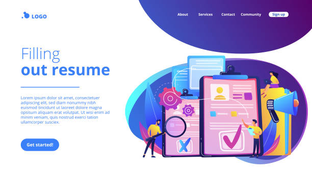
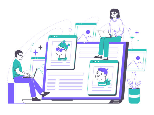
Today, the presence of websites across various dimensions and on different devices is an undeniable necessity. #Responsive_Web_Design is no longer a luxury choice, but rather a foundation for the success of any online business.
In a world where users access content from smartphones, tablets, laptops, and even smart TVs, your website must be able to provide a seamless and optimized user experience on every screen size.
This approach ensures that your content is displayed correctly and users can easily interact with your site without needing to zoom in or scroll horizontally.
Responsive design goes beyond simply adjusting image sizes; it’s a complete philosophy about how to organize and present content.
The importance of responsive website design is due to changing content consumption patterns and the need for a perfect #User_Experience.
With increasing mobile usage for web browsing, websites that do not display correctly on these devices will lose a large portion of their audience.
Google has also explicitly stated that #mobile_friendly websites are prioritized in search results rankings.
This shows that investing in responsive website design is crucial not only for user satisfaction but also for improving website SEO and reaching more audiences.
This explanatory and educational approach is the foundation for a deeper understanding of its benefits.
Did you know that poor online store design can drive away up to 70% of your potential customers? Rasaweb transforms your sales with professional and user-friendly e-commerce website design.
✅ Significant increase in sales and revenue
✅ Full optimization for search engines and mobile
⚡ [Get free consultation from Rasaweb]
Basic Principles and Pillars of Responsive Design

To understand how #Responsive_Web_Design works, it is necessary to become familiar with its basic principles. These principles include three main pillars: #Fluid_Grids, #Flexible_Images, and #Media_Queries.
Fluid grids use relative units like percentages instead of fixed pixel units.
This approach helps the layout naturally adapt to the screen width, without content overflowing or creating too much empty space.
For example, a column that is 300 pixels wide on a desktop might occupy 30% of the total screen width in responsive design, which also changes as the screen size changes.
Flexible images mean that images and videos should also be scaled to always fit the available space and not overflow.
This is typically done by setting the max-width: 100%; property for image elements.
Finally, media queries are a vital component that allows you to apply different CSS rules based on device characteristics such as screen width, height, orientation (portrait/landscape), and resolution.
By using media queries, you can define breakpoints where your site’s layout changes to provide the best display at that specific size.
This #specialized approach allows unique styles to be applied for different devices, providing an optimal user experience.
For example, on small displays, the navigation menu might transform into a hamburger icon, while on larger displays, it is shown in full.
These principles form the foundation of any successful responsive website design.
Practical Tools and Frameworks for Responsive Development

To facilitate the #website_development process and implement #Responsive_Web_Design, numerous tools and frameworks are available. These tools help developers quickly build responsive websites without needing to write all the code from scratch.
Among the most prominent and popular CSS frameworks widely used for responsive website design are Bootstrap and Foundation.
Bootstrap is a powerful and comprehensive framework that includes a collection of CSS and JavaScript templates for typography, forms, buttons, tables, navigations, and other UI components.
This framework easily allows for the creation of responsive layouts using a 12-column grid system.
Foundation is also a responsive and extensible framework that focuses more on flexibility and customization.
In addition to these frameworks, tools like Flexbox and CSS Grid in modern CSS provide unparalleled power for creating complex and responsive layouts without the need for heavy frameworks.
Using CSS preprocessors like Sass and Less can also organize the CSS writing process and increase its maintainability.
This specialized and guiding section helps you become familiar with more efficient tools for responsive website design.
The table below provides a comparison between two popular frameworks for responsive design:
| Feature | Bootstrap | Foundation |
|---|---|---|
| Ease of Use | Very easy, rich documentation | Medium, requires some learning |
| Flexibility and Customization | Good, with themes and variables | Very high, strong Mobile-first approach |
| File Size | Relatively large (full versions) | Relatively smaller (with selected components) |
| User Community | Very large and active | Large and active |
Common Challenges and Solutions in Responsive Design
Despite numerous advantages, implementing #Responsive_Web_Design is not without challenges. One of the most important #design_challenges is #optimizing_site_performance for different devices.
Websites that are not properly optimized may load slowly on mobile devices, creating a poor user experience.
This problem is often due to large image sizes, multiple fonts, or unnecessary JavaScript scripts that are optimized for desktop but not for mobile.
The solution to this problem includes using image optimization techniques such as compression, lazy loading, and serving images in different sizes (using srcset and picture) is.
Another challenge is managing navigation on small screens; complex desktop menus should be transformed into a simpler, more accessible form like a hamburger menu on mobile.
Controlling content and ensuring its readability on various screen sizes, especially for long content, also requires attention.
This issue is often resolved by adjusting font size and line spacing using relative units (like em and rem) or media queries.
Testing and debugging on different devices is also a significant challenge, as site behavior may vary across browsers and operating systems.
Browser developer tools, simulators, and real device testing platforms are helpful in this regard.
This analytical and explanatory section helps us look at the responsive website design process with a realistic view and find practical solutions for potential problems.
Does your current site showcase your brand’s credibility as it should? Or does it drive away potential customers?
Rasaweb, with years of experience in designing professional corporate websites, is your comprehensive solution.
✅ A modern, beautiful site tailored to your brand identity
✅ Significant increase in lead and new customer acquisition
⚡ Contact Rasaweb now for a free corporate website design consultation!
Impact of Responsive Design on SEO and Google Ranking

Today, the importance of #Responsive_Web_Design on #SEO and ranking in search engines, especially #Google, is undeniable. In 2015, Google officially announced that mobile-friendliness is a ranking factor, and in 2018, with the introduction of Mobile-First Indexing, this issue gained double importance.
This means that when crawling and indexing websites, Google primarily looks at the mobile version of the site and considers it the main version.
Therefore, if your website is not optimized for mobile and does not provide a good user experience, it will have less chance of website_ranking in search results.
Responsive website design, by providing a single URL for all devices, prevents duplicate content issues and simplifies the crawling and indexing process for search engines.
This helps Google to centrally allocate site authority and PageRank to one URL, instead of splitting it between different versions (e.g., separate desktop and mobile versions).
Reducing the bounce rate and increasing user time on site, which is a direct result of a better user experience on responsive sites, also act as positive signals for Google and help improve site ranking.
This news and analytical section shows how responsive website design is not just a choice for a better user experience, but a vital strategy for a successful presence in search results and attracting organic traffic.
Responsive Design Beyond Desktop and Mobile
The concept of #Responsive_Web_Design is evolving and is no longer limited to desktop and mobile. With the emergence of #Internet_of_Things (IoT) and the expansion of #smart_devices, designers and developers must consider designing for a wider range of displays.
From smartwatches with very small screens to smart TVs and even in-car displays, each requires a different approach to responsive design.
This raises the question: can only media queries based on screen width address all these needs? The answer is likely no. For devices like smartwatches, one must think about designing Micro-interactions and very brief, useful information, while for televisions, remote interaction and readability from a distance become important.
This is where the question arises whether the current approach to responsive website design (which mainly focuses on screen width) is sufficient, or if attention should also be paid to specific device characteristics (such as touch capability, input type, and even location)? Should we design completely separately for each device, or can we have a more flexible approach? This thought-provoking and specialized content section addresses the future of responsive website design and raises challenges that web designers will face in the coming years.
Case Study: Successful Websites with Responsive Design
To better understand the power of #Responsive_Web_Design, examining #successful_examples in practice can be very #inspiring. Many leading global companies have used this approach to provide a seamless user experience to their audience.
For example, the Apple website is a classic example of responsive website design that adapts flawlessly to different screen sizes.
From the layout of products on the homepage to the details of product pages, everything is designed to look great and function properly on any device.
The New York Times is also a prominent example in the media sector, demonstrating how rich news content can be presented readably and engagingly across all devices.
They intelligently use media queries to adjust the layout of articles, images, and videos so that the reading experience on mobile is as pleasant as on desktop.
Airbnb’s site has also implemented this concept well in its booking platform; users can easily search, view, and book rooms from any device.
These successes show that investing in responsive website design not only yields good returns but also contributes to customer loyalty and increased engagement.
This entertaining and analytical section allows us to learn from others’ experiences and apply best practices for our own responsive website design.
The table below shows examples of successful websites with responsive design:
| Site Name | Industry | Responsive Strength |
|---|---|---|
| Apple | Technology, Electronic Products | Product layout, image galleries, navigation |
| The New York Times | Media, News | Text readability, article layout, advertisements |
| Airbnb | Accommodation Rental, Travel | Search forms, maps, listings |
| Smashing Magazine | Web Design, Development | Specialized articles, coding, resources |
Steps for Principled Responsive Website Design Implementation
To #implement_responsive_design in a principled manner, following specific steps can help ensure project success. The first step is design_planning, which includes defining the target audience, the devices they use, and the main content of the site.
In this stage, a Mobile-First approach should be considered, meaning first designing for the smallest screen and then progressing to larger displays.
This approach helps you focus on core content and essential functionality, avoiding unnecessary clutter on mobile.
The second step is choosing a framework or CSS approach (such as Flexbox or Grid), which is selected based on project needs and team skills.
Then, it’s time for HTML and CSS design and coding, with a focus on using relative units for grids and images.
Media queries are used at this stage to adjust the layout at different breakpoints.
After coding, the critical #responsive_testing phase begins.
In this phase, the site must be tested on various physical devices as well as simulators and browser developer tools to ensure its correct functionality across all sizes and platforms.
Google’s mobile-friendly testing tools are also very useful for this purpose.
This guiding and educational section is a practical roadmap for anyone looking to implement a professional and efficient responsive website design.
Is your online sales not as expected? With Rasaweb, permanently solve the problem of low sales and poor user experience!
✅ Increase conversion rate from visitor to customer
✅ Create an enjoyable user experience and increase customer trust
⚡ Act now for a free consultation!
The Future of Web Design with a Focus on User Experience and Responsive Website Design

As technology advances at astonishing speed, the future of #web_design, especially #Responsive_Web_Design, is also evolving. A greater focus on personalized user experience (UX) and the use of Artificial_Intelligence_in_design are future trends.
AI can help designers optimize layouts based on user behavior or even automatically create optimized versions of content for different devices.
The emergence of Progressive Web Apps (PWAs), which combine the best features of web and mobile applications, also indicates the direction the web is heading; these applications provide capabilities like offline work, push notifications, and device hardware access through the browser.
Furthermore, designing for Dark Mode and paying attention to Accessibility for all users, regardless of their abilities, have gained increasing importance.
New approaches like “Component-Based Design” also allow developers to create reusable components that are inherently responsive. This analytical and news section shows us how responsive website design, as a constant principle, alongside new innovations, will shape the #future_trends of the web.
Summary and Key Recommendations for Modern Web Design

In conclusion, it can be said that #Responsive_Web_Design is not just a technical approach, but a comprehensive strategy to ensure the success of your website in today’s world. Given the countless variety of devices users employ to access the internet, providing a seamless and optimized user experience on every screen is crucial.
This approach is the foundation of any modern website seeking to reach maximum audience and improve conversion rates. From SEO benefits and better Google rankings to increased user satisfaction and reduced bounce rates, all are direct results of investing in responsive website design.
Our #key_points and #final_recommendations for designers and website owners include: Always design with a Mobile-First approach; utilize modern tools and frameworks to accelerate the development process; continuously test your website on different devices; and always strive to optimize performance and loading speed.
Also, remember that content is king and should be presented in a way that is readable and accessible on any screen size.
By following these principles and staying updated with the #future_of_web, you can ensure that your website not only looks beautiful but also delivers unparalleled performance anytime, anywhere.
This explanatory and guiding section provides a summary of what you need for responsive website design in the digital age.
Frequently Asked Questions
| Question | Answer |
|---|---|
| What is Responsive Web Design? | It is a method for designing and implementing websites that automatically adjusts the layout and content of the display based on the user’s device screen size (desktop, tablet, mobile, etc.) to be displayed in the best possible way. |
| Why is responsive design important? | With increasing use of various devices to access the web, a responsive site improves user experience, reduces bounce rate, strengthens site SEO, and makes site management and maintenance easier (instead of having separate versions for mobile and desktop). |
| How does responsive design work? | This type of design uses techniques such as flexible grids and layouts (Flexbox, CSS Grid), flexible images and media, and most importantly, CSS Media Queries to change the styles and layout of the page based on screen characteristics (width, height, resolution, etc.). |
| What are the main tools for implementing responsive design? | Main tools include HTML5 (for content structure), CSS3 (especially Media Queries, Flexbox, Grid for responsive styling and layout), and sometimes JavaScript for more complex interactions. |
| What are the main advantages of using responsive design? | The main advantages include increased user accessibility (covering a wide range of devices), improved user experience, better site ranking in search engines (especially Google), reduced development and maintenance costs, and an increased conversion rate from visitor to customer. |
And other services of Rasaweb Advertising Agency in the field of advertising
Smart Link Building: An innovative platform for improving customer behavior analysis with precise audience targeting.
Smart Direct Marketing: A professional solution for improving SEO ranking with a focus on attractive UI design.
Smart Marketplace: Revolutionize click-through rates with custom programming.
Smart Google Ads: An effective tool for customer acquisition with Google Ads management.
Smart Digital Advertising: An innovative platform for improving user engagement with key page optimization.
And over a hundred other services in the field of internet advertising, advertising consulting, and organizational solutions
Internet Advertising | Advertising Strategy | Advertorials
Resources
What is Responsive Web Design?What are UI and UX Design and What are their Differences?Iran’s Digital FutureWeb Design Trends
? To be seen in the digital world and reach the peak of success, Rasaweb Afarin Digital Marketing Agency is with you. By providing specialized services including professional WordPress website design and targeted SEO, we bring your business to the position it deserves. For a free consultation and to start your business’s digital transformation, contact us.
📍 Tehran, Mirdamad Street, next to Central Bank, Southern Kazeroun Alley, Ramin Alley, No. 6

