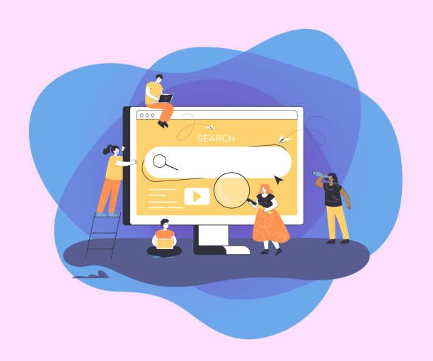
Introduction to the Importance of User-Friendly Website Design
In today’s highly competitive world, an online presence is vital for every business and individual.
However, simply having a website is not enough; it’s crucial for that website to be #effective, #attractive, and most importantly, #user-friendly.
User-friendly website design goes beyond mere visual aesthetics; it’s a comprehensive approach that focuses on ease of use, efficiency, and end-user satisfaction.
A well-designed website helps users quickly and without confusion access the information or services they are looking for.
This not only helps retain users but also significantly increases conversion rates.
In this educational section, we introduce the fundamentals of this concept.
Imagine a user landing on your website.
Can they easily find the menus? Are the registration forms not complicated? Is the information clearly and organizedly displayed? The answers to these questions indicate the success of your user-friendly website design.
The main goal of this type of design is to create an enjoyable and hassle-free experience for visitors.
When users feel comfortable and in control of your website environment, their likelihood of returning and becoming loyal customers significantly increases.
This explanatory approach in this context shows how attention to small details can have a major impact on a website’s overall success.
From choosing readable fonts and appropriate colors to strategically placing Call-to-Action (CTA) buttons, every element on a website plays an important role in creating a positive user experience.
For example, if an online store has a complicated payment process, many customers will abandon their purchase midway.
This indicates that user-friendly website design is not just about appearance, but also about functionality and efficiency.
In fact, a poor design can lead to customer loss, reduced brand credibility, and ultimately, failure to achieve business goals.
Therefore, investing in this area is not just an option, but a necessity.
Another important topic is website compatibility with various devices.
Today, a large portion of internet traffic occurs via mobile phones.
Therefore, if your website is not displayed correctly on mobile or is difficult to use, you will practically lose a large segment of your audience.
This itself is one of the important pillars of user-friendly website design, which we will discuss in detail in subsequent chapters.
Finally, it should be noted that this design is a continuous process and requires constant updates and optimizations based on user feedback and technological changes.
Do you dream of a thriving online store but don’t know where to start?
RasaWeb is your comprehensive e-commerce website design solution.
✅ Attractive and user-friendly design
✅ Increased sales and revenue⚡ Get a free consultation
User Experience (UX) is the Core of Every Successful Website

#User_Experience, or #UX, is a concept beyond merely the appearance of a website.
This term refers to all aspects of a user’s interaction with a product, system, or service.
In the context of websites, UX includes a user’s emotions, beliefs, preferences, perceptions, physical and psychological responses before, during, and after using a website.
In other words, User Experience addresses how a user interacts with the website and how they feel about this interaction.
A strong UX leads to increased satisfaction, loyalty, and conversion rates.
This section analytically addresses why focusing on UX is crucial in any website design.
In the past, many websites were merely seen as online catalogs or tools for providing information.
However, over time and with increasing user expectations, the importance of interaction and ease of access has significantly grown.
A website with a poor user experience, even with excellent content or unique products, will not be able to retain its audience.
Today’s users are not patient; if they cannot find what they are looking for within the first few seconds, they will quickly leave your website and move on to the next competitor.
An explanatory approach to UX components includes items such as usability, accessibility, value, credibility, and desirability.
Usability means how easy the website is to learn and use.
Accessibility ensures that people with various disabilities can also use the website.
For example, are the texts large enough? Is the color contrast appropriate? User-friendly website design is inextricably linked with these concepts.
An excellent UX website requires user research, creation of user personas, user testing, and continuous feedback.
This process is an iterative cycle of design, evaluation, and improvement, whose ultimate goal is to create a unique experience for every visitor.
Ultimately, it must be understood that a website’s success today is more dependent on user-friendly website design than ever before.
A company that prioritizes UX not only increases customer satisfaction but also reduces support costs and strengthens its brand reputation.
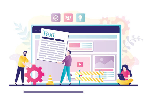
Key Principles in Designing an Effective User Interface

To achieve a successful and #effective #User_Interface (#UI), which forms the core of user-friendly website design, adhering to several key principles is essential.
These principles help designers create interfaces that are not only aesthetically pleasing but also effectively assist users in achieving their goals.
The first principle is #simplicity.
A user interface should be as simple as possible, without unnecessary complexities.
Every extra element can distract the user and diminish the overall experience.
The second principle is #consistency.
Similar design elements, naming conventions, and functionalities should behave uniformly across the entire website so that users can easily recognize patterns and have a seamless navigation experience.
In this specialized and guidance section, we delve into these principles in detail.
The principle of feedback is also very important.
Users should always know what is happening; for example, after clicking a button, they should receive an indication of processing or operation success.
This feedback can include a button color change, displaying a success message, or a loading animation.
The fourth principle is user control.
Users should feel that they are in control.
The ability to go back, undo operations, and edit information are examples of applying this principle, which enhances the user’s sense of confidence.
These elements collectively contribute significantly to user-friendly website design.
The table below provides a summary of some important UI design principles:
| Principle | Description | Example |
|---|---|---|
| Simplicity and Clarity | Removing unnecessary elements and focusing on key information. | Concise navigation menus without complex sub-branches. |
| Consistency | Using consistent design patterns and terminology throughout the site. | Consistent color and size for call-to-action buttons. |
| Immediate Feedback | Informing the user about the current status of an operation. | Loading indicator after form submission, or success message. |
| User Control | Ability for the user to cancel or go back. | “Back” button or “Undo” functionality in forms. |
The fifth principle is ergonomics and efficiency.
The design should be such that the website is easy to use and does not cause fatigue.
For example, placing clickable elements in easily accessible locations, especially on touch devices.
Adhering to these principles not only helps improve the user experience but also enhances the site’s SEO, as search engines prefer websites with a good user experience.
Ultimately, user-friendly website design is an iterative process that requires continuous testing and feedback to ensure its effectiveness.
These principles serve as strong guidelines for web designers to achieve the best results in this field.
Logical Navigation and Information Architecture

#Website_navigation and #information_architecture are two fundamental pillars in user-friendly website design that are often overlooked but have a profound impact on the user experience.
#Information_Architecture (IA) refers to organizing and labeling content and functionality on a website in such a way that users can easily find information and accomplish their tasks.
This involves logical categorization, creating clear hierarchies, and designing intuitive navigation systems.
Without strong information architecture, even the richest content can appear cluttered and inaccessible.
This section expertly and explanatorily clarifies the importance of this topic.
An effective Navigation System helps users quickly and without confusion navigate the website.
This includes main menus, internal links, search bars, and sitemaps.
Menus should be clear, concise, and predictable.
For example, using familiar terms instead of technical or ambiguous words can help users easily find their way.
Additionally, placing menus in standard locations (such as the top of the page or the sidebar) meets user expectations and reduces the need for cognitive effort.
How can one create logical information architecture? This usually begins with researching users and their goals.
Understanding the audience’s needs helps you organize content in a way that is logical and useful for them.
Techniques like “Card Sorting” and “Tree Testing” are effective tools for understanding how users categorize information.
For example, if users are looking for “after-sales services,” this section should be easily accessible in the menu, not hidden under complex sub-branches.
This precision in organization is one of the key elements of a user-friendly website design.
Furthermore, internal links play an important role in navigation and SEO.
By creating relevant links between different pages of the website, you help users discover more information and also show search engines which pages are more important.
Additionally, using “breadcrumbs,” which indicate the user’s current path on the website, can help them understand their position within the site’s hierarchy and easily return to higher-level pages.
A strong navigation system not only helps the user reach their destination but also guides them throughout their journey on the website and prevents confusion.
These aspects directly influence usability and overall user satisfaction.
Did you know that 94% of users’ first impressions of a business are related to its website design? With professional corporate website design by **RasaWeb**, turn this first impression into an opportunity for growth.
✅ Attracting more customers and increasing sales
✅ Building credibility and trust in the audience’s view⚡ Get a free website design consultation now!
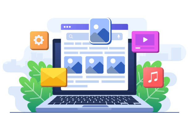
The Importance of Visual Design and Content Readability

#Visual_design and #content_readability are two vital aspects that directly impact user experience and play a significant role in user-friendly website design.
Initial visual aesthetics are what attract the user at first glance and encourage them to stay on the website.
But beyond appearance, visual design should be functional, guiding the user’s eye and facilitating navigation.
Factors such as the use of white space, visual balance, visual hierarchy, and choosing an appropriate color palette all contribute to creating a pleasant and efficient visual experience.
In this section, we’ll cover these points in a guidance-oriented and somewhat entertaining way.
Imagine your website is a book; if its font is unreadable, the letter size is too small or too large, or the text color doesn’t have enough contrast with the background, reading it quickly becomes tiresome and annoying.
Choosing the right font (type, size, and line height), using short paragraphs, and employing clear headings and subheadings all contribute to content readability.
White space around text and images gives the user’s eyes a rest and prevents visual clutter, which in turn helps with information processing ease.
Colors and images also play a key role. Colors can evoke specific emotions and assist with branding.
For example, blue often conveys a sense of trust and calmness, while red can transmit passion and excitement.
Choosing an appropriate color palette that is both consistent with your brand and not tiresome for users is crucial.
Images and videos should also be high-quality and relevant to the content.
Using low-quality or irrelevant images can negatively impact your website’s credibility.
Furthermore, optimizing images for the web in terms of size and format is essential for site loading speed, which is itself an important part of the user experience.
Ultimately, it must be noted that successful visual design is a balance between aesthetics and functionality.
Beauty without functionality is just a painting, and functionality without beauty can be boring.
Web graphic designers, by combining these two, can create websites that are not only visually appealing but also help users easily achieve their goals and have an enjoyable browsing experience.
This integrated approach is the foundation of a user-friendly website design in its true sense.
Responsive Design and Mobile-First Approach
In the current era, where the use of smartphones and tablets for internet access has become widespread, #Responsive_Web_Design (RWD) and the #Mobile-First_Approach are no longer an option, but an indispensable necessity for any website.
#Responsive_design means that your website is designed to adapt its appearance and functionality to the screen size and characteristics of the device the user is using.
This includes changes in layout, font size, images, and navigation elements to provide an optimal user experience on any device.
This section reports and specializes in examining these developments.
Statistics show that a large portion of web traffic today comes from mobile devices.
Therefore, if your website is not displayed correctly on mobile or is difficult to use, you will practically lose a large segment of your audience and business potential.
Furthermore, search engines like Google rank mobile-friendly websites higher in their search results, as their goal is also to provide the best user experience.
The mobile-first approach goes a step beyond responsive design.
In this approach, the website design and development process begins by focusing on the user experience on the smallest screen (mobile) and then gradually expands to larger screens (tablet and desktop).
This method ensures that the most important content and functionalities are accessible and usable in the mobile version of the site, as the more limited mobile space forces designers to focus on essential elements.
After ensuring correct functionality and optimal user experience on mobile, more features and details are added for larger versions.
This approach not only ensures that your website performs excellently on mobile but also helps improve site loading speed and reduce file sizes, as the initial focus is on simplicity and efficiency.
In today’s world, a website without responsive design is almost inconceivable, and adopting a mobile-first approach demonstrates a deep understanding of user behavior and modern SEO requirements.
This topic shows that web design that addresses all aspects of responsiveness is highly important.
Responsive design is a key element in building websites that are usable by everyone, everywhere.
Website Speed and Performance Optimization
#Website_loading_ speed is one of the most important factors in #user_experience and #SEO_ranking.
In today’s world, where users have high expectations for website speed and performance, every second of loading delay can mean losing visitors and customers.
Studies have shown that a significant portion of users abandon websites that take more than a few seconds to load.
Optimizing site performance not only helps user satisfaction but also directly impacts conversion rates, reduces bounce rates, and improves search engine rankings.
This section specializes in and explains the factors affecting site speed and optimization solutions.
One of the main reasons for slow websites is the large size of images and media files.
Optimizing images (compressing without losing quality) and using modern formats (like WebP) can significantly reduce loading time.
Minifying code (HTML, CSS, JavaScript) and removing unnecessary code also help improve performance.
Using browser and server caching stores website resources for subsequent visits, significantly reducing loading time.
The table below shows some key website performance metrics:
| Metric | Description | Importance |
|---|---|---|
| Largest Contentful Paint (LCP) | The time it takes for the largest visual content on the page to load. | Indicates the main loading speed for the user. |
| First Input Delay (FID) | Time until the user’s first interaction (click, type). | Measures the site’s responsiveness to initial interactions. |
| Cumulative Layout Shift (CLS) | The amount of unexpected layout shifts on the page. | Indicates the visual stability of the page. |
| Time to Interactive (TTI) | Time until the page becomes fully interactive. | Important for users who need quick interaction. |
In addition to the above, choosing suitable hosting and using a Content Delivery Network (CDN) can significantly improve content loading speed for users in different geographical locations.
CDNs minimize data transfer time by storing copies of your website on servers close to users.
Continuous monitoring of site performance with tools like Google PageSpeed Insights or GTmetrix is also essential for identifying and addressing weaknesses.
A fast website not only provides a better user experience but also increases the credibility and profitability of your online business.
Ultimately, speed is one of the important pillars of modern web design.
Web Accessibility; A Step Further in Inclusion

#Web_Accessibility means designing and developing websites in such a way that people with #various_disabilities can fully and unimpededly use them.
These disabilities can include visual impairments (such as blindness or low vision), hearing impairments (such as deafness), motor impairments (such as limitations in mouse usage), or cognitive impairments (such as learning disabilities).
Focusing on accessibility is not only an ethical and social responsibility but also a great opportunity to expand the audience and increase a website’s reach.
This approach is an inseparable part of the broader concept of user-friendly website design.
In this educational and guidance section, we address the importance and implementation of accessibility.
One of the most important principles of accessibility is providing text alternatives for non-text content.
For example, using alt text for images allows blind users who use screen readers to understand the image content.
Also, providing captions for videos and transcripts for audio content helps deaf users.
HTML code structure also plays a vital role in accessibility. Correct use of semantic HTML tags like <header>, <nav>, <main>, and <footer> helps screen readers better understand the page structure and facilitates navigation for users with disabilities.
Ensuring appropriate color contrast between text and background, especially for visually impaired individuals, and the ability to zoom text without breaking the layout, are other important points.
Keyboard navigation is also a crucial factor.
Some users, due to motor disabilities, cannot use a mouse and only browse the web with a keyboard.
Ensuring that all interactive elements (links, buttons, forms) are accessible and activatable with the keyboard and that there is a logical tab order is essential.
Also, providing clear visual feedback when an element is focused (using a Focus Ring) helps these users.
The World Wide Web Consortium (W3C) has published standards called WCAG (Web Content Accessibility Guidelines) for web accessibility, which provide comprehensive guidance in this area.
Implementing these standards not only benefits individuals with disabilities but also generally improves the user experience for everyone and demonstrates an organization’s commitment to inclusivity and ethics.
User-friendly website design should never overlook any group of users.
How much does losing business leads due to an unprofessional site cost you? Solve this problem forever with professional corporate website design by RasaWeb!
✅ Increase credibility and trust among potential customers
✅ Easier acquisition of new business leads
⚡ Get a free consultation right now!
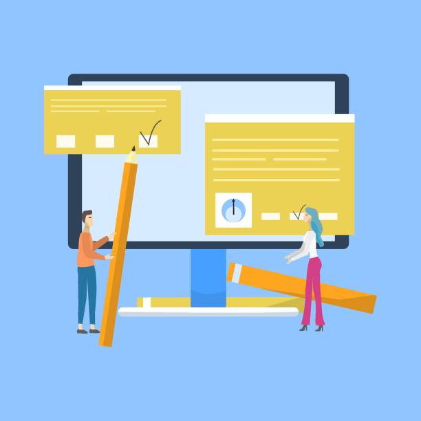
User Testing and Continuous Improvement
#Usability_Testing is a vital process in the lifecycle of any website that allows you to identify the strengths and weaknesses of your design from the perspective of real users.
Without testing, you rely solely on your or your team’s assumptions, which can lead to creating a website with hidden user experience issues.
The main goal of usability testing is to discover problems users encounter when interacting with the website and ultimately improve their overall experience.
This approach is an analytical and question-provoking content phase in the path of user-friendly website design.
How is usability testing performed? This process can be done in various ways, including:
- In-person tests: Users interact with the website in a controlled environment, and their behavior and feedback are monitored by the design team.
- Remote tests: Users interact with the website in their natural environment, and their behavior and feedback are recorded through online tools.
- Unmoderated tests: Users perform specific tasks on the website without direct supervision, and results are collected automatically.
- A/B tests: Two different versions of a page or design element are shown to different groups of users to identify the best version.
The question is, “Is our website really as user-friendly as we think it is?” Usability testing answers this question.
Test results can include task success rates, time required to complete a task, error rates, and overall user satisfaction.
This data provides valuable insights for the design team to implement necessary changes based on them.
#Continuous_improvement is an inseparable concept from usability testing.
A website is dynamic, and user needs and technologies are constantly changing.
Therefore, the optimization process must be an iterative cycle: design, test, analyze, and improve.
Collecting user feedback through surveys, contact forms, and web analytics (such as Google Analytics) can also help identify behavioral patterns and potential issues.
This agile approach ensures that your website consistently aligns with user needs and provides the best possible experience.
Investing in continuous testing and improvement is an investment in your website’s long-term success.
The Future of Web Design and User Experience
The world of #web_design and #user_experience (UX) is rapidly evolving, and every day we witness the emergence of new technologies and trends.
The future of user-friendly website design is moving towards greater intelligence, more natural interactions, and deeper personalization.
In this news and analytical section, we examine some of the most important upcoming trends that will shape future websites.
One of the most important future trends is the wider use of #Artificial_Intelligence (AI) and #Machine_Learning (ML) for #personalizing the user experience.
AI algorithms can analyze user behavior and suggest content, products, or services based on their individual preferences.
This personalization can include dynamic page layouts, smart product recommendations, and even adaptive user interfaces that change according to each user’s specific needs.
Other trends include:
- Voice UI/Conversational UI: With the expansion of voice assistants like Siri and Alexa, voice search and conversational interactions with websites and applications will become more common.
Designers must create websites that can respond to voice queries and perform tasks through conversation with the user. - Augmented Reality (AR) and Virtual Reality (VR): These technologies have the potential to create immersive experiences.
In the future, online stores might allow users to view products in their real-world environment through AR or explore in 3D virtual spaces. - No-Code/Low-Code Design: These tools make it possible for more people to design and build websites without deep programming knowledge, which will lead to an increase in the diversity and number of websites.
- More Advanced Microinteractions: These small but impactful details in the user interface (such as subtle animations on click or scroll) will become increasingly complex and intelligent to make the user experience more enjoyable and intuitive.
The future of web design is moving towards websites that are not only beautiful and efficient but also intelligent, adaptable, and highly personalized.
To stay at the forefront of these changes, designers and developers must constantly learn and experiment with new technologies.
Focusing on changing user needs and using AI to anticipate and respond to these needs will be the cornerstone of successful websites in the future.
These developments indicate a major leap in providing user-friendly website design in the near future.
Frequently Asked Questions
And other services of RasaWeb Advertising Agency in the field of advertising
Smart Advertising Campaign: A dedicated service for growth in campaign management based on marketing automation.
Smart Marketplace: A creative platform for improving campaign management with intelligent data analysis.
Smart Sales Automation: A creative platform for improving customer behavior analysis with precise audience targeting.
Smart Google Ads: An effective tool for customer acquisition through Google Ads management.
Smart Social Media: A dedicated service for growth in increasing sales based on SEO-driven content strategy.
And over hundreds of other services in the field of internet advertising, advertising consultation, and organizational solutions
Internet Advertising | Advertising Strategy | Advertorial
Resources
Principles of User-Friendly Website Design
Importance of User Experience in SEO
Guide to Responsive Design
Essential Web Design Tools
? RasaWeb Afarin, by providing comprehensive digital marketing services including SEO-optimized website design and targeted strategies, sets your business on the path to online growth and success.
📍 Tehran, Mirdamad Street, Next to Central Bank, Kazeroun Jonoubi Alley, Ramin Alley, Plaque 6

