
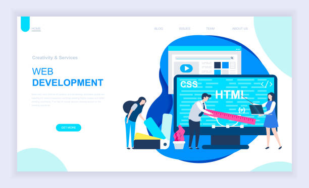
Introduction to Responsive Web Design and its Importance in the Digital Age

In today’s fast-paced world, an online presence is vital for every business.
But this presence is not limited to having a website; its quality and accessibility are of great importance.
This is where the concept of Responsive Web Design comes into play.
Simply put, #Responsive_Web_Design means designing a website in such a way that its layout and content automatically adjust to the screen size of the user’s device.
This adjustment includes changes in font sizes, images, navigation, and even the order of page elements.
The main goal of #Responsive_Design is to provide a seamless and optimal user experience for users, regardless of whether they are using a mobile, tablet, laptop, or a large monitor.
The importance of this approach is more evident than ever in the digital age.
With the increasing use of mobile devices to access the internet, having a website that displays correctly on these devices is no longer a competitive advantage, but a necessity.
Ignoring this aspect can lead to the loss of a large segment of the audience and ultimately a decrease in revenue.
Furthermore, search engines like Google also prioritize websites that offer a good mobile user experience in their rankings.
Therefore, responsive website design not only helps increase user satisfaction but also plays a vital role in improving website SEO and increasing visibility in search results.
This approach explains the foundation of modern web design.
Does your current website build the trust that potential customers should have in your business? If the answer is no, it’s time to have your professional and impactful corporate website with Rasavob.
✅ Fully customized design tailored to your brand identity
✅ Increase lead generation and your business’s credibility in the eyes of customers⚡ Contact us for a free consultation!
Why Responsive Website Design is a Necessity, Not an Option
In the past, web developers designed separate website versions for different devices (such as a desktop version and a mobile version).
This approach was not only time-consuming and expensive, but also had its complexities in management and updates.
With the emergence of the concept of Responsive Web Design, these problems were significantly reduced.
Today, given the unprecedented variety of devices in terms of screen size and resolution, not using this method can lead to disastrous results.
According to global statistics, more than half of web traffic comes from mobile devices.
This means that if your website is not optimized for mobile, you will lose a large portion of your potential users.
Users who encounter non-responsive websites quickly leave them and go to competitors who offer a better user experience.
Google, by introducing the “Mobile-First Indexing” algorithm, has doubled its emphasis on the importance of website responsiveness; meaning that the mobile version of your website will be Google’s primary criterion for ranking in search results.
Therefore, flexible web design is no longer a luxury feature, but a fundamental element for survival and growth in the digital space.
This is a serious analysis of the current state of the web and the role of responsive design in it, showing that this issue is no longer an option, but a strategic necessity for any business.
Technical Principles of Responsive Website Design and Implementation Techniques

Implementing Responsive Web Design is based on three key principles: Fluid Grids, Flexible Images, and Media Queries.
Fluid grids mean that instead of using fixed widths (pixels) for page elements, relative units such as percentages are used.
This ensures that the website layout automatically stretches or compresses with changes in screen size, without breaking.
Flexible images also prevent them from going out of bounds or creating horizontal scrolling by automatically adjusting image sizes based on available space.
But the core of responsive design is formed by “Media Queries”.
This CSS capability allows you to apply different CSS styles based on various device characteristics (such as screen width, height, orientation, and resolution).
For example, you can display a two-column layout on a desktop screen, but arrange the same content vertically in a single column on a mobile screen.
Example of Media Query:
@media (max-width: 768px) {
    .column {
        width: 100%;
        float: none;
    }
}| Unit | Description | Advantages for Responsiveness |
|---|---|---|
| px (pixel) | Absolute unit, fixed size | Lack of flexibility, suitable for fixed sizes |
| % (percentage) | Relative unit, based on parent | Fully flexible, ideal for element width and height |
| em | Relative to parent font size | Suitable for font sizes and spacing, text scalability |
| rem | Relative to root (HTML) font size | Centralized control over scalability, prevention of nesting issues |
| vw/vh | Viewport width/height percentage | Suitable for full-screen elements, scalability relative to viewport |
These technical principles form the basis for constructing a website fully compatible with any device and are a specialized and educational part of the modern web design process.
User Experience and Responsive Website Design (UX)

User Experience (UX) is the heart of every successful website, and responsive web design plays a pivotal role in shaping it.
A responsive website prevents cognitive overload for the user by adapting content and layout to the screen size.
Imagine a user accessing your site with a smartphone; if your site is not responsive, he/she will have to zoom in or scroll around to see all the content.
This tedious process quickly leads to site abandonment and user dissatisfaction.
In contrast, a site with responsive design, displays content in a way that is easily readable and interactive.
Fonts are adjusted to appropriate sizes, buttons and links are large enough to be easily touched with a finger and images display beautifully without going out of bounds.
Site navigation also should be designed to take up less space on small screens; for example, by using hamburger or dropdown menus.
Optimizing user experience in responsive web design is not limited to aesthetics but also includes loading speed.
Images and videos must be optimized for mobile devices to increase site loading speed, as mobile users often have slower internet connections or less bandwidth access.
A smooth and enjoyable user experience not only keeps users on your site but also turns them into loyal customers.
This section provides guidance for improving key UX aspects in the responsive web design process.
Did you know that 94% of users’ first impressions of a business are related to its website design? With professional corporate website design by **Rasavob**, turn this first impression into an opportunity for growth.
✅ Attract more customers and increase sales
✅ Build credibility and trust in the audience’s view⚡ Get a free website design consultation!
Impact of Responsive Website Design on SEO and Google Ranking

The relationship between responsive website design and SEO (Search Engine Optimization) is very direct and crucial.
Google, as the largest search engine in the world, has officially stated that responsiveness is an important factor in website rankings.
Since 2015 and with the “Mobilegeddon” update, Google began penalizing websites that were not optimized for mobile.
This trend reached its peak with the introduction of “Mobile-First Indexing” in 2018, meaning Google primarily considers the mobile version of your website for crawling, indexing, and ranking.
A site with flexible web design has several SEO advantages:
- Reduced Bounce Rate: When mobile users visit your site and have a poor experience, they immediately leave.
This high bounce rate signals to Google that your site is not useful for users and can lead to a drop in your ranking. - Increased Dwell Time: A responsive site, by providing a better user experience, encourages users to stay longer on your site, which is also a positive signal for Google.
- URL Consistency: With responsive website design, you have only one URL for each page, which simplifies Google’s crawling and indexing process and prevents duplicate content issues.
- Reduced Crawl Errors: Separate mobile sites usually have more complex internal and external links, which can lead to crawl errors.
In summary, responsive website design is no longer just a visual feature, but a vital strategy for improving SEO and ensuring your website’s visibility in search results.
This is important news for any business that wants to remain competitive in the online space.
Common Challenges and Solutions in Implementing Responsive Website Design

Despite countless advantages, implementing responsive website design is not without challenges.
One of the biggest problems is content management.
How can one ensure that all content from a large page is correctly and accessibly displayed on a small mobile screen? Is there a need to remove or reorder some elements? These are questions that designers must answer.
Performance is also a major challenge.
Given that mobile users may use slower internet connections, site loading speed is crucial.
How can one ensure that images and scripts are optimized for different devices so that the site loads quickly?
Solutions to these challenges exist.
For content management, a “Mobile-First” approach can be used; that is, starting the design for the smallest screen and then moving towards larger screens.
This method ensures that the most important content is always accessible.
For the performance challenge, techniques such as Image Compression, Lazy Loading for images and videos, and optimizing CSS and JavaScript codes can significantly increase site speed.
Did you know that even web fonts can affect loading speed? Using optimized fonts or loading only subsets of fonts can be helpful.
Continuous testing and debugging on different devices are also essential for identifying and resolving issues.
While implementing a complete responsive website design requires precision and planning, with the right approaches, these challenges can be overcome and an excellent user experience can be provided.
This section provides thought-provoking yet guiding content for facing problems.
Tools and Frameworks Assisting in Responsive Website Design

To facilitate the responsive website design process, numerous tools and frameworks have been developed to help developers build responsive websites faster and with fewer errors.
These tools range from CSS libraries to complete JavaScript frameworks.
One of the most well-known and widely used frameworks is Bootstrap.
Bootstrap is a CSS, JavaScript, and HTML framework that includes design templates for typography, forms, buttons, tables, navigation, and other UI components, as well as optional JavaScript plugins.
This framework makes creating responsive layouts very easy using a 12-column grid system.
Foundation is another powerful framework designed with a mobile-first approach, offering similar capabilities for building responsive websites.
If you are looking for a lighter approach, you can use pure CSS libraries such as Flexbox and CSS Grid, which give you more control over the layout and do not require loading the entire framework library.
| Framework/Tool | Key Feature | Advantages | Potential Disadvantages |
|---|---|---|---|
| Bootstrap | UI component library and 12-column grid system | Comprehensive, strong documentation, large community, fast development speed | Large code, similar appearance on websites, sometimes difficult to customize |
| Foundation | Mobile-first framework, for complex UI/UX | High flexibility, suitable for large projects, focus on performance | Slightly harder to learn, smaller community than Bootstrap |
| Flexbox (CSS) | One-dimensional layout model (row or column) | Precise control over alignment and space distribution, lightweight, native CSS | Not suitable for two-dimensional (grid) layouts |
| CSS Grid (CSS) | Two-dimensional layout model (row and column) | Powerful for complex layouts, native CSS, separation of content from layout | Limited older browser support, newer concept |
Choosing the right tool depends on the complexity of the project, team needs, and the required level of customization.
Using these tools can make the responsive website design process much faster and more efficient.
This is an educational and specialized section for developers.
The Future of Web Design with a Focus on Responsive Website Design

The future of web design is strongly intertwined with the concept of responsive web design.
With the advent of new technologies such as Virtual Reality (VR) and Augmented Reality (AR), Voice UIs, and Wearables, the need for flexibility in content display is felt more than ever.
Future websites must be able to present content not only on screens of different sizes and resolutions but also on entirely new platforms and interactive channels.
One of the important future trends is Progressive Web Apps (PWAs), which offer a combination of the best features of websites and native applications.
PWAs can work offline, send notifications, and even be installed on the user’s device home screen.
Responsive web design is the basis for building PWAs, as they must work well on any device.
Furthermore, with an increasing focus on Accessibility, responsive web design must ensure that content is accessible to people with disabilities.
This includes using semantic HTML, appropriate color contrast, and keyboard navigation capability.
The emergence of Design Systems also helps standardize and accelerate the responsive design process.
These systems are a collection of components and guidelines that ensure the website has a consistent appearance and stable performance across all devices and contexts.
This is a comprehensive analysis of web design trends and the future, showing that responsiveness will remain central.
Disappointed with your e-commerce site’s low conversion rate? Rasavob transforms your e-commerce site into a powerful tool for attracting and converting customers!
✅ Significantly increase visitor-to-buyer conversion rate
✅ Exceptional user experience to boost customer satisfaction and loyalty⚡ Get a free consultation from Rasavob!
Key Tips for Testing and Optimizing Responsive Website Design

After implementing responsive website design, the next crucial step is testing and optimization.
A responsive website must function correctly not only across different browsers (Chrome, Firefox, Safari, Edge) but also on various devices with different screen sizes and resolutions (from the smallest phones to the largest monitors and even smart TVs).
Testing on real devices: Simulators and browser developer tools (like Chrome’s Responsive Design Mode) can be useful, but the best way to ensure proper functionality is to test on actual physical devices.
This helps you identify issues related to touch, loading speed on different networks, and device-specific interactions.
Image optimization: Images are usually the largest factor in page size.
Use modern image formats like WebP and load images appropriate for the screen size.
The “srcset” technique in HTML allows the browser to choose the most suitable image for the user’s device.
Code performance optimization: Minify CSS and JavaScript codes to reduce file sizes.
Ensure critical CSS files load earlier and non-essential JavaScript is deferred.
Using a CDN (Content Delivery Network) to serve assets can also improve loading speed.
Tools like Google PageSpeed Insights, Lighthouse, and GTmetrix can help you analyze website performance and provide suggestions for optimizing responsive website design.
Regular testing and continuous optimization ensure that your site always provides the best experience for users on any device.
This section provides practical guidance for developers and website managers.
How Responsive Website Design Transforms Your Business

Responsive web design is not just a technical trend, but a strategic investment that can fundamentally transform your business.
In today’s world, where online competition is fiercer than ever, having a website that looks great and works well on any device can be the difference between success and failure.
Increased Conversion Rates: When users have a pleasant user experience, they are more likely to become customers, fill out a form, or purchase a product.
A responsive web design significantly increases this rate by removing navigation and readability barriers.
Access to a Wider Market: By optimizing for mobile devices, your business gains access to millions of mobile users who might have previously bypassed your website.
This means a potential increase in customers and sales opportunities.
Reduced Maintenance Costs: Instead of having multiple website versions for different devices, you have only one website that is much simpler and less costly to manage, update, and maintain.
This efficiency will be beneficial for your business in the long run.
Strengthening Brand and Credibility: A modern and user-friendly website presents a professional and trustworthy image of your brand.
This makes customers trust your brand more and see it as a leader in your industry.
Responsive web design not only helps you get better visibility in search results and attract more traffic but also converts this traffic into loyal customers.
This engaging yet motivating approach highlights the immense potential of responsive web design for your business growth.
Frequently Asked Questions
| Question | Answer |
|---|---|
| What is responsive website design? | A web design approach where the site adapts to the screen size of various devices (desktop, tablet, mobile). |
| Why is responsive design important? | To provide an optimal user experience on any device the user employs and to improve SEO. |
| What are the main techniques of responsive design? | Using flexible grids, flexible images, and Media Queries. |
| What is a Media Query? | A CSS rule that allows applying different styles based on screen characteristics (such as width or height). |
| What are the benefits of responsive website design? | Increased user satisfaction, improved site ranking in search engines (SEO), reduced maintenance costs compared to having separate versions for each device. |
And other advertising services of Rasa Web Advertising Agency
Smart Marketing Automation: A creative platform to improve campaign management by optimizing key pages.
Smart Custom Software: An effective tool to increase sales by customizing user experience.
Smart Marketplace: A creative platform to improve customer behavior analysis with custom programming.
Smart Marketing Automation: A new service to increase customer behavior analysis through user experience customization.
Smart UI/UX: A professional solution to increase click-through rates by focusing on SEO-driven content strategy.
And over a hundred other services in the field of internet advertising, advertising consultation, and organizational solutions
Internet Advertising | Advertising Strategy | Advertorials
Resources
Benefits of Responsive Design
User Engagement Strategies
Web Design Trends
Website Optimization Tips
? For elevating your business in the digital world, Rasaweb Digital Marketing Agency offers innovative and effective solutions. Are you looking for personal website design?
📍 Tehran, Mirdamad Street, next to Central Bank, Southern Kazeroun Alley, Ramin Alley, No. 6

