1. Introduction to the Importance of User-Friendly Website Design

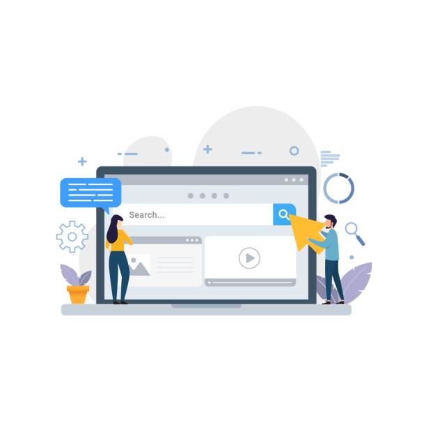
In today’s digital world, where competition is at its peak, user-friendly website design is no longer a luxury option, but an undeniable necessity.
Your website should not only look beautiful, but more importantly, it must be #efficient and #understandable for your users.
This means that users should be able to easily navigate your site, find the information they need, and complete their tasks without confusion.
Good website design means creating a positive experience for the visitor, an experience that encourages them to return and interact more.
This section is explanatory and guides you to understand why investing in this area is crucial.
Neglecting this can lead to high bounce rates, reduced engagement, and ultimately, the loss of potential customers.
When users don’t quickly find what they want, they simply go to a competitor’s website.
This translates to direct loss for your business.
In fact, user-friendly website design is the foundation of any successful digital strategy.
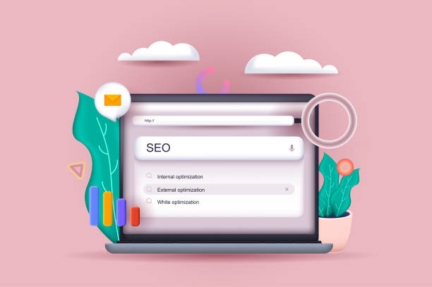
It not only affects the direct user experience but also plays a significant role in your SEO and search engine rankings.
Google and other search engines place great importance on user experience factors; sites that keep users engaged longer and have lower bounce rates usually achieve better rankings.
Therefore, user-friendly website design is a long-term investment that yields significant returns and helps your business grow sustainably.
Furthermore, Usability, as the cornerstone of this approach, ensures that your website functions correctly and users can easily interact with it.
This topic includes ease of learning, high efficiency, easy memorability, error reduction, and general user satisfaction.
Thus, with a user-friendly website design, you not only meet the current needs of your users but also provide a suitable foundation for the future.
Did you know that your website is the first impression customers have of your company? Boost your business’s credibility with a powerful corporate site from Rasawab!
✅ Exclusive and eye-catching design tailored to your brand
✅ Improved user experience and increased customer attraction
⚡ Get a free consultation!
2. Key Principles and Psychology of User Experience (UX)
A deep understanding of User Experience (UX) and the psychology behind it is the backbone of a successful user-friendly website design.
This section educates you on how psychological principles influence user behavior and how you can leverage these principles to improve your website.
The first principle is “Hick’s Law,” which states that the more choices there are, the longer it takes to make a decision.
Therefore, simplicity and avoiding visual clutter are crucial for user-friendly website design.
The second principle is the “Mere-Exposure Effect,” which states that familiarity with an element creates a more positive feeling in the user.
This means that using standard and predictable design patterns can improve the user experience.
For example, placing the logo in the top-left corner and the navigation menu at the top or side are among these patterns.
Also, “Fitts’s Law,” which relates the speed of movement to a target with the size of the target, highlights the importance of the size and placement of buttons and interactive elements in user-friendly website design.
The larger and closer a button is to the user’s activity point, the more likely it is to be clicked.
Ultimately, becoming specialized in this field means having a deep understanding of user needs and expectations.
Using personas and user scenarios helps designers put themselves in the users’ shoes and look at issues from their perspective.
This process involves continuous research, analysis, design, and testing.
The ultimate goal is for every visitor, regardless of their technical knowledge or the device they are using, to easily achieve their goal on the site.
This approach transforms your website from a collection of pages into a powerful tool that helps users fulfill their needs and build a meaningful connection with your brand.
Designing a user-friendly site requires a deep understanding of human behavior and how people interact with digital interfaces.
3. Visual Layout, Typography, and Their Impact on UX
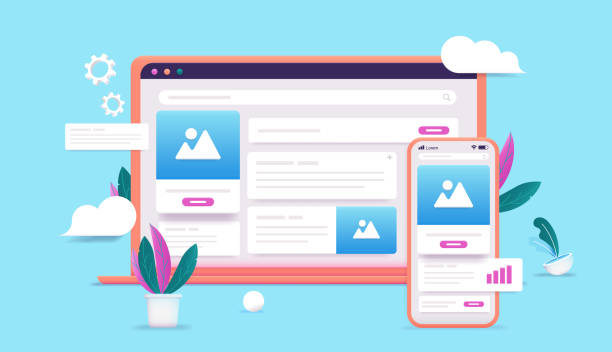
The visual appearance of a website is the first thing that captures a user’s attention and has a profound impact on the user experience.
In user-friendly website design, layout, typography, and color scheme not only contribute to aesthetics but also play a crucial role in guiding the user’s eye and facilitating content comprehension.
A clear and balanced layout makes information more digestible and prevents user confusion.
Sufficient whitespace allows various elements to “breathe” and reduces visual clutter, which in turn helps the user focus more.
This section analytically discusses how these visual elements can create an entertaining yet efficient experience.
Typography: The choice of appropriate fonts, text size, line spacing, and text color all influence readability and the feeling the user gets from the content.
Legible fonts with good contrast against the background make the reading experience more enjoyable.
Using visual hierarchy through different font sizes and weights helps users quickly identify important information.
Color Scheme: Colors have a powerful impact on user emotions and perceptions.
Choosing an appropriate color palette that aligns with your brand and site message can convey a sense of trust, professionalism, or excitement.
Sufficient contrast between text and background is essential for Accessibility and readability.
User-friendly website design pays special attention to these aspects.
Below is a table of key visual design principles that help create an effective layout:
| Design Principle | Description | Why It’s Important? |
|---|---|---|
| Contrast | Difference in color, size, or shape of elements for emphasis | Attracts attention to key elements and improves readability. |
| Repetition | Repeating visual elements (like font, color, layout) throughout the site | Creates consistency and a sense of familiarity for the user. |
| Alignment | Placing elements in line with each other (left, right, center) | Creates visual order and a professional appearance. |
| Proximity | Placing related elements close to each other | Logically groups information and reduces user cognitive load. |
| Visual Hierarchy | Giving importance to different elements using size, color, and position | Guides the user’s eye to the most important information. |
By adhering to these principles in user-friendly website design, you can ensure that your website not only looks beautiful but also effectively helps users achieve their goals.
Designing an efficient website requires a combination of aesthetics and functionality.
4. Information Architecture and Intuitive Navigation

Information Architecture is the beating heart of any user-friendly website design.
This concept refers to organizing and labeling content in a logical and understandable manner for users.
If users cannot easily find what they are looking for, even the best visual design will be useless.
This section guides and specializes in examining how to structure content and create an intuitive navigation system.
The first step is to understand the users’ mental models.
How do they expect to find information? What words do they use to describe concepts? Tools like card sorting and tree testing can be very useful at this stage.
These tools allow you to see how users group concepts and whether your proposed structure makes sense to them.
An intuitive navigation system should include the following:
- Clear Main Menu: Menu items should be labeled with understandable and unambiguous words.
Avoid jargon or vague terms that may not be familiar to all users. - Secondary Navigation: For subpages and deeper content, sidebars or breadcrumbs can help users understand their location on the site.
- Search Functionality: A prominent and efficient search bar is essential for users who know exactly what they want.
Search results should be relevant and clear. - Efficient Footer: The footer can include important links to policy pages, contact information, sitemap, and social media.
A user-friendly website design also emphasizes scanability.
Users often scan web pages to find the information they are looking for, rather than reading word for word.
Therefore, using clear headings, bulleted lists, short paragraphs, and bolding keywords can help this process.
The ultimate goal of strong information architecture and navigation in user-friendly website design is for the user to never feel lost and always know where they are and how to reach their next destination.
This approach increases user satisfaction, reduces bounce rates, and improves conversion rates.
A site with good navigation offers a delightful user experience.
How much does losing business leads due to an unprofessional site cost you? Solve this problem forever with professional corporate website design by Rasawab!
✅ Increased credibility and trust of potential customers
✅ Easier attraction of new business leads
⚡ Get a free consultation now!
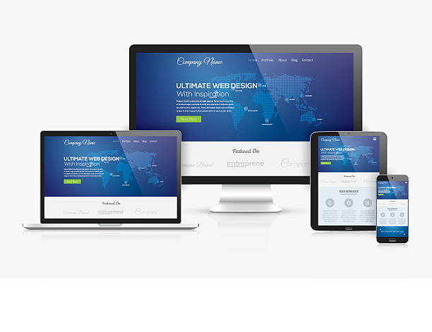
5. Responsiveness and Mobile-First Approach

In the current era, using mobile devices to access the internet has become a standard.
Therefore, user-friendly website design is incomplete without considering a responsive and “mobile-first” approach.
This section educates and informs about the importance of designing websites that display correctly and provide a consistent user experience across all screen sizes, from desktops to tablets and smartphones.
The mobile-first approach means starting the website design for the smallest screens (mobile) first, and then gradually expanding it for larger screens.
This method ensures that the most important elements and functionalities are also available in mobile versions.
Why is responsiveness crucial?
- Improved User Experience: Users expect your site to work well on any device.
If your site doesn’t display correctly on mobile, users will immediately leave. - SEO: Google and other search engines prioritize responsive sites.
Having a mobile-friendly site is very important for ranking in search results. - Increased Accessibility: With user-friendly and responsive website design, you ensure that your site is accessible to a wider range of users with different devices.
- Reduced Costs: Maintaining a responsive website that works across all devices is usually simpler and less costly than maintaining separate mobile and desktop versions.
Key elements in responsive design for a user-friendly site include:
- Flexible Images and Videos: Media should be scaled to display well on any screen size.
- Fluid Fonts: Font sizes should adjust with screen size to maintain readability.
- Mobile-Optimized Navigation Menus: Hamburger Menus or other compact navigation methods are essential for mobile.
- Sufficient Touch Space: Buttons and interactive elements should be large enough and have adequate spacing so users can easily click them with their fingers.
In summary, investing in user-friendly and responsive website design prepares you for the future and ensures that your website provides a seamless and optimal experience for every user, regardless of the device they use.
This is a fundamental step in creating a strong and effective online presence.
6. Performance Optimization and Loading Speed
Website loading speed not only affects user experience but also plays a vital role in SEO rankings.
In fact, a user-friendly website design must prioritize performance optimization.
Today’s users are impatient and expect pages to load instantly; any delay can mean losing a visitor.
This section specializes and explains strategies you can employ to increase your website’s speed.
Why is loading speed important?
- Increased User Satisfaction: A faster site makes the user happier and increases their likelihood of returning.
- Reduced Bounce Rate: Users hate waiting.
If your site is slow, they will leave and go to another site. - Improved SEO Ranking: Search engines give better rankings to faster sites.
- Increased Conversion Rate: For e-commerce sites, high speed directly leads to more sales.
Key Solutions for Speed Optimization:
- Image Optimization: Images are usually the biggest factor in site slowness.
Using optimized image formats (like WebP), compressing images without significant quality loss, and using lazy loading can have a dramatic impact. - File Compression (Gzip): Compressing HTML, CSS, and JavaScript files before sending them to the user’s browser significantly reduces their size.
- Code Minification: Removing whitespace, comments, and unnecessary characters from CSS, JavaScript, and HTML code reduces file sizes.
- Browser Caching: By configuring users’ browsers to store static files (like CSS, JS, images) in the cache, subsequent loads will be faster.
- Improve Server Response Time: Choosing a reputable hosting provider and optimizing server-side code can help reduce response time.
- Use of CDN (Content Delivery Network): A CDN stores your site’s content on various servers worldwide and delivers it from the closest server to the user, which reduces loading time.
Regularly monitoring site speed with tools like Google PageSpeed Insights or GTmetrix is essential for maintaining a user-friendly website design.
By implementing these optimizations, you can ensure that your website is not only beautiful and functional but also fast, providing a flawless user experience.
This is one aspect of user-optimized design.
7. Accessibility for All Users
A truly user-friendly website design is one that is accessible to all individuals, regardless of their abilities.
Web Accessibility means designing and developing websites in such a way that people with disabilities can also fully use them.
These disabilities can include visual, auditory, motor, cognitive, and neurological impairments.
This section guides and educates on the importance and methods of implementing accessibility in your website.
Adhering to these principles is not only an ethical and social responsibility but also a legal requirement in many countries.
Furthermore, improving accessibility can also aid in site SEO and expand your target market.
Web Content Accessibility Guidelines (WCAG) Principles:
The World Wide Web Consortium (W3C) has provided a set of guidelines called WCAG (Web Content Accessibility Guidelines) to help designers and developers create accessible content.
These guidelines are based on four fundamental principles:
| WCAG Principle | Description | Example in Design |
|---|---|---|
| Perceivable | Information and user interface components must be presented to users in ways they can perceive. | Alternative text (Alt Text) for images, captions for videos, sufficient color contrast. |
| Operable | User interface components and navigation must be operable. | Keyboard navigability, no time limits for completing forms. |
| Understandable | Information and the operation of the user interface must be understandable. | Simple and clear language, helpful error messages, consistent navigation. |
| Robust | Content must be robust enough that it can be interpreted by a wide range of user agents, including assistive technologies. | Correct and standard HTML and CSS coding, compatibility with various browsers and screen readers. |
By focusing on these four principles, your user-friendly website design can truly become inclusive.
Implementing accessibility is not only beneficial for people with disabilities but also provides a better experience for all users.
For example, video captions help deaf individuals, but they are also useful for people in noisy environments or whose native language is different.
Alternative text for images is essential for the visually impaired, but it also aids in SEO and site loading speed.
Therefore, user-friendly website design that pays attention to accessibility is a smart investment in the future of your website.
8. Content Strategy for User Attraction and Retention

Content is king, and a user-friendly website design would be meaningless without high-quality and engaging content.
Content strategy determines what kind of content, with what tone, and for which audience it should be produced.
This section provocatively and entertainingly discusses how you can create content that not only provides information but also engages users and guides them toward your business goals.
Does your content answer user questions, or does it create new questions in their minds that lead to more interaction?
Characteristics of Engaging Content for a User-Friendly Site:
- Relevance and Value: Content must be directly relevant to your target audience’s needs and interests and provide real value to them.
Does it solve a problem? Does it offer new information? Or is it simply entertaining? - Easy Readability: Use short sentences and paragraphs.
Subheadings, bulleted lists, and whitespace improve readability.
Use technical terms only when necessary and with sufficient explanation. - Content Variety: Don’t limit yourself to text.
High-quality images, videos, infographics, podcasts, and charts can make your content more engaging and understandable.
This variety significantly aids in user-friendly website design. - Clear Call to Action (CTA): Every piece of content should have a goal.
Do you want the user to sign up, buy a product, or read another article? CTAs should be clear, prominent, and persuasive. - Updates and Freshness: Outdated content can harm your site’s credibility.
Regularly update your content and add new content to give users a reason to return.
How to Create Provocative Content?
This type of content encourages users to think, discuss, and interact more.
You can create this type of content by posing open-ended questions, offering diverse perspectives, or encouraging comments and sharing.
For example, an analytical article about the future of user-friendly website design can raise numerous questions in the reader’s mind.
The ultimate goal of content strategy in a user-friendly website design is to build a lasting relationship with the audience.
By providing valuable and engaging content, you not only increase your site’s traffic but also gain user loyalty, which directly leads to your business success.
A user-friendly website without powerful content is like a luxury car without an engine.
Did you know that your website is the first impression customers have of your company? Boost your business’s credibility with a powerful corporate site from Rasawab!
✅ Exclusive and eye-catching design tailored to your brand
✅ Improved user experience and increased customer attraction
⚡ Get a free consultation!
9. Testing and Iteration in the User-Centered Design Process
No user-friendly website design achieves perfection on the first try.
The User-Centered Design process is a continuous cycle of design, testing, and iteration.
This section analytically and expertly discusses the importance of user testing and how to use feedback for continuous improvement of your website.
User tests help you identify site problems and weaknesses from the perspective of real users, not from the designers’ or developers’ viewpoints.
Types of User Tests:
- Usability Testing: In this test, real users perform specific tasks on the site while their behavior is observed.
This method can reveal navigation issues, form confusion, and other obstacles.
This is a crucial step in ensuring user-friendly website design. - A/B Testing: Two different versions of a page (A and B) are shown to two groups of users to determine which version performs better (e.g., higher click-through rate or conversion rate).
This method is very effective for optimizing specific elements such as headings, buttons, or images. - Surveys and Feedback: Collecting direct feedback from users through surveys, feedback forms, or interviews can provide valuable insights.
- Heatmap and Session Recording Analysis: These tools show you where users click, how much they scroll, and how they navigate pages.
This data can reveal weaknesses in layout or content.
Iteration Cycle:
After collecting data from tests, it’s time to analyze and implement changes.
This process should be iterative:
- Problem Identification: Prioritize problems based on the data.
- Solution Design: Design changes to address the problem.
- Implementation: Apply the changes to the website.
- Re-testing: Test the changes again to ensure the problem is resolved and no new issues have been created.
User-friendly website design is not a static process, but a continuous path to improvement.
By embracing a culture of testing and iteration, you will always be able to optimize your user experience and ensure that your website consistently meets user needs and helps achieve your business goals.
An iterative design is essential for achieving perfection.
10. The Future of User-Friendly Website Design and Emerging Trends
The world of the web is constantly evolving, and user-friendly website design is no exception.
To remain competitive and provide the best user experience, it’s essential to be aware of emerging trends.
This section informs and provocatively examines some of these trends and how they will impact the future of web design.
What will the future of user-friendly website design look like? Will artificial intelligence replace designers?
Some Key Trends:
- Artificial Intelligence (AI) and Personalization: AI is transforming how users interact with websites.
From advanced chatbots to content recommendation engines and personalization of user experience based on past behavior, AI will play an increasing role in creating a user-friendly site. - Voice User Interfaces (Voice UI): With the growing popularity of voice assistants like Siri and Alexa, designing for voice search and voice interactions on websites becomes more important.
Optimizing content to respond to voice queries is a new aspect of SEO and user-friendly design. - Augmented Reality (AR) and Virtual Reality (VR) on the Web: Although still in early stages, AR and VR have great potential to provide interactive and immersive experiences on websites, especially in industries like retail and tourism.
- Microinteractions: These small animations and feedback in the user interface, such as a button changing color after a click or engaging loading animations, help make user-friendly website design more delightful.
- Focus on Sustainability and Green Design: With increasing awareness of climate change, designing energy-efficient and high-performance websites with a smaller carbon footprint is becoming an important trend.
The future of user-friendly website design revolves around greater intelligence, deeper personalization, and more natural interactions.
Designers must be ready to use new technologies to create experiences that are not only efficient but also exciting and predictive of user needs.
This is a great challenge and opportunity to create the next generation of user-friendly websites that literally provide the best possible experience for everyone, in every context.
Future websites will not only be beautiful but also operate much more intelligently and intuitively.
Frequently Asked Questions
And other services of RasaWeb Advertising Agency in the field of advertising:
Smart Social Media: A fast and efficient solution for user interaction focusing on precise audience targeting.
Smart Sales Automation: A combination of creativity and technology for campaign management through custom programming.
Smart Marketplace: An effective tool for improving SEO ranking by optimizing key pages.
Smart Advertorials: A creative platform for enhancing online growth with intelligent data analysis.
Smart Direct Marketing: Revolutionize user interaction with the help of SEO-driven content strategy.
And over hundreds of other services in the field of internet advertising, advertising consultation, and organizational solutions.
Internet Advertising | Advertising Strategy | Advertorials
Resources
Successful Website DesignUser Experience GuideImportance of Responsive DesignSEO Improvement Tips
? Is your business ready to leap into the digital future? RasaWeb Afarin Digital Marketing Agency, by providing comprehensive services including modern UI website design, SEO, and social media management, paves your path to success. Contact us today and transform the future of your brand.
📍 Tehran, Mirdamad Street, next to Central Bank, Southern Kazeroun Alley, Ramin Alley, No. 6

